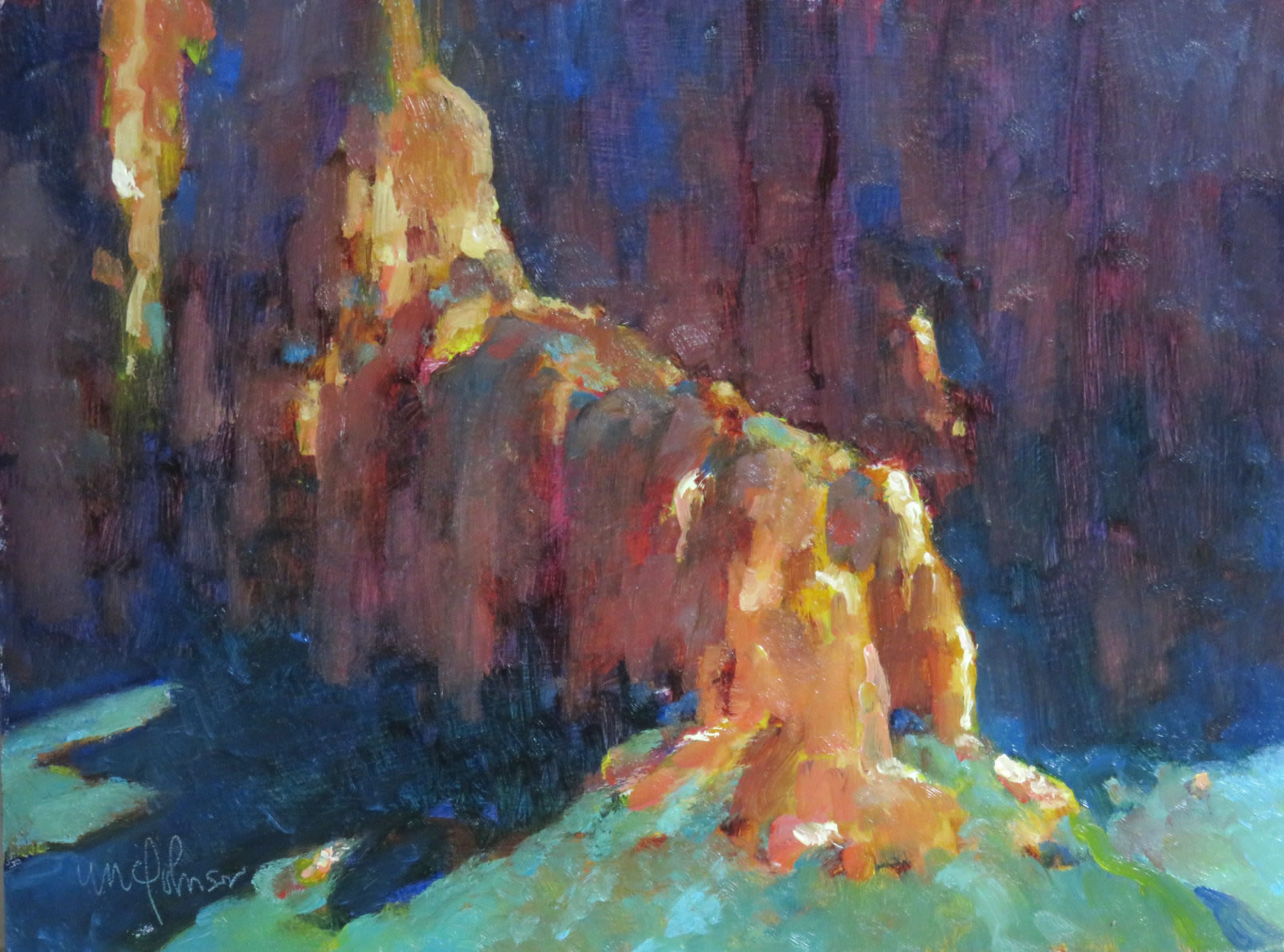
Authentically Human! Not Written by AI!
All Content Copyright © Michael Chesley Johnson AIS PSA MPAC

Sunday, October 30, 2016

Master Class: Depth

Plateau Point View
6x8 oil by Michael Chesley Johnson
How far can you see?

One of the biggest failings I see in landscape paintings is a lack of depth.  Many instructors teach you to abstract (or flatten) the landscape as an aid for transferring your subject to the two-dimensional surface of your canvas.  This works well in that early stage of painting when you are trying to get a grip on large, simple shapes and the relationships between them.  However, you need to remember that this two-dimensional representation needs to have the third dimension added back in at some point.

It’s like deflating an air mattress for storage.  When you want to use it again, it really helps to put the air back in.  It’s the same with painting.  Without air -- or atmospheric perspective -- the painting will appear flat and less real.

But painting the effect of air exactly as you see it isn’t enough.

When standing in front of your subject, you are looking at it with two eyes. Binocular vision gives you certain clues that help you see the distance between objects.  The viewer of your two-dimensional representation, on the other hand, doesn’t have the benefit of stereopsis.  It’s as if he’s looking at the scene with just one eye.

What you must do is exaggerate the effect for the benefit of your visually-handicapped viewer.  We’ve all been painting enough to know what air does to the landscape.  It makes the color of distant objects cooler and greyer; and it softens edges and lightens darks.  But to make the depth more understandable, you need to make objects even cooler and greyer than you see them, and the edges even softer and  the darks even lighter.

If you’re an advanced painter, do you have a Master Class topic you’d like to see discussed?  Let me know!

Saturday, October 29, 2016

Paintout in Sedona - and About Paint Sedona Plein Air Painting Workshops

Almost There
8x16 oil by Michael Chesley Johnson - Available

Most plein air painters, I think, immerse themselves in solitude when they hike out into the landscape.  That's part of why we're out there -- the solitude.  But there are times when you might want a more social experience.  You'd like to share the solitude with like-minded people.

Going out with a group of painters can be motivating, educational and, not to mention, fun.  You can chat as you explore for the best spots...learn about the latest gear or DIY box...and maybe have a few laughs, too, or share a meal.


A few years ago, I founded two plein air groups, one of which is in the Sedona and Verde Valley area of Arizona.  It's been a great group, and we've made new friends and have learned a good deal through it.  (The other is in Downeast Maine and the Canadian Maritimes.)

Today was our first outing of the season.  I've included my painting from the day at the top of this post, plus a few photos.


Another way to get the social fix is to take a plein air painting workshop.  In some ways, it's very much like my plein air group, except I give instruction, demonstrations and critiques.  It's very much a "value-added" painting group!  My Paint Sedona season has just begun, and I still have openings through April 2017.  These are small workshops for the serious student.  Limited to no more than four students, we take our craft seriously but have fun, too.  For more information on the program, please visit www.PaintSedona.com

Wednesday, October 26, 2016

Master Class: Contrast Pairs

An Inviting Spot
10x9 pastel by Michael Chesley Johnson
What contrast pairs are at work here?

In my last Master Class post, I discussed three contrast pairs that are most useful for the plein air painter.  In this post, I’ll be writing about other contrast pairs.

First, what are contrast pairs good for? As we saw in my last post, using the principle of dominance in conjunction with contrast pairs helps to create a sense of mood.  This combination goes a long way when you are trying to “capture the moment.”  But in a more general sense, they’re also useful for creating richness in a painting.  What’s more, they can help move the eye through the painting and, ultimately, serve to support the center of interest.

Just to review, here are the three contrast pairs I find useful for landscapes:

  • light/dark (value)
  • warm/cool ( temperature)
  • rich/dull (chroma)

These are three of the four properties of color.  The fourth and final property is hue.  Hue can also be considered a contrast pair.  Here’s how.

Think blue/orange or any pair of complementary colors.  In a way, this is somewhat related to the contrast pair of warm/cool. Blue is usually thought of as a cool color, and orange, warm.  The early illustrators sometimes used just these two colors to create beautiful illustrations.  Whichever pair of complements you choose, one member must be warm and the other, cool.

You have a lot of control over the degree of contrast, which can be useful for creating mood.  Rather than black/white, which can indicate strong sunlight, you might use two greys that are just a few steps apart on the value scale; this can create a sense of overcast or even fog.  For a more harmonious painting, consider using a split-complement color pair.  Rather then red/green, you might choose red/blue-green or red/yellow-green.  This makes the contrast a little less jarring because the colors aren’t directly opposite each other on the color wheel.

For my next Master Class topic, I’ll talk about depth.

If you’re an advanced painter, do you have a Master Class topic you’d like to see discussed?  Let me know!


Sunday, October 23, 2016

Sedona Plein Air Festival Final Report Plus Observations

At the Main Street Paintout
(Photo by Kelli Klymenko, Sedona Arts Center)

The 12th annual Sedona Plein Air Festival ended yesterday with the Main Street Paintout and a barbecue for artists and the public.  While attending all the events, I had some time to make a few observations regarding awards and sales.

But first, let me fill in what's happened since my last post.

After the L'Auberge de Sedona paintout, we had another paintout at the Seven Canyons resort.  Unlike the one at L'Auberge, which was all about the creek, this one was all about the vista.  The resort was built right up against the National Forest and the red rocks.  The day was hot, but I managed to find a scrap of shade on Rachel's Knoll, a hilltop with stunning views.  Afterward, we all gathered on the practice green near the clubhouse for awards and sales and to watch the sun go down.

The next day, Friday, was Hanging Day.  Artists scrambled to frame and rehang work between the Awards Gallery – work that would be judged for awards – and the Salon Gallery, which contained other work from the week plus backups the artist had brought.  Most of the work in the Salon Gallery, in my opinion, could easily have gone into the Awards Gallery, the quality was that high.  I'm sure it was difficult for artists to choose what to put in which gallery.  That evening, Lori Putnam, the Awards Judge, handed out awards.  A tough task, since I think most artists had done masterful work.

After a busy week, on Saturday morning weary artists tumbled out onto Main Street to set up to paint.  (In past years, the Main Street paintout had been on the first day – a cruel act, since the new artists had yet to get comfortable with Sedona's unique landscape, but there they were, put in front of the public.  Moving it to the last day was an act of kindness.)   At the end of the paintout, the festival opened the gallery and fired up the barbecue.  The line was quite long, but thankfully, artists were allowed to cut in line so they could eat and get quickly to the gallery.

As I mentioned before, this was my ninth time as an invited artist.  This week, especially, I paid attention to sales and awards, and I came up with the following observations:

Awards and sales are different goals.  Paint larger, more finished pieces for the awards; paint smaller, less expensive ones for sales.  Awards are more likely to be given to paintings one would find in a good gallery.  These paintings also are more likely to be bought by local collectors and collectors who have traveled specifically for the event.  The smaller, less expensive paintings will mostly be bought by tourists, who may not have much room in their luggage, or by others with a smaller budget.  By painting to these two goals, I think one stands a better chance of both awards and sales.  Don't paint just cheap, small pieces; make sure to paint a couple of larger, more expensive pieces for awards.

As for awards, having judged shows myself, I can safely say that in one of this caliber, the choice is personal.  The artists were invited because they demonstrate a mastery of the basics – drawing and design, color usage and mark-making – as well as a mastery of evoking mood and feeling.   How can you possibly make an objective decision?   You just can't.   Instead, the choice comes down to the judge's subjective response and other factors.  I think just about every artist painted a "Best of Show."

I've included my paintings from the week in this post.  Now I'm on to other things – my Paint Sedona workshops begin next week!

Out of the Shadows
9x12 oil by Michael Chesley Johnson

Sweet Morning
12x18 pastel by Michael Chesley Johnson

This Was Once an Ancient Sea
12x24 oil  by Michael Chesley Johnson

Bridge of Dreams
16x12 oil by Michael Chesley Johnson

Ravens in the Sun - SOLD
6x8 oil  by Michael Chesley Johnson

Monument
12x16 oil  by Michael Chesley Johnson

Season of Trees
12x9 oil  by Michael Chesley Johnson

Thursday, October 20, 2016

Sedona Plein Air Festival Mid-Term Report: Color and Contrast

Bridge of Dreams
16x12 oil panel by Michael Chesley Johnson

We're about halfway through the 2016 12th Annual Sedona Plein Air Festival.  Artists have been enjoying a period of beautiful weather, marred only by an occasional  gust of wind and, on one morning, smoke from a controlled burn near Flagstaff.  It's been a great week so far, and I've enjoyed meeting the new artists and reconnecting with old friends.  For me, this is my ninth time as an invited artist.  (Follow the event on my Facebook studio page and on the festival's page.)

This year, I wanted to shake up my process.  Normally for an event, I stick with the tried-and-true, but I yearned to add something new to the mix.  (Remember, this is my ninth year!)  So, I am starting my paintings in a new way.  I'm using nothing but rich, raw color in my underpaintings and shooting for as much contrast as possible.  Rather than try to mix exactly what I see, I'm just applying color straight from the tube.  If I see something in shadow, I paint it either cool red, blue or cool green.  If I see something in sunlight, I paint it either yellow, orange or warm red.*

This Was Once an Ancient Sea
12x24 oil/panel by Michael Chesley Johnson

And then I dull the heck out of it.  I start with what area looks the most garish and grey it down first, and go from there.  But always some of that rich beginning pops through.  Yesterday, another artist, known for vivid color and not familiar with me or my work, stopped by my easel to say, "I'm glad there's another artist here who likes strong color!"  If she'd seen me painting a week ago, she'd have expressed a different sentiment.  Although the start is somewhat scary – "How am I going to pull myself out of this particular hole?" – I'm really loving this new look.

Out of the Shadows
9x12 oil/panel by Michael Chesley Johnson


By the way, this week I'm also playing with two colors from Gamblin I haven't used before:  Radiant Turquoise and Brown-Pink.  The Turquoise, either pure or modified with ultramarine blue and sometimes the Brown-Pink, is great for skies.  The Brown-Pink is great for drawing my initial shapes, since some of that shows through at the end and livens up the painting, and also for greying down my phthalo emerald.  Thank you, Lori Putnam, our Keynote Speaker and Awards Judge, who suggested these two colors as suitable sponsor gifts to artists from Gamblin.

Although I'm painting in oil this week, I was asked to give a demonstration in pastel.  I thought this was a good idea since none of the other demonstrating artists were working in pastel.  There are lots of closet pastel painters out there who would love to see it demonstrated, so I eagerly agreed.

Sweet Morning
12x18 pastel demonstration by Michael Chesley Johnson

The theme this year is Gated Communities.  Sedona has several. Most are along Oak Creek or in especially pretty spots near the red rocks, places the public would "over-love" if they weren't gated. One day we painted at the L'Auberge de Sedona, a sunny spot along the creek with lots of ducks. (By the way, I have several paintings for sale hanging in the lobby there, courtesy of Goldenstein Gallery.) Another, at Back O'Beyond, which has views of Cathedral Rock and other famous features of Red Rock Country. This afternoon, we'll be painting at Seven Canyons, which abuts an extensive wilderness area of the national forest. It's energizing to paint in these beautiful locations.

I'll have another report at the end of the Festival.  If you're in the area, please come to the public events and say hello.  The public is invited today to Seven Canyons (1-4, followed by awards and sales), and also to the Opening and Awards Night on Friday (5-8) and the Main Street Paintout and Sale on Saturday (10-2).  For a full list of events and times:  http://www.sedonapleinairfestival.org/
__
*All my colors are from Gamblin Artists Colors, Inc.

Thursday, October 13, 2016

Master Class: Dominance

Nestled in Dawn's Early Light
9x12 pastel by Michael Chesley Johnson
What color qualities are dominant in this scene?


I've decided to start a new series of blog posts, one that will address topics of interest to more advanced painters.  With this post, I'd like to talk about dominance.

Climb to a hill top on a summer's morning, overlooking a forested valley.  It's a breath-taking view, and you can see for miles.  You'd love to paint it.  But stop for a moment to consider what visual ingredients go into making this scene.  The sun begins to rise before you, casting a golden light over the valley, and the very air seems incandescent.  Summer has nearly reached its end, and the vibrant greens of spring are now tempered with muted reds and yellows, giving a hint of fall.

You set up your easel and prepare your palette.  Now, after you’ve used your viewfinder to crop your scene but before dipping your brush into the paint,  ask yourself three questions:

  • Is the scene mostly light or dark?
  • Is it mostly warm or cool?
  • Is it mostly filled with rich color or dull?

I usually think in terms of square inches.  For example, do the warm colors occupy more real estate in the scene than the cool ones?

You determine that yours is a low-key scene, filled with cool, mostly dull color.  Yes, there are little spots of warm light and a hint of richer reds and yellows, but these only serve to increase the sense of luminosity.

This analysis to determine what is dominant in a scene will help you to "capture the moment" successfully.   Although there are many different contrast pairs, I’ve found that these three -- value (light/dark), temperature (warm/cool) and chroma (rich/dull) -- are the most important ones for landscape painting.

In my next Master Class post, I'll write about what I call contrast pairs.

If you’re an advanced painter, do you have a Master Class topic you’d like to see discussed?  Let me know!

Tuesday, October 11, 2016

Workshop Report: Wilmington, North Carolina - and Hurricane Matthew

Pastel demonstration by Michael Chesley Johnson

I've never had to cancel or shorten a workshop because of a natural disaster or an act of God. However, I had to shorten this one. Read on!

I always like to teach a workshop on our annual fall migration from our summer studio on Campobello Island to our winter one near Sedona, Arizona. This year, the Wilmington Art Association in North Carolina asked me to come down and teach plein air painting to their group. I happily agreed, since I'd never been to that part of the coast before, and I'm always eager to spread the gospel of plein air painting.

Painting on the River Walk

Because Wilmington was new to me, we arrived a day early so that Ann, my workshop coordinator as well as our delightful lodging host, could show me the possible painting locations. I was pleased to learn she is an experienced outdoor painter, and her choices were excellent with restrooms, plenty of parking and, of course, plenty of great scenery. We went down to the Intra-Coastal Waterway and the River Walk, which is a boardwalk filled with interesting shops and restaurants; then to the historic downtown mansions, hedged with beautiful magnolias and oak trees; plus the Aboretum, which is just chock-full of painting possibilities including a Japanese tea house.

That same day, Hurricane Matthew had just finished chewing up Haiti and was hungrily marching on to Cuba.

Pastel demonstration by Michael Chesley Johnson
Horse trolley tour

We weren't worried yet, as the forecast seemed to indicate Matthew would slow down and possibly veer out to sea. There was a chance it might nick Florida on its way out. At any rate, a major hurricane hadn't hit the Wilmington area in 20 years, and most of us thought we'd escape this one.

But by the second day of the workshop, the forecast had changed remarkably. That morning, the governor of South Carolina issued a mandatory evacuation of the coast. North Carolina was still biding its time to give the order, but the prospect of the one million already ordered to leave made Trina and me reconsider the timing of our travel plans. We had a very tight schedule, and the next stop was a family visit in Georgia with my elderly parents. Our path was going to take us directly parallel to the coast and into the evacuation traffic. There was no other way around.

Also, students needed to prepare. Some had already made hotel reservations for further inland; others, who had planned a vacation at Myrtle Beach for the holiday weekend (this was Columbus Day weekend), canceled theirs. Some were discussing plans for their cats and dogs.

Ready for the critique!

Painting downtown


Sadly, we made the decision to cancel the last day of the workshop. Students got a refund on the last day, and I also offered to critique two paintings for each student via e-mail for free.

If you've watched the news, you'll know we made the right decision. Although Matthew slowed down a bit and arrived to the Carolinas later than expected, as I write parts of the the coast are still under water, and further inland, communities are flooded because of swollen rivers from the 15+ inches of rain received. Section of Interstate 95 are still impassable.

All that said, we had a great two days for the workshop. The weather couldn't have been better, and the students eagerly trooped on despite the threat of Matthew.

Now, I am back on the road and in Oklahoma. I'll arrive in Arizona on Friday just in time for the Sedona Plein Air Festival, which starts Saturday. As usual, I'll be posting to my blog daily if possible during the event. Stay tuned!

Oil demo by Michael Chesley Johnson

Monday, October 10, 2016

A Short Introduction to Pastel

A couple of years ago, I gave a short, introductory talk on pastel.  I was fortunate enough to have a professional tape it.  If you're new to pastel, you might find this informative.  Here it is:


(Email recipients, view video at https://www.youtube.com/embed/XIylGBLjii8)

I have many more videos available at my online workshop! https://www.udemy.com/user/michaelchesleyjohnson/

Friday, October 7, 2016

Mounting Paintings on Paper or Canvas to Hardboard

Many painters who practice their skill frequently complain about material costs.  One way I've found to cut down my costs is to paint on gessoed paper.  (I use domestic etching paper from Dick Blick with a layer of Gamblin's PVA size followed by two coats of inexpensive acrylic gesso.)  Gessoed paper is very inexpensive, pennies rather than dollars.  If you hate what you do, you can simply toss it without pecuniary guilt; if you love it, you can mount it and frame it as a regular oil painting.  Here's how:


(Email recipients, view video at https://www.youtube.com/embed/BrKifvmeVeo)

More videos available at my online workshop! https://www.udemy.com/user/michaelchesleyjohnson/

Wednesday, October 5, 2016

Fixing Light and Shadow with Greys

One of the biggest problems I've seen with plein air painting students in my workshops (other than lack of drawing skills, as I mentioned in an earlier post) is learning how to see value before seeing color.  Value is a tool we use to create a two-dimensional representation of the three-dimensional world; color is a tool we use to add mood and a sense of the moment.  Frequently, students will think of color first and value second or not at all.  But getting the values right -- and getting them right first, before color -- is essential to good plein air painting.

One approach I teach is to start with a monochromatic underpainting.  This lets you get create a solid representation of your subject before getting into trouble with color.  Here's a video that shows you how:


(If you're getting this via email, you won't see the video.  Go here instead: https://www.youtube.com/embed/Pn0PIH2M0uI)

Here's on more that shows a sequence without sound:


(Again, for email receipients: https://www.youtube.com/embed/d_uqo2Qr1lA)

More videos are available at my online workshop!  https://www.udemy.com/user/michaelchesleyjohnson/

Saturday, October 1, 2016

How to Set Up a French Easel

Fall is a great time for taking a plein air workshop.  If you're new to the experience and happen to have a French easel, there's no need to sign up for that gymnastics class to learn how to set one up.  This short video should help.  And practice!


For those of you receiving this by email, you won't see the video.  Instead, go to https://youtu.be/ZfhwuUJcb94

More videos at my online video course! https://www.udemy.com/user/michaelchesleyjohnson/