Authentically Human! Not Written by AI!
All Content Copyright © Michael Chesley Johnson AIS PSA MPAC

Sunday, May 31, 2020

Another Journey into the Canyon—and Some Thoughts on Gouache as a Plein Air Painting Medium

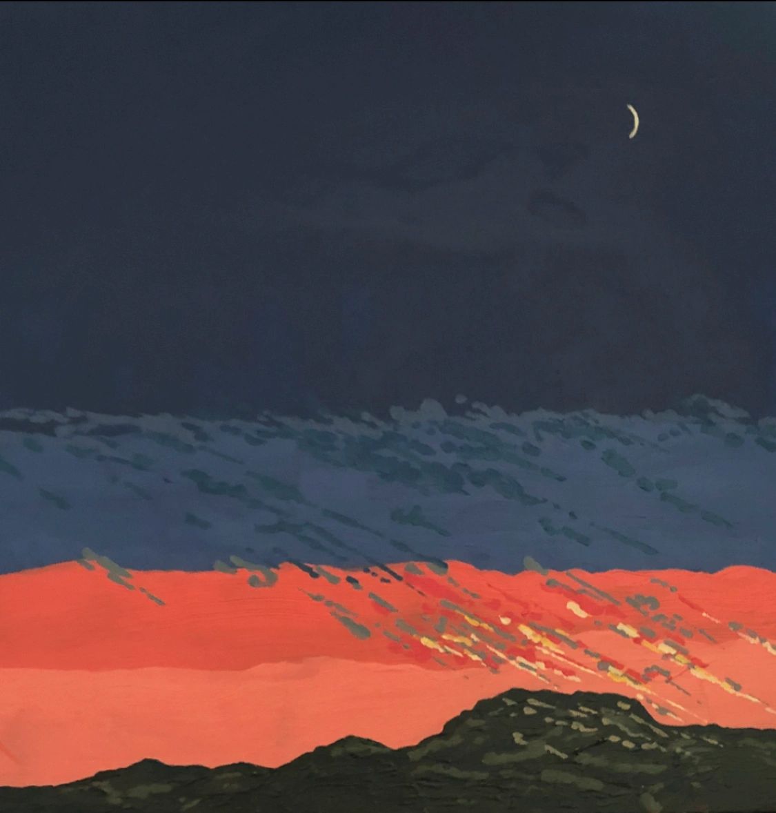
5x8 gouache sketch, Backlit Oak in the Canyon

I'm amazed at how often the word “gouache” pops up in the art blogs I read.  It seems everyone's rediscovering this old medium.  Old?  Yes, it's been in use for over 600 years.  More recently, back in the early part of the 20th century, it was popular among illustrators as well as artists in the animation field.  Although some artists, notably N.C. Wyeth, used oil paint for illustrations, gouache was more popular because it was “quick'n'dirty.”  It dried quickly, allowing the artist to meet aggressive deadlines, and it dried to a velvety matte finish, eliminating any problem with glare when photographing the work for reproduction.  That's the “quick” part.  Now here's the “dirty” part.  Many of the pigments used in “designer's gouache,” as it was called then, faded upon exposure to light.  Because illustrations and animation cels were discarded soon after being photographed, nobody cared if the pigments were fugitive.  Those works weren't meant to be hung on the wall or bequeathed to the next generation. 

Today, most modern gouache colors will last the test of time.  Some won't, however.  It's important to check a color's lightfastness rating.  Even so, I leave my gouache sketches where I make them—in a hardbound watercolor journal that, closed, protects them from light.  Were I to frame these sketches, I would make sure to mount them under UV-proof glass such as Tru Vue.

Because gouache is an opaque, fast-drying medium, you can layer, scumble and correct.  (The working properties of gouache are so similar to pastel that the two mediums are often used together.)  But because it can be re-wet easily, I make sure these earlier passages are completely dry before painting over them, and I don't use much water when I do so.  Here in the high desert of New Mexico, gouache dries very quickly, so I don't have to wait long.

Here are some thoughts on painting gouache en plein air:

  • Use pans of gouache rather than tubes.  It's easier to reactivate when dry than tubed paint.  A dried blob of tube gouache is nearly impossible to re-wet because it forms a thick shell when exposed to dry air; you'll ruin your brush trying to poke a hole in it.  (If you insist on tubes, you can use a Sta-Wet palette or a spray bottle to mist the paint to prevent this.  But that's just more stuff to take to the field.)
  • Block in the sketch first with thin washes of gouache to establish regions of warm and cool colors.  Although gouache is considered an opaque medium, these nearly-transparent washes can mimic the beautiful glow one can achieve with watercolor.  For example, if I want to paint an illusion of warm sunshine on a cliff, I use a thin wash of yellow ochre over what will be the sunny parts.  When I later pop in the darker, cooler shadows, these sunny notes create a powerful glow.
  • If you're trying to create a highlight, avoid painting it with pure white, as this will look too cold.  And don't try to paint it with a light tint of a color, as this will look too grey.  Instead, put down pure white where you want the highlight and then, once that mark is dry, apply a transparent wash of color on top of it.  It will be cleaner and brighter than any mixed tint.  It's like applying a transparent wash to white paper.  (Think “watercolor” again.)

With that in mind, here are sketches (all 5x8, except for one 5x16) from my most recent expeditions into the canyon behind my studio.  As it is getting hot and more humid now, thunderstorms are building up most afternoons.  This will kill the brilliant “sun on rocks” motif I've been painting.  I may have to go out earlier in the day before the clouds build—or start painting clouds.


5x16.  I had to scan in each half of
the sketch and combine to this full version.

5x8 left half of the above 5x16  sketch

5x8 right half of the above 5x16 sketch


Sunday, May 24, 2020

Working with Pastel, Oil Paint and Cold Wax Medium—in One Painting!

Finished 12x14 pastel/oil/cold wax 

Back in the winter—back before the pandemic—our local art group embarked on a series of life drawing sessions. We managed to get just one under our belts before the world collapsed upon itself. Well, the other day, while looking over my sketches, I realized that a couple had potential. With the hot weather driving me into the studio in the afternoons, I decided to take one and make something of it.

I had in mind that I wanted to try an idea I've had about pastel. Pastel is what I call a “crossover” medium. You can draw with it, or you can paint with it. In drawing, one makes marks with the point or edge of the pastel stick; in painting, one makes marks with the broad side. I especially like the way a pastel painting can have all sorts of scratchy “drawn” marks beneath a more painterly application. The drawing remains, showing some of the artist's process. I wondered if I could find a way to retain the drawing aspect of pastel while combining it with oil paint and cold wax medium. I decided to give it a try.

First, I needed to transfer my sketch to a painting surface. Because I didn't want to damage the original sketch, which was done with soft vine charcoal on newsprint, I photographed it, converted it to grayscale, maximized the contrast, and then printed it out in a size appropriate for my 12x14 panel. (The panel, by the way, I had already prepared with one layer of acrylic gesso, one of Gamblin's PVA size, and then two of Art Spectrum Clear Pastel Primer.) I coated the back of this print with a thin layer of compressed charcoal, placed it “dirty side” down on my panel, and used a pencil to trace the major lines. This transferred a thin charcoal outline to my panel.

Here's the original vine charcoal sketch on newsprint:


Here's the high-contrast, grayscale version:


Next, using a dark pastel, I refined the drawing and darkened lines so I could see them better. After this, I blocked in my major color masses with Pan Pastels. And then the fun began. I needed to fix the pastel so it wouldn't be disturbed by the application of oil paint and cold wax. To do this, I:

1. Heavily sprayed the underpainting with matte fixative, but not so much as to liquefy the pastel and make it run; then
2. Brushed on a coat of Gamblin's Galkyd Lite.

Once the Galkyd Lite was dry, I found it had completely sealed the pastel. I was pleased to see that all my interesting little marks were still quite visible. Here's the painting in this state:


From here, I proceeded to paint on top of all this with Gamblin's cold wax medium and oil paint. Here's the finished painting:


And some detail:


I like the effect of the textured wax and touches of oil paint against the pastel underpainting, but I'm not sure I'll take the painting any further. One could, of course, but the risk is that the drawing will become more and more obscured with paint and wax. But the experiment worked, and I'm sure I'll try this again. Maybe you'll give it a try!


Sunday, May 17, 2020

More Journeys into the Canyon

I love the abstractions geology creates.
Canyon Wall, 5x8 gouache on 300 gsm watercolor paper.

Good spring weather continues here in the high desert of northern New Mexico.  I'm seeing our beautiful spring flowers opening up:  the deep red blossoms of the claret cup cactus, the heavy blooms of the yucca, the delicate, orange flowers of the desert mallow.  With these have come the birds.  Hummingbirds zip crazily around our feeder; the grosbeaks have begun to monopolize the feeding stations.  Although last week we had some hot weather—80+ to me is hot—over the weekend a front moved through, bringing welcome rain and more seasonable temperatures.

Banana yucca

Claret cup cactus
 
With the good weather, I've been able to maintain my discipline of heading most afternoons into the canyon for sketching.  Shade is more important now than before.  New Mexico is windy in the spring, but the breeze seems to die the deeper into the canyon I go.  My viewpoints are dictated by the most comfortable rock in the shade.  (I sit and work in my lap for these sketches.) The other day, I came home with a few insect bites, and yesterday I noticed ants crawling up my leg.  Now I tuck the pants into my socks and my shirt tail into my pants to keep out the ants.

I thought I'd share the most recent set of sketches.  I'm continuing to focus on canyon walls, ledges and rocks.  Close-ups of these seem to provide a quality of abstraction that I'm enjoying right now.  I'll save the long vistas for a future sketchbook.

If any of these 5x8 gouache sketches appeal to you, I'll be happy to create a new painting based on it.  (Rather than cut out and sell pages from my book.)


I couldn't resist this 150-foot, magnificent ponderosa!


Sunday, May 10, 2020

Looking for Feedback on your Paintings?

The only thing missing in this screenshot of a Zoom session is you!

For most of us, painting is a solitary endeavor.  In our studio or out in the field, we work on our canvas and then step back, alone, to evaluate what we've done.  Even if we've learned the important skill of self-critique, the eyes of another may better help us see where to improve.  During my workshops, I give a great deal of feedback on paintings.  For the student, this is often the most rewarding part of the week.

These days, with workshops cancelled, many of you may be missing this feedback.  I can help with that.

Lately, I've been evaluating Zoom as a tool to reach out to students.  Two dozen have participated in my test sessions, and I've been very pleased with the results.  Despite a few technical glitches (resolved) and learning curve issues (mostly resolved), everyone gave the sessions a thumbs-up.

One session offered critiques of student work.  I particularly enjoyed this one, and the students felt it was the most valuable.  In fact, I realized that the Zoom critiques actually can be even more helpful than the ones I give in a face-to-face workshop.

Here's why.  For each of the critiques, I asked for images in advance.  Then, before the session, I ran each image through what I call my “Photoshop mill” and made changes to improve the piece. This is something I cannot do in a workshop because of the preparation time.  And, rather than me just pointing to different parts of a painting and talking about it—which is all I can do in a workshop—I was actually able to share my computer screen and show the changes, step by step.

In some ways, Zoom is a poor substitute for the rich interaction one experiences in a workshop.  But in this special case, it's much better.

So, I  want to make you an offer.  For $25, I will critique two of your paintings and both show and discuss the changes with you via Zoom.  If you'd like to take advantage of this offer, you can sign up right here:

Sign Up for a Zoom Critique

Once I receive payment, I'll send an e-mail confirmation and let you know where to send the two images.  We'll also set up a date and time for our session then.

Here are formatting guidelines:

  • JPEG format 
  • 2000 pixels on the longest side (or if pixels give you trouble, just try to keep the file under 2 megabytes in size)  
  • Send these as attachments to your e-mail and not embedded in the text as "inline" images

And here are guidelines for choosing which paintings to have critiqued:

  • Landscape paintings only (no still lifes, figures or portraits)
  • Paintings can be en plein air or studio
  • Paintings should be recent work; you are most likely a better painter than you were five or ten years ago, and my suggestions will be more helpful to you

I hope you'll take advantage of my offer.  Painting is lonely enough without having to do your own critiques!

Here's a short video of how it works:


Sunday, May 3, 2020

The Wellivers: Father and Son

Old Windfall
1981-1982
Oil on Canvas, 96”x120”
Neil Welliver
Courtesy of Alexandre Gallery

Neil Welliver at work in the field

Neil Welliver's studio palette

I'm a fan of well-done crime shows.  Lately, I've gotten hooked on Amazon's “Bosch.”  It's about an L.A. Detective with strong principles but who doesn't always follow the rules.  The detective, Hieronymous Bosch—named after the 15th century painter from the Netherlands—is played by actor Titus Welliver.  Somewhere in my web surfing I came across a curious fact.  Titus Welliver is the son of well-known Maine landscape painter Neil Welliver.

Neil Welliver (1929-2005) is one of my favorite painters.  His work is realistic yet graphic in a posterized sort of way.  His paintings of deep woods evoke for me the feeling of a long hike through a forest thick with hemlock and strewn with moss-covered glacial erratics.  When I see a painting like the one at the top of this post, I can almost smell the ferns.

Here's what Wikipedia says about the artist:
Welliver was born in Millville, Pennsylvania. He graduated from the Philadelphia College of Art (now part of the University of the Arts) and then received an MFA from Yale University. At Yale, he studied with the abstract artists Burgoyne Diller and Josef Albers, whose theories on color were influential.  Welliver taught at Cooper Union from 1953 to 1957 and at Yale from 1956 to 1966. In 1966, he began teaching at, and eventually became chairman of the University of Pennsylvania Graduate School of Fine Art, from which he retired in 1989.
While teaching at Yale, Welliver's style evolved from abstract color field painting to the realistic transcription of small-town scenes in watercolor. In the early 1960s he went to Maine, where he began painting figures outdoors, the large oil paintings often focusing on his sons canoeing or female nudes bathing. In 1970 he moved permanently to Lincolnville, and by the mid 1970s the figure as subject had given way to the exclusive study of landscape. 
His mature works, often as large as 8 by 10 feet, are at once richly painted abstractions and clear representational images of intimate Maine landscapes, taking as their subjects rocky hills, beaver houses, tree stumps, and rushing water, occasionally opening out to blue cloud-laden skies. Carrying his equipment on his back, Welliver hiked into the woods to make plein-air sketches. His equipment-laden backpack weighed 70 pounds, and included eight colors of oil paint: white, ivory black, cadmium red scarlet, manganese blue, ultramarine blue, lemon yellow, cadmium yellow, and talens green light. These plein-air studies usually took about 9 hours, and were painted in 3 hour increments, after which time the light would change too much to continue. Welliver insisted that he was uninterested in trying to copy the exact colors of objects, desiring instead to find "a color that makes it look like it is, again, surrounded by air.” 
He often painted out of doors in winter, and enjoyed the crystal quality of the air and luminosity created by light reflecting off snow, but acknowledged that the process was not easy:
"Painting outside in winter is not a macho thing to do. It's more difficult than that. To paint outside in the winter is painful. It hurts your hands, it hurts your feet, it hurts your ears. Painting is difficult. The paint is rigid, it's stiff, it doesn't move easily. But sometimes there are things you want and that's the only way you get them."
Welliver later expanded some of the outdoor studies into large paintings in the studio, painting 4 to 7 hours a day, meticulously starting the canvases in the upper left-hand corner and finishing in the lower right. If the finished paintings were vibrantly painted, containing "an emotional intensity that goes beyond the ordinary limits of realism", they also tended to be emotionally sombre. 
Welliver died of pneumonia in Belfast, Maine, near his home in Lincolnville.

Here's a 30-minute video of Neil Welliver making an outdoor sketch and then moving to the studio to paint a larger version.  (Can't see the video?  Here's the link: https://www.youtube.com/watch?v=ht_5csln19k)  I find it fascinating that he used the old charcoal-and-pounce method for transferring his  drawing to a large canvas.


Son Titus learned initially from his father and then studied art at Bennington College.  Although he doesn't say in so many words, I believe his father was as strict with him regarding technique as N.C. Wyeth was with his son, Andrew.  In this interview, he talks about his father and painting.  (Can't see the video?  Here's the link: https://www.youtube.com/watch?v=0n_ihljNygQ )


Titus' painting style, although similar to his father's in that values are reduced and shapes flattened, tends to have an even more contemporary feeling.  Uncluttered by unnecessary detail, his paintings distill the landscape into a few, evocative shapes.  Here's an example:


Concerto No.5 in F Minor
Acrylic on Canvas, 20" x 20" 
Titus Welliver
Courtest of artrep-dg.com