Authentically Human! Not Written by AI!
All Content Copyright © Michael Chesley Johnson AIS PSA MPAC

Sunday, January 31, 2021

Forrest Moses (1934-2021)

Winter Woods
32"x32" Oil, 2005
(Courtesy Lewallen Galleries)


I never met Forrest Moses, but he was well-known in the Santa Fe art scene.  He died the week before last at 86 in Palm Springs.

I've always enjoyed seeing his work.  He expertly distilled the essence of the landscape into a beautiful abstraction of color and shape. Whereas his earlier paintings possess more of the trappings of reality, some of his most recent works look like a much-used palette that someone forgot to clean off—a thing of beauty in itself, a riot of color that you can enjoy looking at forever—but as you linger over it, your realize it's a painting of a pond or a stream.  (Moses stopped painting in 2012.)

Rio Grande at Pilar, No. 4
42"x60" Oil, 1983
(Courtesy Lewallen Galleries)

While on tour in Japan after serving in the Navy, he was struck by the visual experience:  “An empty space, an empty table, creates tension with anticipation of what might occupy it.  While an object finds its importance to the space it occupies.”

After earning a degree in Fine Arts from Washington and Lee University, Moses studied at the Pratt Institute in New York, and then moved to Houston to work as a designer before heading to Monterey, California, in 1965 to become a painter.  He didn't stay long, though, being charmed by Santa Fe in 1969.  He lived and worked there until seasonal allergies prompted him to move to Palm Springs in 2010.

Here's a short video about Forrest Moses (https://youtu.be/07eLsMCarn0):


Sunday, January 24, 2021

Books: Edgar Payne, Composition of Outdoor Painting

My own copy of Payne's book.  Yes,
I mark pages with yellow stickies.  I also
have underlined and highlighted lots, too.


If Carlson's Guide to Landscape Painting is the “bible” of plein air painting, I would consider Edgar Payne's Composition of Outdoor Painting to be the “bible study supplement.”  

You and I might define “composition” as the placement of shapes within a frame.  But for Payne, it goes well beyond that.  He writes in his introduction:

A fine painting is a composite of all its factors and influences.  Bringing these together, to form this composite, creates the process of composing.  Hence the study of composition is a matter of studying art and all of its factors and influences.

So, composition includes more than “composition.”  Payne slips under this umbrella everything that goes into making a painting:  color, perspective (both linear and aerial), mark-making and much more.

The book isn't much bigger than a 6”x9” plein air sketch.  Still, at 170 pages and with a small, dense font, it is a rich vein to dig into.  The publisher added color illustrations to the black-and-white ones not too long ago in a reprint.  These greatly help with understanding the sections on color, and one wishes the publisher of Carlson's book would do the same.  

Here are a few more quotes:

No one can give any new powers to the student.  All that can be done is to show him how he may develop his natural abilities.  This is much easier said than done.

Freedom in expressing pictorially needs to respect nature and natural expression on the one end, and elementary prinicples and traditions on the other.

Good composition is always determined by good selection.  Fine painting is a matter of proper taste and judgement in choosing the motive, accepting some parts, discarding others, and making changes or alterations throughout the procedure. 

While any amount of effort may be put into the preliminary notes, the actual work on the picture should go along without a hitch. The less effort, the more pleasure and finer quality.

Many good pictures are ruined by constant striving to make them better.  Over-modeling and accenting detail or highlights is an over-influence of realism.

I've never seen any of Carlson's work in person, but I have seen some of Payne's.  Beautiful works, and he certainly practiced what he preached.  If you don't have this wonderful little book in your library, you should.

A page from the book. Lots of
helpful little illustrations like this one.


A typical lake and mountain scene by Payne.


Sunday, January 17, 2021

Books: Carlson's Guide to Landscape Painting

Winter Scene by John F. Carlson


It's always been on my suggested reading list for students, but now I'm going to make it required reading.  You'll need to read it before you come to the workshop.

I'm talking about John F. Carlson's Carlson's Guide to Landscape Painting.  Many consider it the “bible” for plein air painters.  I'm surprised how few of my students have read it.


When you first see the book, you might be a little reluctant to get involved—especially given the bounty of free YouTube videos showing you how to paint.  The book is the old-fashioned kind, with too many words and too few pictures.  Worse yet, the pictures are all in black-and-white.  Not much there to entice the Tik-Tok generation, is there?

But Carlson's book has everything an outdoor painter needs to know about painting en plein air.  Once you get started on it, you'll read it through to the end.  You'll be a much better painter because of it.

I have two copies.  One, the paperback, which is unfortunately locked up in my Campobello Island studio until the pandemic passes.  A second, digital copy, which I keep “in the cloud” and available so I can refer to it at odd moments when on the road, teaching workshops. 

Here are some quotes to enjoy.  These are some non-technical ones.  I'll leave it to you to get the book and read the rest.

The sketch is a true statement of things as you found them; the picture is an arrangement of these things as you wish them to be.

No one can teach “art.” No one can give a singer a glorious voice, but granting the voice, and emotional sensibility, a teacher can teach a man to sing.

A good picture is a series of good corrections, a striking of balance.

We must have design in a picture even at the expense of truth. You are using nature for your artistic needs.

When you see something that interests you to paint, do not flop down in some cool, convenient spot and begin by painting. Walk around your motif two or three times and decide what quality it is that made you wish to paint it, then find the spot from which your motif best lends itself to your needs and arrange it accordingly.

Concerning the “complementary colors in shadows,” that one hears and sees so much of among beginners, little need be said excepting this: If you see the complementary color anywhere, paint it as you see it, but do not try to invent complementary juxtapositions.

You may find (to your satisfaction) that some distant patch of flowers or a grain field will look very warm or very red. Paint it very warm or very red, by all means; but since you are trying to paint a receding piece of ground in a landscape, rather than the still-life of a patch of flowers in the distance (or the individual field), be sure to make it “stay back” where it belongs, even if you have to resort to stratagem

There's so much more.  Get the book, read it.  Consider it Scripture.

And yes, there'll be a pop quiz.

Sunday, January 10, 2021

Downeast Maine Plein Air Painting Retreat


Painting Retreat, Maine, Lubec. August 8-13, 2021

I'm always surprised when other landscape painters tell me they've never heard of Lubec, Maine.  Just two hours east of Bar Harbor, this incredibly scenic and historic fishing village, perched on the edge of the Atlantic Ocean, offers plenty for the painter:  ramshackle fish buildings, a working fleet of lobster boats and scallop draggers, cottages that date from the 1800s—not to mention an abundance of natural scenery that includes bold seaside cliffs, quiet coves and stunning views of the islands of Passamaquoddy Bay.

And it's quiet.  Even on what you might think would be the busiest summer weekend, you'll see only a few people walking the beach.  When I go off to paint, I have no problem finding a place of solitude with a stunning view.

This summer, I'm hosting a special plein air painting retreat for experienced painters in Lubec. Our base camp will be the beautifully-renovated West Quoddy Station, a historic US Coast Guard campus, just a short drive from the Quoddy Head Lighthouse. I have reserved the entire week for our retreat, with check-in on Sunday, August 8, and departure after lunch on Friday, August 13, for a total of five nights.

The Station is perfectly located for our retreat, as it is very close to Quoddy Head State Park with its trails and lighthouse. If you've never been to this park before, it offers stunning views of the Grand Manan Channel with rocky cliffs and rugged beaches as well as interior trails that wind through bogs and spruce forests.

From the Station, a ten-minute, scenic drive along the ocean takes you to the village.  It has several restaurants and shops, as well as a nearby medical center and grocery store. Beyond Lubec, there are several trailheads that offer painting opportunities, such as Hamilton Beach and Boot Head. You will need a passport, as we may visit my studio on nearby Campobello Island, which is in Canada, and also paint in the Roosevelt-Campobello International Park, which has 3000 acres of natural beauty. You won't want this retreat to end!

Each day will start at 8 a.m. with critiques of the previous day's paintings. Following this, I will give some helpful pointers on painting in the area. After that, we'll paint as a group for the morning. Although I won't be giving any formal instruction, I will be offering demonstrations to anyone who wants to watch, serving as your local guide to painting locations, and also painting along with you. After lunchtime, I will give you optional painting assignments for the afternoon. Or, if you prefer not to paint, you can explore—go on a whale watch, take a hike, or visit some of the other villages.

The price of the retreat is $300, which does not include lodging or meals. (You will book lodging separately, directly with West Quoddy Station.)   For full details on the retreat, download this brochure.  I hope you'll join us!

Here's a short video about the retreat from last time (link here if you don't see it below).  (Yes, I know it talks about 2019, but I no longer have the software to edit the video. You'll get the idea, though.)


By the way, if the retreat doesn't work for you, I also am offering two workshops just prior to the retreat in Lubec, July 27-30 and August 3-6.  You can see full details on these workshops here, at www.PleinAirPaintingMaine.com 

Sunday, January 3, 2021

What's in a Title?

The back of one of my paintings, where the title goes.
You'll also see the stamp for the Grand Canyon
Celebration of Art, plus a location, date and time.
Finally, an inventory number, copyright year, title,
my name, and the month the painting was varnished.

Here's a flashback:

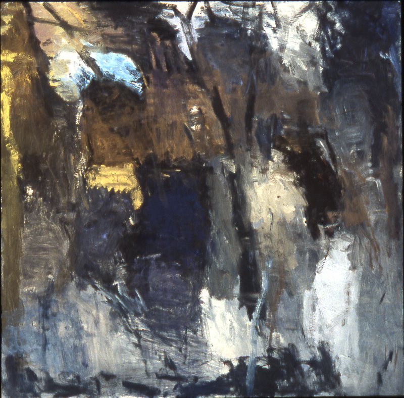
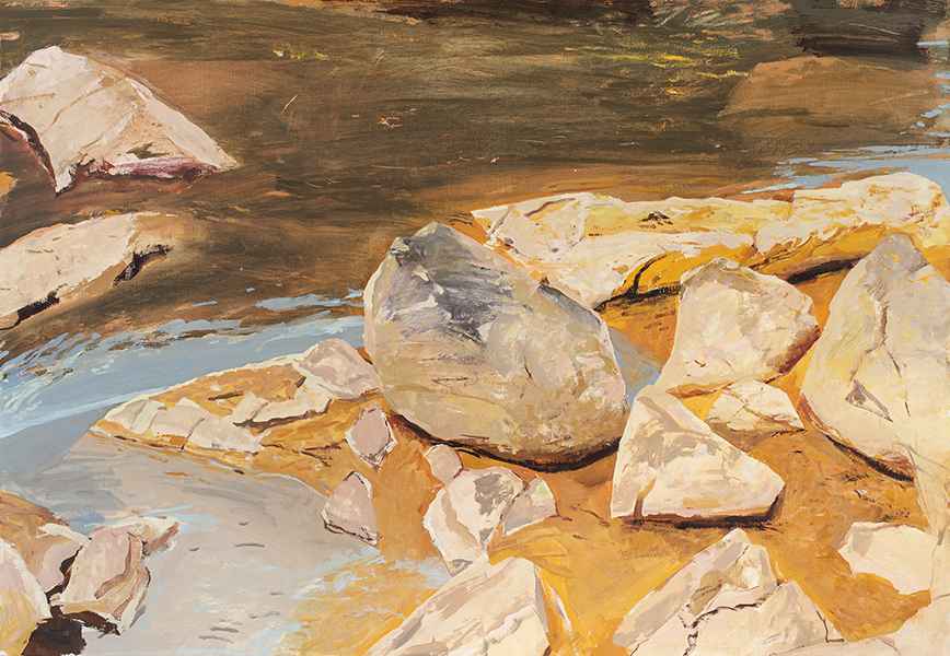
I've just spent the last seven days at a plein air event painting like there's no tomorrow.  Each day was the same.  Rising before sunrise, wired up on coffee, I would drive to my first location—but not too fast, because hitting an elk would ruin my morning.  After parking, I'd hike to a scenic overlook, not for the glorious sunrise, but to study the light and wonder how the shifting shadows might affect my composition.  Then, quickly, I'd set up my gear and begin.

Later that morning, I'd begin again.

And that afternoon.  And that evening, too.

And now, at the end of seven days, I'm beat.  I've made more than two dozen paintings, some big, some small, and proud to say, there are only a couple of duds in the bunch.  That means I need to frame and, yes, title, all those paintings.

Framing's not so hard, since I paint to a standard size, and with my handy point driver, it's just pop-pop-pop and it's done.

But titling?  For many painters, this is the hardest part of painting.  A painting needs a title, but why?  The title goes on a little placard on the wall, with two goals.  First, hopefully to reinforce the painting's theme.  A sweet little painting of a tree bathed in the rich light of sunset might be called “Nature's Repose.”  Second, to clarify any confusion the viewer might have about the painting.  If that tree that might be misidentified as an ugly troll, making the viewer wonder why a fantasy painting was included in a plein air event, you might instead call it “Strangely Bent Tree on a High Cliff.”

These are two terrible titles, of course, but I only have a couple of hours to think up two dozen titles and then truck everything to the gallery.

Now, back to the present.  I'm sure every painter under pressure struggles to come up with titles.  And even when you have all the time in the world, it's still hard.  How many of the paintings stacked up in your studio have the title0 “Sunset Colors” or something equally bland?

Paintings weren't always titled.  Back in the Renaissance, when the only patrons were churches or wealthy merchants, the paintings were made as commissions and really didn't need titles.  The cathedral required an altarpiece representing the usual characters.  The merchant craved a painting depicting the happiness of his marriage.  If any of these paintings have titles, they were most likely given by curators needing to identify them centuries later with something other than a museum accession number.  Hence, we have titles like “The Ghent Altarpiece” and “The Arnolfini Wedding.”  The title of any one painting could change over time, depending on who was in charge.  For example, “The Arnolfini Wedding” may also be found as “The Arnolfini Marriage” and “Portrait of Giovanni Arnolfini and his Wife.”

It wasn't until the 19th century, when painters stopped being thought of as craftsmen belonging to a guild and instead were honored as individual artists, that they began titling their paintings, and with a purpose.  Whistler named one of his paintings “Arrangement in Grey and Black, No. 1: Portrait of the Painter’s Mother” because he wished to draw attention to its design and colors rather than to the subject.  I think he added “Portrait of the Painter's Mother” because he wanted to be a good son, not because that fact was particularly important.

There are three ways to title a landscape painting:

  • By description.  In this case, the painter emphasizes that either the location or the subject is important to the viewer's understanding.  Examples: “The Hay Wain” or “Domes of Yosemite.”
  • By inventory number.  Here, the painter depends on the viewer to come up with his own idea of what the painting may mean.  Example:  “Number 6.” 
  • By literary title.   The painter may try to stir up the romantic spirit in the viewer, or a feeling of mystery, awe, etc.  Examples:  “A Dream of Spring.”

Over the years, I've used all three.  During plein air events, I usually resort to the first; the patrons at these events often want to know where a painting was made and what it depicts.  Over time, of course, one tires of the variations:  “Mather Point, Sunset,” “Mather Point, Sunrise,” “Mather Point, Evening Glow.”  Out of laziness, I've sometimes used the second method, simply assigning numbers plus a much abbreviated description:  “Fall Tree #43.”  This caused a problem once.  I had a piece juried into a competition, and what I mistakenly took to the show was a painting with a very similar name but a different scene.  It didn't match the slide I'd sent in at all. (No one noticed.)  

I do love the third method best, as it appeals to the writer in me.  But it is very hard to come up with meaningful titles time and again.  Writers often use phrases from Shakespeare to title their works; I decided at one time to try Grateful Dead lyrics.

These days, I have started focusing more on the painting and not so much on the title.  My titles are more descriptive.

I'm curious:  What are your thoughts on titles?