Authentically Human! Not Written by AI!
All Content Copyright © Michael Chesley Johnson AIS PSA MPAC

Monday, February 28, 2011

Plein Air Southwest Week

I had the pleasure today of painting with some very fine painters as part of the Plein Air  Southwest event.  Although the event covers a lot of territory - most of the Southwest, in fact - I was pleased to learn that one of the painting weeks was going to be on my home turf.  As one of the juried artists, I was relieved that I wouldn't have to drive far, especially considering local gas prices are nearing $3.50 a gallon!

We were blessed with snowfall this past weekend, so we were ready for snow.  Two out-of-towners, in fact, arrived in snowboots and gaiters.  Fortunately, we didn't have all that much.  But the snow meant that Dry Creek was flowing, so we drove out to one of my secret spots and painted snow and running water.  Below are my two paintings for the day, both 9x12 oils.


I painted with Rusty Jones and Steve AtkinsonBill Cramer, Cindy Carillo and Linda Dellandre.  It was hard to find the painters to photograph them - when we're painting in an event, we tend to scatter to find our own best spots - but I got everyone but Rusty and Linda.

Steve Atkinson

Bill Cramer

Cindy Carillo

Tomorrow, we're heading up to Jerome.  We might have more snow there, and certainly we'll have the collection of old trucks at the Gold King Mine!

By the way, if you're near Dallas in April, the Plein Air Southwest exhibit will run April 8 - April 30 at Southwest Gallery, 4500 Sigma Rd, Dallas, Texas.  I hope some of you will see the show.

Saturday, February 26, 2011

Chalky Color and Secondary Colors


"Red Rocks" sketch - 9x12, oil - $100 - contact Michael

Beginners will sometimes end up with a lot of chalky color in their paintings. The chalkiness always appears in the light colors, and therein lies the key. In order to make something lighter, the beginner adds white. White is the "killer color." It not only lightens, but it also cools and dulls color. Too much added white will make a color look chalky.

If you use a split-primary palette, you'll note that your colors are laid out in color wheel-fashion. Cool and warm versions of the primaries go from yellow on left to red and then blue on the right. (See my recent blog post on my palette to see a picture.) To lighten any color mixture, find approximately where it sits on the color wheel and then add a bit of lighter and thus warmer color from the left. For example, if you make an orange - cadmium yellow medium plus cadmium red light - and it's not light enough, lighten it with white, but then warm it up again with a touch of cadmium yellow medium or even cadmium yellow light. (You'll have to experiment.) Anytime you want a warm mixture, if you add white to it, you'll have to add a warm light color to it to warm it back up.

One word on white. Some whites are warmer than others. Going from warmest to coolest: flake (lead) white, followed by titanium white and then zinc white, which is the coolest. For a very warm white, I have sometimes used a very light tint of Naples Yellow instead of white.

By the way, if getting a really pure orange is your problem, it'll be hard with the split-primary palette. It's impossible to mix rich secondaries. You'll need to buy a tubed orange, such as cadmium orange. The richest secondaries are always tubed colors. For my secondaries, I like cadmium orange, dioxazine violet (or purple), and phthalo green. If you're interested in secondaries, it's important to remember that, just as with the primaries, there are cool and warm versions of each. Conceivably, you could create a large but very workable palette that incorporates cool and warm versions of both the primary and secondary colors. It would have 12 colors.
At the top is a painting I made recently with cadmium orange and in which I tried to avoid chalky color.

Wednesday, February 23, 2011

Snow in Sedona

I had the opportunity this week to do a little snow painting with students.  As you may recall, we had a big storm this past weekend that sent us scurrying home early on Saturday before the roads  got too bad.  (Trina wonders how I ever managed to live and drive 25 years in Vermont; I'm such a wimp these days when it comes to snow.)  Of course, by the next day, the snow had all melted in town.  Right now, though, it still lingers beautifully in the shadows of the red rocks.

The first sketch, a 5x7 oil, I did primarily because I was interested in the mystery of the shadows.  I really zoomed in for this one, focusing on the interplay of light and shadow.


Shadow Mystery (sketch) - 5x7 oil - $60 - contact Michael

The second, a 12x9 oil, I did because it had been remarked to me that I haven't done any painting with a knife lately.  Working with a knife gives me cleaner color and interesting texture.  Also, because I'm working in a small format, it's hard to render detail, but easy to maintain the integrity of simple shapes.  By the way, when I paint with a knife, I like to start my block-in with a brush - it gets things going faster.  For both images, I've left the file size large so you can zoom in for the juicy details.


Snow in the Shadows (sketch) - 12x9 oil - $150 - contact Michael

I have some workshop updates for you.  There are only TWO spaces left in my four-day plein air workshop with the Sedona Arts Center, April 2-5.  This workshop runs four full days and is for all levels, all media.  And I have only ONE space left in my Grand Canyon advanced-level plein air workshop, April 26-29.  Sign up now!

Monday, February 21, 2011

Snow Day


As many of you know, I give a free plein air painting demonstration once a month at Pumphouse Studio Gallery. This past weekend, however, we had heavy rain followed by snow.   (The photo above is of Trina and Saba hiking along a little trail near Wilson Canyon this morning.)  Needless to say, painting outdoors was out of the question - especially given that it was to be a pastel demonstration - so I stayed in the studio.  Some of you also know that, when forced indoors, I like to paint looking out the window.  Well, the snow fell so heavily at times that there really wasn't much to see out the window, either.  So, rather than paint from a photo, I set up a little still life.

There's a little bit of irony in this painting.  Two tubes of Gamblin oil colors, painted in pastel?  Trina suggested that I add a stick of pastel to the scene for balance.  Good idea.


"Pals" 9x12, pastel on black Colourfix paper - $80 - contact Michael

Saturday, February 19, 2011

Value and Temperature


"Ravens Watching" 12x16, oil - $250 - contact Michael

The eye sees warm colors as brighter than they are and cool colors, darker than they are.  When you try to paint the sunlit boughs of trees or sunspots among cast shadows, you will almost inevitably paint them brighter than they should be.  If you do this, you will hit the upper end of your value scale too soon.  You won't be able to paint the lightest accents, because you have already used them.

One way of getting a sunny effect right is to focus more on temperature than value.  (See the above painting as an example.) That is, paint the warm sunny spots not so light but a little warmer, or the cool shadows a little cooler.  Sometimes a temperature contrast will be more effective than a value contrast in creating the effect of sunshine.  A mid-light yellow beside a mid-dark violet will "feel" a little more contrasty and sunnier than white beside black or a lighter violet beside a darker violet.

Thursday, February 17, 2011

BIG Painting Redux


"December Morning in the Desert" 24x30, oil

Awhile back, I was making some adjustments to a 24x30 plein air oil that I had done on-location over three sessions.  I've had a chance to look at it a bit more, and I spent some time yesterday making the finishing adjustments.  Based on other pieces I've done in the same location, I realized that my values were too dark in the distant mountains.  I lightened these and made them a bit cooler to push them back.  In addition, I lightened some of the sunlit trees at the bottom edge of the shadowed mountains.  I lightened the sky, too. I used damar retouch varnish to bring back the "wet" look of the paint before making adjustments.

 Above is the finished piece.  (If you compare it with the older version, the older one looks lighter; it isn't.  That is an artifact of trying to increase the exposure so it would "read" properly.  The latest image seems to read like the real thing.)

By the way, for those of you looking for a mentoring-style plein air painting workshop, I still have space in my March 29-April 1 workshop here in Sedona.  Let me know if you're interested!  It'll be springtime, and we should have some nice, early spring greens in the cottonwoods and aspens.

Wednesday, February 16, 2011

Starting a Plein Air Group


"Out of the Chasm" 12x24, oil

A reader recently asked about how to start a plein air group.   I've only started one - Plein Air Painters of the Bay of Fundy, or Plein Air Fundy for short - and it is small.   I started it because I was new to the area and was looking for people to paint with.  As luck would have it, coastal New Brunswick and Downeast Maine are sparsely populated, rural areas, and although there are outdoor painters, many miles separate us.  But we do manage to organize a paintout plus an exhibition every summer, and it's good to see everybody and the work they've been doing.  This summer marks our fifth year painting and exhibiting together.

First, ask yourself, Why?  Most likely, you're just looking for other people to paint with.  If that's the case, then keep it small and casual.  Get together with a few painting friends on a regular basis.  Put together a list of the group's favorite painting spots and make a schedule for painting.  Make sure you have enough cars, good directions and everyone's cell phone number.

After you've painted awhile together, maybe you'll be ready for a local group show.  You'll need a committee for this, since you'll have to locate suitable space, deal with advertising, hang the show and put on a reception.

You may think about doing a juried plein air show.  This requires a lot more energy, professionalism and committment, especially if you are going to invite big-name jurors and judges and have prizes.  Unless you have a large pool of volunteers to pull from, I suggest you keep things small and don't do a juried show.

One thing you might do, though, is have regular meetings with demonstrations by members or invited guests.  Usually the demonstrator gets a stipend.  You might even consider having someone teach a workshop.  If you can't find anyone local, some artists do travel to teach.  I'm one, and I'll be happy to teach a plein air painting workshop for your group.  (Let me know if you're interested.)  A schedule of paintouts, demonstrations and workshops will keep everyone in the loop and informed.

But whatever you do, remember what's really important - and that's having fun.

Monday, February 14, 2011

Grand Canyon Photo Day - and a Big Painting


"A Grand Calm" 16x20, oil

Above is the studo painting of the Grand Canyon I've been working on.  This is the finished version.  Below is a detail:


In prepartion for the four-day Grand Canyon plein air painting workshop I'm offering in April, Trina and I went up to the Canyon yesterday to take some photos and hike.  We couldn't have asked for a better day - low 50s, full sunshine, absolutely no wind, and some scraps of snow for some nice photos.  After a 2.5 hour ride from our house, our first stop was Mather Point to stretch our legs.  From there, we had brunch at the historic El Tovar lodge.  I ordered the polenta corncakes with prickly pear syrup and Trina had a spinach omelette.  The entrees were alarmingly big; each of my corncakes was the size of a dinner plate.  After that, we badly needed to hike again, so we went out to the Kolb Studio, where the painting above will hang with my plein air work at the Grand Canyon Celebration of the Arts festival in September.

We drove on to Hermit's Rest, stopping along the way to hike the Rim Trail.   Hermit Road doesn't close to vehicles until March 1st, when the only option to get out there is by shuttle.  It's nice to take your own car, but it does make for busier traffic. For my workshop, we'll be taking the shuttle one day out to Hermit's Rest, which has some nice views.  Later, we headed slowly back east, going on Desert View Drive to the Watchtower, the final stop in the park.  I'd forgotten how pretty the views are from this part of the park, and I'm looking forward to painting there in April with my students.

Over all, I took nearly 200 photos.  Below this post is one, in which I caught two photographers well off the trail shooting some of the late afternoon light.  And finally, one of a brash, foolhardy hiker who is taking a siesta on  a rock that I'm sure is off-limits to hikers.  For the third photo, I've zoomed in on this guy.  Did he make it back safely?  I'll have to watch the evening news.

By the way, if my little trip has whetted your appetite for a Grand Canyon visit, I still have room in the Grand Canyon painting retreat.  It is April 26-29, 2011 - let me know right away if you're interested.


Friday, February 11, 2011

Learning to See, Learning Not to See

Besides being out in the fresh air and getting some sun, what's the point in painting en plein air?  Well, it's all about learning to see.  The more you paint outdoors, the more you'll begin to see.  You'll start noticing subtle color shifts in the cliff shadows, complex patterns of light and dark in a forest and, if you're really observant, Brownian motion in air molecules.

You shouldn't, of course, fit all of this on your canvas.  If you did, there'd be no focus to the painting.  By exercising creative control and omitting things that don't contribute to the overall effect you wish to create, you'll provide your viewer with a more satisfying experience.

In a phrase, plein air is all about learning to see - and then learning not to see so much.

Learning what to leave out is a key skill for any painter, studio or outdoors.  If an element in the scene doesn't contribute to the painting, omit it.  You should evaluate your scene for non-essential elements early in the composition stage.   Also, simplify any "busy-ness" that you see.  Intricate patterns often are better left only suggested.

There was a lot more going on in the scene depicted in "Shadow Study" than I felt was needed.  I left out quite a bit.


"Shadow Study" 5x7, oil - $60 - contact Michael

Thursday, February 10, 2011

The Art of Breathing


"Lee Mountain Shadows" 8x10, oil - $150 - contact Michael

"Remember to breathe," I admonish my students.  Holding your breath when executing a precise painting stroke is commonplace.  (I'm guilty of that, and more - I even clench my teeth.  Bruxism can make the enamel of your teeth spall, much like an old brick.)  We don't do this consciously, of course, but I can hear my students.  They sound like free divers, coming up for air, or like whales, as they breach and blow.

Paying attention to the breath - a sort of Pranayama, or the Yoga of Breathing, for the plein air painter - will make sure you get plenty of oxygen to the brain so you will be in top form as you work.  A slow, deep, regular breathing will relax you, too.  You'll forget about the pressure of time and the fact that the shadows are always moving.  Instead, you'll develop meditative, controlled observation and execution.  The paintings will almost paint themselves.

By the way, if you're in Sedona, I am doing a free public painting demonstration for the Sedona Arts Center this Saturday, February 12th, 1-3 pm.  This will be an indoor demonstration in oil.  This in conjunction with the ongoing Faculty Exhibition at SAC.  I hope to see some of you there.

Tuesday, February 8, 2011

New Video - Cleaning Up


I've released a new mini-video in my Plein Air Essentials series.  It's called "Cleaning Up," and in it I show you what I do with my leftover oil paint and how I clean my brushes.  For those of you who are mystified by brush cleaning, this is the video for you!  It runs just short of 3 minutes and sells for 99 cents.  How could you go wrong?  Go to my Lulu store to preview and order.

If you're new to the series, I have several other mini-videos that you may find helpful.  All the videos concern the practice of plein air painting.

Monday, February 7, 2011

Brush Cleaning


Back when I was painting more casually, I cleaned my brushes religiously at the end of each painting session.  I rinsed them in Gamsol, washed them up with soap and water, and then slicked on a little hair gel to preserve the shape.  I finally realized that I was spending a good deal of time each day just cleaning brushes.

Things got really bad when I started teaching back-to-back workshops and participating in plein air events, both of which required me to spend more time dirtying brushes than cleaning them.  Life is too short!  These activities led me to a better way to clean brushes.

So here's my current practice, and now I actually have time to catch up with the evening news.   If I'm painting every day, I swish my brushes briefly in Turpenoid Natural.  This is a non-drying oil that gets most of the paint out, and it doesn't seem to "burn" the brushes like mineral spirits.  It smells nice, too.  Once a week, I'll also wash the brushes with shampoo and water.  Yes, with  shampoo - I use natural bristle brushes, and they are, after all, hair.  Or, I might wash them with Master's Brush Cleaner or Jack's Linseed Studio Soap.  I reshape the tips while wet.  If they have wild hairs, I still use a little hair gel.   (I have about a case of it, left over from when I had hair back in the 80s.)  If the brushes are really wild, I'll use a trick I picked up from Richard Schmid's Alla Prima, and use cardboard sleeves with clothespins to train them back into shape.

I travel a lot, and I don't always have Turpenoid Natural with me.   In this case, I'll just wipe off my brushes and then roll them up in plastic wrap and put them in a freezer.  Oil paint cures through oxidation, a chemical reaction which can be slowed by cooling.  Of course, the brushes are dirty, but I generally have two sets in use - one set for cools or darks, a second for warms or lights.  This helps keep my color cleaner until I can rinse them out properly at the end of the week.

Now, here's a little painting that has nothing much to do with cleaning brushes:


"Barn Shadow with Painter" 9x12, oil 

Saturday, February 5, 2011

Sedona Plein Air Festival - And the Grand Canyon Painting

I found out that I've been invited back to the Sedona Plein Air Festival.  This makes my sixth consecutive year as one of 30 invited artists from across the US, and as always, I am honored.  Among the 2011 painters will be Kevin Macpherson and my friend Lois Griffel.  Go to the Sedona Plein Air Festival website for the full list of artists and the schedule, all of which will be posted in the next few weeks.

For the Grand Canyon Celebration of the Arts, in addition to participating in the "Plein Air on the Rim" event, I am required to put a studio painting of the canyon in the exhibit.  This week I had some time to begin work on that.  Although the painting isn't finished yet, I thought I'd show you the in-progress painting and also a photo of the studio.   It's a 16x20 oil, worked up from photos and a couple of plein air reference sketches.  I'm really enjoying working on it in the afternoons while listening to my various Pandora Internet radio stations.  (Pandora caters to my electic tastes; I've set up stations based on music by Laura Nyro, the Grateful Dead, Robin Trower, the B-52s, Black-eyed Peas and Sigur Rós, among others.)

The first photo was shot with my laptop camera, which required a bit of juggling, since I had to shoot over the shoulder to the painting behind me with the laptop in my palm.  This also explains the mediocre quality of the shot.  I shot the second and third with my Canon SD 780.  You'll note the initial block-in has much more vivid color than the second stage.  I am going for more accurate but still exciting color in the finished piece.  We'll see how it develops.


It was cold - only 10 degrees at night and barely above freezing in the day!  I was toasty in my studio, though.

Friday, February 4, 2011

Limited Oil Palettes: Learning by Rote, Learning by Rule


Sycamore sketch, 6x9, oil - $70 - contact Michael

When I was in high school, I had a hard time learning my multiplication tables.  I found it easier - though perhaps a bit slower - to do the calculation in my head by using the basic rules of multiplication.  The first is an example of learning by rote; the second, by a set of rules.  What's the difference?  Well, if I asked you to multiply 31 by 23, you probably haven't memorized a table for that and would quickly run out of fingers and toes.  But knowing how to multiply, you can arrive at the answer easily.

Some of my students will ask me exactly what I mixed to get a certain color.  They want a recipe - a rote multiplication table, if you will - that will tell them two dollops of ultramarine blue, one dollop of cadmium red light and three dollops of white will yield a particular grey.   What I prefer to tell them, and what I want them to learn, is the concept of mixing color.   If you use a split-primary palette, it's easy to cool, warm and grey colors by moving logically around the color wheel.

Here's my palette, arranged as a color wheel.    You'll note that it's not strictly split-primary.  Where I would have had a blue with more green in it, such as Cobalt or Phthalo Blue, I have substituted Phthalo Green.  (In the image, it looks more like Viridian!)  This is because to my eye, Cobalt Blue is too similar to Ultramarine Blue, and I wanted something with an even warmer cast.    Also, the Cadmium Yellow Deep has so much red in it, it almost looks like an orange.

If I take, for example, Cadmium Red and want to cool it, I'll shift in the cool direction and add Alizarin Crimson.  If I want to warm it, I'll shift in the warm direction and add Cadmium Yellow Deep.  The same principle goes for any color mixture.  (By the way, you can also add white to cool, but it also will grey the color.)  It's a very simple principle and one of the beauties of this limited palette.

The little sketch above was done mostly with reds, cooled and warmed by moving around the color wheel.

Thursday, February 3, 2011

Travelling with Paints


"January Snow" 8x10, oil - $100 - contact Michael

I sometimes get nervous e-mails from students who worry about having their oil paints confiscated by airport security.  You can't argue succesfully with a TSA agent, but there are a few things you can do to make the risk less.  Let me say first that, personally, I have flown a great deal with both pastels and oils after 9/11, and I have never once had a problem.  Everything has always arrived, intact.

First, don't carry your oil paints  in your carry-on luggage.  Put it in a checked bag.  I know the airlines now charge for checked bags - they'll start charging for ample air pressure next - but do yourself a favor and check a bag and put your oil paints in it.  You do want to isolate the paint from your clothes, of course.  Some folks put theirs in a sturdy Ziploc bag, but I found a rigid, clear plastic container with a screw-top lid that I prefer.   It keeps the paint tubes from getting squashed and the sharp corners of one tube from cutting into its neighbor and causing leakage.  Write on the container "Artist's Oil Colors - Made with Vegetable Oil."  Don't ever use the words "paint" or "oil paint," which for most people, including TSA agents, conjure up images of a smelly, flammable product that comes in cans and for which you have to use paint thinner to get it off your hands.  Next, go online and find the Manufacturer's Safety Data Sheet (MSDS) for each paint.  Print it out and put it in the container.  If you follow this, you should be fine for flying.

As for pastels, they are precious.  Do put those in your carry-on luggage.  You'll want to be there when the TSA agent opens up the box so you can warn him about how fragile they are.  I use a Heilman pastel box (backpacker size) which has retaining panels on the inside.  When the agent opens up the box, pastels don't fall all over the place; he still has to open the panels, and he has to lay the box flat to do that.  I have yet to have a TSA agent inspect my box, though.

As for your other materials, don't even think of flying with mineral spirits, either in your checked bag or carry-on.  I know students who have done it by mistake and who have gotten away with it.  (So much for airport security.)  OMS is very flammable, after all.   If possible, locate in advance an art supply store near your destination.  They'll have OMS (Gamsol or Turpenoid), and in the remote chance that your paints are confiscated, you will be able to get resupplied quickly.

Finally, consider shipping your materials.  This is probably the best way to avoid any hassle.  Also, shipping your materials will most likely cost you less than checking a bag.  Consider shipping your gear, too.  Although you can put a French easel in a large suitcase, why drag it through the airport?   Sometimes, if I'm running low on supplies, I'll even order new materials to be dropshipped to my destination.

Are you now ready to fly to a workshop?  
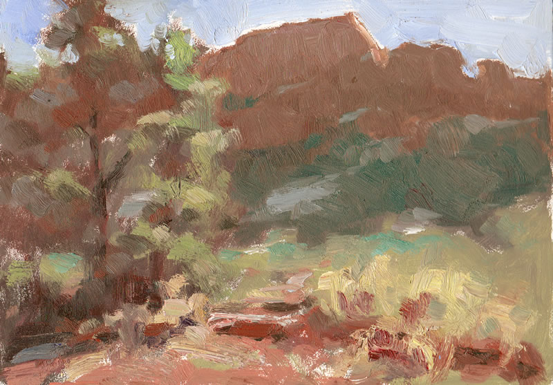
Plein air painting workshops in Sedona, Arizona.  - Michael Chesley Johnson

Wednesday, February 2, 2011

Using a Dry Wash in Pastel

The other day, I went out with a 12x18 sheet of white Wallis paper, and I found myself confronted with the problem of how to cover up all that whiteness.  If you use nothing but dry pastel on this paper, little white spots of the paper show through no matter how hard you massage the pastel into the surface.  Sometimes these white dots are a desirable effect, but often, they're more of a distraction.

My preference, when working in a large size, is to use a toned paper such as the Belgian Mist paper, which has a mid-value, warm grey color.  The little flecks of grey showing through at the end pull the painting into a gentle harmony.  When I do use the white, I apply a wash of alcohol or Gamsol to my block-in, and that eliminates the white totally.

Not so this time.  Poor planning?  Maybe, but I did have a roll of paper towels.  I decided to try a "dry wash" instead.  I pulled off a couple of sheets and balled them up very loosely, and then, making a light, sweeping motion as if using a feather duster, I managed to move the pastel around enough to cover the white.  I liked the effect very much.  One problem with using a liquid to wash in the block-in is that it makes the darks almost too dark, and I sometimes struggle with bringing them into harmony with the lights and mid-tones.  This "dry wash" technique, though, actually lightens the darks and gives you a mid-tone.  It gives you a chance to hit the darks a little harder later if you need to.

Here is the "dry wash" stage, and below, the finished painting, which I also posted the last time.


"Templeton Trail" 12x18 pastel, $700 (unframed) - contact Michael

By the way, in case you aren't tired of hearing it yet, I still have some spaces left in my www.PaintSedona.com workshops and also in the Grand Canyon Plein Air Workshop this April.