Authentically Human! Not Written by AI!
All Content Copyright © Michael Chesley Johnson AIS PSA MPAC

Sunday, August 29, 2010

Video: A Day in the Life (studio)

What does an outdoor painter do on his day off from painting? Good question. Sometimes I end up in the studio. Some folks think that a plein air painter has no need for a studio, since he's got the Great Outdoors. This is far from the case, however.

I decided to shoot a video of what I do when I'm not outside painting. When I began shooting, I thought it would be a pretty typical day, but as it turned out, it was busier than usual. I sold a couple of paintings in the afternoon, which required me to wrap them up for the client and to then get another piece or two ready to replace them in the gallery. This takes more time than you'd think! Also, I ended up varnishing a couple of pieces, tweaking a plein air piece and more. Take a look.

(Can't see the image? Go directly to the video here: http://www.youtube.com/watch?v=5pLcpDByIIc)


Music by Moby. Used with permission.

By the way, Artistsnetwork.tv has now released my pastel video as a download. Click here to preview/purchase. I'm very happy, because now I don't have to worry about duplicating and distributing a physical product! My other video, the one on oil, will be released next month (September 2010.)

Saturday, August 28, 2010

Discovering Purple


"Surge" 11x14, oil - SOLD

As my loyal readers know, I use a split-primary oil palette that consists of a warm and cool version of the three primaries. There's no purple on my palette, and if I need it, I can mix a reasonably good one out of Permanent Alizarin Crimson and Ultramarine Blue.

However, I recently threw a tube of Dioxazine Purple in my kit. I was painting flowers - beach roses, fireweed - and it was a nice cool dark for the flowers in shadow. I came across this purple again when I was out painting a closeup of seaweed-covered rocks and the roiling surf. Hm, I thought, how would it look added to the blues I normally use for painting water?

I tried it, and I was excited how a bit of this purple livened things up. It's far richer than the purple I can make by mixing a cool red and a cool blue. I've always known that if I'm painting gardens, which require high-chroma secondary colors (green, violet or orange), I should reach for the tubed versions. You just can't mix a rich secondary from the tubed primaries. It only makes sense that if I need a nice purple in the water to do this, too.

In the wrong hands, of course, that tube of Dioxazine Purple can turn into tubed nitroglycerine. But it can always be muted or greyed down. It's impossible to go the other way. You can't take a dull purple and make it rich.

In the painting above, I also snuck in a little Viridian, which is a tubed but muted green.

By the way, Artistsnetwork.tv has now released my pastel video as a download. Click here to preview/purchase. I'm very happy, because now I don't have to worry about duplicating and distributing a physical product! My other video, the one on oil, will be released next month (September 2010.)

Friday, August 27, 2010

Tonalism? Impressionism?

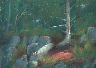
"Fir & Shadow" 9x12, pastel

I recently finished reading Lois Griffel's excellent new book, Painting Impressionist Color, and it got me to thinking about Impressionism and its ugly stepmother, Tonalism.

Ugly stepmother? Well, yes, in a way.

"Tonalism implies a painting limited to pigments that are somewhat gray and dull, lacking vibrancy. Impressionism on the other hand, uses rich and stunning color." Lois writes a great deal about these two approaches to painting, and there are more complete definitions, but this paragraph sums it up. Basically, both approaches to painting have the goal of creating an illusion of reality. Tonalism does it with value; Impressionism starts with value, but enhances the effect with clever color use.

Inexplicably, I've lately found myself creating drama with broad areas of dark punctuated by small spots of light. (It's like theatrical lighting.) I paint the illusion of light by using value differences and not necessarily focusing on juxtaposing complementary colors. Some might call this devolution, but I think of it as exploring the roots of Impressionism. Most of the French Impressionists were academically trained as Tonalists. (I've posted a couple of my new pastels here; the one at the bottom I posted the other day, but it was appropriate to re-post it.)

Of course, knowing today all about impressionistic color, it's hard for us to turn back the clock completely. I still put complements into my shadows or a stroke of dark violet beside a stroke of yellow to make the yellow more intense. I just don't carry it to the "micro" level, where every single brush stroke is accompanied by its complement. Look at some of Monet's skies, and you'll see little pink and violet dots intermingled with the blue and yellow ones. I, on the other hand, will sometimes paint a sky with nothing but blues.

I think this is what most of the American Impressionists were about. Unlike the French, who allowed shapes to dissolve through keeping everything high-key and close in value, the Americans maintained strong value contrasts but used Impressionist color theory to enhance the illusion of light. I'd say that most landscape painters today who are not strict Tonalists take this approach. The result is often strong design with exciting color.

I recommend Lois' book. It's not for beginners, but it does build on the foundation laid by her earlier book, Painting the Impressionist Landscape. It has nine demonstrations in oil, acrylic, pastel and watercolor along with many illustrations to accompany the text.

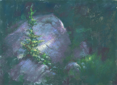
"Spruce & Shadow" 9x12, pastel

Monday, August 23, 2010

How to Prepare for a Plein Air Workshop - 2

"Eureka Street" 16x20, oil

My last post, How to Prepare for a Plein Air Workshop, must have scared off a few people because no one made any comments. Hopefully, I haven't also scared off prospective students! But truly, the more you can prepare before spending big bucks on a workshop, the more you'll get out of it. And I'm not really as grumpy as I may have sounded. Past students say I'm quite tame.

I have one more skill you might want to address - design. Now, design is a complex issue, and one can spend a lifetime learning how to create designs that aren't clichéd and overused. But students should have some basic ideas of what a good design consists of. A lead-in for the eye, perhaps, and a balanced (but not boring) composition. Sometimes I'll see a student paint a really well-done rock, but it'll be smack-dab in the middle of the canvas. The painting would have been a better piece if the student had given some thought to design.

If you look at Edgar Payne's book, Guide to Outdoor Composition, you'll find many thumbnail sketches that can serve as templates for your work. The "U," the "Z," or the "balance beam" can be applied to most landscape situations. You can memorize a few and practice fitting your landscapes into them.

Arthur Wesley Dow, in his book Composition: Understanding Line, Notan and Color, states that design cannot be taught but is learned through exposure to good design. The more great paintings you study, the more intuitive your design skills will become. (Intuition is nothing special, just well-digested experience.) Not near a museum? Not a problem. Many works are available on the Internet now.

Saturday, August 21, 2010

How to Prepare for a Plein Air Workshop

"Shadow and Spruce" 9x12, pastel

I've been teaching outdoor painting workshops now for nearly ten years, and I've taught hundreds of students, from beginners to professionals. Over the years, I've seen some of my students struggle in three areas: gear setup, painting basics and drawing skills. (The latter even among some professionals who are selling their work!) If I could create a "sure-fire," one-day lesson that would teach these, and plan it for Monday, they would enjoy the five-day workshop so much more.

Not knowing how to set up your gear is like taking the road test for your driver's license without having ever gotten into a car. "I just got this easel and I've never set one up before" is a phrase that tells me a lot about the student. Part of my workshop is, indeed, helping you fine-tune your gear so you can get into the field with a minimum of fuss, but learning how to use your easel before the workshop will save you much frustration. Before you pack your bags and head for the airport, take out the easel and practice setting it up with all its accessories.

For a painter to know painting basics is like a chef having a set of good cutlery. He needs good knives to prepare a meal efficiently. Knowing, for example, how to hold a brush and what to mix for a cool green will let you get to the "meat" of plein air painting faster. In my workshops, we learn skills unique to working outdoors. Painting basics should be learned in an introductory studio class. Even a one-day class and studying a book like Oil Painting for the Serious Beginner or Pastel Painting for the Serious Beginner will help. I'll assist you, of course, but remember that painting outdoors adds another layer of complexity to an already complex craft.

We usually think of drawing skills in connection with portraits and architecture. One might think they don't apply to the landscape, but they do. Drawing is all about proportion, and there are plenty of places where proportion can go wrong in a landscape. In my workshop, if your drawing is poor, I'll let you know. But I'll also tell you there is no shortcut to getting better, except practice. Drawing involves first learning to see relationships accurately - length and angle of line, amount and shape of curve - and then teaching your muscles to copy what you see. I recommend carrying a small sketchbook and a 6B pencil and sharpener. Draw at odd moments - in the doctor's office, while stopped in traffic, when taking a break during a long walk. Draw anything, even if you don't love the subject. Draw the dumpster, if that's all you can see.

Not everyone who has a desire to learn plein air painting has the time to learn so much before taking a workshop. Sometimes, we just want to jump in and do it. If you're like that, I appreciate your enthusiasm! And if you can continue with that admirable spirit, you'll do well as a painter. But if you can find time to prepare, you will have a much more rewarding experience.

(By the way, I've created an on-line course, "Prepare for Plein Air," along with a series of videos on "Plein Air Essentials" to give you a jump start on some of these issues.)

Wednesday, August 18, 2010

Starting with Vivid Color

"Rainbow Days" 4x8 pastel

One of my students this week noted how they always seem to be painting at mid-day, when the light is flat and color is washed out. It's true. By the time we finish with critiques and a demo, the students get the least desirable time of day to paint. But at mid-week, I always flip things around and give them the first, best part. So today I took noontime to do a demo and gave myself a challenge by painting a washed-out scene - and to make it exciting.

To start things off, I began with rich, vivid color. I didn't see any of that in the actual landscape, of course. But if I want a colorful painting, I find it easier to start this way. It's a struggle to start with dull color and then to try to make it livelier.

I made objects off in the distance an intense blue; objects closer by, I made intense red or green. My reasoning is that distant objects appear cooler (blue) and nearer objects appear warmer (red and green.) The result was a cartoon version of the landscape - an excellent beginning!

Next, I adjusted color. The closer islands were more green than they were blue. The sandbar was more violet than it was red. But during the adjustment, I again used only intense colors. I avoided muted colors or neutrals.

Finally, I got out my secret weapons, my greys. These are nearly neutral warm and cool greys. I scumbled them lightly over each area to dull the cartoonish, overly-intense colors. The trick is to stick with the right values - put a dark grey over a dark color, a light grey over a light color.

The result is "Rainbow Days," above. I think it's an exciting little painting. Not something I'd expect to paint at noontime.

(By the way, I've put this piece over in my Studio Store: http://johnsonstudiostore.blogspot.com)

Sunday, August 15, 2010

St Andrews Workshop

"Sunbury Shores" pastel sketch, 9x12

As many of you know, I just returned from the beautiful seaside resort town of St Andrews, New Brunswick, where I taught a weeklong plein air workshop for the Sunbury Shores Art & Nature Centre. This was my fifth year teaching in St Andrews. Although it's an exhausting five full days with a dozen students, it's relaxing, too. Because the cottage I rent has neither TV nor Internet, I spend my evenings going to the wharf for ice cream and then back home to read a novel or some of the half-dozen art books I lug along. (This year, Robert Ludlum won out over Emile Gruppé.)

We had some great locations to paint, but my favorite was Water Street, which is where all the shops and quaint buildings are. Normally, in early August, Water Street is thick with tourists and quite parked up. I wouldn't dream of dragging a dozen students out to paint street scenes there. This year, however, the town decided to replace a water main and cordoned off four blocks. Although many of the shopkeepers questioned the mayor's wisdom in doing this at the height of the tourist season, it turned Water Street into a pedestrian mall. I've always dreamed of having the group painting on Water Street, so I grabbed the opportunity. We had a wonderful day painting. At the top is the pastel demo I did of the Sunbury Shores building.

This year, some students requested a paint-along. I've done this only with my one-day classes for beginners, but I thought, why not? So, I found a location along the St Croix River that had not just a nice view but a huge picnic shelter that all of us could fit under. Everyone enjoyed this activity, where I stopped at each step to let them catch up. I found one drawback, however. Students were inclined to cease observing the landscape and to copy me instead. In a plein air paint-along, students should use the instructor's demonstration only as another reference, and not as the subject. I'll remember to mention this next time!


By the way, I've set up a "blog store." This is where I'll be selling small sketches and demonstration paintings - pieces I won't put in galleries. You can follow the link on the sidebar on the right or go to http://johnsonstudiostore.blogspot.com/

Saturday, August 14, 2010

New Book from Lois Griffel

I just returned from teaching a workshop in St Andrews, New Brunswick, to find a nice little surprise waiting for me at home - Lois Griffel's new book, Painting Impressionist Color. I am honored that Lois thinks enough of my work that she wanted to use three of my paintings as illustrations.

Lois was the director of the now-gone Cape Cod School of Art in Provincetown, Massachusetts, for many years, having worked closely with the previous director, Henry Hensche. (Hensche took over the School from another legendary artist, Charles Hawthorne.) Lois, also the author of Painting the Impressionist Landscape, is well-known for her use of impressionistic techniques and has a national reputation as a plein air instructor. I've admired her work for many years. It wasn't until she taught a workshop at the Acadia Workshop Center in Maine that I was able to study with her. We have a mutual friend, Gail Ribas, who owns AWC, and we had some good times during that week.

Not too long ago, Lois moved from the Cape to Arizona. I was delighted to find out that she lives only a few hours from our winter home in Sedona!

Lois' site is http://www.loisgriffel.com. Her book is available at these sites:


Saturday, August 7, 2010

Doug Dawson Workshop

Doug Dawson, Master Pastellist, PSA, came to Lubec last week to conduct a five-day plein air workshop. This, his third visit to the area as my guest instructor, was full of sunshine, but we did have a bit of rain and fog to keep us on our toes. At one point, when I was reviewing possible painting locations, I suggested not going to one spot because of the frequent fog. "Are you trying to avoid the fog?" he asked. "Where I come from (Denver), we have so little of it, and I really look forward to painting in it!" I granted him his wish, and let him paint fog for an afternoon.

This was a mentoring workshop. Unlike a typical workshop, in which the teacher first demonstrates and then helps the students at their easels, this one ran on the premise that the students are advanced enough to paint on their own. He once described this workshop as "painting with Doug," in which he let students into his head as he went through the day. We were always welcome to follow him as he selected a location, analyzed the play of light, shadow and color, and built up a painting - and if we did, he gave us a full narration of his process. Some of us treated these periods as demonstrations, while others of us painted on our own and waited for the critiques and "art talk" periods to get our dose of Doug.

Every day was intense - starting after breakfast with a trip into the field, followed by a lunch break, then another painting period and a long critique. On most nights, we also had discussions on composition and color or on taking reference photos at twilight. (Doug is well-known for his paintings of city scenes at dusk.) I imagine the week exhausted everyone, except Doug, who seems to have unlimited stamina for teaching.

Below are a few shots of the week. One is of Doug's pastel setup. Two are my paintings still in the field. Once I've made adjustments in the studio, I'll post them again.

Doug's Pastel Setup


Doug painting at Jackson's Landing

Doug's version of Jackson's Wharf

My version of Jackson's Wharf, in oil


My painting from the Lubec bandstand on a drizzly morning

Sunday, August 1, 2010

Brush Handling


For those of you following my video series, Plein Air Essentials, I've published a new video. It's on brush handling. In it, I show you how I manipulate the brush to get a variety of strokes and also how I use it to mix paint. These are useful skills for the outdoor painter! This 4 1/2 minute video is a 99-cent download. To download it and the other videos, please visit my Lulu storefront: