Authentically Human! Not Written by AI!
All Content Copyright © Michael Chesley Johnson AIS PSA MPAC

Sunday, April 26, 2020

On Making Copies—and Using a Light Box

The light box - ready to go.

Recently, a follower asked if I'd paint a same-size copy of one of the gouache sketches from my afternoon hikes into the canyon.  I find making copies difficult.  A certain excitement comes with creating the original, whereas toiling over a copy presents a more mechanical task.  Still, it can be challenging.  The buyer has certain expectations in that the copy should be neither a lesser version of the original nor an improvement upon it.  (Improvement is often in the eye of the beholder; the buyer may disagree with my changes, so I try to restrain myself if I find a spot that could use improvement.)

I normally decline requests to make a copy.  However, this request came because I didn't want to sell and cut pages out of my journal.  So, I considered it a reasonable one.

But another aspect of making a copy challenged me:  What would be the best way to transfer the design?

There are many ways to make a copy, one of which is to draw the design free-hand.  But no matter how careful I am, a free-hand transfer often creates disappointing errors.  (I always warn that the copy will not be exact.)  Another, more accurate option is to use a grid for the transfer—cumbersome, but it works.  Then I remembered that Trina had recently acquired a light box for her fabric projects.  Since the piece would be small—just 5x8”—I decided to give it a try.

Yet I did sense this would present other challenges.  Don't get me wrong—I welcome technical challenges, and if I learn something, all the better.  So I forged ahead.

A light box works by transmitting light through the object to be copied to the material the design is to be traced on.  I had two problems here.  First, the original had been done on 300 gsm (grams per square meter) watercolor paper.  Would it be too thick to transmit sufficient light?  Also, there was a second sketch on the back of the journal page.  This would add a confusing underlay to the sketch to be copied.  What's more, the design was going to be traced on a piece of paper of the same weight.  Usually, one uses translucent tracing paper, which weighs in around 40 gsm.  The sheet of watercolor paper I planned to use, however, was nearly 8 times heavier, at 300 gsm,  I didn't think it possible for light to pass through two layers of this paper.

And how would I get that one journal page onto the light box, anyway?

My solution:

  • Scan the original (by laying it on my flat-bed scanner)
  • Convert the scanned image to a high-contrast, black-and-white version (with GIMP)
  • Print this out in the same size as the original (by creating a document in Open Office, dragging the image into it and resizing it to 5x8”)
  • Place it on the light box and atop it lay my blank 300 gsm watercolor sheet, and
  • Hope that the light from the box would be strong enough to penetrate it so I could see the design well enough to trace it (with a #2 pencil.)

The project ended up working well.  The light box is an inexpensive one:  “LED Drawing Tracing Pad”, model A4-DWT from Shenzhen Youpinchung Technology Co, Ltd.  It's big enough to fit an A4 sheet, the dimensions of which are 8.3 x 11.7" or 210x297mm.  Here's a link to it on Amazon.

Below are some images to show how this all works, plus steps in painting the copy.

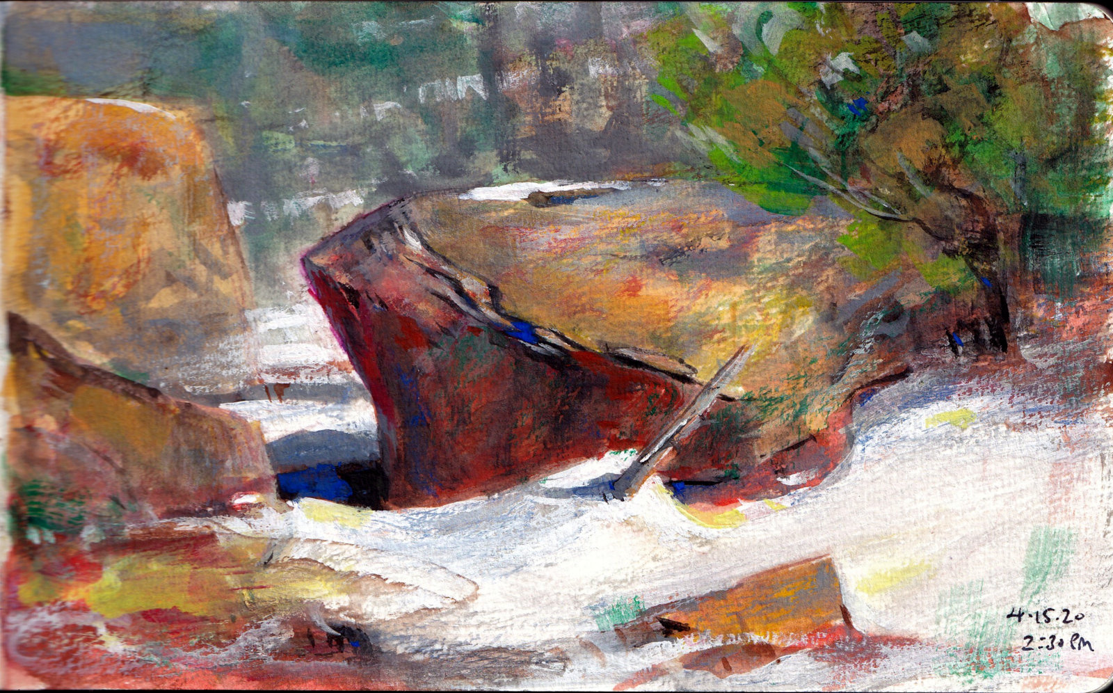
The original 5x8 gouache sketch

Black-and-white,  high-contrast image
Black-and-white, high-contrast print on the light box

A sheet of 300 gsm watercolor paper laid over the print
I used a #2 pencil to trace very lightly over this.
This and the following images show the copy being made,
step by step.


The finished 5x8 gouache copy

The original sketch again

Wednesday, April 22, 2020

Earth Day 50: Richard McDaniel and the Russian River

My feature article on Richard McDaniel in the April/May 2020 issue of PleinAir Magazine


Today marks the 50th anniversary of Earth Day.  Where were you on April 22, 1970?  I'm not sure where I was, but California artist Richard McDaniel was participating in the very first Earth Day exhibition.

I've known Richard for many years now, having first met him while he was teaching a workshop in Maine.  I went to visit him there one afternoon to interview him for a possible book project.  We hit it off and have stayed in touch ever since.

Looking forward to the 50th anniversary of Earth Day, Richard spent the last three years documenting the Russian River for an exhibition and book project in partnership with Sonoma Land Trust and Sonoma Water.  The project was interrupted several times by natural disasters:
During the three years I was drawing and painting the river, a few major wildfires impacted the area, including my hometown of Santa Rosa. There was widespread damage to the watershed and considerable strain on the people and animals of the region. But the community is strong, and Nature is resilient.
I recently interviewed him for PleinAir Magazine, and in the April/May 2020 feature article, Richard discusses the project.  Several images of over 50 paintings and drawings from the project accompany the article.

Unfortunately, another natural disaster - the novel coronavirus - has interrupted the project, delaying both the exhibition and the publication of the book.  Like many of us artists who are also affected by the pandemic, Richard is carrying on and looking forward to the day the exhibition and book will become a reality.   I'm looking forward to seeing both.

Laguna de Santa Rosa in a Rainstorm 
oil, 30x47, 2013 
from The Russian River and its Watershed 

Sunday, April 19, 2020

Sketching the Canyon

These gouache sketches are all 5x8
and painted en plein air.

If you've been following my blog over the years, you'll probably think “Canyon” refers to Grand Canyon.  Well, yes, I've painted there many, many times, and it is always a rewarding challenge.  Lately, however, I've been exploring a different canyon.  This one is just a ten-minute hike from my studio, across cactus-studded fields, along sandstone ridges and into woods of pinyon, scrub oak and ponderosa pine.  It's become one of my favorite places.

I've been using gouache on these afternoon expeditions and sketching “sunlight on rocks.”  The canyon runs somewhat east-west, so there is a south wall, which is shaded and lush, and a north wall, which is neither.  Years of the strong New Mexican sun have made the north wall inhospitable to vegetation, so there I can clearly see the layers of orange, red and yellow sandstone.  The afternoon sun creates dramatic tableaus of light and shadow among the overhangs and cracks.

Once I'm settled—always on the south wall where I can find a shaded rock to lay my cushion on—I spread out my kit and have at it.  The beautiful song of a canyon wren, recently returned to the area, cascades like a gentle waterfall.  (Here's what a canyon wren sounds like.) The Gila woodpecker, flashing its red patch, dashes out of the shadows and gets busily to work on an old snag.  Rising from the deep tub that forms the canyon's terminus, a huge ponderosa pine lifts its boughs in the breeze.  The earthy fragrance of the canyon gathers around me as the afternoon warms up.  Sometimes it's hard not to get drunk on this sensory brew and just sit there, looking, not sketching.

This past week, we had snow.  We had nearly a foot of it, heavy and wet.  In two days, the sun melted nearly all of it, but snow still decorated the shaded south wall of the canyon.  I wanted to sketch it before it all melted, so I hiked out despite the muddy, slippery trail.  The trip was worth it.

I thought you might like to see some of these gouache sketches.  They are all 5x8 and bound in my little journal.  They aren't for sale, but if you have a hankering for one of them, I'd be happy to paint for you a larger version in either oil or pastel.  I'll be doing more of these and posting them to my Instagram account.  Also, if you're interested in my gouache kit, you can see what I use in this post, one I wrote as I was packing for a trip to Scotland.


Monday, April 13, 2020

How Can I Help?

We can't get this close for a workshop, but you don't
need to let your education stop.

Plein air workshops cancelled, painting conventions rescheduled—you know the story.  But you do want to continue your art education.  Well, maybe I can help.

There are several ways in which I can boost your skill set during these times.  First, there's Patreon.  One of the “tiers” in my Patreon plan includes a monthly critique of three paintings.  I will look at your paintings and run them through what I call my “Photoshop mill” to make them better, and then I will email a critique explaining the changes.  What's more, you get a 40-minute Zoom session in which you can ask me questions directly.   Go here to find out more about my Patreon tiers.

If you're content to study on your own, consider my Udemy courses.  These self-study, self-paced courses consist of both video and texts.  I offer a Plein Air Essentials course that covers the basics, plus others as supplements to that for pastel and oil.  There's also an Outdoor-Study-to-Studio course.  You don't have to pay full price for these, as I am offering discounts on the courses.  Go here to find out more about my Udemy courses.

Another option are my books.  I have several, some that cover the basics (complete with demonstrations) as well as outdoor-study-to-studio, and  location-specific books that are a bit lighter (but still packed with good information) about painting in Downeast Maine, the Canadian Maritimes and the American Southwest.  These are all available through Amazon.  Go here to find out more about my books.

Are you more of a watcher than a reader?  I have several videos that you can purchase through Artist's Network.  These are full-length, professionally-produced videos that cover both oil and pastel.  One is plein air (pastel), and the other two are oil demonstrations in the studio. You can download them or stream them.  Go here to find out more about my Artist's Network videos.

Those are my offerings for now.  You can still sign up for my workshops, starting with  July and August in Maine, but in the meantime, if you're hungry for knowledge, know that I can still help you.

Sunday, April 12, 2020

Master Class: Munsell and his Color Theory

"Sunny Morning in Auchterarder" 11x14 Oil - Available
This is the first painting discussed below, with cadmium orange, phthalo green and dioxazine purple.

"Highland Path" 9x12 Oil - Available
This is the second painting, with naphthol red, chromium oxide green and dioxazine purple.


By now, most of us painters have run into Albert H. Munsell and his color system.  Munsell swept away earlier, unsatisfactory attempts at ordering color and replaced them with a more logical model. He gave each color equal space and assigned to it a number that represents its hue, value and chroma.  Somewhere, I read that he felt the Newtonian color wheel, which has red, yellow and blue as its primaries, was too heavily weighted toward the warm colors (red and yellow).  So in his model, he decided there would be not three but five primaries:  red, yellow, green, blue and purple, thus distributing temperature more evenly.

Although Munsell's model is three-dimensional, with the axes being hue, value and chroma, one can flatten out this model into a color wheel.  In it, the complements to the primaries are different from the ones you find in the Newtonian wheel.  As you will recall, the complement pairs in a Newtonian wheel are:

  • Red/green
  • Yellow/purple
  • Blue/orange

But in the Munsell model, they are:

  • Red/blue-green
  • Yellow/purple-blue
  • Green/red-purple
  • Blue/yellow-red (orange)
  • Purple/green-yellow

Here's the Munsell wheel with its hue numbers, courtesy of Gamblin Colors:


This makes for color harmonies that are slightly different from ones made with the Newtonian wheel.  I decided to play with this, and made two paintings based on Munsell triads composed of green and two split-complements, purple and red.  (If I'd used the Newtonian wheel, the split-complements would have been purple and orange.)

Of course, the pigments used for such an experiment are important.  Gamblin offers the following list that describes its paints in terms of Munsell numbers:

https://gamblincolors.com/color-temperature-list/

This is a very useful chart if you want to play with Munsell color choices.  (At the moment, the Munsell numbers don't appear on the tube labels, but I think it would be very helpful and have requested that Gamblin put them there.)

I used this list to make my color choices.  For the first painting (“Sunny Morning in Auchterader”), I used phthalo green (5BG), cadmium orange (5YR) and dioxazine purple (2.5P).  I intentionally made my choices a little off so you could contrast it with the second painting.  Here's how these colors are plotted:


If I'd wanted to get a true split-complement triad, I would have chosen instead radiant green (5G), naphthol red (5R) and ultramarine violet (5P).  See how these are plotted, and notice the nice isoceles triangle with green at the apex:


Unfortunately, I don't have radiant green or ultramarine violet on hand.  So, for my second painting (“Highland Path”), I did my best.  My choices were chromium oxide green (2.5G), naphthol red (5R) and dioxazine purple (2.5P).  Here's the chart:


These are closer to being a true split-complement triad.

Of course, for both paintings, I included a few other colors.  For the first painting, I added minimal amounts of permanent green light, chromium green and napthol red, and I greyed down most colors with Gamblin's Portland Greys.   For the second, I used touches of permanent green light and yellow ochre, and again greyed down color with the greys.

There are, of course, many variations on triads.  If you're looking at the charts, I think building a triad around an isoceles triangle is a good solution.  (This triangle has two sides of equal length; the main color choice would be at the point where these two sides join.  Although note that according to this idea, in my paintings, where green would have been the main color choice, it is not the dominant color—violet is.  But the green does have more impact because of its rich chroma and lighter value.)

Does your brain hurt yet?  If you'd like more information for your own experiments, here are some good resources:

Gamblin's discussion of the Munsell system as relates to its products:
https://gamblincolors.com/munsell-color-system/

“Navigating Color Space,” a video discussion of Gamblin's use of the system:
https://gamblincolors.com/navigating-color-space/

An article about the importance of color theory in painting:
https://munsell.com/color-blog/the-importance-of-color-theory-in-painting/

An article about color harmony with respect to the Munsell system:
https://munsell.com/color-blog/visual-analytics-color-wheel-triad-harmony/

An article about Munsell as an artist:
https://munsell.com/color-blog/albert-h-munsell-artist/

And a very good book on the history of all of this:
Color: A Visual History from Newton to Modern Color Matching Guides by Alexandra Loske.
https://www.amazon.com/dp/1588346579/ref=cm_sw_em_r_mt_dp_U_trGFEbG9FJRCS

Sunday, April 5, 2020

My Story: The Importance of Mentors

Ann Templeton


In my last post, I didn't mention one of the biggest boosts to my success:  my mentors.  A mentor can show you shortcuts on your journey to becoming a better artist.

How is a mentor different from a teacher?  Not all teachers are mentors, but all mentors are teachers.  Yet they're more than that.  A mentor will guide you when you have lost your way; offer help in clearing the path before you; and, through the example of his own success, serve as an inspiration to keep going when the next seemingly insurmountable mountain rises before you.

I never sought out a mentor.  Instead, I was lucky in stumbling across my first one.  Trina and I had just moved to the Sacramento Mountains of New Mexico, about an hour from the resort towns of Cloudcroft and Ruidoso.  Looking to hook up with some other painters, one day I reached out to the Cloudcroft Art Society,   At the time, oil and pastel artist Ann Templeton was teaching a painting workshop for the group, and the director invited me up to visit.  Ann, with a soft Texas accent, welcomed me with generous hospitality.  Invited to join her and the director for lunch at Cloudcroft's historic Lodge, I felt a tickle of specialness.  (Ann always made me feel special.)   During lunch, learning that I wrote for Pastel Journal, Ann asked, “Would you like to write an article about me?”

For a moment, I was taken aback by her forwardness, but I soon realized that this was not so much a request as an offer to help.  It also turned out to be the start of a mentoring relationship that would last many years.  It wasn't long before I was helping her at workshops, painting with her artist friends at the studio, and spending nights at what she called her “apple house.” There I worked with her on The Art of Ann Templeton: A Step Beyond, a book that offered readers a 30-year retrospective of her work.  Ann was a night owl, and she would stay up until the wee hours, pulling 35mm slides for the book; and I, the early bird, would rise just after she went to bed to organize the slides and write captions.  Sometimes, while she was on the road, Trina and I would house-sit for her and take care of her pug, Cassie, and her African grey parrot, Lacey.

Sadly, Ann passed away in 2011 from cancer.

Albert Handell

I also stumbled upon my second and current mentor.  I first met Albert Handell at one of his workshops in Sedona, Arizona, nearly 20 years ago now. Albert's reputation as a living master always precedes him, and I admit I was intimidated.  After that, our paths crossed occasionally at the biennial International Association of Pastel Societies convention.  Then one day, I received a call from Albert.  A mutual friend, Doug Dawson, recommended me to him as someone who might organize a workshop in Maine.   (I had just finished helping Doug with one.)  I said yes, even though I felt some trepidation, not knowing him well.  But Albert came to Maine, and we had a convivial time scouting out painting locations and running the workshop.  One night, when he came to a meal at my in-laws'  house on Campobello Island, I was impressed to learn that he wasn't all about art.  With a fondness for TV documentaries, he proved himself ready for a discussion on just about any topic.

After that, we began to see more of each other.  Although the Maine workshop was for any level of student, he also taught mentoring workshops for advanced students.  He asked me to put one together for him in Sedona.  I did, and we then followed with at least a couple more.  Watching him paint, learning how he handled critiques of student work, talking about his business—all of this was eye-opening.   Then I began visiting him at his Santa Fe studio whenever I was in town.  “At the Art Students League in New York,” he once said to me, “I studied under Frank Mason.  Mason never wanted anybody in his studio.  I vowed I'd never be that way, and so my studio is always open.”

I'm still in awe of Albert, but we've become good friends.  Yet friendship doesn't get in the way of mentoring.  Recently, he said he was disappointed in a painting I'd made.  “From a distance, it has carrying power,” he said, “but when I get up close, there's nothing to enjoy.”

 I thank him for that, and for his continued mentorship.