Authentically Human! Not Written by AI!
All Content Copyright © Michael Chesley Johnson AIS PSA MPAC

Wednesday, February 26, 2020

Post-Workshop with Albert Handell: Making it Better

Through the Passage
12x16 Oil
Larger Image Here

I want to share with you the paintings I made during the workshop with Albert Handell at his studio in Santa Fe.  Over our four days together, I managed just three 12x16s.  I spent longer on them than I ever would have on my own—making small strokes, reconsidering those strokes, incorporating them into new strokes.  Although I started each painting with a general concept and some vision of where I wanted it to go, Albert gave us this advice: 

Don't think of finishing a painting; just think of making it better.

Finishing implies a terminus, a predetermined point when the brush gets laid down.  Working toward any envisioned finish, however, can exert uncomfortable pressure.  You just want to get the job done, and you want it to be perfect.  Sometimes, these are incompatible—or unreachable—goals.  Rushing headlong to a finish has ruined many a painting.

“Making it better,” on the other hand, is a philosophy that doesn't depend on time or perfection.  Instead, it depends on looking, on analyzing or feeling, and on then responding.  It takes as long as it takes.  And if whatever you do continues to improve the painting, then you aren't finished.  It may take ten hours or a hundred hours, a hundred brush strokes or ten thousand brush strokes—there's no saying until you reach the point where you can't “make it better.”

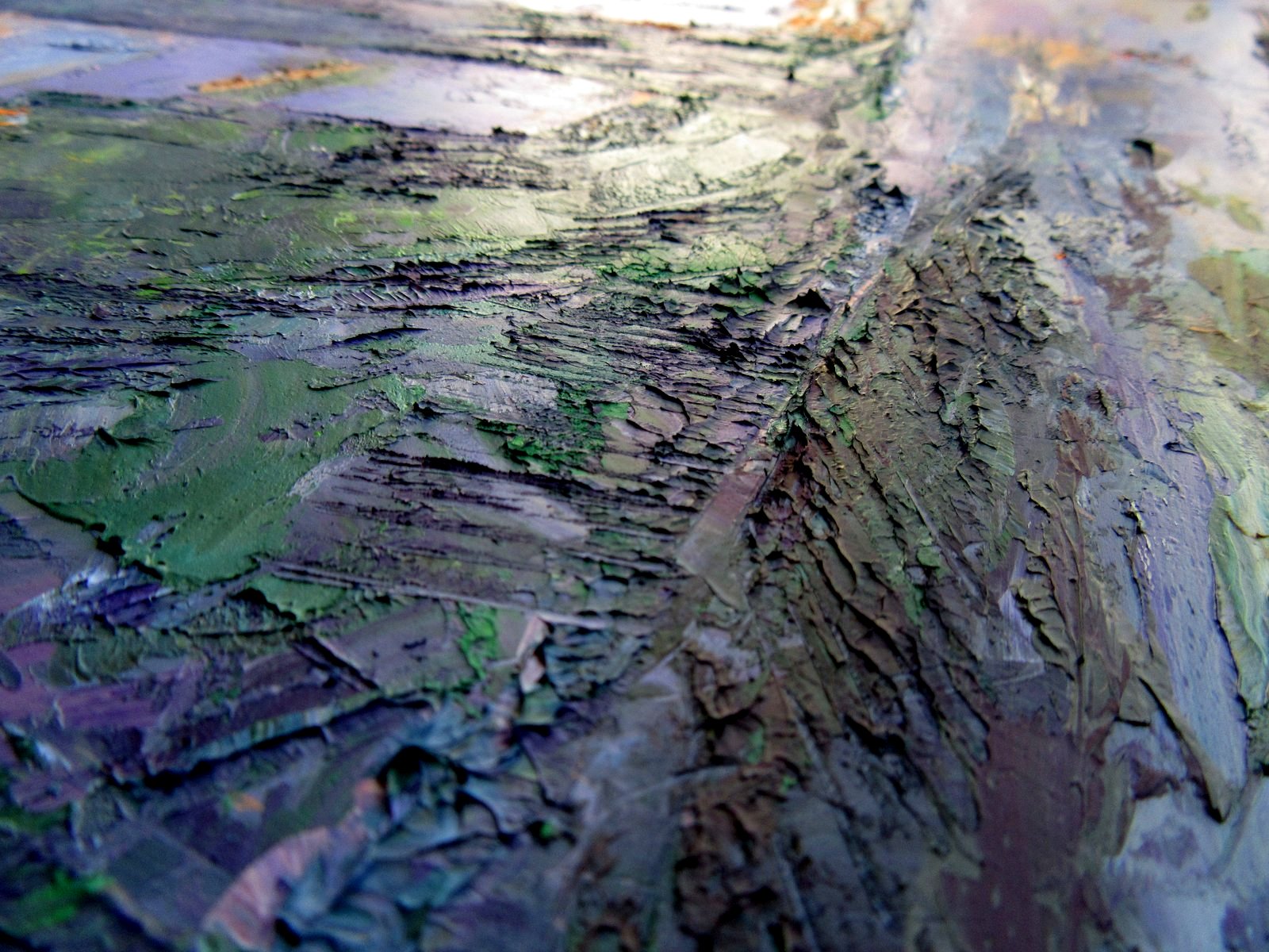
On the Edge
12x16 Oil
Larger Image Here

Spring Snow
12x16 Oil
Larger Image Here

Sunday, February 23, 2020

Encounter: Albert Handell Studio Oil Painting Workshop


This weekend, I'm attending a four-day workshop at Albert Handell's studio in Santa Fe. It's a small group of just four students, which means each of us gets a big piece of the pie. I remember taking a workshop from Albert perhaps 20 years ago, and there were 15 or 20 of us. That piece of pie, though nourishing, was small. It's a real treat to have so much pie it's hard to clean your plate.

Better yet, this is pie with ice cream. Albert has a spare bedroom, and he invited me to stay with him. I don't think this is an offer he extends to everyone. Albert and I have become good friends over the years. I've helped him run workshops both back east, in Lubec, Maine, and also out west, in Sedona, Arizona. (We're doing another one in Sedona this November.) Working with a professional--and  one of our true living masters--is a real pleasure.

Plus, Albert has another side. He loves documentaries. Yes, one might say painting is to Albert like earth, air and water are to an oak, but he relishes a historical documentary on, say, the Battle of Midway or the Diaspora. Over dinner, more often than not, the conversation turns away from painting to an interesting fact he picked up from the History Channel. In that way, he's like me, and we enjoy talking about a variety of subjects.

But he will talk about art and the art life and his paintings, if you ask. About his mother, who gave him his first French easel. About his days at the Art Students League and learning under Frank Mason. About the three framed, beautifully executed sketches on his dining room wall, each of which seems to feature an antique automobile from the 1950s. "That was my first car, a Pontiac," he explains.

One thing I'm learning this week is that mastery of painting is about the small things, not the big things. It's about a touch of pure ultramarine blue. The scratch of a knife. The understanding that finishing is not the point. And that these small things become a Big Thing.

Here are a few of the paintings I'm working on this time. I'll post the final versions later


.

Wednesday, February 19, 2020

Master Class: Video Demonstration of My Secondary Color Palette

Nature features muted color more than vivid color.  Many times, a standard red/yellow/blue palette can create garish mixtures.  A more "calm" and natural palette can be made by starting with secondary colors:  orange/purple/green.  This video shows you one possible secondary palette and how to mix the "primary" colors from it.  There are many other options for colors, so this is just one choice.  For a full discussion of the concept, plus some sample paintings made with this palette, please visit my blog at http://mchesleyjohnson.blogspot.com/2020/01/master-class-secondary-color-palette.html


(If you're getting this blog post via e-mail and don't see the video, here's the direct link.)

Sunday, February 16, 2020

My Fifteenth Year as a Blogger

It was just drawn to my attention that 2020 marks my 15th year as a blogger!  As of this writing, I've written 1,624 posts.  If every post contained only 200 words--which is on the extremely conservative side--that is over 200,000 words.  My blog would make a good-sized book worthy of George R. R. Martin.

These posts chart my journey as a plein air painter.  If you've followed my blog for 15 years, you've seen my successes and failures.  You've hopefully learned a few things along the way, too.  If you're new to the blog, I encourage you to search the archives.  (If you're receiving this post via e-mail, you'll need to go to the actual blog site; the archives are in the right column under "Index of Blog Posts," but you can also view Topics.  You can even search the posts in the box in the top left corner of your screen.)  You'll find posts on the technical aspects of painting; on gear, equipment and materials; on my travels; and also on interesting painters I've met.  By the way, we all grow as painters, and as you read, please be aware that I may have changed my mind on some topics I wrote about years ago.

Oh, one more thing.  I never tried to "monetize" the blog.  Everything I offer is freely given.  But it would be nice if you'd take a workshop, buy a book or video, purchase a painting or at least leave a kind word.  One option for you is to support me via Patreon. (And if you have already done so, thank you!)

With that in mind, here are the All-Time Top Ten Blog Posts.  Don't ask me why these are the top ten; the internet rates things through an esoteric process that, like quantum physics, no one truly understands.


Wednesday, February 12, 2020

Art Business: Society Signatures—Are They Worth It?


A society signature is something like “PSA.” In this case, it means that the artist has jumped over several hurdles to win the honor of being allowed to scrawl “PSA” after his signature on a painting.  Most societies, like the Pastel Society of America, place the hurdles high.  To get the PSA signature designation, for example, you have to be accepted into three national PSA exhibitions.

I'm proud to say that I have signature status in several organizations:  Pastel Society of America, Pastel Artists Canada (Master), American Impressionist Society, Pastel Society of New Mexico and Arizona Plein Air Painters.   Theoretically, after my signature I could apply the following cryptic string:  “PSA MPAC AIS PSNM APAP.”

That would take up a lot of space and perhaps draw the eye too much.  So, I trim down the list to whatever's appropriate.  For pastels exhibited in the US, I use “PSA.”  For pastels in Canada, “MPAC.”  For oil paintings, “AIS,” and so on.

There's one I don't have:  “OPA.”  That stands for Oil Painters of America.  I've been in a couple of the OPA regional exhibitions—for OPA, a mix of regional and national exhibitions qualify—but over time, it's gotten more and more expensive to apply to shows.  And, more and more competitive, as there are more good painters than there were ten or twenty years ago.  Plus, you have to reach the right number of exhibitions within the right number of years.  It's a sliding window.

Sure, I'd like to have the “OPA” designation.  It'd be a nice merit badge to add to my sash.  But, as I mentioned in an earlier post,  applying for these shows is like buying a lottery ticket.  I do consider myself a competent oil painter, but I'd rather spend my money on more paint and canvas.

Are there any benefits to a society signature other than “ego boost”?  Well, as with advertising, it's difficult to tell.  In my experience, there's little or no feedback.  I've never had a gallery, museum or organization to which I've had to submit a resumé say to me, “It was that society signature that made our decision.”  Granted, among your peers, and certainly in the society your share, having such a status is applauded.

By the way, so many artists are winning signature status, that the societies have had to come up with new uber-categories.  Today we have “Master Signature,” “Master's Circle,” “Hall of Fame” and more.  Some of these are honorary designations; others are won by getting into more shows or winning more awards.  Has plain old signature status been devalued?

Sunday, February 9, 2020

Escape from Mud and Snow

"Evening Cliffs" 9x12 Oil - Available

In my last post, I whined about the mud and snow here in northern New Mexico.  Well, to take a little break from it all, Trina, Raku and I headed over to Sedona, Arizona, for a few days of R&R.  Hiking, mostly.  Sedona is a little lower elevation (5000 feet or less), compared to our 7000 feet, and drier, so any snow there long ago sublimated into another dimension.  It was good to get out on the trails.  Most of my trips to Sedona these days involve teaching a workshop, so I don't get to hike as much as I'd like.

Although Sedona's streets and sidewalks are more crowded than ever these days, thanks to an over-muscled Chamber of Commerce and city leadership, the trails are still quiet.  Especially if you get out before the cyclists start touring.  If we finish a hike before noon, we rarely encounter any.  And if we make sure to hike into the designated wilderness areas, we never see any at all—they're not allowed.  Although some of the cyclists respect the “rules of the road,” announcing themselves and giving way to hikers, many do not.  We've had some close moments, especially where on a narrow trail the choice was to either get run down by a herd of cyclists or dive into an acre of prickly pears.  Multi-use trails, in my mind, are a poor compromise.  My advice—hike early or head for the wilderness.

But it wasn't a trip without a little painting.  My Sedona painting friend, M.L. Coleman, invited me to go painting one afternoon.  Joining us would be one of his other friends, Larry Pirnie.  I'd never met Larry before, but he's an artist well-known for paintings of cowboys and other Western themes.  He's been an artist all his life, and it was Norman Rockwell who advised him to attend the Pratt Institute.  “But my recommendation won't mean anything,” Rockwell told him.  “They think I'm just an illustrator.”  From Montana, he's come down every year to Sedona to paint for a spell.  This year he wanted to focus more on the natural landscape.

We headed out to the eastern side of town, over by Courthouse Butte and Bell Rock.  There's not much to say about the afternoon except that the weather was warm, the company pleasant, and the painting superb.  Oh, and no mud.  Life doesn't get any better.

Me, M.L. Coleman and Larry Pirnie.
And Raku.  That's Larry's painting on the easel.

Wednesday, February 5, 2020

Old Man of Hoy

Old Man of Hoy
18x22 Oil/Cold Wax
Available

We haven't had much snow this winter, but what we have had is sticking around.  It's slow to melt.  And when it does melt, it makes mud.  The dirt road up the mesa behind us, where I like to walk to clear my mind, has been deep in mud for weeks now.  A recent warm spell has dried it up a little, but it's still long stretches of mud bracketed by shorter stretches of dry.  Now on my walks, at the end of a dry stretch, I leave the road and step carefully through the cacti and sandstone outcrops that line it.  Although the area off the road is also muddy, little clumps of bunch grass serve as stepping stones.  The clumps sit a few inches above mud level, and if I'm careful, I can carry on, unsullied.

The mud has hindered my plein air painting.  So, I've been doing more studio work this winter.  With another trip to Scotland coming up in June, I've been revisiting in my mind our trip to Orkney two years ago.  This week, I made a painting of the Old Man of Hoy, a well-known sea stack just off the island of Hoy.

I first caught a glimpse of the Old Man from the ferry that runs from Thurso, in the north of Scotland, to Stromness on Orkney's “Mainland.”  As we rounded the towering cliffs of the southern tip of Hoy, the Old Man suddenly came into view.  It truly does have the proportions of a human, although on a gargantuan scale.  Nearly 450 feet tall, it is one of the tallest sea stacks in England.  Composed of layers of red sandstone, it is separated from the main cliff of Hoy by a 200-foot gap.  Although it looks ancient—you might think it dates back to the prehistoric times of the Picts—it came into being some time after 1750.  Experts say it may not last much longer because of the fierceness of the sea and the softness of the stone.  Here's how it looked in 1817, when it had two legs, in a painting by the artist William Daniell:


And here's how it looks today.  Once we got to Orkney, we took a day trip to Hoy, where we took the long hike out to the cliff that overlooks the Old Man. It was a blustery day, churning with mizzle, and my old Gore-Tex coat finally breathed its last and I got soaked.  But the view!  I teetered right on the edge with the wind snatching at my coat as I peered across the gap at the Old Man.


For my painting, I decided first to sketch out a number of possibilities in pencil.  I offered these up to my followers on Facebook and Instagram and asked them to vote for one.  (I here now apologize to them, as I didn't use their choice.)  Next, because cool colors were going to dominate in the painting, I toned my 18x22 panel with Gamblin's Permanent Orange to add a warm note.  I completed the painting with my current palette of three secondary colors—Permanent Orange, Dioxazine Purple, Phthalo Green—and lots of Gamblin Portland Grey. I also used Gamblin's Cold Wax Medium to create an impasto and add translucency.

This painting is not meant to be a photographic representation of the Old Man.  I took  liberties with the scene.  Among them, I lowered the cliff on the left to make the Old Man rise taller; pushed the saturation of the colors; and abstracted the foreground.  The painting is more about feeling and texture.

Design sketches

18x22 panel toned with Gamblin's Permanent Orange,
plus the design transfer

Block-in.
I ultimately eliminated that sunlit green patch on the cliff bottom.

Old Man of Hoy
18x22 Oil/Cold Wax
Available

Close-up of texture

Close-up of texture


Sunday, February 2, 2020

January's Top Posts

Now that we're into February, I thought I'd offer the top posts from A Plein Air Painter's Blog for January.  It's always interesting to see which posts--and which topics--get the most views from you, my Faithful Reader.  Thanks very much!


It's getting warmer, and I'm thinking more of summer!
I still have spaces left in my Lubec, Maine, plein air painting
workshops.


It's always a struggle to transfer a drawing accurately to
the final canvas.  Here's one method I invented to make the
process easier.


We're still in winter, so I'm guessing we'll still have a few
more snowstorms.  You can look for more snow paintings
here on my blog!


One of my heroes, for many reasons.


Many of us painters need some quiet time to reflect
on our past and to look toward the future.