|
| Violets/Purples from Gamblin Artists Colors |
Violet lurks everywhere in the landscape. It inhabits the deep shadows; but it also sparkles in sunlit rock, adding a refreshing cool note to a warm subject. In my split-primary palette, I can sense it buried deep in Ultramarine Blue, and by adding a little Alizarin Crimson, I can bring it to the surface. And if I want an even stronger note, I can add Dioxazine Purple—or one of the many other violets available—to my palette.
HISTORY
You've most likely heard of Tyrian Purple, a brilliant pigment loved by the Roman emperors and famed for its expense. Over 10,000 whelks are needed to make a single gram; you can still buy it today, with a gram going for $4000 from Kremer Pigments. But it's not just expensive—it's also incredibly fugitive. A cheaper purplish earth color, perhaps used by the lower strata of Roman society, is Caput Mortuum ("dead head" or "worthless remains" in Latin), a pigment derived from hematite. But it wasn't until 1859 that a truly rich, lightfast and inexpensive violet became available with the creation of Cobalt Violet. Early versions were poisonous and made from ore containing arsenic. In 1868, chemists developed the non-toxic Manganese Violet. In our modern era, a whole host of organic (carbon-based) violet pigments, such as the dioxazine and quinacridone colors, were developed.
(Side note: What's the difference between purple and violet? Purple is a combination of red and blue pigments; violet occupies a range in the electromagnetic spectrum. Many artists, however, use the terms interchangeably. Since I consider my palette to be spectrum-based, I use the term "violet.")
USAGE
You don't often think of violet as being a landscape color. But consider: It's not primary colors but secondary colors that make up the natural landscape. Orange, green, violet—all of these appear in vegetation, from warm orange in sunny spots to cool greens in the half-tones to even cooler violets in shadow. Orange and green might seem obvious to you; violet, perhaps less so. But believe me, a little touch of the right violet in a landscape adds punch.
And what is the right violet? Usually, "right" has to do with color temperature and intensity and the relationship to surrounding colors. I can adjust the temperature of violet with hues near it on the color wheel. For example, if I want my Dioxazine Purple warmer, I can mix in a little Alizarin Crimson, which is closer to red. If I want to cool it down, I can add a little Ultramarine or Cobalt Blue. If I want to reduce the intensity, I can add a bit of a complement (a yellow) or near-complement (yellow-green or yellow-orange.) Violet, by the way, can make some very beautiful greys with near-complements and white. And I can make a really dark, transparent neutral by mixing Dioxazine Purple and Phthalocyanine Green. Sometimes you want black without using an actual black.
Violet has always been another of my favorite colors in pastels--warm violets, cool violets, intense violets, dull violets. I find them especially useful in the greens, deepening shadows or de-intensifying light areas.
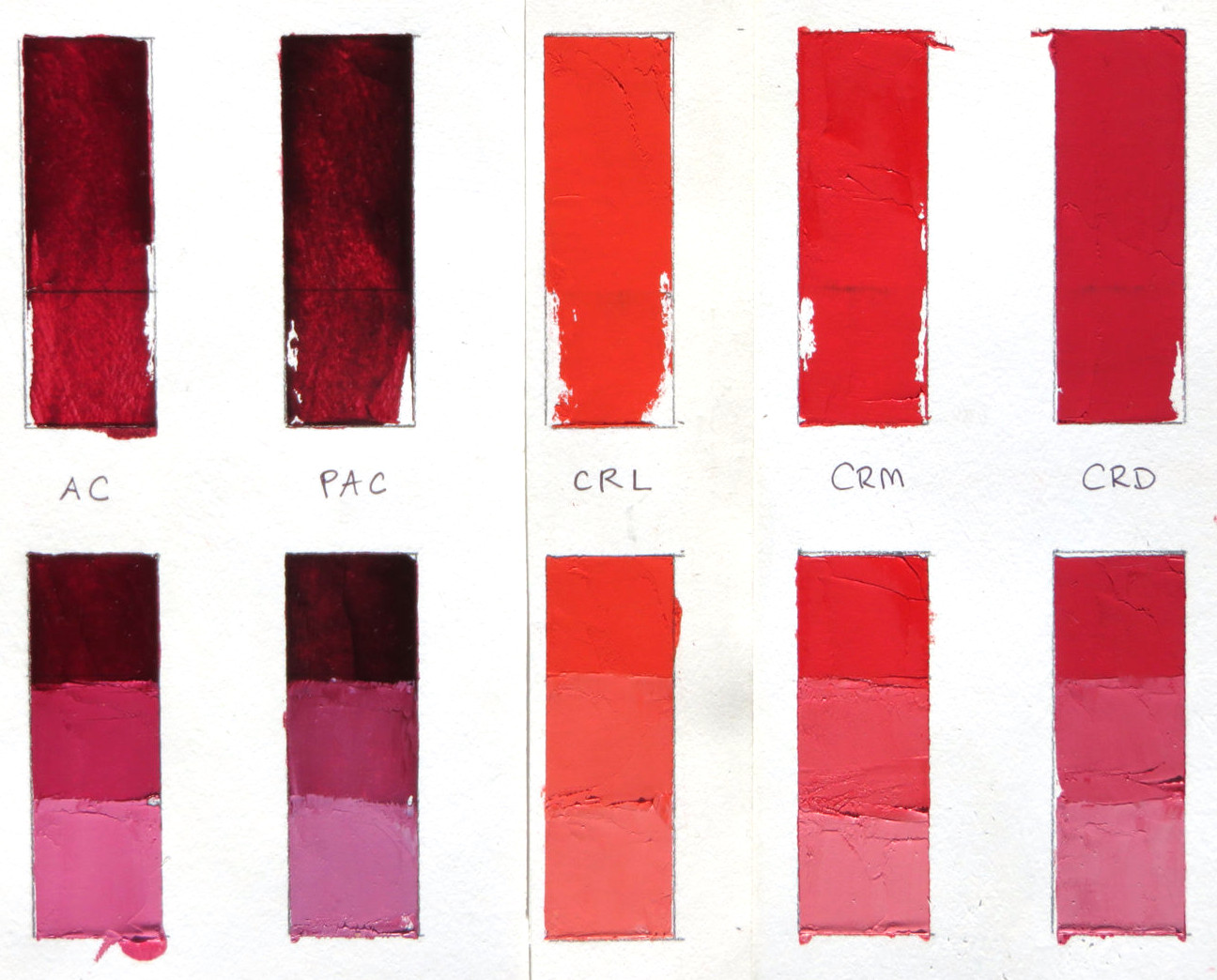
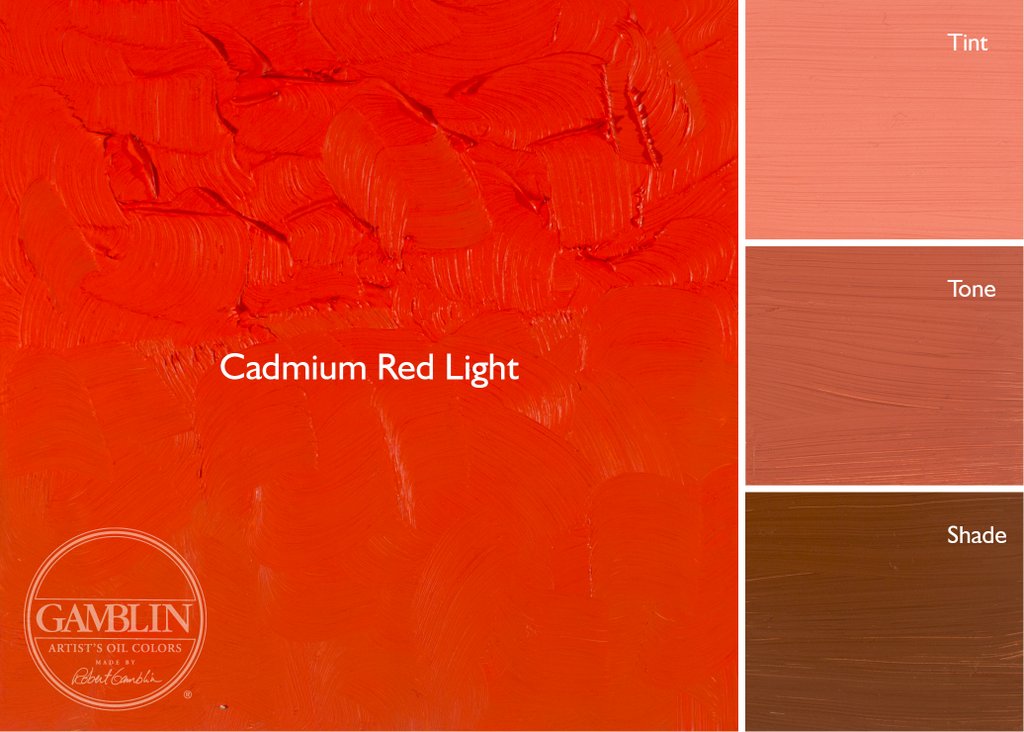
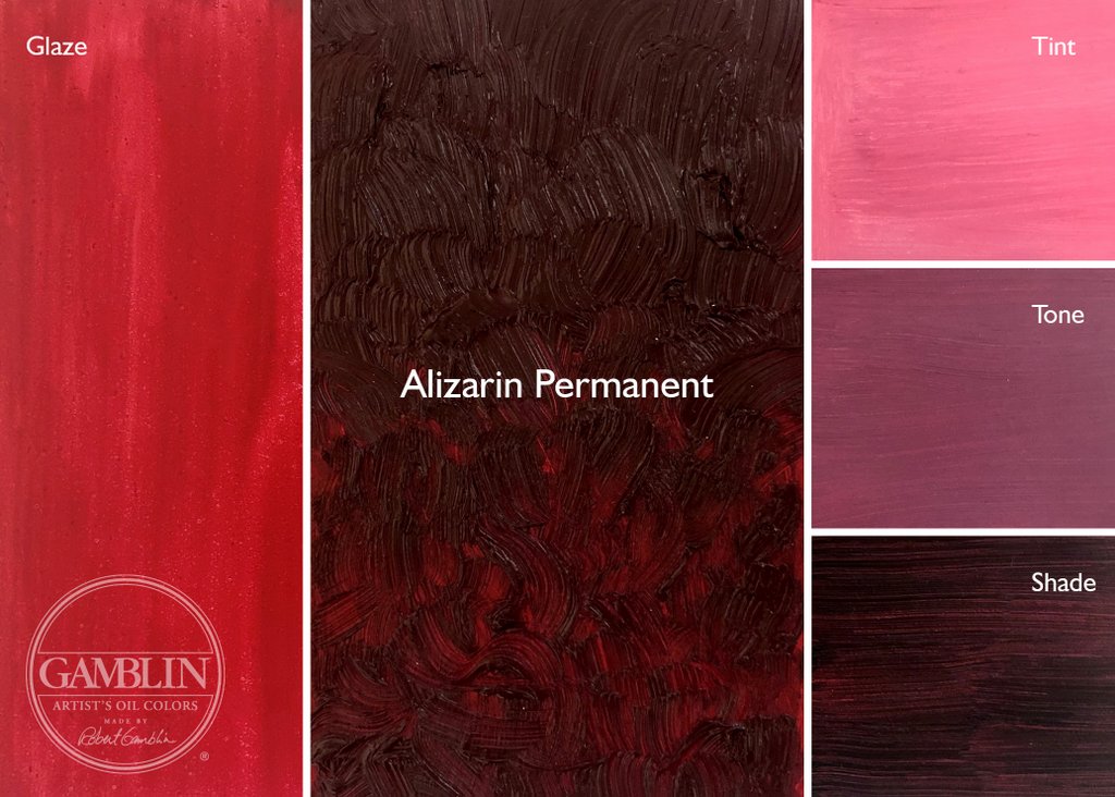
I'm including below an image of swatches I've made of colors from Gamblin. You can learn more about their line of colors here. They also have a series of informative articles about the color experience here.
 |
| Top row: Tints Bottom: Masstone + Undertone L-R: Quinacridone Magenta, Quinacridone Violet, Manganese Violet, Cobalt Violet, Dioxazine Purple, Ultramarine Violet (I included the Quin Magenta because it is so close in hue to the Quin Violet) Here are color swatches from Gamblin's website, showing some of the colors as tints, tones and shades. Also, if the color is transparent, there is a glaze. Tint is made with Titanium Zinc White + the color, tone is made from Portland Grey Medium + the color, and shade is made from Chromatic Black + color. The glaze swatch is made with Galkyd medium.      |