Authentically Human! Not Written by AI!
All Content Copyright © Michael Chesley Johnson AIS PSNM
Showing posts with label Technology. Show all posts

Sunday, December 29, 2024

The Dose Makes the Poison: Are Water-Miscible Oil Paints Safe?

View in browser

**Authentically Human! Not Written by AI**


Good news for oil painters -- you can still paint with traditional oils and not worry about solvents. Read all about it here!

Saturday, August 19, 2023

Preserving Paintings for the Next Millenium—and Beyond

View in browser

**Authentically Human! Not Written by AI**

Image: Redo-Sanchez, from Wikimedia Commons. License.
Breylon Immersive Virtual Monitor 


Will your paintings outlast you?  Even after one lifetime, many paintings start to show damage.  Nothing's worse than having a bright sunset fade to monochrome tints or for the surface to become disfigured due to alligatoring.  (Here's an exhaustive list of all the things that can happen to an oil painting.)  To ensure the physical integrity of our work, we artists are admonished to use archival materials and procedures.

Some paintings have outlasted their creators by centuries.  The oldest surviving oil paintings are nearly 1400 years old; these are Buddhist murals made around 650 AD in Afghanistan, but they are in poor shape.  Looking a bit better are the Fayum portraits, painted in encaustic in Egypt in the 1st century AD.  Even much older are some frescos, also in Egypt, lining a Bronze Age tomb from 3500 BC.  They've survived over 5000 years!

What helped these priceless artworks survive was a combination of things:  the right materials, the right painting process and the right environmental conditions. If I use the right materials (maybe a wood panel sealed with Gamblin's PVA sizing plus an oil ground) and the right process (painting fat-over-lean with lightfast pigments) and store the painting under the right conditions (perhaps a climate-controlled museum), how long can I expect it to last?

The problem with physical objects is that they break. You can't avoid it. I worked in IT for many years, where I learned about something called MTBF or "Mean Time Before Failure."  Every hard drive was stamped with "MTBF" and a number, which would give me an idea of how reliable a drive was.  The engineers who designed the drives expected them to fail at some point.  As they say, sh*t happens—even if you do everything you can to ensure that it won't.  

If I do everything I can, maybe my painting will last as long as the Mona Lisa.  But is there a way for it to last thousands of years?  Perhaps even milllions?

Prompting these thoughts is a book I read recently.  In the first half of Scatter, Adapt and Remember, science writer and science fiction author Annalee Newitz outlines several possible scenarios of global catastrophe, from asteroid strikes to thermonuclear obliteration and pandemics.  In the second half, she presents several possible solutions, such as colonizing other planets or even uploading our brains to robots.  As I read, I started to wonder how our cultural artifacts—our artwork—would fit in.

Perhaps someday science will find a way to take a painting and preserve it for a million years.  But as I noted earlier, anything physical will eventually deteriorate.  (I do worry about all those frozen heads in cryogenic tanks, waiting for resurrection.)

Maybe there's a better option.  What if we scanned the artworks and preserved them digitally?  We already have high-resolution 3D scanners and printers, and this technology will continue to improve.  I predict a time when the printed copy will be indistinguishable from the original, right down to the finest brush hair embedded in the paint.  The original could delaminate and eventually turn to dust, but we could print another copy whenever we wished.  

But does it make sense to create yet another physical copy that will someday also turn to dust?

And what about that digital scan?  Is it protected from the whips and scorns of time?  Not at all.  It's a binary code not stored in some virtual place but on physical hardware as a set of voltage or magnetic charges.  And remember what I said about a physical object.

Even so, the best bet to ensure that a painting survives is to keep it digital and put it in the metaverse.  (By the way, the term "metaverse" predates Mark Zuckerberg by three decades; it was first used by fiction futurist Neal Stephenson in his novel, Snow Crash, published in 1992.)  Here's my own possible solution for an end-of-the-world scenario:

Over time, the technology for virtual reality will improve, and we (or some future generation) will be able to experience the painting in its perfect, original (but virtual) state in the metaverse.  To make sure that there will always be some kind of physical platorm available to support this virtual world, we'll have a continually-maintained, continually-running infrastructure of self-healing computer systems, all run by artificial intelligence.  This physical platform may be on Earth or Mars, or in some distant galaxy, far, far away—or perhaps it'll be everywhere, buried in the fabric of space-time.

Unless, of course, some of the cosmologists are right, and the entire universe will eventually collapse in the "Big Crunch" to a dimensionless point.  And what did I say about things physical?

Maybe I'll just keep painting the way I do and let future generations figure it out.

Sunday, April 23, 2023

GPS Coordinates and the Plein Air Painter

View in browser

My old GPS unit.  Coordinates noted on the panel.

One year, at one of the many plein air painting events I've been invited to, I decided to scribble GPS coordinates on the back of each painting.  I figured it'd be one more "talking point" I could use during the sales event:  "And here," I'd say, proudly pointing to the coordinates, "is the exact location where I stood when I painted this."

The occasion was the invitational Celebration of Art at Grand Canyon National Park.  Although the GPS unit—an old, bulky Magellan that I'd decommissioned from my car—added just one more complexity to a very busy event, I committed myself.  Each time I found my painting spot, I wrestled it out of my backpack and put it on the ground.  It always took a few minutes for it to lock onto the satellites, so I'd turn it on even before setting up my easel.  Once it locked, I took out my black Magic Marker and noted the coordinates on the back of the panel I'd chosen to paint on.  I felt rather smart and smug about it all.

But after a week of this, at the culminating sales event, I discovered no one really cared.

So, at the next year's event, I ditched the GPS.  I also decided to make larger paintings, ones that would require me to visit a location two or three times in order to complete them.  For my first painting, I found the ideal spot.  It had a beautiful composition of weathered rocks and storm-blasted junipers.  I painted away happily, stopping after a couple of hours with the understanding that I would finish it the next day.  Knowing it would be important to find the exact same spot, I carefully memorized details of the location.  I even took a photo of the scene as a memory aid with my Canon point-and-shoot.  (It did not have a GPS feature.)

Now, if you've ever hiked the South Rim, you might have noted that the view doesn't change much; the buttes and mesas are far enough away that, unless you hike a long distance, you see basically the same features all along the way.  And as you hike, you pass by many similar-looking patches of junipers and rocky outcrops.  It's easy to lose your way, especially if you're hiking off-trail, which I always do when hunting a painting spot.

The next day, despite my close observation of the scene and having a reference photo, I could not for the life of me find the spot.  I regretted not having a GPS.

Today, of course, I have a smartphone with an excellent GPS, and it goes with me everywhere.  I've used it many times on hikes to mark a location that I thought would be a good painting spot and wanted to return to. It's also been great for helping me find my way back to civilization.  But I still don't bother to put the coordinates on my paintings.

As I mentioned, buyers aren't interested—but other painters, photographers and hikers sure are, especially when they see my work on social media.  They are eager to visit the same beautiful spot so they can paint it, photograph it or hike it.  And they can do exactly this, if  I tag the location or upload the image with the location metadata intact.  But as a "steward of the land," I find this practice troubling—and I'll tell you why in a future blog.

Wednesday, March 22, 2023

AI Fears: A Tool to Help

View in browser

Here's an image of a painting of mine that I cloaked.  Top is the original, and below are two different degrees of cloaking.  Can you tell the difference?  Down below I'll post zoomed in sections of each that might help.


I've written before about artificial intelligence (AI) and its  impact on the art community.  Commercial artists, especially, worry about AI bots mining their work for use in image-generation systems without compensation.  But now there's a possible solution, Glaze.

Glaze was created jointly by an academic research group at the University of Chicago and several professional artists. The inventors say:
Glaze is a tool to help artists to prevent their artistic styles from being learned and mimicked by new AI-art models such as MidJourney, Stable Diffusion and their variants. It is a collaboration between the University of Chicago SAND Lab and members of the professional artist community, most notably Karla Ortiz. Glaze has been evaluated via a user study involving over 1,100 professional artists.  [I participated in the study.]
Basically, the tool makes subtle changes to an artist's image, causing the AI to see it as having been made by another hand.  (The Glaze team calls this change "cloaking," and it's nearly undetectable by human eyes.)  When the AI sees a cloaked image of one of my paintings, for example, it may see my style as being more akin to Van Gogh's.  If I upload many cloaked images to the Internet and these get incorporated into the AI's training dataset, over time the AI will gradually "learn" that this is my style.  So, when someone prompts the AI to "paint a landscape in the style of Michael Chesley Johnson," it will generate one that looks like a Van Gogh.

But I see a couple of problems.  First, the slowness of the software.  The tool allows the user to change the degree of protection it gives, but the better the protection, the longer the process takes—up to many minutes per image.  Also, because the tool runs locally rather than server-side, it requires you to download several gigabytes of resource files on installation.  (And these will need to be updated periodically.)  No doubt these issues will be addressed in future versions.

But I see a bigger problem, one that has to do with the proportion of cloaked to non-cloaked images in the dataset. Here's an example.  Frank Frazetta was an extremely popular illustrator in the science fiction and fantasy industry for many decades.  If I do a Google search on "Frank Frazetta images," I'm told there are 2.4 million results on the Internet.  No doubt most if not all of these images are already in the dataset.  Cloaking won't affect any of these images; it only works on new uploads.  I expect it will take a long time for enough cloaked images to be added to make a difference for Frazetta.  (Although perhaps the AI might develop a preference for "learning" from newer images rather than older, which would help.)

Will I use the tool?  Probably not, since I'm not a commercial artist and don't share their concerns. But I do find how this is playing out interesting.  Maybe I will worry more when 3D printers capable of spitting out actual oil paint are being used with AI image-generation to create wall art in my style.  But I'm too much of an experimenter to have a particular style, so maybe not.

If you need more background on how AI image-generation works in order to understand all this, go read my other posts on AI as well as the FAQ on the Glaze site.  You can also download the tool there.

Here are zoomed-in sections of each of the three images above.  I can see a small difference in each, with the largest difference in the Level 25 version.

Original


Level 25 Cloaking - somewhat noticeable

Level 75 Cloaking - very noticeable

Sunday, February 26, 2023

New Blog Series on Color, Part 9: White

View in browser

Whites by Gamblin Artists Colors


(This is the final post in my series on color.  Next, I'll start a series on giving plein air paintings extreme makeovers!)

Not all whites are created equal.  Most of us start painting with something like Titanium White and think that's all there is.  But there's also Zinc White, Flake White and various versions of these.  Gamblin's Titanium-Zinc White remains my go-to choice for a mixing white because it's dense and opaque like Titanium White but has the creaminess of Zinc White.

HISTORY

Like black, white was one of the earliest colors.  In the Lascaux drawings, calcite or chalk was used as a kind of "ground" on the cave walls so the bulls, painted with charcoal and red and yellow earths, would stand out.  Around the 4th century B.C., the ancient Greeks invented a process for creating Flake White (or Lead White). The unpleasant process involved exposing scraps of lead to either vinegar or urine and heating them with dung; today we have a similar process that doesn't use body waste, but the resulting pigment is no less toxic.  Even though it is very hazardous—Raphael died of lead poisoning at 37—Flake White was "the" white for centuries.  Painters liked it because it was fast-drying and created a durable, flexible film.

In 1782, Zinc White was invented as a safe replacement.  But though it doesn't discolor like Flake White when exposed to sulfur compounds—Ultramarine Blue contains sulfur—it does darken over time in linseed oil and creates a brittle film.  On the plus side, it is more transparent than Flake White and colors mixed into it retain more of their intensity.  Finally, in 1921, Titanium Zinc was created.  This brilliant, opaque white makes a more flexible film and doesn't discolor.  It's a cold white, though, and colors mixed into it lose warmth and intensity quickly.  

Gamblin's Titanium-Zinc White takes the best of both whites as I noted earlier.  They also make a Warm White, which is the same mixed white with a little yellow and orange added.  Finally, Gamblin offers a Flake White Replacement, which has the best properties of traditional Flake White:  It's creamy, warm and translucent—but without the toxicity of lead.

USAGE

No matter what white you use, white can cause your colors to turn chalky and cold.  (My late mentor, Ann Templeton, called white the "color killer.")  I try to use it sparingly, preferring to use lighter pigments rather than add too much white.  Another option is Gamblin's Radiant Colors series, which consists of tints of the major color families that have been tweaked to maintain intensity.

Pure white makes a hard note on your canvas.  If I need to make a highlight, I'll take white and tint it to get the appropriate temperature rather than use pure white.  Tinting the white also slightly lowers the value so the highlight doesn't jump out as much.  If I want this highlight to appear lighter, I'll darken the area around it rather than go with pure white.

Finally, can you get your whites whiter than white?  Yes!  Adding a pinhead's worth of Cadmium Yellow Light to the white warms it up slightly, actually making it seem whiter. 

I'm sorry that this time around I don't have swatches. You can learn more about Gamblin's whites here: https://gamblincolors.com/getting-the-white-right-by-robert-gamblin/

Sunday, February 19, 2023

New Blog Series on Color, Part 8: Black

View in browser

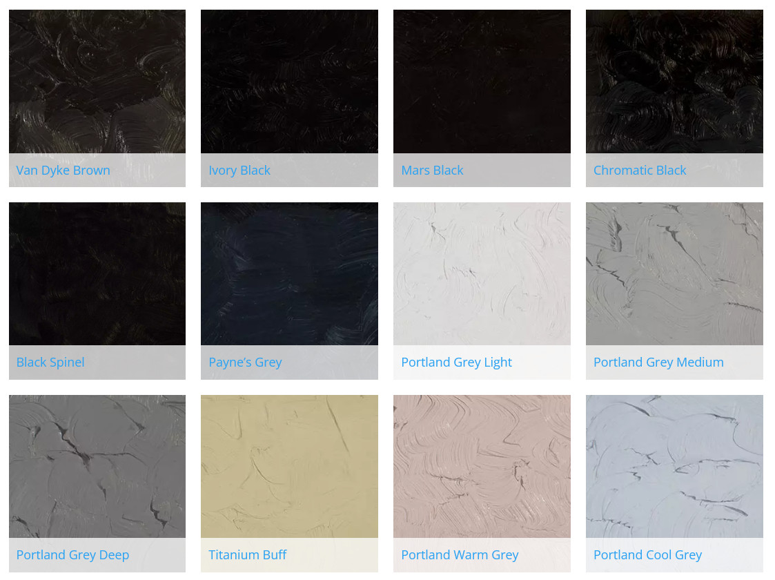
Blacks and Greys by Gamblin Artists Colors


So many of us plein air painters, working in the Impressionist tradition that dominates our craft, have been warned to steer clear of black.  We're told that the landscape is all about color—color in the shadows, color in the darks—and if black should touch our painting it will be tainted forever.

Well, here's a secret:  I know more than a few master artists who have confessed that they have black on their palettes.  When no other dark pigment is dark enough, black is their go-to for dark accents.  They even use it in mixtures to dull down colors.  Sometimes, the resulting slight bit of muddiness is exactly the note needed.

HISTORY

Black is a very old pigment.  When humans first discovered fire, they also discovered charcoal.  Wood, bone and ivory probably gave us our first blacks.  Manganese oxide, found in minerals like magnesite and in various earths, provided an even darker and possibly earlier black.  The first black ink was made by the Chinese, who in the 23rd century B.C. compounded it from soot, walnuts and grease.  The Romans burned grapevines and grape promace—the stems, skins and seeds left over from winemaking—to make Vine Black.  In Renaissance Italy, almond shells and apricot pits were burned to make a similar black.  For most of humanity's existence, black was either dug from the earth or manufactured in a fire pit.

Fast forward to the Industrial Age and the discovery of coal gas and other coal byproducts.  Chemists in 1863, playing around with coal tar, created Aniline Black, the first synthetic, organic (carbon-based) black.  Other blacks followed in the early 20th century, including the non-organic Mars Black, which is made of synthetic iron oxide.  And finally, a blacker-than-black pigment, Vantablack, was invented in 2014.  It absorbs up to 99.5% of visible light.  In my view, it has no practical application for the painter of traditional landscapes but possibly for the Modernist.

USAGE

I, too, use black.  But I prefer to keep it in the studio rather than to take it to the field.  With all the light bouncing around outdoors, I often have a hard time telling just how dark my darks are getting; if I use black, my accents most likely will be too dark.  Yet once I'm in the studio under controlled lighting, I can see better if a painting needs a value adjustment, and sometimes, I'll use black to get a darker note.

But what kind of black?  Ivory Black dries slowly like all carbon-based blacks, but it is my black of choice.  It's cheap, and I always have a tube of it somewhere.  It's also semi-opaque, which is good for accents.  Gamblin sells a Chromatic Black, made from cool red and cool green pigments, but it's transparent and never seems quite dark enough as an accent.  Chromatic Black is more properly used in dulling other colors—unlike Ivory Black, which has a bluish tint, Chromatic Black is neutral and won't affect the hue as much.  (All that said, I sometimes think Chromatic Black has a slight greenish cast; Gamblin's website, however, says it is neutral.)   You can make your own with Phthalo Green and Permanent Alizarin Crimson.

Speaking of Ivory Black, it was sometimes used as a blue by the Swedish painter Anders Zorn.  (Contrary to popular myth, he also sometimes used an actual blue.)  I use it in my earth palette, which includes Yellow Ochre and Burnt Sienna.  This black makes a lovely, dull blue when mixed with white and, when mixed with Yellow Ochre, a nice, greyed green.

And let's not forget greys.  Many of the blacks available make interesting greys in tints.  Some useful "tubed" greys I like are the three Portland Greys (Light, Medium and Deep) from Gamblin, which are good for dulling down the split-primary palette when painting the natural landscape.  Portland Grey Light, by the way, isn't quite light enough, and I often mix a fourth value by adding white to it.


I'm including below an image of swatches I've made of colors from Gamblin.  You can learn more about their line of colors here.  They also have a series of informative articles about the color experience here.


Left column, tint.  Middle, masstone.  Right, mixed with Cadmium Yellow Light.
Top to Bottom:  Ivory Black, Mars Black, Black Spinel, Chromatic Black, Asphaltum (hue), Van Dyke Brown, Payne's Grey

Here are color swatches from Gamblin's website, showing some of the colors as tints, tones and shades.  Also, if the color is transparent, there is a glaze. Tint is made with Titanium Zinc White + the color, tone is  made from Portland Grey Medium + the color, and shade is made from Chromatic Black + color. The glaze swatch is made with Galkyd medium. 


Sunday, February 12, 2023

New Blog Series on Color, Part 7: Green

View in browser

Greens from Gamblin Artists Colors

Every plein air painter knows the dangers of Green in the Landscape:  It's ubiquitous, often choking the landscape like a bad case of kudzu.  On the palette, Green is sometimes too garish in our mixtures, and we have a tendency either to render it as a single, monotonous Green or, equally risky, as a confusing profusion of too-subtle variations.  I capitalize "Green" like a pronoun here, because it is a person to be reckoned with.

HISTORY

In ancient times, very few greens were available to the painter—and most had problems.  They were either dull, toxic or unstable.  Terra Verte, an earth pigment mined in Italy, Poland and Bohemia, was dull.  Verdigris, a brilliant green that forms the patina on copper, brass and bronze, wasn't just toxic but also expensive.  (Botticelli, because he was working for the Pope, could afford it.)  Sap Green, made from ripe buckthorn berries, faded quickly.  There were so many problems with the available greens that many Renaissance painters preferred making green by glazing yellow over blue.

Malachite was the only bright, stable and lightfast green until the creation of mineral pigments like Emerald Green (1808), which was toxic, and its far-safer cousin, Viridian (1838).   In the 20th century, rich, organic (carbon-based) colors such as Phthalo Green (1938) were invented.  Today, many of the earlier, unsatisfactory greens have been recreated in non-toxic and stable versions as "hues" or mixtures of other pigments.  Gamblin's Sap Green, for example, is a mixture of diarylide yellow (PY83 or HR70) and copper phthalocyanine (PY 83, PB 15:1).   (Want to know more about the odd numbers?  Go here.) 

USAGE

To help avoid the monotonous appearance of greens that can result from using tubed green, many landscape artists recommend mixing our own from blue and yellow.  This way, especially if marbleized rather than thoroughly mixed, the mixtures will have more interest and variety.  For example, you can make beautiful warm greens with Prussian Blue and Yellow Ochre or cool greens with Hansa Yellow Light and Cobalt Blue.  Violets and yellows make nice greens, too, and so does substituting Ivory Black for blue.  It's worthwhile making some color charts to familiarize yourself with the universe of greens.

Tubed greens do have their place, most often as convenience colors when time is short or if you need a particular green that is impossible to mix.  Sap Green—these days a "hue" rather than the genuine article—I use as a convenience color for painting seaweed or juniper trees.  Sure, I could mix it, but here it is, in my paint box.  (By the way, I usually modify this and most of my other greens with a little red.)  On other hand, Permanent Green Light is impossible to mix, and it is perfect, right out of the tube, for representing the first tiny leaves of spring.

I'm including below an image of swatches I've made of colors from Gamblin.  You can learn more about their line of colors here.  They also have a series of informative articles about the color experience here.


Masstone, Undertone and Tint
Top (L-R): Cobalt Green, Viridian, Phthalo Green, Phthalo Emerald, Emerald Green
Bottom (L-r): Chromium Oxide Green, Permanent Green Light, Cadmium Green, Sap Green, Terre Verte

Here are color swatches from Gamblin's website, showing some of the colors as tints, tones and shades.  Also, if the color is transparent, there is a glaze. Tint is made with Titanium Zinc White + the color, tone is  made from Portland Grey Medium + the color, and shade is made from Chromatic Black + color. The glaze swatch is made with Galkyd medium. 


Sunday, February 5, 2023

New Blog Series on Color, Part 6: Blue

View in browser

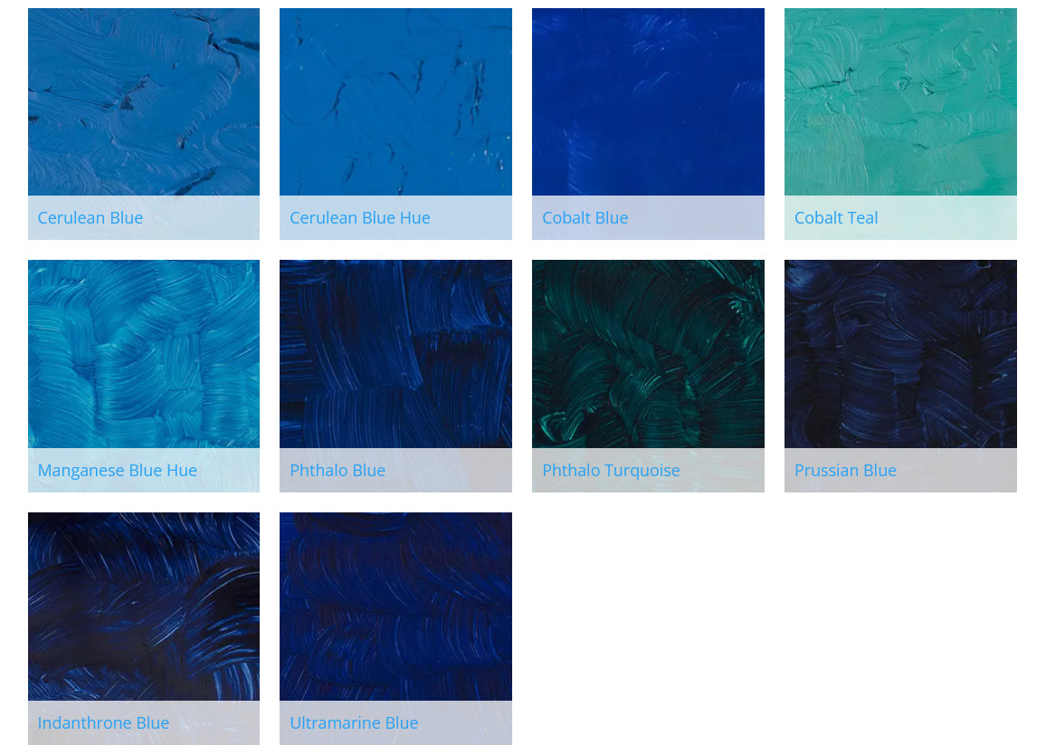
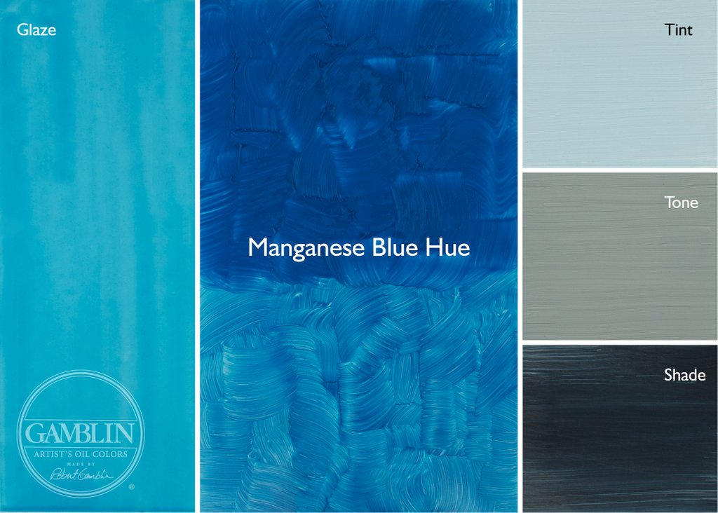
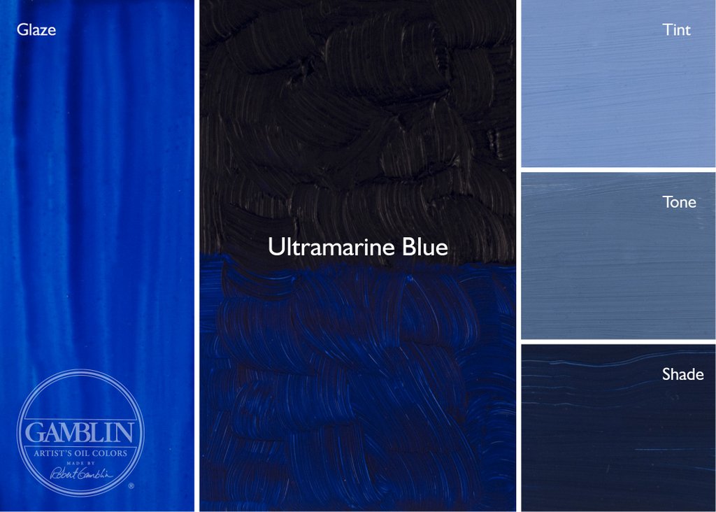
Blues from Gamblin Artists Colors


Blue is a color that has more effect on the landscape than one might think.  Question:  How many light sources are there in the landscape on a sunny day?  The man-on-the-street would say just one, the sun.  But plein air painters know there is a second light source, the sky.  The light provided by the noontime sun (on average) tips the scale at 111,000 lux—lux being a measure of illumination—but the sky alone measures a whopping 20,000 lux.  This is nearly 20% of the sun's illumination.  (A full moon, which can seem quite bright, shines at only 0.25 lux.)  

And what does the light from this second source do?  A clear sky at noon has a light temperature of around 7000°K, which is a blue light.  The sun, on the other hand, has one of around 5000°K, which sits a little more toward yellow on the spectrum.  (An incandescent light bulb glows at a very yellowy 3600°K.)  So, on a clear day, the sky throws a considerable amount of blue light onto everything, not just the shadows but even the open, unobstructed landscape.  Most often, though, you won't see this as a definite blue cast but will sense it more as a general cooling-down of colors.

HISTORY

Blue has long been an essential hue.  Before the invention of synthetic pigments, it was the only color that could provide a cool contrast to warm earth colors.  The ancients had Egyptian Blue, a glass made from copper and sand.  Replacing this in the 16th century was Smalt, a finely-ground glass made with cobalt.  In Renaissance times, a method to refine a very pure blue from the precious mineral lapis lazuli was discovered.  Lapis, or Ultramarine Blue, was so highly prized that it cost more than gold—understandably, since it was hauled over the dangerous Silk Routes from a remote part of Khorasan (now Afghanistan) and passed through many hands before arriving in Europe.

The creation of modern blues was haphazard at first.  Prussian Blue was discovered serendipitously in 1724; Cobalt Blue, also by accident, in 1807.  Then, in the 1820s, the French government, wanting to find a cheaper alternative to the not-to-be-matched beauty of Lapis, offered a 6,000-franc prize to anyone who could make it for less than 300 francs per kilo. Finally, in 1826, a process was invented to make French Ultramarine, giving impoverished painters who weren't under the employ of a nobleman or the Church a cheap and plentiful supply of blue.  Since then, a variety of organic (carbon-based) pigments have been created, including Phthalo Blue in 1928.

USAGE

Although Ultramarine Blue is the most common blue used by painters, each painter seems to have a favorite "other" blue:  Cobalt Blue, Cerulean Blue, Sevres Blue, Indanthrone Blue—the list goes on.   Cobalt seems to be #2 on most palettes, right after Ultramarine, filling out the split-primary palette.  Ultramarine is a warm blue with a slightly purple cast; Cobalt, which has no purple, a cooler blue.

But to my somewhat deuteranomalic eyes, Cobalt Blue isn't visually different enough from Ultramarine, especially when in a tint.  So instead, I prefer a more greenish blue, Cerulean Blue Hue.  (I prefer this over the genuine pigment, which is more expensive and weakens too much when mixed with white.)  This gives me a wider temperature difference between the two.

I use Ultramarine Blue for a sky approaching the zenith, as the blue there seems darker and redder.  Lower down toward the horizon, where the blue is lighter and greener, I use Cerulean Blue Hue.  (I sometimes add a cool yellow to this to make the color even greener.)  This color also makes lovely greys when mixed with tints of red or orange.

What about Manganese Blue, once used for swimming pools and achingly reminiscent of Caribbean waters?  Mining the mineral for this color was an environmentally toxic process and has stopped.  According to Robert Gamblin of Gamblin Artists Colors, the last industrial batch of this pigment was made in 1989, and he worked hard to create a "hue" that closely matched the original.  (Robert once gave me a rare tube of genuine Manganese Blue to play with and, honestly, I prefer the "hue" he makes.  Genuine Manganese weakens too easily.) 

And, finally, what about Phthalo Blue?  This intense pigment is great in pastels, providing a beautiful range of intense darks and tints.  But it's a lot like nitroglycerin (or maybe Brylcreem), where "a little dab'll do ya."  Powerful stuff, it's best avoided in oil and acrylic paints.  I used to have both it and Phthalo Green on my palette, and to this day I regret the messes it made.  Prussian Blue is a better choice than Phthalo Green.  Intense and staining, yes, but not like Phthalo Blue.  Plus, Prussian Blue, Yellow Ochre and Burnt Sienna make a wonderful three-color palette for landscape painting.

I'm including below an image of swatches I've made of colors from Gamblin.  You can learn more about their line of colors here.  They also have a series of informative articles about the color experience here.

Masstone, Drawdowns, Undertone, Tints and Shades

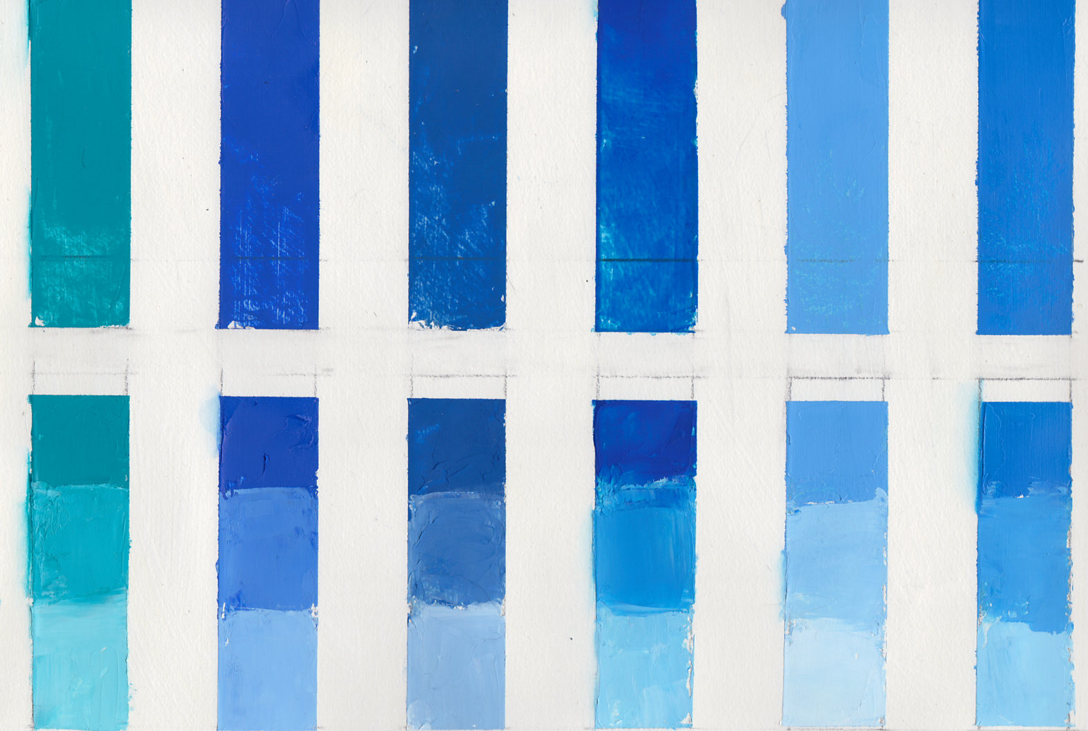
Top: Masstone/Drawdown/Undertone
Bottom:  Shade/Tints
L-R: Prussian Blue, Phthalo Blue, Indanthrone Blue, Cobalt Blue, Ultramarine Blue

Top: Masstone/Drawdown/Undertone
Bottom:  Shade/Tints
L-R: Cobalt Teal, Cerulean Blue Hue, Cerulean Blue, Manganese Blue Hue, King's Blue (Williamsburg), Sevres Blue (Williamsburg)

Here are color swatches from Gamblin's website, showing some of the colors as tints, tones and shades.  Also, if the color is transparent, there is a glaze. Tint is made with Titanium Zinc White + the color, tone is  made from Portland Grey Medium + the color, and shade is made from Chromatic Black + color. The glaze swatch is made with Galkyd medium. 


Sunday, January 29, 2023

New Blog Series on Color, Part 5: Violet

View in browser

Violets/Purples from Gamblin Artists Colors


Violet lurks everywhere in the landscape.  It inhabits the deep shadows; but it also sparkles in sunlit rock, adding a refreshing cool note to a warm subject.  In my split-primary palette, I can sense it buried deep in Ultramarine Blue, and by adding a little Alizarin Crimson, I can bring it to the surface.  And if I want an even stronger note, I can add Dioxazine Purple—or one of the many other violets available—to my palette.

HISTORY

You've most likely heard of Tyrian Purple, a brilliant pigment loved by the Roman emperors and famed for its expense.  Over 10,000 whelks are needed to make a single gram; you can still buy it today, with a gram going for $4000 from Kremer Pigments.  But it's not just expensive—it's also incredibly fugitive.  A cheaper purplish earth color, perhaps used by the lower strata of Roman society, is Caput Mortuum ("dead head" or "worthless remains" in Latin), a pigment derived from hematite.  But it wasn't until 1859 that a truly rich, lightfast and inexpensive violet became available with the creation of Cobalt Violet.  Early versions were poisonous and made from ore containing arsenic. In 1868, chemists developed the non-toxic Manganese Violet.  In our modern era, a whole host of organic (carbon-based) violet pigments, such as the dioxazine and quinacridone colors, were developed.

(Side note:  What's the difference between purple and violet?  Purple is a combination of red and blue pigments; violet occupies a range in the electromagnetic spectrum.  Many artists, however, use the terms interchangeably.  Since I consider my palette to be spectrum-based,  I use the term "violet.")

USAGE

You don't often think of violet as being a landscape color.   But consider:  It's not primary colors but secondary colors that make up the natural landscape.  Orange, green, violet—all of these appear in vegetation, from warm orange in sunny spots to cool greens in the half-tones to even cooler violets in shadow.  Orange and green might seem obvious to you; violet, perhaps less so.  But believe me, a little touch of the right violet in a landscape adds punch.

And what is the right violet?  Usually, "right" has to do with color temperature and intensity and the relationship to surrounding colors.  I can adjust the temperature of violet with hues near it on the color wheel.  For example, if I want my Dioxazine Purple warmer, I can mix in a little Alizarin Crimson, which is closer to red.  If I want to cool it down, I can add a little Ultramarine or Cobalt Blue.  If I want to reduce the intensity, I can add a bit of a complement (a yellow) or near-complement (yellow-green or yellow-orange.)  Violet, by the way, can make some very beautiful greys with near-complements and white.  And I can make a really dark, transparent neutral by mixing Dioxazine Purple and Phthalocyanine Green.  Sometimes you want black without using an actual black.

Violet has always been another of my favorite colors in pastels--warm violets, cool violets, intense violets, dull violets.  I find them especially useful in the greens, deepening shadows or de-intensifying light areas.

I'm including below an image of swatches I've made of colors from Gamblin.  You can learn more about their line of colors here.  They also have a series of informative articles about the color experience here.

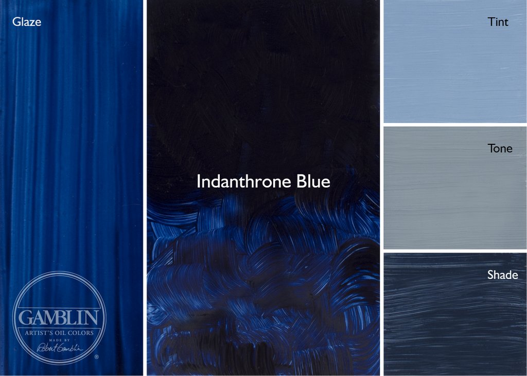
Top row: Tints
Bottom: Masstone + Undertone
L-R: Quinacridone Magenta, Quinacridone Violet, Manganese Violet, Cobalt Violet, Dioxazine Purple, Ultramarine Violet
(I included the Quin Magenta because it is so close in hue to the Quin Violet)

Here are color swatches from Gamblin's website, showing some of the colors as tints, tones and shades.  Also, if the color is transparent, there is a glaze. Tint is made with Titanium Zinc White + the color, tone is  made from Portland Grey Medium + the color, and shade is made from Chromatic Black + color. The glaze swatch is made with Galkyd medium.