*Never AI, always human. Any errors are my own.*
Here's a sunny day oil demonstration for my paid subscribers: Ebbing, 8x10 oil. https://mchesleyjohnson.substack.com/p/demo-ebbing-8x10-oil
*Never AI, always human. Any errors are my own.*
Here's a sunny day oil demonstration for my paid subscribers: Ebbing, 8x10 oil. https://mchesleyjohnson.substack.com/p/demo-ebbing-8x10-oil
*Never AI, always human. Any errors are my own.*
Here's my report on the Gamblin "Whites" set: https://mchesleyjohnson.substack.com/p/gamblins-whites-set
*Never AI, always human. Any errors are my own.*
I'm about to start playing with three different sets of oil paints from Gamblin. Here's a free column in my Substack about them. https://mchesleyjohnson.substack.com/p/useful-color-sets-for-the-oil-painter
**Authentically Human! Not Written by AI**
**Authentically Human! Not Written by AI**
 |
| "Crevice" 16x20 Oil Available |
Not long ago, I sold a large painting from my Canyon Abstraction series. It was one of a trio that I had hung in the bedroom, and I have been missing it like an old friend. This past month, I had some free time and decided to paint it again.
I pulled out my pandemic gouache journals, which had most of the color studies I needed. I also printed out a copy of the painting I sold, plus a few photos of this particular part of the canyon. Interestingly, the only reference I ended up using was the photo of the original, and I used that just for the composition, not for color or form – all this other information was conveniently held in memory, thanks to having spent much time sketching in the canyon over the last few years.
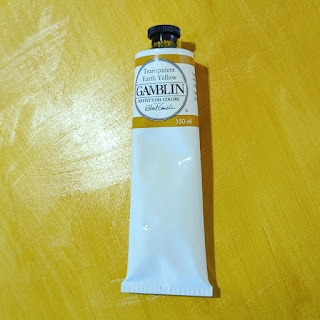
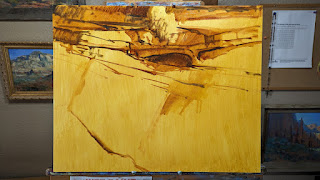
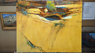
I started off by toning my 16x20 panel with Gamblin's Transparent Earth Yellow. This is a beautiful, luminous yellow that served well as a base color for the canyon wall. After that, I used Burnt Sienna and Viridian to create a warm dark for the shadows and cracks, and Cerulean Blue Hue for reflected skylight. Finally, I used touches of Naphthol Scarlet and Cadmium Orange to indicate hot spots of reflected canyon light in the shadows.
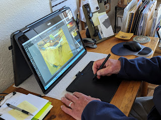
After my first pass at color, I shot a photo of the panel and used my photoediting app (Krita) and a Wacom Intuous tablet to do a little digital painting. I wanted to experiment with color and get a sense of where I might go in the next stage. I liked the result, and I used some of it in the finished painting, such as the cool pinks in the edges of the wall and the cool, blue-green stains on the rock. But as much as I enjoyed my digital painting session, my preference is for using a real brush to push around thick oil paint. Even so, I found the detour useful, and I'll probably do it again.
Another tool I used was the new "gesso and ground blade" from Gamblin. Neat tool, which I also used in this painting for spreading paint over large areas and also scraping back areas.
 |
| Gamblin's Transparent Earth Yellow |
 |
| Initial Drawing |
 |
| Blocking in Darks plus a Few Lines |
 |
| Adding Some Color |
 |
| Wacom Tablet and Digital Painting |
 |
| The "Digital Version" of the Painting (Note that in the final version of the oil, I departed slightly from this.) |
 |
| The Gamblin "Gesso and Ground Blade" |
 |
| Watch it here |
I was pleased to meet Calvin several years ago when each of us was invited to participate at the Grand Canyon Celebration of Art, one of the country's premier plein air painting competitions. And so it was my pleasure to talk to him again, this time in his studio in southern California. You can either watch the video below or through this link: https://youtu.be/UTF8rZEgvKM
In case you haven't heard about my book, it features 15 master artists who share their tips and techniques for plein air painting. This 160-page book is packed with demonstrations, illustrations and, of course, beautiful paintings. The book, which will come out March 2022, is available for pre-order from both Amazon and Barnes & Noble. You can get details at the following links:
https://www.amazon.com/gp/product/1684620457
 |
| "YInMn Cliffs with Sunflowers" 9x12 oil / plein air YinMn Blue, Yellow Ochre, Burnt Sienna, Hansa Yellow Light, Hansa Yellow Deep, Titanium-Zinc White AVAILABLE! - $300 |
How often does a brand-new color come along? For blues, not very often. The last useful blue for artists, phthalocyanine blue, was created in 1928, But as luck would have it, some scientists stumbled across a new one in 2009 while engaged in research on semiconductors: YInMn Blue.
It's a clumsy name, to be sure. It's composed of the symbols of the components: the rare-earth elements yttrium (Y) and indium (In), plus manganese (Mn). Someone should have a contest for coming up with a better name. Perhaps get rid of the uncommon capitalization, throw in another vowel to make it easier to pronounce, and add an “O” for the other component, oxygen: Yinmino Blue.
It's an expensive pigment not because yttrium and indium are “rare”—yttrium, for example, is 400 times more common than silver—but because they are expensive to mine. The start-up costs for a rare-earth mining operation can edge up to a half-billion dollars. And this is why a 37 ml tube of YInMn Blue from Gamblin lists for $75. (You can get your tube here: https://gamblinstore.com/yinmn-blue/)
How does this color compare with other blues? As primarily a landscape painter, I enjoy a blue that is easily greyed. YInMn Blue fits that need perfectly. In fact, the first time I added a bit of it to a dollop of titanium-zinc white, I immediately got a grey. My initial thought was, “Oh, I must not have cleaned my brush thoroughly.” But then I took up a “known clean” brush and got exactly the same results. Although YInMn Blue looks very intense right out of the tube, it does grey down quickly, making beautiful, soft blue-greys.
YInMn Blue also possesses a weak tinting strength. If you're used to the tinting strength of ultramarine blue and cobalt blue, you'll be surprised how easily YInMn Blue gets lost in a mixture. But as a plus, if you have a heavy hand and tend to add too much color to a mixture—a real problem with something like pththalo blue—you won't have that problem with this blue.
Finally, the color plays well with an earth pigment palette. Earth pigments make mixing the predominantly muted colors of the landscape a snap. (Other than flowers and garishly-painted manmade structures, there's very little rich color in nature.). YInMn Blue is a fitting companion for yellow ochre and burnt sienna. For my test paintings of some of our Southwestern cliffs, the blue cooled the burnt sienna gently, giving me just the right “tweak” on coolness.
I've included here some of my test paintings and color swatches—all of which are, of course, at the mercy of my camera and your monitor. You'll want to make your own tests and see the results with your own eyes.
 |
| Masstone/Undertone/Tint You can see how the tint of YInMn Blue is distinctly greyer than the other two. |
 |
| Color Chart Out-of-the-tube colors are at the top Tints of YInMn Blue on the left Other two rows show what happens when you mix YInMn Blue with Yellow Ochre and Burnt Sienna + tints of same mixtures |
 |
| "YInMn Cliffs" 9x12 oil / studio YInMn Blue, Yellow Ochre, Burnt Sienna, Titanium-Zinc White AVAILABLE! - $300 |
 |
| "YInMn Sky" 9x12 oil / plein air YInMn Blue, Yellow Ochre, Burnt Sienna, Titanium-Zinc White AVAILABLE! - $200 |
 |
| Final Step of Color Temperature Demonstration "Winter's End" 9x12 Oil |
If you've ever taken a workshop with me, you know I've enjoyed using Gamblin oil paints for many years. Well, Gamblin Artist Colors recently invited me to contribute a technical article for their web site. I get a real pleasure in writing this kind of article. It's not only an opportunity to share what I know, but I get to learn a bit, too. The articles always involve research, experimenting and creating demonstrations. Okay, let me be honest—I just love to play around with paint!
The article is about color temperature. Again, if you've ever taken a workshop with me, you know that I stress using color temperature effectively. It is key to creating a realistic sense of light and shadow, of form and distance. If you'd like to know more about this vital topic, you can read the article on Gamblin's web site: https://gamblincolors.com/understanding-color-temperature/
 |
| End of Bar Road, 9x12 oil/Multimedia Artboard |
I just returned from a whirlwind trip to Lubec, Maine, where I taught a workshop one week and then ran a retreat the next. Normally, I'd be there for the entire summer, but because the Canadian border was closed to me, I was unable to occupy our family home on Campobello Island, my usual base camp for workshops. Having rescheduled these two events from last summer because of the pandemic, I didn't want to disappoint anyone yet again, so I decided to fly up and rent car and lodging. Despite the extra expense and trouble, I had a fantastic time and enjoyed working with everyone.
Because of the unusual heat wave baking New England, a good deal of moisture pushed toward Lubec and the cold waters of the Grand Manan Channel, making for some foggy mornings and drizzly afternoons. Even so, we had some stunningly brilliant hours. Of course, one of the charms of Downeast Maine is the fickle weather, and as plein air painters, we are all used to rolling with whatever comes along. We painted at a variety of locations, including West Quoddy Head, where the cliffs and the ocean swells are most dramatic; in Lubec itself, where we enjoyed a bounty of ramshackle fish buildings and fishing boats; and in spots nearby, where we lingered on quiet beaches or near tidal streams that created interesting patterns among the seaweed-cloaked rocks.
For the workshop, students lodged where they pleased, but for the retreat, we all lodged at West Quoddy Station, just a mile from the lighthouse on West Quoddy Head. A beautifully-renovated US Coast Guard campus, it gave us immediate access to some of the best scenery and provided a comfortable place where we could be together and build the friendships that are so important to the retreat concept. I am scheduling this retreat again for next summer.
I wrote that the Canadian border was closed. This is not entirely true, as it did open up while I was at the retreat. Fortunately, I was able to fulfill the requirements for entry, and I went over for an afternoon, which was all I had time for. (The border agent asked, “You went through all that trouble just for a few hours?”) I checked on house and studio—it'd been two years since our last departure—and I'm happy to say all is in good order. I hope next year will be better for international travel.
In this post, I'm sharing some of the work I created while in Maine. They are all for sale at $200 each, shipping included to the lower 48 US states
By the way, if you are interested in my plein air painting retreats, here are two coming soon that I still have space in. Please let me know if you would like to join us!
Taos, New Mexico. September 26-October 1, 2021. $300, lodging and meals not included. Join me for some of northern New Mexico's best scenery! We'll paint at such beautiful locations as the Rio Grande Gorge, the scenic village of Arroyo Seco, the aspen-clad slopes near the ski area and, of course, in Taos itself. Our retreat will include visits to such historic sites as the Mabel Dodge Luhan House, the Nicolai Fechin House and the Couse-Sharp Studio.
Sedona, Arizona. November 2-5, 2021. $300, lodging and meals not included. I lived and painted in the Sedona area for over ten years, and I'm eager to share some of my very special painting spots with you. We'll paint among Sedona's stunning red cliffs and explore its rich riparian areas. At this time of year, we should have some good color in the cottonwood trees, which make for a beautiful pairing with the red rocks.
Unlike my all-level workshops, the retreats have no formal instruction. However, we'll have daily critique sessions, informal art talk, and I'll demonstrate my painting methods in both oil and pastel. The retreats are a great way to connect with the other participants and to learn from them. And, of course, I will be your in-house expert and happy to answer any questions! (You can learn more about my retreats here.) The retreats will be held entirely outdoors, and we will follow CDC guidelines for masking and distancing. Let me know if you're interested in any of these retreats.
 |
| Fog in Purples and Greens, 9x12 pastel/paper |
 |
| Fog in Greys and Greens, 9x12 pastel/paper |
 |
| Low Tide, 9x12 pastel/paper |
 |
| Bay View, 9x12 pastel/paper |
 |
| Fish Buildings, 9x12 pastel/paper |
 |
| Standing Tall, 9x12 oil/Multimedia Artboard |
 |
| The Village, 9x12 oil/Multimedia Artboard |
 |
| Fog and Rocks, 9x12 oil/Multimedia Artboard |
 |
| Staying Put, 5x12 oil/Multimedia Artboard |
 |
| Reaching Out, 9x12 oil/Multimedia Artboard |
 |
| Pirate Cove in Fog, 9x12 pastel/paper |
 |
| I removed about two tubes' worth of dried paint off this palette. |
I think it's a point of pride among studio painters to leave thick slabs of dried, leftover paint on the palette. If your palette covers enough acreage, why not preserve these coprolitic remains? You have worked hard to get where you are today, and these are the trophies to prove it.
But for the plein air painter, not cleaning one's palette thoroughly can cause problems down the road. First, the mixing area on most palettes is small. You can run out of room fast if you don't keep things tidy. Second, dried-up paint adds weight to your gear, and if you like to hike a distance to your painting location, you want to pack like a long-distance hiker, for whom every ounce counts.
I'll admit—I'm a terrible one for keeping a clean palette. As the above photo shows. It seems that my mixing area just gets smaller and smaller. It's the Incredible Shrinking Palette. But now and then, I'll take out the gloves and the putty knife and scrape off those fossilized piles as best I can. It's not a pretty process.
Palettes basically come in three flavors, and each requires a different approach when cleaning up at the end of a painting session.
Wood palettes. These can easily be scraped clean of wet paint with a razor blade. But you don't scrape it by pushing the business end of the blade forward. That would just cut into the wood, ruining it. Instead, you drag the blade across the wood with just a little pressure. This takes off most of the paint, and a little OMS on a rag will finish the cleaning. If you forget and let the paint dry, you can apply a putty knife to work off the big hunks and then use a sander to get back down to the wood. To help with clean up, make sure you prep a new wood palette (or a newly-sanded one) with linseed oil first.
Acrylic palettes. You don't really want to use a razor blade on these, as you will gouge the surface and make it even harder to clean. Instead, use a plastic squeegee tool to scrape off the wet paint. Follow this with a rag dampened with OMS. If you make the mistake of letting paint dry, you can take a putty knife gently to it—but that's about as far as you can go. I really don't like acrylic palettes for this reason, but they are much lighter than the next palette.
Glass palettes. These are the easiest to clean, wet or dry paint. Dry paint just takes a little more effort with the razor blade. Unlike with wood, you push the blade forward. But the glass can be heavy, and it can break. I love my glass palette for the studio. But for plein air, I prefer wood.
I should mention one positive to leaving those piles of paint: They serve as a memory jog for where to put out your different colors.
Honestly, I'm not fastidious about cleaning the palette other than the mixing area. I do try to keep the mixing area clean enough so I can properly see the color of my mixtures. But as for the areas where I lay out fresh paint, if there's a pedestal of dried paint, I just put fresh on top of it. I don't clean these areas until I have trouble closing the lid—or need to worry about weight.
 |
| Morning at the Lake 36x36 oil/gallery-wrap canvas Available |
I've always been a fan of Prussian Blue. Although many landscape painters like Ultramarine Blue and Cobalt Blue for their skies, in my view these always seem a little too intense and need to be muted. Prussian Blue already seems more muted, more natural. It also greys down other colors in the landscape well, especially the reds, and produces a wide range of greens with yellows and oranges. And I love the way it mixes with earth colors. One of my favorite palettes: Yellow Ochre, Burnt Sienna and Prussian Blue.
 |
| Rain over the River, 12x16 Oil (Available) Prussian Blue is great for storms, too. Painted with Yellow Ochre, Burnt Sienna, Prussian Blue. |
In my recent demo for Eric Rhoads' daily series of artist demonstrations, I used Prussian Blue. Someone observed that the pigment is poisonous, and that I should be careful. Well, yes, it contains a compound of cyanide, but it is not poisonous.
A student of mine, Charles Eisener, who has a long history with pigments in the medical field, explained this to me, and with his permission, I want to share it with you. His qualifications: “Over a period of almost 50 years, I worked with dye powders and stains, solutions, solvents and chemicals that most folks do not even know to be part of our medical care system. Mutagens, carcinogens, caustics, poisons and potential explosives were all part of the mix.”
Regarding Prussian Blue, he writes:
Prussian Blue is a double iron salt complex with cyanide and is a commonly used pigment in many areas, including Histotechnology. I have used the pigment over more than 40 years in that capacity and have yet to see it labeled as a poison. Most safety references did not list ANY physical hazards associated with skin contact unless you are referencing the basic chemical "powder." Like many other chemicals, the bets are off when ingestion or injection is involved. Even flour can be a hazard when injected. Chinese white is a close chemical relative; after oxidation it also turns blue. Ferrous ferrocyanide salts are widely used in many product areas as pigments and carry no explicit hazards to the product user. Personally, the cadmiums pose far greater health hazards to the user than a worst-case scenario with Prussian Blue given the same type of exposure.
The cyanide is so tightly bound to the iron salt in this pigment that a reaction to the iron salts is far more likely than any potential exposure to what is left of the cyanide molecule. The other factor is that many manufacturers do not even use the ferrous cyanide salts for their "Prussian Blue." Some of the synthetic pigments are much easier to produce and thus much cheaper to include in the end product. As always, it pays to carefully read the labels, so you know what you are paying for, or being exposed to.
He goes on, more generally:
Our primary risk from chemicals, solvents, and pigments occurs during the actual act of mixing and applying paint or cleaning our materials and tools. Residual risks from artists pigments are very minute, particularly if due diligence is taken with disposal. Rinse water containing pigments can be precipitated and disposed of as a solid. Dried paint films are at very minimal risk of releasing cadmium. Far more heavy metals are released into the environment through household disposables than from artist studios. This does not mean we should not exercise caution, but rather that risks are quite relative. Some of the pigments currently in use show "unknown" under various risk categories on their official MSDS (Material Safety Data Sheet) forms. Nobody has done research to determine that potential risk. Does that mean it is safer than a cadmium color with known risk? Hardly! Should we not take more care with an unknown than with a known?
Many common food preservatives and colorants carry health risks if one cares to examine their MSDS data. OSHA guidelines mandated that gloves and face protection be used when weighing out sodium chloride, yet the cafeteria provided saltshakers on every table. Risks and safety are relative. Ingesting too much water or too much table salt can cause health issues or in extreme cases, death. So can too little! Safety is a relative term and simply implies the use of common sense and reasonable care based upon our current knowledge of the specific chemical/product.
Here in the US, we have labeling requirements. It pays to read the label and to know what we're painting with.
By the way, I am on the faculty for Plein Air Live. If you haven't already signed up, there's still plenty of time. You can find out more about Plein Air Live here.
I'm happy to announce that two of my paintings, "Path to the Shed" and "Near Los Gigantes," are in the annual Plein Air Painters of New Mexico Juried Member's Exhibition. You can see these two 9x12 oil paintings in the postet above, and also below.
The exhibit runs from November 7 - 29, 2020 at the Wilder Nightingale Fine Art Gallery in Taos, New Mexico. Although the opening reception has been cancelled due to the pandemic, the awards ceremony will be held via Zoom. For details, visit www.papnm.org. TO PURCHASE THE PAINTINGS, visit www.wnightingale.com.
 |
| Near Los Gigantes, 9x12 Oil |
 |
| Path to the Shed, 9x12 Oil |
 |
| Rolling Fog 7x9 Oil - Copy (studio) |
 |
| Rolling Fog 7x9 - Original (en plein air) |
 |
| "Build Up" 8x10 Oil - $200 unframed Cloud as subject |
I've looked at clouds from both sides nowWith practice, you can get to know clouds pretty well!
From up and down, and still somehow
It's cloud illusions I recall
I really don't know clouds at all
 |
| Clouds I - 6x8 oil - $100 unframed |
 |
| Clouds II - 6x8 - $100 unframed |
 |
| Buildup - 6x9- $100 unframed |
 |
| A Summer's Idyll - 9x12 Pastel - $300 unframed A gentle "scrim" of clouds in the distance seem peaceful |
 |
| Evening Cliffs - 12x16 Oil - $700 framed The upward diagonal of the cloud opposes the downward one of the cliff |
 |
| Lifting Fog at Dawn - 11x14 oil - $700 framed The clouds almost become the subject...but not quite! |
 |
| Morning in Mallaig - 14x18 Oil - $900 framed Again, opposing diagonals |
 |
| Paso Por Aqui - 9x12 - $400 framed A pleasing patchwork of clouds |
 |
| The Watchman - 9x12 oil - $400 framed A single cloud to give distance behind the peak |