Authentically Human! Not Written by AI!
All Content Copyright © Michael Chesley Johnson AIS PSA MPAC

Sunday, September 26, 2021

ACM Panels for Plein Air Painting?


While looking for a new substrate for my oil paintings, I came across ACM panels.  The initials stand for “aluminum composite material.”  ACM is a rigid, puncture-proof, lightweight product that consists of a polyethelene core sandwiched between two sheets of aluminum.  For artists looking for an archival material, you probably can't get more archival than this!

I ordered three 9”x12” panels from Trekell.  They sell these panels, which are 1/8” thick, with a variety of different added surfaces—oil-primed, gesso-primed, and so on—but I ordered the “raw” panels, so I could apply my own grounds as a test.  One would expect a raw panel to just be bare aluminum, but it comes from the manufacturer pre-painted. This thin layer of paint is very smooth, so I asked Trekell how to prepare it so it would accept an application of acrylic gesso.  They recommended I “scuff” the surface, so I took a sanding block and abraded the surface until it no longer had a sheen and looked quite matte.

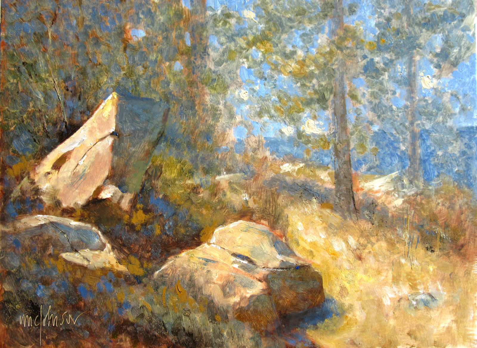
I prepared the three panels with acrylic gesso (two coats), BIN (a shellac-based primer, two coats) and Gamblin's oil ground (one coat.)

One worry was absorbency.  I like my panels somewhat absorbent, and a raw ACM panel is about as non-absorbent as can be.  As I expected, the board with acrylic gesso had the most absorbency, and I liked that one best.  Coming in second was the one coated with BIN.  This one also was absorbent, but slightly less so.  The slickest surface was the panel coated with Gamblin's oil ground, and it was my least favorite.  I found it difficult to keep my stiff, hog bristle flats from scraping down through the paint to the white of the ground.  I was constantly trying to apply more paint to cover up the white.  I ended up “dabbing” the paint on with a softer round, and that worked well enough.

Another worry was weight.  ACM is a bit heavier than the hardboard I typically use for my painting panels.  A 1/8” 9x12 hardboard panel with two coats of acrylic gesso weighs 236 grams; the same size ACM panel with two coats, 314 grams.  One other concern is the rigidity of larger panels.  On its website, Trekell notes: “ACM panels over 16x20 do not always lie completely flat. Corners may lift slightly.”  And what about cost?  Good news here. From Trekell, a “raw” 9x12 ACM panel costs the same as a 9x12 hardboard panel primed with acrylic gesso, or $7.26 as of this writing.

You can find the ACM panels here: https://www.trekell.com/collections/aluminum-composite-panels 

Here are my test paintings (each available for sale at $300):

"Ledge I" 9x12 oil
ACM with 2 coats of acrylic gesso

"Ledge II" 9x12 Oil
ACM with 2 coats of BIN

"Trio" 9x12 Oil
ACM with 1 coat of oil ground


Sunday, September 19, 2021

New Book: Beautiful Landscape Painting Outdoors


After almost a year of work, I'm happy to announce that you can now pre-order my new book, Beautiful Landscape Painting Outdoors: Mastering Plein Air, from Amazon.  The book hits the streets March 1, 2022, but by ordering it now, you'll make sure to get a copy.  I expect it will sell out fast.

Why?  Because this is the comprehensive guide to painting outdoors.  It gives you everything you need to know about plein air painting, from A to Z.  Fifteen master artists share their knowledge—and their secrets—in this 160-page book that is packed with demonstrations in the major mediums, helpful techniques and many, many, many gorgeous images.  

I've written the book so both beginner and advanced painters will benefit from it.  If you're a beginner, you'll learn everything you need to get started and, better yet, how to have an enjoyable and satisfying experience.  If you're an advanced painter, you'll learn the tricks that the masters learned the hard way, through long experience.  (All you have to do is read the book!)

So who are these master artists?  They are:

Rob Adams / UK / oil
Tony Allain / UK / pastel
Lyn Asselta / US /pastel
Marcia Burtt / US / acrylic
Lorenzo Chavez / US / oil
Nathan Fowkes / US / watercolor
Marc Hanson / US / acrylic 
Michael Chesley Johnson / US / gouache & oil
Margaret Larlham / US / pastel
Calvin Liang / US / oil
Kim Lordier / US / pastel
Mark E. Mehaffey / US / acrylic
Sandra Nunes / Brazil / pastel
Stephen Quiller / US / watercolor
Colley Whisson /Australia / oil

With a lineup like this, I expect the book to become one of the classics. Don't wait!  You can get it here: https://www.amazon.com/Beautiful-Landscape-Painting-Outdoors-Mastering/dp/1684620457

Sunday, September 12, 2021

Lighten the Load: Every Ounce Counts


In my plein air painting workshops, it's gotten to be an in-joke.  When someone announces, usually with regret, that he'd forgotten to bring a particular tube of paint or a certain brush, the sympathetic response from the group is:  “Hey, it's okay—every ounce counts.”  The idea being that, as plein air painters, we try to lighten our load—even though we may sometimes forget an important item.

Our gear and materials can be heavy, and the ounces do add up.  Whether you're toting everything in a rolling cart, a boat bag or, as I do, a backpack, one more tube of paint can be the difference between comfort and pain.  Hikers and backpackers will be familiar with this concept.

Until the pandemic, I taught many back-to-back workshops.  My pack, which contained not just things to paint with but a few things to teach with, accompanied me to each location.  A couple of times a year, I'd pull a tiny muscle in my back, and the pain would be bad enough to put me in bed for a few days—unless, of course, I was teaching, in which case I just had to slog on.  One year, I hurt my back very badly, and I didn't have time to rest it properly.  Consequently, I just injured it more, and I was in agony.

Maybe I'm a bit slow, because I didn't connect the back pain to the backpack until COVID came along.  When the pandemic hit, the in-person workshops stopped.  The backpack stayed in the closet.  For my personal painting expeditions, I started taking a light shoulder bag, just big enough to hold my very minimal gouache kit.  One day, I realized I hadn't had any back problems since I stopped carrying the backpack.

Out of curiosity, I thought I'd weigh the various things I typically stuff in my pack, using an old postal scale.  Also, because I use a variety of surfaces for oil painting, I thought I'd weigh a few of those, too, since some surfaces seemed heavier than others. You can find my list of all this below.

By the way, I'm now teaching workshops and running painting retreats again.  (You can check out my current schedule here.  More to come!)  And I'm now handling my backpack with Right Mindfulness.


Item

Weight (kg)


Masking tape roll

0.02


Pencil kit (with 3 pencils, eraser, sharpener)

0.11


PanelPak (9x12, not loaded) / add 0.472 kg if + two panels

0.11


Sketchbook (3.5x5)

0.14


Paper towel roll (full)

0.21


Leatherman multitool kit

0.27


Brush tube (with 8 brushes)

0.30


Turps can (small, full)

0.43


Box of paints (partly-empty tubes)

0.94


Palette box (DayTripper from Prolific Painter)

1.29


Backpack (REI Alpine)

1.46


Tripod plus panel holder (ProMaster XC525, DayTripper holder)

1.82


Total

7.10

(15.6 pounds)


Panels (9x12, 1/8”)

Weight (g)


Multimedia Artboard + 1 coat acrylic matte medium (thinner than 1/8”)

36


Hardboard + 2 coats acrylic gesso

236


ACM + 2 coats acrylic gesso (Aluminum Composite Material)

314


ACM + 1 coat oil ground

314


ACM + 2 coats BIN

316


Panels (8x10)

Weight (g)


Multimedia Artboard with linen surface

54


Multimedia Artboard on Sintra

118


Sunday, September 5, 2021

New Color: YInMn Blue

"YInMn Cliffs with Sunflowers" 9x12 oil / plein air
YinMn Blue, Yellow Ochre, Burnt Sienna,
Hansa Yellow Light, Hansa Yellow Deep,
Titanium-Zinc White
AVAILABLE! - $300

How often does a brand-new color come along? For blues, not very often. The last useful blue for artists, phthalocyanine blue, was created in 1928, But as luck would have it, some scientists stumbled across a new one in 2009 while engaged in research on semiconductors: YInMn Blue.


It's a clumsy name, to be sure. It's composed of the symbols of the components: the rare-earth elements yttrium (Y) and indium (In), plus manganese (Mn). Someone should have a contest for coming up with a better name. Perhaps get rid of the uncommon capitalization, throw in another vowel to make it easier to pronounce, and add an “O” for the other component, oxygen: Yinmino Blue.

It's an expensive pigment not because yttrium and indium are “rare”—yttrium, for example, is 400 times more common than silver—but because they are expensive to mine. The start-up costs for a rare-earth mining operation can edge up to a half-billion dollars. And this is why a 37 ml tube of YInMn Blue from Gamblin lists for $75. (You can get your tube here: https://gamblinstore.com/yinmn-blue/)

How does this color compare with other blues? As primarily a landscape painter, I enjoy a blue that is easily greyed. YInMn Blue fits that need perfectly. In fact, the first time I added a bit of it to a dollop of titanium-zinc white, I immediately got a grey. My initial thought was, “Oh, I must not have cleaned my brush thoroughly.” But then I took up a “known clean” brush and got exactly the same results. Although YInMn Blue looks very intense right out of the tube, it does grey down quickly, making beautiful, soft blue-greys.

YInMn Blue also possesses a weak tinting strength. If you're used to the tinting strength of ultramarine blue and cobalt blue, you'll be surprised how easily YInMn Blue gets lost in a mixture. But as a plus, if you have a heavy hand and tend to add too much color to a mixture—a real problem with something like pththalo blue—you won't have that problem with this blue.

Finally, the color plays well with an earth pigment palette. Earth pigments make mixing the predominantly muted colors of the landscape a snap. (Other than flowers and garishly-painted manmade structures, there's very little rich color in nature.). YInMn Blue is a fitting companion for yellow ochre and burnt sienna. For my test paintings of some of our Southwestern cliffs, the blue cooled the burnt sienna gently, giving me just the right “tweak” on coolness.

I've included here some of my test paintings and color swatches—all of which are, of course, at the mercy of my camera and your monitor. You'll want to make your own tests and see the results with your own eyes.


Masstone/Undertone/Tint
You can see how the tint of YInMn Blue
is distinctly greyer than the other two.

Color Chart
Out-of-the-tube colors are at the top
Tints of YInMn Blue on the left
Other two rows show what happens when  you mix
YInMn Blue with Yellow Ochre and  
Burnt Sienna + tints of same mixtures


"YInMn Cliffs" 9x12 oil / studio
YInMn Blue, Yellow Ochre, Burnt Sienna,
Titanium-Zinc White
AVAILABLE! - $300

"YInMn Sky" 9x12 oil / plein air
YInMn Blue, Yellow Ochre, Burnt Sienna,
Titanium-Zinc White
AVAILABLE! - $200