Authentically Human! Not Written by AI!
All Content Copyright © Michael Chesley Johnson AIS PSA MPAC

Wednesday, January 31, 2018

Poor Drawing: It's All Impressionism's Fault

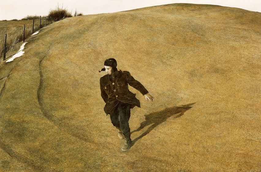
Drawing by Degas of Manet.
 Degas was probably the only Impressionist
who kept up his drawing skills nearly to the end.


You’ve heard me say it, time and again:  “Draw, draw, draw.”  Learning to draw is like learning to construct a sentence; without that foundational skill, you’d come off sounding like a 12-year-old on Twitter.  Without drawing skills, your paintings will look, at best, unconvincing; at worst, laughable.

I’m no drawing master, but I know poor drawing when I see it.  It lurks in much amateur work.  The problem is more obvious in painting architecture, but it’s there in the pure landscape, too, where perspective takes on curious distortions.  It’s almost as if one of Star Trek’s space-time anomalies has lodged itself among the trees and rocks.

All too often, the painter doesn’t care.  Or doesn’t recognize that the drawing is poor.

I blame this unconcern for drawing on the Impressionists.  Few of them were good draughtsman.  And even the few, bewitched by light and color, ultimately sacrificed line for the lazy brush stroke.  We prize their work today not for the drawing but for their brilliance in “capturing the effect” of the moment.

This has given succeeding generations of amateur painters permission to forgo the practice of drawing. (I say “amateurs” because most of the professionals do draw well, thanks to teachers who insist upon it.)  You can see the embarrassing evidence in local art shows, co-op galleries and many web sites.

I know this sounds harsh.  But there’s a very easy remedy for it.  And it doesn’t cost much.  What’s more, improvement can come incredibly fast.  You’ll be surprised at how fast you will get better.

Get yourself a little notebook and a pencil.  Put away the paint box for awhile.  Now go into the field and draw.  Just draw.

Draw trees.  Not the fluffy boughs full of leaves—that allows too much cheating—but the trunks.  Draw the tree from the roots up.  When I paint a tree demonstration for my students, I tell them trees are really all about drawing.  The individual character of the tree lives in the drawing.

Draw rocks.  Not little round rocks, but big, angular ones with lots of cracks.  When I paint a rock demonstration, I tell my students that rocks are all about line and angle—and that is drawing.

And yes, draw buildings, too.  Measure the angles with your pencil.  Just draw line over line without erasing until you get it right.  (Erasing makes you feel bad, like you’ve made a mistake.)  Because of the complexity of architecture, you may be tempted to draw from photographs, but they distort perspective and won’t help your drawing.  Drawing isn’t only about moving a pencil; it’s also about learning to see accurately, which you can only do with the subject in front of you .

Go ahead and paint like an Impressionist if you want to—just don't draw like one.

Monday, January 29, 2018

The Creative Artist: Play vs. Work


Andrew Wyeth: Early Watercolors
contains many good examples of Andrew Wyeth in PLAY mode
Is this Andrew Wyeth at WORK?
Winter, Egg Tempera, 1946.

(The above image is presented as a link to an image on www.brandywine.org
and may not be visible if the author of that page makes changes.) 


How much of your work is play, and how much of your play, work?  

Confused?  Although we moderns are used to the idea of segregating our work life from our play life, under the right circumstances, work and play may overlap—and even start to sound a lot alike.

We think of play as an activity that relaxes us and recharges our creative batteries.  On the other hand, we think of work as something that drains them.

But sometimes play can be exhausting.  If you're a backpacker, think of taking a 20-mile hike through new and exciting country, but one with rough terrain.  At the end, you're beat but glad you made the journey.   As a creative person, the mental equivalent of that 20-mile hike can “play you out.”  But after resting, you'll recognize that you learned new things and boosted your creativity.

Like play, work can be relaxing.  If you're a runner, think of your daily 6-mile run over familiar roads.  The legs know the route and your lungs, the pace, and this sets your mind free.  Your head clears.  You return to life, ready to accept challenges.  “Mindless work,” as it is called, will free you to direct your mental energy to that next project.

Andrew Wyeth is, to me, the best example of an artist for whom work and play overlapped.  This is something about Wyeth that I haven't read in books, but it's my own take on seeing a great many of his paintings over the years.   His egg tempera paintings—made in the studio with what appears to have been the tiniest of brushes and excruciating attention to the smallest blade of grass—constituted work.  Some of his watercolors—painted in the field with seeming abandon and big brushes splashing lots of color—were play.

But did he perhaps find the egg tempera also relaxing, and the watercolor, exhausting?

As a painter myself, I'm sympathetic to these different modes of painting.  Although working with tiny brushes and egg tempera is, to me, akin to the monotony of housepainting with a trim brush, I can see where the mind would be able to roam.  Once I'd mixed that yellow-ochrey color and knew I had to apply it with a #1 sable round over a few hundred square inches of canvas,  I'd start thinking about other things while my hand went at it.   But with the plein air watercolors, there'd be complete engagement:  observing, mixing, responding, splashing.

And yes, I'd be ready for a nap at the end.

Saturday, January 27, 2018

Even More on Design: 2D v. 3D

One of Cézanne's many depictions of Mont Sainte-Victoire.
Look how the middle ground, especially, is flattened.
(From Wiki Commons)

Cézanne and the other Post-Impressionists introduced the idea of flattening the landscape.  Many of us landscape painters use the concept when we start a painting.  We squint with the goal of “removing” color from the scene and to soften edges, but also to remove the visual clues that create a sense of depth.  This flattening of the scene makes it easier for us to transfer it to the canvas as an abstract pattern.  We then build upon this pattern and re-introduce depth with linear and atmospheric perspective, thus making the scene look more real.

How the real Mont Saint-Victoire looks.  In this photo, the middle
ground is absent, but see how much farther away the mountain seems.
(From Wiki Commons)

Foremost in our minds when we are establishing that initial abstract pattern is designing the two-dimensional plane of the canvas.  We make sure not to put the center of interest in the center of the canvas.  We make sure that if we have a big shape here, we counterbalance it  there.  We make sure that we have one member of each contrast pair dominant, such as more light than dark, more warm color than cool, or more rich color than dull.  As abstract painters, we get pretty good a two-dimensional design.

But as landscape painters, we often fail in the third dimension.  When we reintroduce depth into the painting, it’s often not enough.  We don’t push the depth sufficiently, especially when out in the field.  This is because we are rushing to finish before the shadows change, and we haven’t accurately observed the difference atmospheric perspective makes in the actual scene.  (I always like to consider the viewers of my painting to be, in a sense, visually handicapped; when they look at the painting, they are looking at the scene, in effect, with just one eye.  I try to push the depth a little more than I observe it to enhance the illusion.)

December Morning in the Desert 24x30 oil by Michael Chesley Johnson (Available)
For this one, I really tried to push the mountains back.  I also did a little 3D designing of the foreground.
This painting was done mostly in the field with tweaks--especially relating to depth--in the studio.

What’s more, we may have not designed the three-dimensional space well enough.  The viewer needs to be able to step into a world where not only a mile looks like a mile but also where there is a pleasingly unpredictable arrangement of three-dimensional shapes.  Think of the landscape architect Frederick Law Olmsted and the beautiful grounds he designed.   A landscape painter must be a landscape architect, as well.

John Singer Sargent's portrait of Olmsted

By the way, I still have room in my March 27-30, 2018, Sedona, Arizona, workshop.  Let's go designing for depth!  www.PaintTheSouthwest.com


Thursday, January 25, 2018

Foreground Design

Like these mountains?  Good luck with that foreground!

When painting the landscape, one encounters three situations:  vistas, where you couldn’t possibly throw a rock far enough to hit your subject; middle-ground scenes, where you stand a fair chance; and close-ups, where you don’t have enough room to even swing your arm.   Each of these situations has its own design problem.  In this post, let’s start with the vista.

In the vista, the foreground is the stumbling block.  We just want to step over it and get to the area we’re most interested in, such as the “purple mountains’ majesty.”  With the foreground, it’s tempting to treat it as an afterthought.  Maybe we just throw in a bush or rock and move on to the beauty of the mountains in the distance.  But unless you’re going to crop out the foreground altogether, its mere presence makes it part of the overall design, like it or not.  You have to give it as much care and consideration as you do the mountain view.

Different mountain range and better foreground.  But it's still pretty amorphous.
Some foregrounds design themselves.  You might have a road or a creek that provides a lead-in for the eye.  (Think of Edgar Payne’s “S” template.) Others have large, dark trees that make a pleasing arrangement.  (Think of his “steelyard” template, where dark shapes on the left balance dark shapes on the right.)  But some have just a seemingly-chaotic scattering of little clumps of weeds or rocks.  If you aren’t provided with a natural lead-in or a pleasing arrangement of trees, you must take charge and rearrange things to create a design the supports the painting.

This is a case where a value sketch can help—but make sure you figure out your design before committing it in paint.

I've painted that mountain ranges in the above two photos countless times.  The foreground is always challenging.  Sometimes, changing your viewpoint will help, but sometimes not.  In that case, you have to design the foreground.  Below are two paintings I did over time that show a couple of different possibilities.  Maybe it's still not perfect, but I will go back to paint them again!

Munds Mountain Morning 16x20 oil by Michael Chesley Johnson
Available

Munds Wagon Trail 12x24 oil by Michael Chesley Johnson
Available

Tuesday, January 23, 2018

More on Design

Some of my notan designs.  I sometimes push them a little farther than just notan.

In my last blog post, I wrote that the Golden Ratio is just one of many ways to divide up the canvas in a pleasing way.  What are some other ways?  Because the Golden Ratio can be complicated to plot on the canvas, many artists simplify it into the so-called “rule of thirds”:

Rule of Thirds - Divide the picture plane into thirds vertically and horizontally.

In this case, anywhere the lines intersect might be a good spot to place a focal point or center of interest.  (A design can have many foci, but only one center of interest.)  Of course, we get rather tired of seeing these four points used all the time.  The approach is a little too predictable.  And yes, I’m guilty of using this method, especially in the field as a shortcut where time is of the essence.

A page from Edgar Payne's book.


Edgar Payne, in his book, Composition of Outdoor Painting, offers scores of thumbnail templates that the beginner can use to help organize space.  You can literally take the book to the field, face your scene and then flip through the pages to find a template that will work.  His templates are based on tried-and-true ideas such as the “steelyard” and some that relate to the alphabet such as the “S” or “Z.”  But again, these are nothing new.

A page from Arthur Wesley Dow's book.


Finally, there is the thought given us by Arthur Wesley Dow in his book, Composition:  Understanding Line, Notan and Color.  Rather than offering us templates, he gives us principles.  I liken this to the difference between memorizing the “times table” and understanding the rules of multiplication; the “times table” only takes you so far—usually to 9x9=81—but the rules will take you infinitely farther.

Dow also gives us the principle of notan.  This has been touted in workshops in somewhat a faddish way the last decade or so, but it’s an idea that has been around for a very, very long time.  Although I use the “rules of thirds” with a pinch of Payne’s templates in the field, in the studio I go to the notan.  Basically, one “feels” one's way through the design.  I use vine charcoal (sometimes 6B pencil) and an eraser on newsprint, starting with just two values, dark and light, and then introducing a third middle value at the end.  I hope to come up with an intuitive design that is unpredictable but pleasing and thus engaging to the viewer.

Sunday, January 21, 2018

The Golden Ratio: Fact or Fiction—And Does It Really Matter?

Golden Ratio and the Nautilus Shell
(The red shows a curve based on the Golden Ratio.  The blue shows a shell,
the growth pattern of which is not based on the Golden Ratio but on a logarithmic curve.)

Most of my students are familiar with the mathematical concept of the Golden Ratio, even before I bring it up in my workshops.  They’ve read that you can find it in shells and hurricanes, that it was used by the ancient Greeks in architecture and by Da Vinci in his “Vitruvian Man” and...well, you can read all about it on the Internet.  Apparently, it is found in everything from sunflowers to spiral galaxies.  Some deem it the magical ratio that holds the universe together.

Da Vinci's "Vitruvian Man."
Did Da Vinci use the Golden Ratio to draw this?
Or did people who came after Da Vinci see a design that isn't there?
Personally, I don't see it.

But recently, I learned that there are Golden Ratio deniers.  One is Keith Devlin, a mathematician and Executive Director of the Human Sciences and Technologies Advanced Research Institute at Stanford University and National Public Radio's “Math  Guy.”  His article on it is fascinating.   Basically, Devlin's thesis is that the Golden Ratio isn't all that prevalent.  There are many others in his camp, and you can spend hours reading arguments, both pro and con.

Basically, the Golden Ratio is simple.  But rather than give you a mathematical formula, I offer the diagram that’s usually given, superimposed over a nautilus shell, at the top of this post.  You've all seen something like it.

Painters who use the Golden Ratio may use it to draw a grid on their canvas to identify what one might call “pleasure points” or “power lines,” where important parts of a design might be placed with the goal of making a more attractive and powerful painting.

Center of Interest Based on Golden Rectangle
(The Golden Rectangle is based on the Golden Ratio)

There’s a difference, of course, between trying to discover the Golden Ratio in a design and purposefully creating a design with it in mind.  We humans like to impose order on what we perceive as a sometimes chaotic world, so we often see order where there is none; or we create nicely ordered designs to satisfy our need for order.

For us artists, it all boils down to:  “Does the Golden Ratio really matter?”

No, it doesn’t.  There are many ways to divide up a canvas or organize a design in a pleasing and powerful way.  The Golden Ratio is just one.  It doesn’t matter if it is the magical formula upon which all Creation is based, or not.  With ruler and compass, you come up with  many attractive ways to organize two-dimensional space.

I believe that we all have an intuitive sense as to what makes a pleasing design.  Designer Arthur Wesley Dow believed one could fine-tune this intuition simply by looking at good art, as described in his wonderful book, Composition:  Understanding Line, Notan and Color.

Much of our intuition, however, isn't innate but is instilled by our culture.  This was made clear in the 19th century when Japanese exports of woodblock prints arrived in Europe after trade was re-established with that country.  The Japanese sense of design was very different from the European one, and it profoundly changed the way the West looked at design.  In his book, Dow draws heavily on what was for his generation a new influence.

So, go look at some good art and get busy!

Friday, January 19, 2018

How Important is Eyesight to a Painter?


Degas Painting, 1867
Degas was 33

Degas, who fretted about problems with his eyes all his life, suffered from retinopathy.  We don’t know exactly what the problem was; 19th century ophthalmology didn’t have the tools we have today for diagnosis.  And his doctors could do nothing.  By the time he turned 40, he had to limit his working time so much that he complained to a friend:
My eyes are very bad. The oculist…has allowed me to work just a little until I send in my pictures.   I do so with much difficulty and the greatest sadness.
By 57, he was more or less blind and couldn't even read.   This news startled me since I, like many, consider the paintings made during his later years to be his best.  His pastels especially are full of brilliant color and beautifully-handled edges.  Eyesight, it's clear, isn’t as important as vision—that is, artistic vision. 

Degas Painting, 1876
Degas was 42

The creative impulse doesn't stop when the tools to express it wear out.  When his ability to paint lessened, Degas added sculpture to his repertoire, along with printmaking and photography.

Degas Painting, 1894-1899
Degas was 60-65

Degas wasn't alone among the French Impressionists to suffer eye problems.  Starting around 65, Monet began to suffer from cataracts, which cast a yellow glare over the world and diffused edges.  His work gradually became more abstract and more dependent on shape and color rather than drawing.

Poor Mary Cassatt suffered from not just cataracts but also diabetic retinopathy.  She underwent several operations, but they only left her worse off. 

Monet, hearing of Cassatt's failed surgeries, had surgery on only one eye, and he was so disappointed with the results that he refused to have the other eye done.  For a time, he convinced himself that he liked the effect cataracts gave him, but in the end, at 82, he said:
I was forced to recognize that I was spoiling them [the paintings], that I was no longer capable of doing anything good.  So I destroyed several of my panels.  Now I’m almost blind and I’m having to abandon work altogether.
As with Degas, many critics believe that the work of Monet and Cassatt improved as their eyesight worsened (up to a point.)  Was it becoming blind that improved their work, or was it the constant practice of the craft?  It doesn't really matter.  The facts give those of us who are aging artists the hope that, even with failing vision, our work will just get better.

If you’d like to read more about vision loss and artists, check out this website.

Tuesday, January 16, 2018

Send a Painter to Bonnie Scotland!

Highlands Cottage, 12x16 Oil
Studio painting based on a plein air sketch I made during my 2016 trip to Scotland.

This June, I'm joining several other painters in Scotland in a painting retreat.  The retreat will be based on the Isle of Skye, but when it ends, Trina and I will wander up to Inverness and beyond, ultimately making our way to the Orkney Islands.  Would you like to help me get there?  If so, read on!

For me, the trip is more than just about painting.  It's about family, too.  I learned not too long ago that I have roots in Scotland on both sides of my family.  From my father's line, I have the Bains.  Hugh Bain was born in 1764 in Inverness, but left Scotland to settle in North Carolina and die there in 1810.  From my mother's line, we have the Harcrows—or the Halcros, as they are called in the Orkneys.  Magnus Halcro was born in Orphir on the Orkney Islands in 1729.  I know a little more about his arrival in America.  With his wife, Elizabeth, and son, Hugh, he emigrated to Savannah, Georgia, on the Marlborough, under master George Prissick, in September 1774.  He worked some years as an indentured servant for a wealthy landowner before dying in Franklin, Georgia, in 1789.

All this is very interesting to me, but perhaps not to you, my reader.  The initial point of the Scotland trip wasn't to research family—I learned all this family history after I'd made plans—but to paint the Scottish landscape.  So I'm very excited to be spending two weeks in Scotland, roaming about with a painter's eye.

So here's an opportunity for you:  you can both support my trip and get a very nice painting of Scotland!  When I return from the trip, I'll start working on a series of 6x8 oil paintings on the Scottish theme.  These will be only $200, including frame and shipping to the continental US.  First come, first choice on these, but I get to select the subject and scene.  Or, if you'd prefer something larger (9x12, 12x16, 12x24 or even bigger), I will do a custom scene, so long as it is of a place I visited on the trip.  (I'll be posting my itinerary at a future date.)  Let me know, and we can discuss size and subject.   Castles, moors,  crashing waves or sheep—it can be yours!  (You can see one of my paintings from the 2016 Scotland trip above.)

To get one of the 6x8 paintings or a custom size/subject, you must reserve in advance.  My goal will be to paint all of these pieces before the end of 2018.  For the 6x8s, I will post images of the work on my web site and notify patrons in chronological order.  So, for example, if you paid first, you get first pick.  For the custom paintings, of course, you will have your very own painting that you commissioned.

Help me get to the Orkney Islands (and back again!) If you'd like to help, below is a PayPal button to reserve one (or more--just change the quantity) of the 6x8 paintings.  I'll let you know what number you are on the list!  If you'd like a custom painting, contact me here.  Thank you so very much!  You won't be disappointed and you'll be supporting one of your favorite artists.

Some scenes from my 2016 trip:


Monday, January 15, 2018

Grand Canyon Celebration of Art - 10th Annual in 2018

Sunrise, Grand Canyon


This week, I'm lost.  I'm wandering the rim of a vast canyon, taking any trail that offers the least promise of finding a special place.  But I'm not outfitted with hiking boots and water bottle; instead, my gear consist of computer and sketchpad.  I'm exploring Grand Canyon in a virtual way from my studio, sorting through all my past paintings and photographs and making little sketches, seeking inspiration for an important painting.

As you might remember, I've been invited back to participate in the Grand Canyon Celebration of Art this fall.  For the event, I need to create a studio painting that will go in the catalog and be exhibited along with my plein air paintings at the show.  The task of creating a painting that is 1) different from everyone else's so it stands out and yet 2) traditional enough that it will attract a buyer is a real challenge, considering the high caliber of artists invited each year.   During a time like this, I take many walks.  I find that a long, solitary hike—or maybe several—helps me discover the bright, shiny nugget of an idea in my personal landscape of images.

Some of Myy Paintings of Grand Canyon

Over the course of this research, I've learned that I've painted over 120 views of Grand Canyon.  This does not include the casual sketches, but only the serious efforts.  Most of them are plein air, painted either on expeditions to the Canyon or at the Celebration of Art .  (This will make my fifth time as an invited artist.)  During the course of painting the outdoor pieces, I've experienced hammering rain and explosive lightning; chilling snow squalls that rattled sleet down onto my palette; awesome, billowy clouds piling up before a storm; the Canyon filled with impenetrable fog; rosy sunrises and golden sunsets of which one cannot fail to make a postcard-perfect photo; and wind powerful enough to rip brushes out of your hand.  Looking through my images brings all of these moments back to me, which is a very pleasurable thing.

I'll be posting updates on my blog as I go through the process of creating the painting.  In the meantime, I offer you some photos of me painting at Grand Canyon over the years.  I'm also hoping to get up to the Canyon this winter to paint snow, if we do get any snow this season!

By the way, if you are an outdoor painter, the Grand Canyon Association, which hosts the Celebration of Art, reserves a few spots on the roster for new artists.  You an apply on-line at https://www.callforentry.org/festivals_unique_info.php?ID=4811   Good luck!  I hope to see you there September 8-16, 2018.