Authentically Human! Not Written by AI!
All Content Copyright © Michael Chesley Johnson AIS PSA MPAC

Sunday, March 27, 2022

Lake Ice 2 – An Oil & Knife Demonstration

View in browser

Lake Ice 2
14x18 oil/canvas - Available


In the last post, I showed you how I created my 12x36 version of  “Lake Ice.”  In the post prior to that, I showed several different design possibilities, any one of which would have made a successful painting.  But one I didn't show was a more square version, cropped to emphasize the lake itself.  So without further ado, here is that version:  “Lake Ice 2,” a 14x18.

Starting with14x18 stretched cotton, pre-primed with acrylic.  I apply a thin wash of Gamblin's Transparent Earth Red. Although I don't always tone my panels--sometimes I like little bits of white to pop through, adding a scintillant effect to a sunny one scene--I always tone my canvas.  It fills in a texture that is hard to fill later.  I then use soft vine charcoal to outline my main shapes.

Starting with a brush, I begin to block in my lightest values.  I add a streak of pure titantium-zinc white to the sunlit lake ice to help me understand just how light my lightest value is.  Everything else will be darker. I'm using cerulean blue hue (all paints are Gamblin) for sky and shadowed ice; yellow ochre for the sunlit ice.

I begin to add the patch of snow in the foreground.  It needs to be lighter than the shadowed ice in the distance, so I'm careful to note that on the canvas.  I'm greying down the strong cerulean blue hue (which contains intense phthalo blue) with burnt sienna.

I block in my distant shadowed tree masses on the cliff, making sure to get the value relationships right with the other shadowed areas.

Now I block in my rock colors--both shadowed and light--and again keeping careful track of the value relationships.  This painting is all about the light, so these relationships are crucial.  For my shadowed rocks, I'm using burnt sienna, cerulean blue hue, permanent alizarin crimson and white.  For the sunny ones in the distance, yellow ochre brightened up with cadmium yellow light. Hints of greyed-down cerulean blue hue create the shadows on that distant promontory.

At this point, with the entire scene blocked in, I put down my brush and move to the knife.  This shape of knife gives me a nice sharp edge on the closest cliff.  I continue to evaluate value relationships between my large masses, and I begin to adjust the color saturation of the foreground cliff, greying it down a bit.

Here's the first pass with the knives. You'll notice I've begun to "muddy up" the foreground snow on the cliff.  It's a bit too clean for snow that's been sitting awhile.  (I think the storm that laid down the snow was at least a month ago!)

More knife work, trying to get the icy feeling to the lake ice.  This is a smaller knife that is good for tight areas.  It's my favorite size and shape, even for large paintings. (Large being 12x16 or 12x24.)

More adustments, especially in the lake ice.

I always like to have some sort of surface feature that runs from light to shadow.  This helps show form.  In a rock, it might be a crack.  Here in the lake ice, I've added a "swoop," a nice curve that goes from light to shadow.  This feature was actually there, but not quite so prominent.  Sometimes the ice gets covered with a bit of snow, and the wind can blow it around, creating a pattern like this.  This curve shows that the lake ice is not just flat but solid.

Now I move to the foreground rock, adding the major cracks with a very dark mixture.  This is ultramarine blue and burnt sienna.  I vary proportions, depending on whether on want the mixture warmer or cooler. 

Final state (also shown at the top of this post.)  I continued to work on the foreground cliff, adjusting its overall value to a darker note, and varying the color within the mass.  Little touches of snow on the cliff  complete the painting.

Saturday, March 26, 2022

New Plein Air Painting Workshop in Maine This August

View in browser


View from West Quoddy Head


For those of you wanting to get away in the heat of the summer to the cool oceanside, I'm announcing a new plein air painting workshop in Lubec, Maine.  The workshop runs from Monday, August 1, through Thursday, August 4, from 8 am - noon each day.  Cost of the workshop is only $300.  I'm limiting this workshop to just four participants, so if you are interested, contact me right away!  (Visit www.PleinAirPaintingMaine.com for all the details.)

Only 90 miles east of Bar Harbor, Lubec provides a quiet, beautiful retreat for the outdoor painter. Think romantic lighthouses, cliff overlooks, working harbours - and lobster!  Lubec is a historic working waterfront with many opportunities for the painter, including Quoddy Head State Park, the easternmost point in the US. Adjacent Campobello Island (in New Brunswick, Canada) is home to both the Roosevelt-Campobello International Park and the Herring Cove Provincial Park. Both locations provide lodging and dining to make sure your workshop week is an enjoyable one! (Visit www.VisitLubecMaine.com for more about the area.)

The half-day workshop leaves you plenty of time in the afternoons to explore the area - or, you can paint more on your own!   Both Lubec and nearby Campobello Island offer hiking, biking, kayaking, whale watch tours and more.

This workshop is suitable for all media and all levels.  (If you have not painted before, though, make sure you take at least a one-day class in your chosen medium.  Painting outdoors adds another level of complexity on painting, and you should know how to hold a brush and to mix a color.)   In the workshop, I will demonstrate plein air painting fundamentals and also help you at your easel in "capturing the moment."  (For details, www.PleinAirPaintingMaine.com.)  A $150 non-refundable deposit is required to hold your place.

Below are some of my 9x12 oil paintings from the area:


Friday, March 25, 2022

New Plein Air Painting Workshop in Maine

View in browser

View from West Quoddy Head


For those of you wanting to get away in the heat of the summer to the cool oceanside, I'm announcing a new plein air painting workshop in Lubec, Maine.  The workshop runs from Monday, August 1, through Thursday, August 4, from 8 am - noon each day.  Cost of the workshop is only $300.  I'm limiting this workshop to just four participants, so if you are interested, contact me right away!  (Visit www.PleinAirPaintingMaine.com for all the details.)

Only 90 miles east of Bar Harbor, Lubec provides a quiet, beautiful retreat for the outdoor painter. Think romantic lighthouses, cliff overlooks, working harbours - and lobster!  Lubec is a historic working waterfront with many opportunities for the painter, including Quoddy Head State Park, the easternmost point in the US. Adjacent Campobello Island (in New Brunswick, Canada) is home to both the Roosevelt-Campobello International Park and the Herring Cove Provincial Park. Both locations provide lodging and dining to make sure your workshop week is an enjoyable one! (Visit www.VisitLubecMaine.com for more about the area.)

The half-day workshop leaves you plenty of time in the afternoons to explore the area - or, you can paint more on your own!   Both Lubec and nearby Campobello Island offer hiking, biking, kayaking, whale watch tours and more.

This workshop is suitable for all media and all levels.  (If you have not painted before, though, make sure you take at least a one-day class in your chosen medium.  Painting outdoors adds another level of complexity on painting, and you should know how to hold a brush and to mix a color.)   In the workshop, I will demonstrate plein air painting fundamentals and also help you at your easel in "capturing the moment."  (For details, www.PleinAirPaintingMaine.com.)  A $150 non-refundable deposit is required to hold your place.

Below are some of my 9x12 oil paintings from the area:


Sunday, March 20, 2022

Lake Ice - Oil Demonstration

View in browser

Here's my studio setup.  (Normally, my studio is quite orderly, unless I'm working on a painting.)  You can see the variety of reference material I use.  A. Photograph displayed on a large monitor.  I hook up my Chromebook via HDMI to the monitor for display.  B. A sketchbook with pencil field studies of different parts of the scene.  C. My original design explorations, but I'm focusing just on the one that I've chosen.  Also, I'll be pulling out a number of oil or gouache snow studies I made in and around the canyon to serve as color references.


In my last post, I showed you how I chose a design "by committee" for a painting.  In this post, I thought I'd show you each step in the progress of creating Lake Ice, a 12x36 oil painting.  (I'm long overdue for sharing a demonstration here in my blog.)

My design sketch.  Half-size (6x12) of the final painting.  Vine charcoal on newsprint.  After choosing this one, I penciled a simple grid over it to help in transferring the design.  After spending all that time on design, it's important to transfer the design accurately!

The 12x36 panel.  This is a sheet of birch plywood that has been cradled and then sealed with BIN primer.  Once the primer dried, I toned it with Gamblin's Transparent Earth Red.  Using a pastel pencil, which is basically pure pigment, I lightly sketched in my transfer grid and the design.

My first pass at establishing an underpainting.  I'm using thin paint (as opposed to "thinned" paint, which can be quite drippy) to block in some general value relationships.  I'm limiting color at this point to just warm and cool--burnt sienna in the nearby shapes, cobalt blue in the distant shapes.

Here I'm refining some shapes.  My initial underpainting always tends to be loose and to hide some of the shape outlines.

My first pass of color beyond the underpainting.  I'm now concerned with getting the value of the lighter passages correct first.  The sunlit snow will be the lightest thing in the painting.  If I were to start instead with the darkest passages, I run the risk of running to the light end of the value scale too early.  In a painting where the light is most important, it's best to start with the lights, and to then work toward the darks.

With the lightest value relationships established correctly, I now start to work on refining and deepening the darks.

The foreground rocks needed texture and more grey, so I begin to slather on a variety of greys, some warm, some cool.  My palette:  Cadmium Lemon Yellow, Cadmium Yellow Light, Cadmium Yellow Deep, Cadmium Orange, Cadmium Red Light, Cadmium Red Deep, Permanent Alizarin Crimson, Ultramarine Blue, Cobalt Blue, Burnt Sienna, Yellow Ochre, Raw Umber, Titanium-Zinc White (all from Gamblin.)

Detail at this stage.

Now I spend most of my time on creating tree shapes above the near cliff and working out the correct relationships of the darks.  I also add the magic of a couple of sunlit spots on the nearby snow.  These will help move the eye around the painting; I like to compare them to stepping stones for the eye.  Also, I've added a little detail to the lake ice--a few dark patches where the snow has blown off, revealing the bare, darker ice beneath.  It's important that the patches cross over the terminator between light and dark on the lake.  This helps let us know that the cast shadow of the hills is indeed a shadow and not just a a different color of ice (or open water, which it is not.)

Here's the final painting.  For the last stage, rather than my usual hog bristle flats, I used a few rounds that allowed me to get the nice, smooth flow of snow in the shadows.
Lake Ice, 12x36, oil.


Sunday, March 13, 2022

Art by Committee?

View in browser


"Lake Ice" 12x36 oil/panel
Available Here


“Art by committee” has never worked for me.  I dislike getting other people too involved in my creative decisions.  Of course, that doesn't mean I won't ask for advice at a critical point.  If I'm uncertain, I may seek out one of the master artists I know.  And in workshops, if a demonstration is veering into the ditch, I'll ask my students for input.  But as the artist, I feel that, ultimately, all decisions are mine.

But once in awhile, I like to ask a larger audience, one that includes people who might say: “I don't know much about art, but I know what I like.”  I'm interested to see what appeals to people who aren't artists but who like art, especially if I feel I have multiple options for a problem, and each option seems an equally worthy solution.  Sure, I could toss a coin—but I think that asking a larger audience can give me valuable insight.

Not far from my studio, there's a ridge that overlooks the lake.  I like to hike up to it for the view.  One morning this winter, I went out when the sun was still quite low in the sky.  Shadowy blues covered the snowy ridge, but the ice-covered lake and a distant ridge glowed with an incandescent, warm light.  I instantly knew I had to paint the scene—but how best to evoke the feeling I had felt on that ridge?

The easiest part of the answer was color harmony—dominant cool blues and greens with a punch of hot red-orange.  Nothing else would work.  The harder part was design.  Design sets the stage for color, and I needed to address that first.  How could I give the viewer a sense of scale and the feeling of being up high?

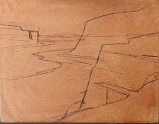
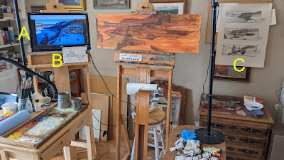
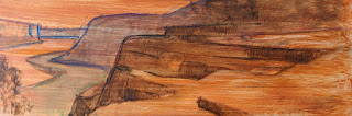
In the studio, I always take my time exploring design options.  This time was no different.  I put a big sheet of newsprint up on the easel and began sketching out some ideas in vine charcoal.  These explorations gave me some exciting possibilities—but I didn't believe any one rose above the others.  I felt each could make a good painting, yet I couldn't decide.  The only thing I could decide on was a long format, a 12x36 (1:3 aspect ratio.)  So, I put the question to my followers on Facebook and Instagram and asked them to vote:


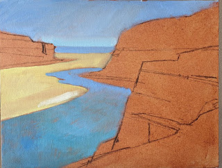
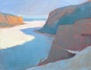
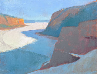
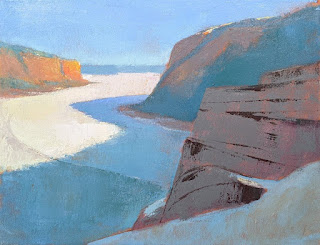
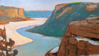
Design "A" got many votes and seemed to appeal to people without question.

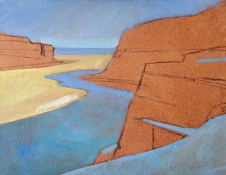
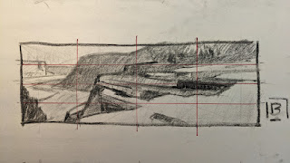
Design "B" got a few more votes than “A."   However, the tree in the bottom left was a problem for some.  It obstructed their visual journey into the distance.  Because of this, one person remarked that, if the distant view of the lake was my subject, “A” would be the right choice; but if I wanted to keep the viewer in the foreground cliff area, then “B” was the right choice.  (The lone tree and the foreground cliff together serve as a fence for the eye.)

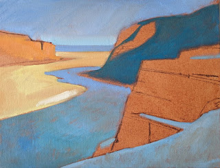
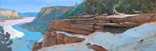
Design "C" got the least number of votes.  But here, the subject was clearly the foreground or middle ground.

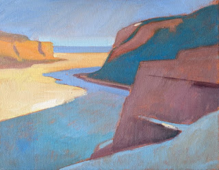
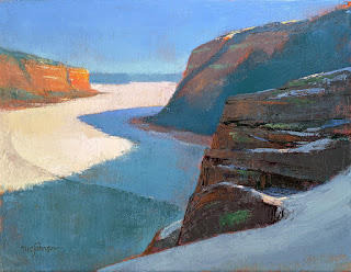
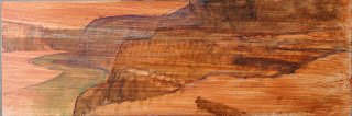
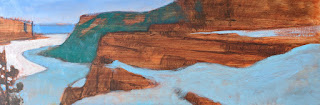
My personal choice was “B,” the result of which you can see at the top of this post.  Although I understood what people were saying about the tree on the left, I was looking at the design in a larger version—4x12—than what most were seeing on their computer screens.  At that size, the tree was less significant and, in my mind, wasn't an obstacle.  For me, it served to keep the viewer's eye from wandering out the bottom left corner and also helped with the feeling of the viewer being high up.

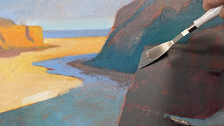
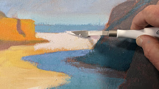
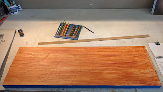
Once I scaled up my 4x12 design to my 12x36 cradled panel, the tree became even less of an obstacle.  Lightening the tree a bit in the painting and darkening the ice behind it reduced the contrast slightly, which further reduced the tree's prominence.  The eye could now follow the little accents of light in the shadows out to the ice and beyond, settling finally on the distant cliff.  I also chose to tone down the “incandescence” of that cliff, allowing the viewer to enjoy the closer cliff a little longer.

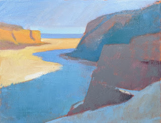
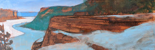
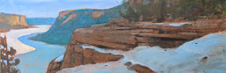
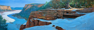
After painting “B,” I decided to tackle a version of the view without the tree.  I wanted to emphasize the lake this time, so rather than trying for a long format and including much of the foreground cliff, I narrowed the view, going with a 14x18 (7:9 aspect ratio) and leaving out the tree. I think it works well, too.  

"Lake Ice 2" 14x18 oil/canvas
Available Here

Input from my larger audience helped with making sure in “B” that the left-corner tree was “tweaked” to serve my purpose correctly, and it also encouraged me to try a version of “A.”  Without that input, I would forever be second-guessing myself on this project.

Sunday, March 6, 2022

Plein Air Live -- and the Plein Air Convention and Expo

View in browser

Come to the Auction at Plein Air Live


You might remember last year about this time I taught at Plein Air Live, the online plein air painting convention.  Although I won't be teaching at PAL this year, I have been asked to put some work in the auction.  I have five pieces in it, and you can see (and bid on!) them at this link. The graphic above shows the paintings, but you can see bigger images at the site.

For some time now Eric Rhoads (publisher of PleinAir magazine) has been running a series of live interviews with artists, which he calls Art School Live.  In the interviews, artists give a short demo.  Eric will be interviewing me on Monday, March 28th, at noon Eastern Time.  (This will be my second interview and demo with him.) My topic:  "Trees are People, Too: How to Paint a Realistic Tree." You can see the playlist of past interviews here.

Eric Rhoads and me at the last PACE

By the way, it looks like the Plein Air Convention & Expo is a "go" this year!  You might remember that I was to be on the faculty back in 2020...then again in 2021...but of course, each of those years PACE was cancelled because of the pandemic.  I don't have a schedule yet, but I will definitely be in Santa Fe and demonstrating.  Registration is still open for the convention, and you can get all the details here:  www.PleinAirConvention.com I hope to see you there!