Authentically Human! Not Written by AI!
All Content Copyright © Michael Chesley Johnson AIS PSNM
Showing posts with label Gamblin. Show all posts

Sunday, September 5, 2021

New Color: YInMn Blue

"YInMn Cliffs with Sunflowers" 9x12 oil / plein air
YinMn Blue, Yellow Ochre, Burnt Sienna,
Hansa Yellow Light, Hansa Yellow Deep,
Titanium-Zinc White
AVAILABLE! - $300

How often does a brand-new color come along? For blues, not very often. The last useful blue for artists, phthalocyanine blue, was created in 1928, But as luck would have it, some scientists stumbled across a new one in 2009 while engaged in research on semiconductors: YInMn Blue.


It's a clumsy name, to be sure. It's composed of the symbols of the components: the rare-earth elements yttrium (Y) and indium (In), plus manganese (Mn). Someone should have a contest for coming up with a better name. Perhaps get rid of the uncommon capitalization, throw in another vowel to make it easier to pronounce, and add an “O” for the other component, oxygen: Yinmino Blue.

It's an expensive pigment not because yttrium and indium are “rare”—yttrium, for example, is 400 times more common than silver—but because they are expensive to mine. The start-up costs for a rare-earth mining operation can edge up to a half-billion dollars. And this is why a 37 ml tube of YInMn Blue from Gamblin lists for $75. (You can get your tube here: https://gamblinstore.com/yinmn-blue/)

How does this color compare with other blues? As primarily a landscape painter, I enjoy a blue that is easily greyed. YInMn Blue fits that need perfectly. In fact, the first time I added a bit of it to a dollop of titanium-zinc white, I immediately got a grey. My initial thought was, “Oh, I must not have cleaned my brush thoroughly.” But then I took up a “known clean” brush and got exactly the same results. Although YInMn Blue looks very intense right out of the tube, it does grey down quickly, making beautiful, soft blue-greys.

YInMn Blue also possesses a weak tinting strength. If you're used to the tinting strength of ultramarine blue and cobalt blue, you'll be surprised how easily YInMn Blue gets lost in a mixture. But as a plus, if you have a heavy hand and tend to add too much color to a mixture—a real problem with something like pththalo blue—you won't have that problem with this blue.

Finally, the color plays well with an earth pigment palette. Earth pigments make mixing the predominantly muted colors of the landscape a snap. (Other than flowers and garishly-painted manmade structures, there's very little rich color in nature.). YInMn Blue is a fitting companion for yellow ochre and burnt sienna. For my test paintings of some of our Southwestern cliffs, the blue cooled the burnt sienna gently, giving me just the right “tweak” on coolness.

I've included here some of my test paintings and color swatches—all of which are, of course, at the mercy of my camera and your monitor. You'll want to make your own tests and see the results with your own eyes.


Masstone/Undertone/Tint
You can see how the tint of YInMn Blue
is distinctly greyer than the other two.

Color Chart
Out-of-the-tube colors are at the top
Tints of YInMn Blue on the left
Other two rows show what happens when  you mix
YInMn Blue with Yellow Ochre and  
Burnt Sienna + tints of same mixtures


"YInMn Cliffs" 9x12 oil / studio
YInMn Blue, Yellow Ochre, Burnt Sienna,
Titanium-Zinc White
AVAILABLE! - $300

"YInMn Sky" 9x12 oil / plein air
YInMn Blue, Yellow Ochre, Burnt Sienna,
Titanium-Zinc White
AVAILABLE! - $200


Sunday, August 29, 2021

My Article on Color Temperature for Gamblin

Final Step of Color Temperature Demonstration
"Winter's End" 9x12 Oil

If you've ever taken a workshop with me, you know I've enjoyed using Gamblin oil paints for many years.  Well, Gamblin Artist Colors recently invited me to contribute a technical article for their web site.  I get a real pleasure in writing this kind of article.  It's not only an opportunity to share what I know, but I get to learn a bit, too.  The articles always involve research, experimenting and creating demonstrations.  Okay, let me be honest—I just love to play around with paint!

The article is about color temperature.  Again, if you've ever taken a workshop with me, you know that I stress using color temperature effectively.  It is key to creating a realistic sense of light and shadow, of form and distance.  If you'd like to know more about this vital topic, you can read the article on Gamblin's web site:   https://gamblincolors.com/understanding-color-temperature/

Sunday, April 11, 2021

Demonstration: Big Cliff Painting

Morning at the Lake
36x36 oil/gallery-wrap canvas
Available

In my previous post, I shared how I start a large painting with oil sticks. Here, I want to show you how I continue the painting, using Gamblin paints plus Gamsol and Solvent-Free Gel to deepen the block-in and to finish. Above is the finished piece. 

Watch this short video (Can't see it? Here's the link):


Sunday, March 14, 2021

Prussian Blue: Peril or Promise?

Some Common Blues
Top row: Draw-downs showing transparency
Bottom row: Tints
From left to right:
Prussian, Phthalo, Indanthrone, Cobalt, Ultramarine
(all from Gamblin)
(From The Artist's Magazine, October 2013)

I've always been a fan of Prussian Blue.  Although many landscape painters like Ultramarine Blue and Cobalt Blue for their skies, in my view these always seem a little too intense and need to be muted.  Prussian Blue already seems more muted, more natural.  It also greys down other colors in the landscape well, especially the reds, and produces a wide range of greens with yellows and oranges.  And I love the way it mixes with earth colors.  One of my favorite palettes:  Yellow Ochre, Burnt Sienna and Prussian Blue.


Rain over the River, 12x16 Oil (Available)
Prussian Blue is great for storms, too.
Painted with Yellow Ochre, Burnt Sienna, Prussian Blue.

In my recent demo for Eric Rhoads' daily series of artist demonstrations, I used Prussian Blue.  Someone observed that the pigment is poisonous, and that I should be careful.  Well, yes, it contains a compound of cyanide, but it is not poisonous.

A student of mine, Charles Eisener, who has a long history with pigments in the medical field, explained this to me, and with his permission, I want to share it with you.  His qualifications: “Over a period of almost 50 years, I worked with dye powders and stains, solutions, solvents and chemicals that most folks do not even know to be part of our medical care system.  Mutagens, carcinogens, caustics, poisons and potential explosives were all part of the mix.”

Regarding Prussian Blue, he writes:

Prussian Blue is a double iron salt complex with cyanide and is a commonly used pigment in many areas, including Histotechnology.  I have used the pigment over more than 40 years in that capacity and have yet to see it labeled as a poison.  Most safety references did not list ANY physical hazards associated with skin contact unless you are referencing the basic chemical "powder."  Like many other chemicals, the bets are off when ingestion or injection is involved.  Even flour can be a hazard when injected.  Chinese white is a close chemical relative; after oxidation it also turns blue.  Ferrous ferrocyanide salts are widely used in many product areas as pigments and carry no explicit hazards to the product user.  Personally, the cadmiums pose far greater health hazards to the user than a worst-case scenario with Prussian Blue given the same type of exposure.

The cyanide is so tightly bound to the iron salt in this pigment that a reaction to the iron salts is far more likely than any potential exposure to what is left of the cyanide molecule.  The other factor is that many manufacturers do not even use the ferrous cyanide salts for their "Prussian Blue."  Some of the synthetic pigments are much easier to produce and thus much cheaper to include in the end product.  As always, it pays to carefully read the labels, so you know what you are paying for, or being exposed to.

He goes on, more generally:

Our primary risk from chemicals, solvents, and pigments occurs during the actual act of mixing and applying paint or cleaning our materials and tools.  Residual risks from artists pigments are very minute, particularly if due diligence is taken with disposal.  Rinse water containing pigments can be precipitated and disposed of as a solid.  Dried paint films are at very minimal risk of releasing cadmium.  Far more heavy metals are released into the environment through household disposables than from artist studios.  This does not mean we should not exercise caution, but rather that risks are quite relative. Some of the pigments currently in use show "unknown" under various risk categories on their official MSDS (Material Safety Data Sheet) forms.  Nobody has done research to determine that potential risk.  Does that mean it is safer than a cadmium color with known risk?  Hardly!  Should we not take more care with an unknown than with a known?

Many common food preservatives and colorants carry health risks if one cares to examine their MSDS data.  OSHA guidelines mandated that gloves and face protection be used when weighing out sodium chloride, yet the cafeteria provided saltshakers on every table.  Risks and safety are relative.  Ingesting too much water or too much table salt can cause health issues or in extreme cases, death.  So can too little!   Safety is a relative term and simply implies the use of common sense and reasonable care based upon our current knowledge of the specific chemical/product.

Here in the US, we have labeling requirements.  It pays to read the label and to know what we're painting with. 

By the way, I am on the faculty for Plein Air Live.  If you haven't already signed up, there's still plenty of time.  You can find out more about Plein Air Live here.


Sunday, July 26, 2020

More News from the Canyon

Canyon Abstract III
16x20 Oil
Available


The good news is, the much-anticipated monsoon season has arrived in New Mexico.  After virtually no precipitation since mid-April, we are blessed with afternoon rains now in late July.  The one cottonwood tree by the house, which has been losing more than just a few leaves, is grateful.  So also are the sunflowers, which are now starting to burst into bloom. 

The bad news is, the rains, which can be quite heavy at times, make mud.  My trail down into the canyon has gotten a little slippery.  Also, I like to sketch my rocks and trees with good, strong sunlight beaming down on them.  The light and shadow patterns make the form of these subjects easier to define.  The clouds are softening the light too much.  So, I am taking a little break from canyon sketching.

In the meantime, though, I have turned to the studio for painting.  My inspiration are the sketches I made in my Pandemic Sketchbooks, Vol. 1, which are all about rocks and canyon walls.  I have chosen another part of the canyon for this third Canyon Abstract.  Below, I'll show you the three reference studies I used, plus the steps in painting the 16x20 version.

One secret ingredient for painting canyon walls:  Gamblin's Warm White.  I used this exclusively in the painting.  Yellow ochre, which is the base color for the walls, cools off just too much if I use my regular titanium-zinc white.  Also, to punch up the color a bit, I included a little Permanent Orange and Napthol Scarlet.  To add life to the warm, dark shadows—mostly painted with Raw Umber—I used Prussian Blue to indicate where the blue skylight spills down into the shadows, creating temperature contrast.

Finally, I've put together the progress shots into a short Youtube video.  If you can't see it in this post, here is the link:  https://youtu.be/n1KPZXDeMOc

Video:


5x8 gouache studies I used as references:


Progress shots of the 16x20 studio painting:


And the finished painting again:

Canyon Abstract III - 16x20 Oil
Available

Sunday, July 19, 2020

The Medium is the Message

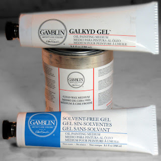
These are the mediums I use most often.


I'm often asked by my oil painting students what mediums to use, when to use them and how to use them.  Frequently, I find students are confused about mediums in general.  “What's this about 'fat over lean'?”  “Maroger medium—isn't that some long-lost secret of the Old Masters?”  “Why can't I just use paint thinner as a medium?”  And so on.

Well, it's not that difficult.  Here's everything you need to know about mediums.

Here's the first thing to know.  It's best to use no medium at all.  A good manufacturer of artist grade paint fine-tunes its product so it works perfectly, right out of the tube.  I always prefer to use paint without adding anything that might negatively alter its working properties or archival quality.

Here's the second thing.  Mediums possess no magic.  Despite the mystique that once surrounded Maroger medium—the inventor, Jacques Maroger, claimed to have rediscovered a secret formula used by the Old Masters—mediums are simply chemical compounds designed to change the properties of paint in certain ways.

So, when should a medium be used?  Here's my list:

  • If the paint is too thick to work, I can add a medium to make it more workable.
  • If the paint dries too slowly, I can add a medium to make it dry faster.
  • If the paint dries too quickly, I can add a medium to make it dry more slowly.
  • If the paint needs a gloss (or matte) finish, I can add a medium to make it more glossy (or more matte.)
  • If an area of a painting needs to have transparent color glazed over it, I can use a glazing medium.

Although there are other situations when one might use a medium, these are the common ones.

Any medium should be used sparingly.  Manufacturers often list the recommended percentage for a mixture.  Gamblin, for example, recommends that their Solvent-Free Gel make up no more than 25% of the mixture.  (That is 1:3, 1 part SFG and 3 parts paint.)

By the way, a medium is not simply paint thinner, like Gamsol.  If you add too much thinner to the paint, you risk weakening the paint film.  The paint will flake off over time.  The only time I use Gamsol is to thin paint initially for my block-in.  After that, I don't use it.  Instead, I use pure paint or paint with a proper medium, which will maintain the integrity of the paint film.

Although there are many brands and varieties of mediums on the market, I basically use three, all from Gamblin:

  • Solvent-Free Gel
  • Galkyd Gel
  • Cold Wax Medium

The first two (Solvent-Free Gel and Galkyd Gel) come in tubes.  I like the tubes because, as a plein air painter, I can just squeeze out a dollop on my palette and not have to worry about it running all over the place.  And I don't have to use those messy medium cups.  (I long ago gave up cups with screw lids, as the lids seemed to get welded on after a couple of uses.)

The Solvent-Free Gel is jellied safflower oil with a little alkyd resin added to it to make it dry faster.  The Galkyd Gel is similar but contains solvent and dries much more quickly.  Both of these give a glossy finish to the paint film.

The Cold Wax Medium is something I use only in the studio.  It contains beeswax with a little Gamsol and alkyd resin added to it to speed up drying time.  It gives a matte finish to the paint, and it can be used thickly to create translucent depth in a painting.  Also used as a final varnish, it can be buffed to the desired level of sheen, like shoe polish.

(For more information on these products from Gamblin:  solvent-free painting mediums,
contemporary oil painting mediums.)

Finally, let me explain the concept of “fat over lean.”  Fatty layers of paint—that is, paint with more oil or medium in it—dry so that they are flexible.  Lean layers of paint—that is, paint that has been thinned with a solvent like Gamsol—dry more brittle.  You want the more flexible layers on top of the more brittle layers to avoid any cracking of the final paint layer.  If you reverse this, and put brittle (lean) on top of flexible (fat), the upper, brittle layer is prone to cracking as the lower layer flexes.  (Cracking, as you might have guessed, is not desirable, unless you are trying to forge an Old Master.) So:

  • Lean = paint with solvent
  • Fat = pure paint
  • Fattier = paint with medium

Medium is always considered “fat.”

Now, here's a secret.  The “fat over lean” rule applies only to “indirect” painting, where one paints in layers over time.  It doesn't matter at all with “direct” or “alla prima” or “au premier coup” painting, where the painting is created in one session.

And that's all you need to know about mediums for basic painting.  There's much more to learn, of course, and I urge you to read more about mediums and then experiment.  The Gamblin site has lots of information on this topic, as well as videos.

Sunday, May 24, 2020

Working with Pastel, Oil Paint and Cold Wax Medium—in One Painting!

Finished 12x14 pastel/oil/cold wax 

Back in the winter—back before the pandemic—our local art group embarked on a series of life drawing sessions. We managed to get just one under our belts before the world collapsed upon itself. Well, the other day, while looking over my sketches, I realized that a couple had potential. With the hot weather driving me into the studio in the afternoons, I decided to take one and make something of it.

I had in mind that I wanted to try an idea I've had about pastel. Pastel is what I call a “crossover” medium. You can draw with it, or you can paint with it. In drawing, one makes marks with the point or edge of the pastel stick; in painting, one makes marks with the broad side. I especially like the way a pastel painting can have all sorts of scratchy “drawn” marks beneath a more painterly application. The drawing remains, showing some of the artist's process. I wondered if I could find a way to retain the drawing aspect of pastel while combining it with oil paint and cold wax medium. I decided to give it a try.

First, I needed to transfer my sketch to a painting surface. Because I didn't want to damage the original sketch, which was done with soft vine charcoal on newsprint, I photographed it, converted it to grayscale, maximized the contrast, and then printed it out in a size appropriate for my 12x14 panel. (The panel, by the way, I had already prepared with one layer of acrylic gesso, one of Gamblin's PVA size, and then two of Art Spectrum Clear Pastel Primer.) I coated the back of this print with a thin layer of compressed charcoal, placed it “dirty side” down on my panel, and used a pencil to trace the major lines. This transferred a thin charcoal outline to my panel.

Here's the original vine charcoal sketch on newsprint:


Here's the high-contrast, grayscale version:


Next, using a dark pastel, I refined the drawing and darkened lines so I could see them better. After this, I blocked in my major color masses with Pan Pastels. And then the fun began. I needed to fix the pastel so it wouldn't be disturbed by the application of oil paint and cold wax. To do this, I:

1. Heavily sprayed the underpainting with matte fixative, but not so much as to liquefy the pastel and make it run; then
2. Brushed on a coat of Gamblin's Galkyd Lite.

Once the Galkyd Lite was dry, I found it had completely sealed the pastel. I was pleased to see that all my interesting little marks were still quite visible. Here's the painting in this state:


From here, I proceeded to paint on top of all this with Gamblin's cold wax medium and oil paint. Here's the finished painting:


And some detail:


I like the effect of the textured wax and touches of oil paint against the pastel underpainting, but I'm not sure I'll take the painting any further. One could, of course, but the risk is that the drawing will become more and more obscured with paint and wax. But the experiment worked, and I'm sure I'll try this again. Maybe you'll give it a try!


Sunday, April 12, 2020

Master Class: Munsell and his Color Theory

"Sunny Morning in Auchterarder" 11x14 Oil - Available
This is the first painting discussed below, with cadmium orange, phthalo green and dioxazine purple.

"Highland Path" 9x12 Oil - Available
This is the second painting, with naphthol red, chromium oxide green and dioxazine purple.


By now, most of us painters have run into Albert H. Munsell and his color system.  Munsell swept away earlier, unsatisfactory attempts at ordering color and replaced them with a more logical model. He gave each color equal space and assigned to it a number that represents its hue, value and chroma.  Somewhere, I read that he felt the Newtonian color wheel, which has red, yellow and blue as its primaries, was too heavily weighted toward the warm colors (red and yellow).  So in his model, he decided there would be not three but five primaries:  red, yellow, green, blue and purple, thus distributing temperature more evenly.

Although Munsell's model is three-dimensional, with the axes being hue, value and chroma, one can flatten out this model into a color wheel.  In it, the complements to the primaries are different from the ones you find in the Newtonian wheel.  As you will recall, the complement pairs in a Newtonian wheel are:

  • Red/green
  • Yellow/purple
  • Blue/orange

But in the Munsell model, they are:

  • Red/blue-green
  • Yellow/purple-blue
  • Green/red-purple
  • Blue/yellow-red (orange)
  • Purple/green-yellow

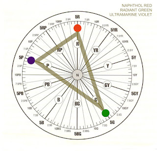
Here's the Munsell wheel with its hue numbers, courtesy of Gamblin Colors:


This makes for color harmonies that are slightly different from ones made with the Newtonian wheel.  I decided to play with this, and made two paintings based on Munsell triads composed of green and two split-complements, purple and red.  (If I'd used the Newtonian wheel, the split-complements would have been purple and orange.)

Of course, the pigments used for such an experiment are important.  Gamblin offers the following list that describes its paints in terms of Munsell numbers:

https://gamblincolors.com/color-temperature-list/

This is a very useful chart if you want to play with Munsell color choices.  (At the moment, the Munsell numbers don't appear on the tube labels, but I think it would be very helpful and have requested that Gamblin put them there.)

I used this list to make my color choices.  For the first painting (“Sunny Morning in Auchterader”), I used phthalo green (5BG), cadmium orange (5YR) and dioxazine purple (2.5P).  I intentionally made my choices a little off so you could contrast it with the second painting.  Here's how these colors are plotted:


If I'd wanted to get a true split-complement triad, I would have chosen instead radiant green (5G), naphthol red (5R) and ultramarine violet (5P).  See how these are plotted, and notice the nice isoceles triangle with green at the apex:


Unfortunately, I don't have radiant green or ultramarine violet on hand.  So, for my second painting (“Highland Path”), I did my best.  My choices were chromium oxide green (2.5G), naphthol red (5R) and dioxazine purple (2.5P).  Here's the chart:


These are closer to being a true split-complement triad.

Of course, for both paintings, I included a few other colors.  For the first painting, I added minimal amounts of permanent green light, chromium green and napthol red, and I greyed down most colors with Gamblin's Portland Greys.   For the second, I used touches of permanent green light and yellow ochre, and again greyed down color with the greys.

There are, of course, many variations on triads.  If you're looking at the charts, I think building a triad around an isoceles triangle is a good solution.  (This triangle has two sides of equal length; the main color choice would be at the point where these two sides join.  Although note that according to this idea, in my paintings, where green would have been the main color choice, it is not the dominant color—violet is.  But the green does have more impact because of its rich chroma and lighter value.)

Does your brain hurt yet?  If you'd like more information for your own experiments, here are some good resources:

Gamblin's discussion of the Munsell system as relates to its products:
https://gamblincolors.com/munsell-color-system/

“Navigating Color Space,” a video discussion of Gamblin's use of the system:
https://gamblincolors.com/navigating-color-space/

An article about the importance of color theory in painting:
https://munsell.com/color-blog/the-importance-of-color-theory-in-painting/

An article about color harmony with respect to the Munsell system:
https://munsell.com/color-blog/visual-analytics-color-wheel-triad-harmony/

An article about Munsell as an artist:
https://munsell.com/color-blog/albert-h-munsell-artist/

And a very good book on the history of all of this:
Color: A Visual History from Newton to Modern Color Matching Guides by Alexandra Loske.
https://www.amazon.com/dp/1588346579/ref=cm_sw_em_r_mt_dp_U_trGFEbG9FJRCS

Wednesday, February 5, 2020

Old Man of Hoy

Old Man of Hoy
18x22 Oil/Cold Wax
Available

We haven't had much snow this winter, but what we have had is sticking around.  It's slow to melt.  And when it does melt, it makes mud.  The dirt road up the mesa behind us, where I like to walk to clear my mind, has been deep in mud for weeks now.  A recent warm spell has dried it up a little, but it's still long stretches of mud bracketed by shorter stretches of dry.  Now on my walks, at the end of a dry stretch, I leave the road and step carefully through the cacti and sandstone outcrops that line it.  Although the area off the road is also muddy, little clumps of bunch grass serve as stepping stones.  The clumps sit a few inches above mud level, and if I'm careful, I can carry on, unsullied.

The mud has hindered my plein air painting.  So, I've been doing more studio work this winter.  With another trip to Scotland coming up in June, I've been revisiting in my mind our trip to Orkney two years ago.  This week, I made a painting of the Old Man of Hoy, a well-known sea stack just off the island of Hoy.

I first caught a glimpse of the Old Man from the ferry that runs from Thurso, in the north of Scotland, to Stromness on Orkney's “Mainland.”  As we rounded the towering cliffs of the southern tip of Hoy, the Old Man suddenly came into view.  It truly does have the proportions of a human, although on a gargantuan scale.  Nearly 450 feet tall, it is one of the tallest sea stacks in England.  Composed of layers of red sandstone, it is separated from the main cliff of Hoy by a 200-foot gap.  Although it looks ancient—you might think it dates back to the prehistoric times of the Picts—it came into being some time after 1750.  Experts say it may not last much longer because of the fierceness of the sea and the softness of the stone.  Here's how it looked in 1817, when it had two legs, in a painting by the artist William Daniell:


And here's how it looks today.  Once we got to Orkney, we took a day trip to Hoy, where we took the long hike out to the cliff that overlooks the Old Man. It was a blustery day, churning with mizzle, and my old Gore-Tex coat finally breathed its last and I got soaked.  But the view!  I teetered right on the edge with the wind snatching at my coat as I peered across the gap at the Old Man.


For my painting, I decided first to sketch out a number of possibilities in pencil.  I offered these up to my followers on Facebook and Instagram and asked them to vote for one.  (I here now apologize to them, as I didn't use their choice.)  Next, because cool colors were going to dominate in the painting, I toned my 18x22 panel with Gamblin's Permanent Orange to add a warm note.  I completed the painting with my current palette of three secondary colors—Permanent Orange, Dioxazine Purple, Phthalo Green—and lots of Gamblin Portland Grey. I also used Gamblin's Cold Wax Medium to create an impasto and add translucency.

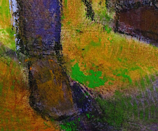
This painting is not meant to be a photographic representation of the Old Man.  I took  liberties with the scene.  Among them, I lowered the cliff on the left to make the Old Man rise taller; pushed the saturation of the colors; and abstracted the foreground.  The painting is more about feeling and texture.

Design sketches

18x22 panel toned with Gamblin's Permanent Orange,
plus the design transfer

Block-in.
I ultimately eliminated that sunlit green patch on the cliff bottom.

Old Man of Hoy
18x22 Oil/Cold Wax
Available

Close-up of texture

Close-up of texture