Authentically Human! Not Written by AI!
All Content Copyright © Michael Chesley Johnson AIS PSA MPAC

Wednesday, March 29, 2023

Abstracting the Landscape: Workshop with Scott Gellatly

View in browser

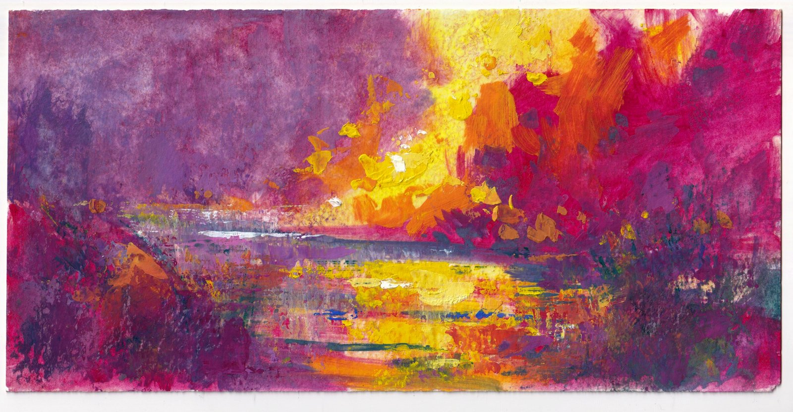
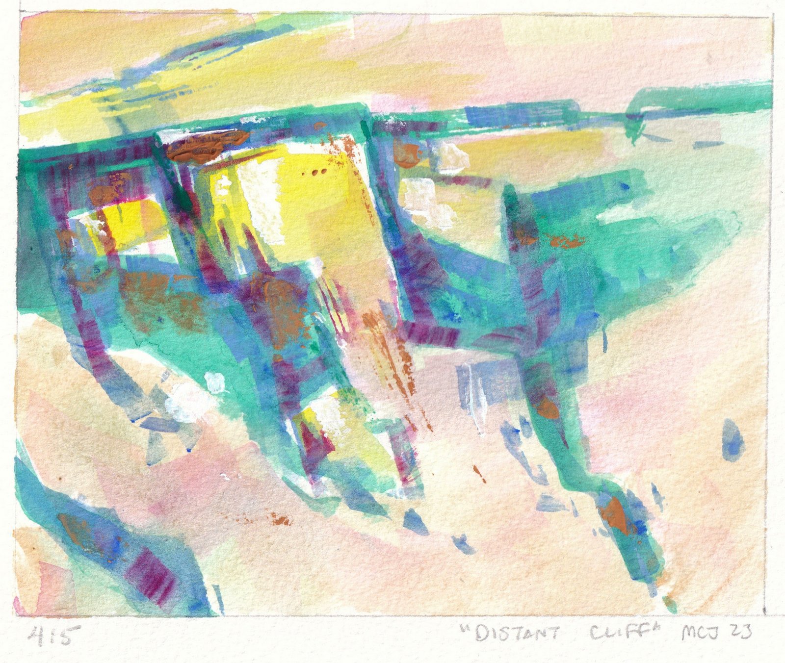
"Rio Grande" 4x8 Watermedia on Cold-Press Watercolor Paper
(One of the abstractions I came up during the workshop.)


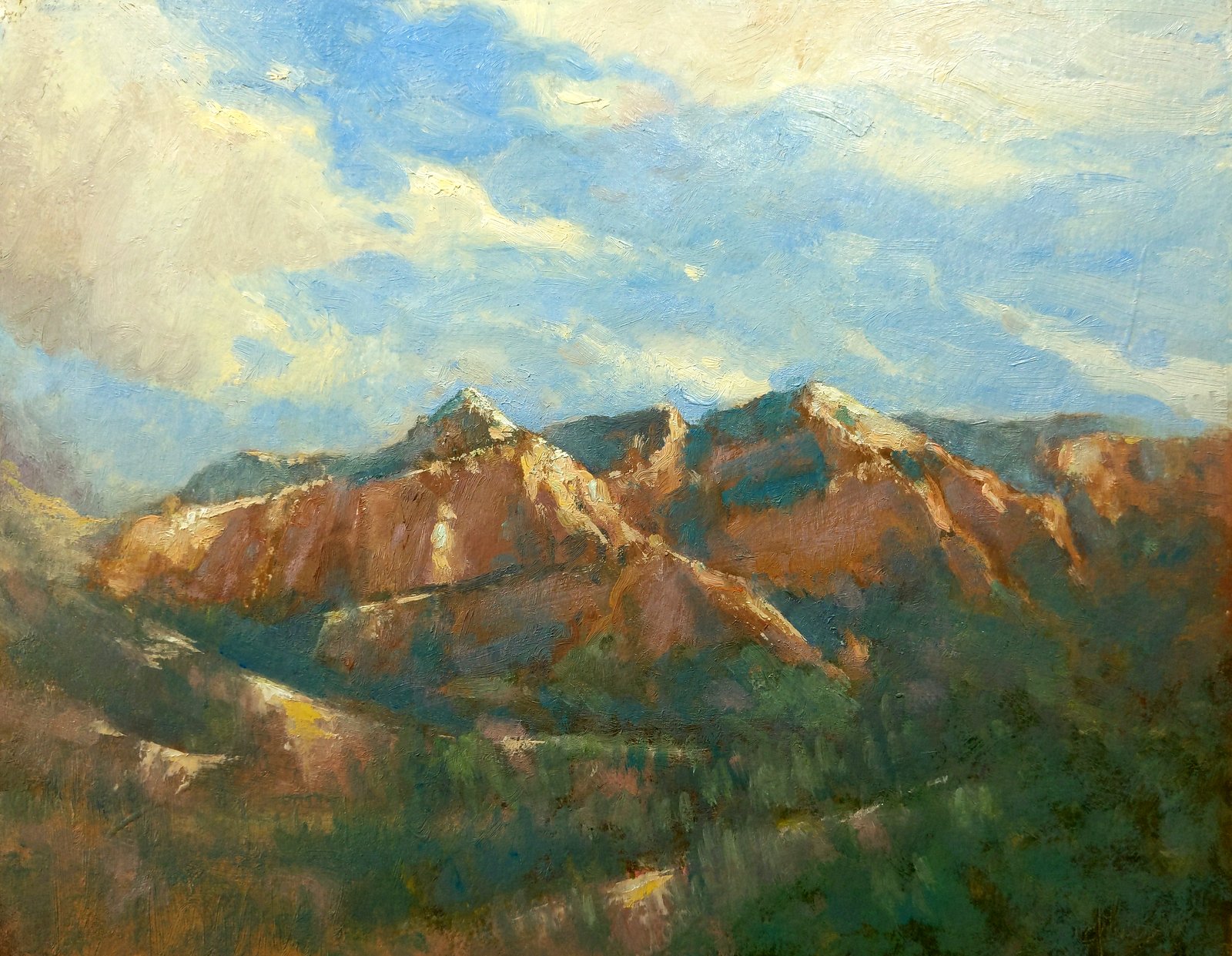
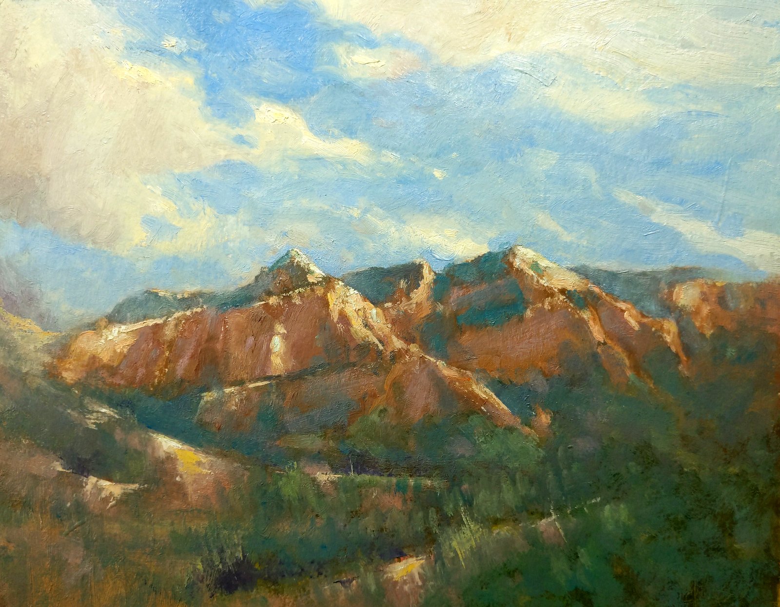
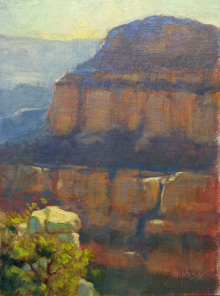
As a long-time, committed plein air painter, I tend to paint what I see.  Sure, I may "abstract" the landscape, as most outdoor painters do, by squinting or making a thumbnail sketch.  Really, though, this isn't abstracting so much as simplifying—rendering the landscape in a few simple shapes and values.  My purpose is to take a three-dimensional view and flatten it so I can transpose it easily to canvas.  The result can, indeed, look pretty abstract.  But then my very next step is to re-install the third dimension and add bits of detail.  In short, to make it look like what I see.

I don't care for abstract painting, per se.  Most of it is just lazy painting.  It looks like decorator art—something you'd see in HGTV's "Property Brothers", whipped up out of masking tape and spray paint.  (Granted, that's often the best the team can do with an exhausted project budget.)  But what if we take the landscape and use it as a jumping-off point for abstraction?  What if we move it beyond reality to a place where the paint and the surface are more important than the scene itself?

Now, this kind of abstract painting I do like.  It takes the real and pushes it—richer color, stronger rhythms—all in an effort to enhance whatever quality of the scene attracted us in the first place.  In the process, the landscape takes a back seat, letting design elements and principles drive the painting, with tools and materials riding shotgun.  The result can excite and engage far more than the actual scene.

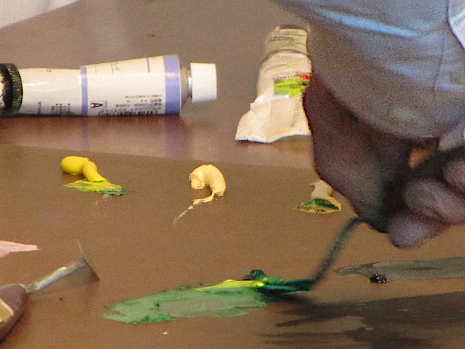
It's something I've always wanted to experiment with.  I've tried it on my own, but it was a struggle.  So, I was delighted to see that my long-time artist friend Scott Gellatly was offering an online workshop on this very topic through the Winslow Art Center on Bainbridge Island, WA. Over three weeks, he explained the process and gave us homework.  Playing with a variety of watermedia—watercolor, casein and gouache—plus a variety of tools and surfaces, I based my experiments on plein air sketches.  

I've included in this post some of my favorite results from my week.  Some are more abstract than others; in most cases, you might have a fair idea of what they represent.  All of them are 8x10 or smaller.

Am I satisfied with them?  Well, I had enormous amounts of fun, but I still struggled.  For me, having painted realism all these years, pushing the real into abstraction is hard work.  It's so easy to fall back on old ways, adding atmospheric perspective and details.  Fortunately, there is no recognized, absolute degree of abstraction in this game; the road between photorealism and the non-objective allows for many stops along the way.

One thought:  Can I take this approach into the field with me?  Can I push the abstraction while standing in front of my subject?  Often, just painting the subject in a representational manner is hard enough.  Adding the complexity of interpreting it in this new way might break me—or will it make me a stronger painter?  It will certainly give me new eyes.

I expect Scott will teach this workshop again.  I highly recommend it, and you can keep in touch with the Winslow Art Center's offerings here.


Sunday, March 26, 2023

Extreme Makeovers for Plein Air Paintings: Spring Freshet

View in browser

Madeover: Spring Freshet
11x14 Oil / Available
Read about my process below

(Continuing my series of Extreme Makeovers for Plein Air Paintings.)

I like to paint snow and especially snow that has gathered around a stream.  I found one such scene not too far from my house, where I was able to set up on a little bridge directly over the creek.  Two things about this scene caught my eye:  the overall softness and the dynamic rush of water.  I was fairly happy with the result, but after having the painting framed and on my wall for a few years, I decided that the pattern of the rushing water swept the viewer right out of the frame. A painting should aim to keep the viewer within its four walls.

Original

1. To help the viewer find a better way up the waterfall, I extend the water to the right, over the rock in the near foreground.  

2. In an effort to keep the viewer from going too far to the left corner, I lighten the water there.  Maybe I should just make it a snowy bank?

3. Now confident about that snowy bank, I paint it in.  It also balances the snowy bank on the right.

4. I add bits of ledge beneath the waterfall.  Rather than being swept out of the painting, the viewer can now crawl up the waterfall and into the scene.  I even give him some extra rocks to hang onto in case he loses his footing. 

5. Finally, I add touches of blue.  I always thought this piece was overly warm.  Cool accents of Cerulean Blue Hue on the water here and there offset the warmth.  I also harden the edges of some of the foreground rocks to add interest and also to contrast with the distant softness.


Wednesday, March 22, 2023

AI Fears: A Tool to Help

View in browser

Here's an image of a painting of mine that I cloaked.  Top is the original, and below are two different degrees of cloaking.  Can you tell the difference?  Down below I'll post zoomed in sections of each that might help.


I've written before about artificial intelligence (AI) and its  impact on the art community.  Commercial artists, especially, worry about AI bots mining their work for use in image-generation systems without compensation.  But now there's a possible solution, Glaze.

Glaze was created jointly by an academic research group at the University of Chicago and several professional artists. The inventors say:
Glaze is a tool to help artists to prevent their artistic styles from being learned and mimicked by new AI-art models such as MidJourney, Stable Diffusion and their variants. It is a collaboration between the University of Chicago SAND Lab and members of the professional artist community, most notably Karla Ortiz. Glaze has been evaluated via a user study involving over 1,100 professional artists.  [I participated in the study.]
Basically, the tool makes subtle changes to an artist's image, causing the AI to see it as having been made by another hand.  (The Glaze team calls this change "cloaking," and it's nearly undetectable by human eyes.)  When the AI sees a cloaked image of one of my paintings, for example, it may see my style as being more akin to Van Gogh's.  If I upload many cloaked images to the Internet and these get incorporated into the AI's training dataset, over time the AI will gradually "learn" that this is my style.  So, when someone prompts the AI to "paint a landscape in the style of Michael Chesley Johnson," it will generate one that looks like a Van Gogh.

But I see a couple of problems.  First, the slowness of the software.  The tool allows the user to change the degree of protection it gives, but the better the protection, the longer the process takes—up to many minutes per image.  Also, because the tool runs locally rather than server-side, it requires you to download several gigabytes of resource files on installation.  (And these will need to be updated periodically.)  No doubt these issues will be addressed in future versions.

But I see a bigger problem, one that has to do with the proportion of cloaked to non-cloaked images in the dataset. Here's an example.  Frank Frazetta was an extremely popular illustrator in the science fiction and fantasy industry for many decades.  If I do a Google search on "Frank Frazetta images," I'm told there are 2.4 million results on the Internet.  No doubt most if not all of these images are already in the dataset.  Cloaking won't affect any of these images; it only works on new uploads.  I expect it will take a long time for enough cloaked images to be added to make a difference for Frazetta.  (Although perhaps the AI might develop a preference for "learning" from newer images rather than older, which would help.)

Will I use the tool?  Probably not, since I'm not a commercial artist and don't share their concerns. But I do find how this is playing out interesting.  Maybe I will worry more when 3D printers capable of spitting out actual oil paint are being used with AI image-generation to create wall art in my style.  But I'm too much of an experimenter to have a particular style, so maybe not.

If you need more background on how AI image-generation works in order to understand all this, go read my other posts on AI as well as the FAQ on the Glaze site.  You can also download the tool there.

Here are zoomed-in sections of each of the three images above.  I can see a small difference in each, with the largest difference in the Level 25 version.

Original


Level 25 Cloaking - somewhat noticeable

Level 75 Cloaking - very noticeable

Sunday, March 19, 2023

Extreme Makeovers for Plein Air Paintings: From the North Rim

View in browser

Madeover: From the North Rim, 12x9 Oil
Available, PM/DM me if interested
Read about my process below

(Continuing my series of Extreme Makeovers for Plein Air Paintings.)

Why's the South Rim of Grand Canyon National Park such a crowd scene?  Well, it's incredibly easy to get to.  Major roads from Flagstaff, I-40 and elsewhere zip you right to it on a beeline.  The North Rim, on the other hand, isn't so easy.  The drive from the South Rim's visitor center to the North Rim is a good four hours.  And because of snow and high terrain, the road from Jacob Lake, the only road that gets you there, is open just from mid-May through November.

Even though I've painted the South Rim many times, I've managed to get to the North Rim just once.  On an early November RV painting trip to Marble Canyon and Vermilion Cliffs in northern Arizona, my friend M.L. Coleman and I decided to head to the North Rim.  Unfortunately, this was right after a full federal budgetary shutdown (thank you, Congress), and the Park had laid off most of its employees because of it.  Because of the lack of staff, the only road open was the one that goes to the Grand Canyon Lodge. This was unfortunate, because other roads lead you to some fantastic views, especially near Point Imperial and Cape Royal.  Because of this—and the fact that the long drive had cut into our time and we still had to find a campsite for the night—we stayed only long enough to do one painting each.  

For some reason, my painting skills were off that day, and I was never happy with what I came away with.  As I was going through my boxes of old paintings, this one struck my fancy as one that I could improve easily.

Camping at Marble Canyon, heading to the North Rim

North Rim view

North Rim view

Grand Canyon Lodge

Posed photo, but yes, I'm painting


I'm sorry I didn't take progress shots on this painting, but the changes were simple.  (I've included some travel shots above for interest.)

1. Original painting, 12x9 oil on linen-covered board.  I don't like that this piece is trapped in mid-values.  It has a somewhat warm and hazy appearance—I don't remember, but maybe it was hazy that day from controlled burns—and I want to correct this by extending the value range. The painting also has a single focal point, the foreground cliff, and I want to give the eye another place to wander to.

2.  Makeover.  I lighten the top of the foreground rock, apply richer greens to the vegetation there, and also add some darker notes.  This pulls the rock closer to the viewer and increases the sense of depth in the view.  To enhance this depth more, and to cool off some of the piece's overwhelming warmth, I add richer blues to the distant, vegetation-covered cliff areas.  Finally, to add a secondary point of interest, I add some raking light to the distant cliffs.

Will I go back to the North Rim?  I hope so.

Thursday, March 16, 2023

Zoom is Here to Stay: Mentoring and Critiques

View in browser

Missing Luggage?


News flash: Zoom is here to stay.


Sure, in-person events have come back in full force, but online versions of the same have settled in for the long haul. Why? People have discovered they can get most of the benefits of an in-person event without having to shell out the big bucks for travel, lodging and meals. Nor do they have to endure hassles like flight delays and cancellations, lost luggage, heavy traffic and closed rest areas (why are so many closed these days?)

For some time now, I’ve been offering critiques and mentoring via Zoom. (Ever since the earliest days of the Pandemic, in fact.) The students I’ve worked with have both enjoyed and profited from my programs. Sometimes it’s just been a simple critique of work; other times, a longer relationship in which I helped a student find a better path forward. Being able to help when it wasn’t possible to visit in person—whether because of the Pandemic or some other obstacle—has been rewarding for me, too.

If you’re not aware of my online programs, here they are. (You can also go to this link for more details.)


One-on-One Mentoring: Are you looking to improve your painting and career as an artist?


Mentoring consists of weekly one-hour sessions over the course of four weeks for $300. The first Zoom session consists of an initial evaluation of your work, a discussion of your goals and an assignment designed to take you in the direction you wish to go. Following sessions consist of a discussion of the previous week’s assignment while addressing any questions you may have plus a new assignment. In the final session, I give you an action plan for the future.

Sessions preferably run over one calendar month. I am available most of the year, except when I am traveling between my summer and winter studios. I usually travel in late May and early June, and also in late August and early September.

(By the way, I also offer in-person mentoring, if you prefer, via my Private Intensive workshop. For details, go here.)

Critiques: Are you looking for feedback on your paintings?


For $50, I will critique two of your paintings and discuss the changes with you. This one-time Zoom session lasts an hour. We’ll arrange a mutually-agreeable date and time to meet.

I ask for images in advance. Then, before the session, I run each image through what I call my “Photoshop mill” and make changes to improve the piece. This is something I cannot do in a workshop because of the preparation time. And, rather than me just pointing to different parts of a painting and talking about it—which is all I can do in a workshop—I am actually able to share my computer screen and show the changes, step by step.

Testimonials? Here’s just one:

To say it was one of the best learning experiences I have had is not an exaggeration. It was rich in information that you were willing to share. … Every session you focused on different goals. I found that very helpful. Your teaching style is very thoughtful and supportive. You made it the outstanding experience that it was.

I hope you’ll join me for a critique—or better, embark with me on an ongoing journey in the mentoring program.

Sunday, March 12, 2023

Extreme Makeovers for Plein Air Paintings: The Cliffs of Zion

View in browser

Madeover: The Cliffs of Zion
12x16 oil / Available, PM/DM if interested
Read about my process below

(Continuing my series of Extreme Makeovers for Plein Air Paintings.)

I've painted at Zion National Park many times, usually in the early morning and just as the sun was coming up.  Well, there is a certain difficulty with this.  If you haven't been to Zion before, you need to know that if you follow the river into the canyon, which I think has some of the best scenery, the passage becomes narrower and narrower and the walls, closer and closer.  When sunlight penetrates into the canyon striking one wall, the light seems to bounce around forever in the shadows, causing all the shadowed walls to glow with a warm light.  Sometimes this bounced light seems to be very bright—and therein lies the problem.  Our eyes see warm colors as being lighter in value than they are.

1.  Here's a 12x16 oil plein air painting I made several years ago at Zion.  You'll note that the values of the shadowed walls are very light—too light.  So, I begin to make adjustments.  And, of course, one thing always leads to another....

2.  The painting needs some highlights for focus.  I add a tiny light shape—it could be a rock—beneath the sunny cliff area.  I also add a tentative highlight on the peak in the upper middle.  I am thinking of strengthening a pattern for the eye to follow through the painting.

3.  To make the peak with the new highlight stand out a bit more, I darken the sky.

4.  Now to the meat of the matter.  I darken the shadows on the cliffs.  I remember there being a distinct blue tone to the shadows, not that overall warmth that I'd painted originally.  I'll worry about adding warmth back in later.

5.  The shadowed middle ground and foreground grasses and shrubs are too warm, so I work in some of that same shadowy blue I used on the cliffs.  I also begin to play more with the patterning, especially in the foreground, where I add some strong darks.  Oh, and I change the shape of the highlight on the peak, giving it more interest.

6.  I decide the dark accents in the foreground change the balance in the painting too much, so I remove them; instead, I suggest rocks on the left.  This better balances the "weight" of the light area on the right, where the shadow cuts diagonally across the cliffs.  I also change the pattern of the fallen lit rocks just below this, as they seem too distracting at this point.

7.  I like the rocks I added to the left, so I work on them a bit more, giving them more interest.

8.  Still thinking of a pathway for the eye, I add dark accents again to the foreground, but this time I keep them subtle.  

9.  Satisfied with the pathway, I now go back to my shadowed cliffs and overlay strokes of warmer color to indicate bounced light.  I don't want to overdo it, so I manage my values carefully—something that's hard to do in the field, in the heat of the moment, with all the light bouncing into one's eyes.  I also restate the geology of the cliffs, as I lost some of the characteristic strata while overpainting earlier.

10.  Finally, I add more texture with a knife to rocks and grasses/shrubs. I also repaint the sky, creating a gradation from warmer blue on the left to cooler blue on the right.  I add hints of these colors into the grass/shrub area.  I think it's done.  Do you?


Monday, March 6, 2023

Get It Now: Plein Air Live Auction

View in browser


Even though I'm not on the faculty of Plein Air Live this year, I was invited to submit some paintings for the auction that is held in conjunction with the event.  I thought I'd share with you the link to the auction.  You can see my paintings at the auction through this link.   (If you like to see the other 100+ paintings up for auction, simply clear the search field.)

The auction goes live today (Monday, March 6) at 1 pm ET and runs through March 11.

Happy bidding!

Sunday, March 5, 2023

Extreme Makeovers for Plein Air Paintings: Clouds and Peaks

View in browser

Madeover:  "Clouds and Peaks"
12x16 Oil / Available
Read About My Process Below

We've all been here:
With bold confidence, I apply the last stroke of paint.  I step back, feeling pretty good about this one.  Yes, indeed, I've made a fine painting.  I pack up my gear, satisfied, and head home.  I sleep well that night.

But after some time, I go to the studio.  As I pull the painting out of its box, my pride takes a hit.  Something about the design isn't quite right.  And the color seems a bit off.   Hesitant, I heft the painting in my hands.  Should I heave it into the recycle crate or try to save it?
Usually, when I bring a painting back from the field, it only takes a moment of consideration and a stroke or two to bring it to completion. (I give myself no more than 30 minutes to work on a painting this way.)  But now and then, a painting calls for more than that.  Because I think there's still hope for it, rather than scraping it down, I put it in a pile with other misfits.

This winter, we've had unusual weather for the Southwest—weeks of cloud and lingering snow.  Since I didn't feel like going out to paint, I took the opportunity to go through some of my old plein air pieces to see if any of them could be redeemed.  I pulled out a stack that had promise and decided to make my best effort.

And that's what this new blog series is about:  Extreme Makeovers for Plein Air Paintings.  I want to walk you through my process for each of them.  Here's the first one.

1.  Original painting.  I painted this in Sedona, Arizona, years ago as part of a plein air festival.  I believe that I was enchanted by not just the mountain view but also the Italian-villa-style bit of architecture in the foreground.  I was never quite satisfied with this painting, and I think it was because the building had as much interest as the distant mountains.


2.  Building wipe-out.  Often, when not pleased with a piece, I'm not quite sure what the problem is.  Not so here.  I was fairly certain that the building is more of an obstacle for the viewer than a pleasing enhancement.  My first action is to immediately paint out the structure.  I also add a few tentative touches of a richer blue into the shadowed mountain vegetation; the scene seems overly warm and a bit muddy, so I'm working toward putting in some purer cool notes.

3.  Foreground.  With the building now gone, I can see that the mountains were indeed what first attracted me.  This is already a big improvement.  However, the foreground now becomes a problem; it doesn't have any topography to support the viewer "walking" out into the distance where the center of interest is located.  I make a stab at introducing a pattern.

4.  Patterning. The pattern helps, but it needs to be enhanced.  Having hiked over this terrain countless times, I have a good sense of what to do here.  (I find that an intimate familiarity with a particular landscape always helps the painting.)

5.  More foreground work.  I continue reinforcing the idea that this pattern is perhaps a road that follows a set of ridges that lead the viewer up.  I plant trees and shrubbery to help the road come and go visually, providing a little mystery.

6.  Into the mountains and sky.  Satisfied that the foreground is now working with purpose, I move to the mountains.  I sharpen edges, punch up highlights, giving the rocky ledges a more "rocky" feeling.  I also think the sky needs a little work.  It's a bit muddy, so I add some of the purer blue that now appears in the shadowed mountain vegetation and reshape the clouds into a more pleasing pattern.  I also add more touches of blue into the mountain areas.

7.  Finished.  I add a few dark notes into the foreground to bring it closer to the viewer, enhancing the sense of depth in the painting. 

This "extreme makeover" went pretty quickly, as I knew right off the start what the biggest problem was.  Once I corrected that, everything else seemed to follow logically, step-by-step.  Not every painting needing a makeover goes this smoothly, as we'll see in upcoming posts.

Wednesday, March 1, 2023

Art that is Authentically Human

View in browser

The Simple Pleasure of Pushing Around Paint

I've been doing a lot of reading about artificial intelligence (AI) and how artists and other creators are worried about its impact on their world. Although there are a few cheery types who say AI will only make things better, many in my extended circle do indeed worry. Money-making opportunities for commercial artists, journalists and programmers will be harder to come by as ad agencies, newspapers and Big Tech turn to AI for their business needs.

But as a creator of "fine art," do I care? I certainly feel sympathy for those who may soon be out of work. The art I create, however, is authentically human—and I think there will always be a market for that. Can an AI churn out marketable art that might be described as handcrafted, handmade or artisanal? It might look that way, but you couldn't label it as such without tampering with your moral compass. (For the record, I've never liked the word "artisanal"—to me, it suggests a corporation trying to market factory-made cheese as if it were made by a family farm.)

Fine art or craft, it doesn't matter. While you might buy a pretty but mass-produced coffee mug at Walmart, you might pick up a more beautiful, handmade mug at a craft fair. I'd rather have the mug made by a real potter, as it is embodies the character of the artisan who made it. (I love finding the ghost of a fingerprint fired into the clay.) I'd treasure this authentically-human item, whereas if the Walmart mug breaks—oh, well.

Certainly, the technology for creating 3-D printed paintings, ones that look like the real thing right down to the brush stroke, is almost there. In the very near future, you'll be able to buy an exact reproduction of a Van Gogh sunflower painting, scanned in at a zillion DPI and printed with real pigments like chrome yellow. Now, plug an AI into this technology, and even a person with no talent could create and "print" an oil painting—one that looks as if an actual human wielded the paint brush.

Yet these works won't be authentically human. Even though they'll be created from a vast data set that includes lots of authentic, human-made images, they won't in themselves be authentically human-made.

Will I be able to tell the difference? I don't know. But I bet there'll be a cooperative effort by artists and artisans to have "Authentically Human" stamped on everything they make, and a "Made by AI" label stuck on all the rest.

But let's step back a moment from all this worry. Why did I choose art as a career? Certainly, I had to make a living. But there was more than money involved in my choice. I love to hold a brush. I love how paint first resists the brush and then softens to accommodate it. I love how the brush, the paint and I all work together, intimately, in the process. As I've said before, for me it's more about the process than the product. As long as I continue to work in this way, with simple tools and a simple process, and with a minimum of technology, I'll be happy.