Authentically Human! Not Written by AI!
All Content Copyright © Michael Chesley Johnson AIS PSNM
Showing posts with label Studio Tech. Show all posts

Sunday, June 16, 2024

How Clean is YOUR Palette?

View in browser

**Authentically Human! Not Written by AI**


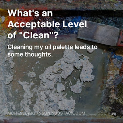
Some thoughts of cleaning one's oil palette. Link here.

Sunday, February 4, 2024

Useful Practice: Copying the Masters

**Authentically Human! Not Written by AI**

Who's the artist?
(Pssst...me, but I'm copying John Singer Sargent)

Copying masterworks is nothing new.  Art students have done it for as long as there have been art students.  It's a useful practice, because it helps you understand the master's process, and it can teach you about composition, color use and more.

Recently, I started taking an online Schoolism course from Nathan Fowkes, one called "Environment Design."  (Perhaps more about that in a future post.)  As one of the first exercises, he asks the student to copy ten paintings that the student admires, paying special attention to simplifying the painting and to exaggerating what each painting's about.

As much as I'd love to go to a museum and plop down my easel in front of a beautiful painting, I don't live anywhere near one.  Intead, I went to my collection of art books—these are big coffee table books that a weightlifter might use to train with—and laid them out on the workbench in my studio.  Paging through them, I put yellow sticky notes on paintings that I've admired over the years.  I went through a lot of yellow sticky notes.

Next, I pulled out my casein paints.  (Not sure what casein is?  I'll write about that next.)  As I worked on each copy, I propped up the book—not an easy task when it seems to weigh 20 pounds—and got to work.  Each copy was small, less than 9x12, and quick, no more than an hour, to avoid having time to add detail.  

With each copy, I posted an image of it on social media and asked followers to guess who I'd copied.  Most folks got them right, but one puzzled all but a friend of mine, a collector who knows his art. I thought I'd share my copies here, along with the names of the artists.  There were so many more I could copy, but I want to move on to the next section of Fowkes' course.

What did I learn from this exercise?  I'm not going to tell you.  Try making some copies yourself, and see what you learn. 

Yes, another Sargent.

Joaquin Sorolla

Granville Redmond
 (A California impressionist, but not a household name.)

Eduoard Manet


Sunday, October 22, 2023

Removing Varnish

View in browser

**Authentically Human! Not Written by AI**


Okay, let's assume you've varnished your painting.  (And if it's good enough to frame, why wouldn't you varnish it? Here's a post on that.)  But after having had the painting lying about in your studio for awhile, you suddenly realize that the painting needs another lick or two with the brush in order to reach perfection.

You wonder: Should you just go ahead and get out the paint, or should you remove the varnish first?

The problem with painting on top of varnish is that varnish, unlike oil paint, is not meant to be permanent.  Somewhere, years down the road, a conservator or restorer may find the need to remove the varnish in order to clean or touch-up the painting.  If you've painted on top of the varnish, that extra paint will be removed along with the varnish.  I know sometimes we forget to sign our paintings, but it's best if you don't sign them after varnishing!

You must remove the varnish first.  And you must remove it from everywhere on the painting—not just where you want to place your signature or repaint an area.  To not remove all the varnish will result in an unpleasant patchiness.  I tried that once, and I ended up having to go back a step and remove all the varnish properly, re-sign the painting, and then re-varnish it.

To remove varnish, you need to know what type of varnish it is so you can determine what solvent to use.  Is it an acrylic resin varnish or a natural resin varnish?  Damar resin, which you find in a natural resin varnish, will not dissolve in mineral spirits; for this, you need turpentine or a citrus solvent.  An acrylic varnish, on the other hand, can be removed with either mineral spirits or turpentine or a citrus solvent.

I varnish my oil painting with Gamblin's Gamvar, and if I need to remove the varnish, I use Gamsol with a soft, lint-free cloth.  I dampen the cloth repeatedly with Gamsol (wearing nitrile gloves, of course, and with good ventilation) and, using a gentle, circular motion, go over the whole canvas.  I can tell the varnish is gone because I typically use a gloss varnish, and when the Gamsol dries, the surface of the painting has a dull, matte look.  Once it dries, I can repaint (or sign) as needed.

By the way, it's not too late to get into my one-day, studio-only workshop at Art Fest in Mesa, Arizona.  The workshop is THIS THURSDAY, October 26th! in it, we'll take plein air references and learn how to create finished studio paintings from them.  You can get $20 off if you use the coupon code SAVEONMF.  You can learn more and sign up here.   

Saturday, December 31, 2022

AI and the Painter, Part 2: A Path Forward

View in browser

"Cottonwood Days" / 12x16 Oil
Based on AI-generated image

In my previous post on AI (Artificial Intelligence), I wrote about what AI image generation is and how it works.  In this post, I'll share an idea of how AI may be useful to what I call the "get your hands dirty" painter.

First, let me say that, for me, AI can never replace what I do as an artist.  Making art is all about touch—holding a brush or pastel stick, stirring a pile of paint with a knife, drawing an expressive line with a lump of charcoal.   You get none of this tactile satisfaction when you feed prompts to an AI.

Yet I have a curious mind, and recently I wanted to see if the technology could help an artist like me.  In the studio, I use reference material gathered in the field—photographs, pencil sketches, color studies—to create a work that is more "considered" and finished than a painting I can do en plein air.  Would it be possible to use an AI-generated image as another reference for painting?

I proposed a process:  Submit a few field references to the AI along with a text prompt describing the scene, and then use the generated image to paint from.

On Midjourney, the AI platform I'm experimenting with, there's a large community of artists.  Most of them, it seems, work purely digitally and using text prompts only.  (A text prompt might go something like:  "Dragon and mountain from Tolkien, intricate details, Frank Frazetta style." See below for the result.)  Others feed the AI sketches along with text prompts and then fine-tune the result through image editing software like Topaz.  After an informal poll of users, I determined that few or none are doing what I wanted to do, which is to use the generated image as a reference for painting in traditional media.

Here's the grid of four images generated by the Midjourney AI from the dragon prompt.  Interestingly, there seems to be a signature on the top left image—a telling clue, letting us know that parts of the image may have been scraped from the Internet from another artist's work.  Or did the AI add it all on its own?

Prompting with an image is easy.  Prompting with text, not so much—especially if you want to send the AI down a certain path.  You can get all kinds of wacky, nightmarish results if you don't consider carefully your choice of words.  Although there's an abundance of documentation on using Midjourney, I will say that this platform is not for the novice computer user.  Even with many years as a systems analyst, programmer and all-round computer geek (yes, I had a life before art), I found the learning curve steeper than I had hoped.  I won't get into all the technical bits here, as that's not my goal.  But I do want to share with you the process and the results of two experiments.

Experiment 1:  Image Prompt (color study, pencil sketch) + Text Prompt

Here are the two images submitted, one a color study, the other a pencil sketch:


Here is my text prompt:
impressionist oil painting of a rocky cliff with faint candy stripes situated by a calm lake, clouds bathed by sunset light 
Here is the first result, a grid of four images:


I decided not to paint any of these, as they are too different from the actual scene, which is more accurately depicted in the color study.  I also thought the trees were a little strange, if not downright frightening.

Experiment 2:  Image Prompt (color study, photo) + Text Prompt

Here are the two images submitted, one a painting, the other a photo:


Here is my text prompt:
cottonwood trees, autumn, impressionist style oil painting
Here some results, grids of four images:


I decided to take these three: 


And referred to them in creating the following painting in oil:

"Cottonwood Days"
12x16 oil

I like the painting I made, and I think the experiment was successful.  But honestly, I might have been able to do pretty much the same by just looking at fine paintings of scenery on the web or in Southwest Magazine if I truly needed the inspiration—and I wouldn't have had to learn how to write a useful text prompt.  Will I use the AI in the future?  Probably not, but if this sort of thing interests you, go for it.  Let me know how it goes.


Monday, December 26, 2022

Imaging Your Paintings: Why Worry?

View in browser

Littlejohn process camera, used until the early 1990s
for creating printing plates from large line drawings.


Do you agonize over color-correcting the photos you've taken of your paintings?  Of course you do; we all do.  After all, as visual artists, the image is what we live for.  I, too, have spent many hours in Photoshop adjusting white balance, saturation and more in an often-futile effort to get the image to look exactly like the painting.  It's frustrating.

Now, look at any carefully-printed museum catalog.  The images look pretty good, don't they?  But take the catalog to the museum and compare the reproductions with the actual paintings.  I guarantee that the two will differ, sometimes by a great deal.  One would expect that the museum staff or hired photographers would know more about imaging artwork than you or me, right?

These people are experts in their field.  But the problem rarely lies with them.  The problem, as I'm sure you already know, is manifold:
  • The eye seems things differently from the camera or scanner
  • Not all imaging devices are calibrated properly to screen and printer
  • Paint pigments are different from ink pigments
  • A painting has a textured, three-dimensional surface, whereas a reproduction is two-dimensional (unless you're using a 3D printer)
  • The printing process usually involves printing a number of images on a single sheet, and printer adjustments made for one image likely will affect the other images negatively
  • And, finally, there's a lot of personal judgment involved with adjusting images for the screen or for print
Personally, I'd like to give up photographing my paintings altogether.  The struggle seems counterproductive for someone who just wants to paint.  But, "just paint" isn't all we do.  We photograph our work to enter competitions, to apply to residencies and exhibitions, and to upload it to a website for sales.  For the working artist, photographing art is a necessary skill—so either you must learn or prepare to hire it out.  (I'll refrain from teaching this here; others have covered this topic better than I can.)

So here's some advice:  Stop comparing the image on your computer screen to the painting.  Just make the image on the screen look as good as you can, even if it means the contrast, saturation and temperature are off.  You aren't trying to duplicate the painting.  You are trying to get a good-looking representation that you can use for competitions, residencies and websites.  I always tell people:  "The painting looks better in person."

I read a lot of magazines, and recently I came across an article that has nothing to do with painting but everything to do with trying to get an accurate representation—and although it concerns sound, we can apply the following to paint.  I'm quoting from "Corner Club Cathedral Cocoon:  Audiophilia and its Discontents" by Sasha Frere-Jones (Harper's, December 2022):
I’ve been making records since I was a teenager, and at no point have I been involved in making a record that re-produced an event from everyday life, just as your favorite novel is (with rare exceptions) not a transcript of a conversation. You shape the material you have to make it do what you need it to. [Italics mine.] The idea of anything being “natural” or “accurate” in the field of recorded music made no sense to me. I do know that the word “accuracy” in the context of audio means reproducing the master recording faithfully, but this always seemed like an imaginary pursuit. Who, other than the artist, would know how a master recording was supposed to sound? More to the point, as that artist, I’ve never been entirely sure that I know what a final release does or should sound like. 
I leave it to you to work out the details of this analogy.  In the meantime, don't worry.

Image generated by DALL-E / Open AI


By the way!  Don't forget my May workshop at Bluebird Studios in Santa Fe.  Santa Fe is an awesome place to hold a plein air painting workshop -- great scenery, but also lots of extracurricular activities like galleries and museums! 10% off the price till Dec 31 if you use the coupon code "BLUEBIRD10"  Details here.

Last but not least, my 50% Studio Sale on Southwest paintings continues through December 31st.  Check out the artwork here.

Sunday, November 27, 2022

Make a Small Experiment and Get a Big Solution - Corrected

View in browser

(My apologies.  An earlier version of this post had a graphic labelled incorrectly.  Here is the correct version.)

"Autumn Glow" 9x12 oil / SOLD
Some places I might experiment to solve problems, as noted in the text.
A.  A good spot to figure out the relationship between sky and mountain.  If I can find a solution in this small area, I can then apply the same solution to the rest of the sky and mountain shape.
B. A good spot to figure out the relationship between the shadowed cottonwoods and the mountain.  Again, if I can find a solution in this small area, I can then apply it to the remaining line of shadowed cottonwoods and this part of the mountain.  One cottonwood here has been "hit" with a lighter, more intense yellow to indicate an area where sunshine illuminates the tree.  Having figured out the relationship of the shadowed cottonwoods and the mountain makes it easy to get the right sunlit note here.
C.  A good spot to figure out the relationship between these sunlit, closer cottonwoods and the rocky cliff.  Again, if I can get a solution here, I can apply it to the whole line of cottonwoods and the cliff side.


Let's say you're working on a large canvas, maybe 16x20. It's a scene of cottonwoods, glowing in all their autumn finery against a distant mountain. You're trying to make those cottonwoods really, really glow—you want them darn near incandescent. But as much as you paint the mountain blue and the cottonwoods yellowy-orange and try a dozen variations of complements and near-complements, you just can't strike the right spark. And you're wasting a lot of paint and time, going back and forth. Your mountain takes up half your canvas, and your trees, a quarter. That's a lot of real estate to cover.

We've all been there. Well, here's the problem: You're trying a big experiment when a small experiment, one that's quick and economical, will do the trick. Here's how to do this.

Pick a smaller area where trees and mountain meet, and try a solution just there. Maybe this spot covers only a couple of square inches, but it should be sufficient to test out your idea. Because you're experimenting in a small area, you can quickly try different solutions until you hit on the right one. Then you can carry this solution to the rest of the painting.

Anytime you have large adjacent areas—and it doesn't have to be just two but can be three or more that meet—and want to get the relationship right, try this approach. I use it all the time. In many of my landscapes, for example, I'll find a small spot where tree, mountain and sky meet, and I work out the color and value relationships. Once I've got the right solution, I can very quickly paint the large shapes correctly.

By the way! Just a reminder about my book. Beautiful Landscape Painting Outdoors: Mastering Plein Air is the perfect gift for your beginning painter friends -- and the advanced painter will enjoy it, too. And hey, it would also make a nice gift for yourself! You can get it at Amazon. (While you're waiting for your copy to arrive, you might like to watch the video interviews I made with several of the artists.)

And don't forget my May workshop at Bluebird Studios in Santa Fe. Santa Fe is an awesome place to hold a plein air painting workshop -- great scenery, but also lots of extracurricular activities like galleries and museums! Details here.

Last but not least, my 50% Studio Sale on Southwest paintings continues through December 24th. Check out the artwork here.

Make a Small Experiment and Get a Big Solution

View in browser

"Autumn Glow" 9x12 oil / SOLD
Some places I might experiment to solve problems, as noted in the text.
A.  A good spot to figure out the relationship between sky and mountain.  If I can find a solution in this small area, I can then apply the same solution to the rest of the sky and mountain shape.
B. A good spot to figure out the relationship between the shadowed cottonwoods and the mountain.  Again, if I can find a solution in this small area, I can then apply it to the remaining line of shadowed cottonwoods and this part of the mountain.  One cottonwood here has been "hit" with a lighter, more intense yellow to indicate an area where sunshine illuminates the tree.  Having figured out the relationship of the shadowed cottonwoods and the mountain makes it easy to get the right sunlit note here.
C.  A good spot to figure out the relationship between these sunlit, closer cottonwoods and the rocky cliff.  Again, if I can get a solution here, I can apply it to the whole line of cottonwoods and the cliff side.


Let's say you're working on a large canvas, maybe 16x20.  It's a scene of cottonwoods, glowing in all their autumn finery against a distant mountain.  You're trying to make those cottonwoods really, really glow—you want them darn near incandescent.  But as much as you paint the mountain blue and the cottonwoods yellowy-orange and try a dozen variations of complements and near-complements, you just can't strike the right spark.  And you're wasting a lot of paint and time, going back and forth.  Your mountain takes up half your canvas, and your trees, a quarter.  That's a lot of real estate to cover.

We've all been there.  Well, here's the problem:  You're trying a big experiment when a small experiment, one that's quick and economical, will do the trick. Here's how to do this.

Pick a smaller area where trees and mountain meet, and try a solution just there. Maybe this spot covers only a couple of square inches, but it should be sufficient to test out your idea.  Because you're experimenting in a small area, you can quickly try different solutions until you hit on the right one.  Then you can carry this solution to the rest of the painting.  

Anytime you have large adjacent areas—and it doesn't have to be just two but can be three or more that meet—and want to get the relationship right, try this approach.  I use it all the time.  In many of my landscapes, for example, I'll find a small spot where tree, mountain and sky meet, and I work out the color and value relationships.  Once I've got the right solution, I can very quickly paint the large shapes correctly.

By the way!  Just a reminder about my book.  Beautiful Landscape Painting Outdoors: Mastering Plein Air is the perfect gift for your beginning painter friends -- and the advanced painter will enjoy it, too.  And hey, it would also make a nice gift for yourself! You can get it at Amazon.  (While you're waiting for your copy to arrive, you might like to watch the video interviews I made with several of the artists.)

And don't forget my May workshop at Bluebird Studios in Santa Fe.  Santa Fe is an awesome place to hold a plein air painting workshop -- great scenery, but also lots of extracurricular activities like galleries and museums!  Details here.

Last but not least, my 50% Studio Sale on Southwest paintings continues through December 24th.  Check out the artwork here.


Sunday, November 13, 2022

Autumn Abstract -- And What About Abstraction?

View in browser

Autumn Abstract
14x11 oil


Over the course of my painting career, I've often wished to move from realistic representation to the more abstract.  It doesn't suit my impatient nature to depict scenes that are better (and more easily and more accurately) captured with a lens.  Of course, there's a market out there for realism, and it's hard not to paint to the market.  And certainly, because painting is a craft, there's something satisfying about getting skilled enough to depict every grass blade and twig.  But in my soul, this isn't what I want to do.  I want to paint an abstracted impression.

So I came up with "Autumn Abstract," a 14x11 experiment in oil.  You'll note in the image above that I still haven't managed to unglue myself from realism—the painting is obviously of a tree in autumn.   Still, it's a departure for me.  When I paint a tree in full foliage, I usually "mass" the leaves so they hang together in leafy boughs and look very much like a tree seen through squinted (or myopic) eyes.  Here, I've tried to avoid that, preferring to suggest the masses of leaves with just swatches of color.  For the tree, I've left out the twigs—I don't paint those, anyway—and have removed most of the branches.  Maybe my next tree will have even less of the tree and more of the abstracted "treeness."

Abtraction is prone to laziness.  I've seen many abstract (or non-objective) paintings that have hardly anything to them.  A splash of color, a brush stroke—nothing more.  It's as if the painter was proud of his laziness.  But I want to create a painting that looks like I labored over it, to make it look like it's worth something.  Worth the effort of a viewer to study, worth the leisure of the viewer to enjoy, and perhaps, worth enough to even buy.

Yes, I've heard that good art should look effortless, like it was born wholly-formed.  But I can tell when I look at a seemingly-effortless good painting that much study, practice and thought went into it.  It smells of sweat, not of laziness.  It doesn't matter whether it's a landscape, portrait, still life or something conjured up out of the artist's imagination.  

Here are some notes about "Abstract Autumn":
  • I painted this almost entirely with a 1" foam brush, the kind you might use to paint the mullions of a window.  The very last bit of paint went on with a painting knife.
  • I purposely took my time with this painting.  I painted it over several days, trying to carefully consider what path best to achieve my vision.  (My vision:  I wanted to represent the intense colors and warmth of a tree in autumn.)
  • The first phase consisted of thin washes:  Indian yellow, transparent earth orange, quinacridone magenta.  (All colors are from Gamblin.)
  • Once I'd finished this first phase, I took a hike.  I went out to the canyon behind the studio where the color of the oaks was peak.  When I reached the end of the canyon where the color was best, I stood perched on the canyon's lip and spent several minutes just observing color.  The canyon's end is called the "bathtub," and it's a deep pocket that's been carved by summer rains and melting winter snows.  A huge ponderosa pine is fixed like an axle in a wheel  in the center of this tub, and at its base the oaks have gathered.  It was a spiritual moment, with clouds sweeping alternate waves of shadow and light into the canyon.  My attention to the colors was broken for a moment by the sudden appearance of a lone bald eagle, being chased through the canyon by a pair of ravens.  My plein air experiences are often filled with this kind of memorable event.
  • Back in the studio, I started the next phase:  glazes of phthalo green, sweeps of dioxazine purple, and then all that warmth punctuated with  a few notes of cool radiant blue.
  • The final phase:  more transparent earth orange, cadmium red deep, cadmium red light, olive green, permanent orange and cadmium yellow light.
  • After a few days of letting the painting rest, I made a few adjustments with the knife.
I put together a short video of shots of the different phases. You can view it here:  https://youtu.be/0BNRJRr00gc


Sunday, November 6, 2022

Painting What I See v. Painting What I FEEL I See

View in browser

Painting What I Saw...

...Painting What I FELT I Saw
(both 5x8 gouache)

Do you paint what you see?  Or what you feel you see?

I learned recently the distinction.  I was in Taos at my painting retreat, sketching in gouache.  I was seated on my three-legged stool before the Rio Grande Gorge, observing the scene, adjusting color mixtures to match what I saw before me.  Now, the Gorge is awesome enough on its own—an 800-foot-deep ragged slash through an endless plate of black lava, with the river a mere spider-silk thread far below—but on this day, dramatic storm clouds flew, and brooms of grey rain and yellow sun-rays swept the land.  I wanted to capture the drama.

But when I stepped back from my 5x8 sketch, it wasn't there.  The colors and shapes were right and, yes, I'd painted what I saw, but I hadn't painted what I felt.  

I sat back down on my stool and tried again.  This time, I didn't worry about accuracy of fact.  Instead, I tried to pay attention to feeling as I mixed color and placed shape next to shape.  I can't quite put this into words, but here it goes:  I felt like an untrained singer trying to hit the right notes in a choir by listening to the other singers around me, and then by modulating my voice until it slid into perfect harmony.  If you've ever sung with a group, you know when you hit the right note.  For me, this is painting what you feel you see versus simply painting what you see.

Monday, August 1, 2022

A New Line of Painting Knives from Gamblin

View in browser

The New Set of Knives from Gamblin Artists Colors

I'm always on the lookout for new tools to paint with—I'm like a raven, gathering anything bright and shiny.  Painting knives are bright and shiny, and I have many.  A knife is a good alternative to the brush and, in many ways, it's a more versatile tool.  You can draw the finest of lines with it, or you can trowel on a big load of paint.  You can finesse an area that needs subtle adjustment, or you can scrape down wholesale an area that doesn't please you.  You can also mix paint with it or even scrape your palette clean.  (Although I recommend using a palette knife—not a painting knife—for that purpose. Yes, there's a difference.)
 
Now I've found some new knives to collect.  Gamblin has introduced a line of painting knives, but interestingly, they're not shiny like all the others on the market.  Instead, they have a matte finish.
 
Here's what I like about them:
  • The single-piece design.  I’ve had knives with welded tips break, so it’s great to have a knife that I won’t have to worry about in the heat of the moment.  (I don’t always have a delicate touch.)
  • The amount of flex.  The have just the right amount.  Other knives tend to be too stiff or, worse yet, too flimsy.  
  • The handle.  The large, rounded handle is very comfortable, whether I’m making big strokes or tiny, fine ones. The handle has a flat side, which prevents the knife from rolling when laid down.  It's also color-coded for quick reference.
  • The balance.  The knives are well-balanced and easy to manipulate.
  • The matte finish.  When painting outdoors, it minimizes those sudden flashes of blinding light when the blade catches the sun. 
  • The names.  Rather than designating each knife with a hard-to-remember stock number, Gamblin has given them names, such as the “Ladd.”  (I'm told each of these names have some significance.  Ladd, for example, is the name of the street where Robert Gamblin first started making paint in a one-car garage.)  Besides the color-coding of the knives, each has the name stamped on the handle.
My only concern is the matte finish.  With my other knives, which have a slick, mirror-like finish, I can wipe them clean easily with a dry rag.  With these, some of the paint seems to remain on the surface, especially with high-tinting pigments like the phthalos. However, I found that wetting my rag with a little Gamsol first helps.  Another thought, although I haven't tried this yet, is to wipe a little oil on the clean knife prior to using it.
 
My favorites?  The Ladd (green handle) is perfect for most of my work, as I tend to paint on the small side.  The Taylor (blue handle) is good for blocking in large areas and down-stroking sky, water and other areas that should be somewhat smooth.  The Hoyt (yellow handle) is good for large areas, too, but its sharp, angled edge is good for rocky cliffs.  I'm sure I'll find uses for the other knives, too.

The "Ladd" in action -- perfect for these small areas

The "Taylor" -- great for sharp edges


Sunday, May 29, 2022

To Varnish...or Not to Varnish?

View in browser

Oil Painting Varnishes I Have Known


One of the questions that comes up in my workshops frequently from oil painters is, Should I varnish?  And this is quickly followed by, When?

Yes, you should varnish.  Varnishing serves to protect the paint layer from the environment and allows one to clean a painting without damaging the paint.  Where I live in New Mexico, we get a tremendous amount of dust from our springtime winds.  The dust, so fine, infiltrates through the smallest crack in doors and windows.  It settles on everything—even the vertical surface of a hung painting.  But a quick wipe with a damp cloth is enough to get the dust off, and I feel safe doing this because I know the varnish will protect the painting.  Also, if you're a messy cook and your kitchen regularly fills with grease and smoke when you fry up a hamburger, those tiny particles will travel a long way—all the way to that painting you have hung in the living room.  Over time, these particles will make a gummy mess, and your heirs and the art conservators they've hired will thank you for varnishing your painting.  Even if you live in a dust-free, grease-free and smoke-free place, the air still contains contaminants that the varnish will block.

But varnish does more.  Many pigments upon drying, especially the earth colors, will become duller and lighter in value.  Varnish will saturate the colors and deepen the values, making the painting look like it did when you applied that last brush stroke.  You worked so hard to get that look, why not keep it?  (If you don't want the “wet” look, choose a matte varnish rather than a glossy one; a matte varnish is also helpful in reducing glare on a dark painting.)

Interestingly, some of the French Impressionists and the Modernist painters didn't varnish their paintings.  They preferred the raw, matte finish of the dried oil paint.  But how a painting appears once dry is difficult for an artist to anticipate and work toward; instead, I prefer to achieve the look I want first and then to resurrect that look with varnish should the painting change.

And when to varnish?  If you're using a traditional varnish, one that contains tree resins such as damar, you need to wait six months or longer, until the painting is completely dry.  This is because a natural resin varnish seals the paint layer so solidly that oxygen can no longer reach it.  Because oil paint cures by oxidation, it will never thoroughly dry and will be subject to damage.  However, Gamblin makes a synthetic resin varnish—Gamvar—that allows the paint layer to continue to “breathe.”  You can apply Gamvar as soon as the painting is dry to the touch, often after just a few days.  I test the dryness by gently pressing a fingernail into the thickest spot of paint; if it doesn't leave a mark, I know the painting is dry enough for Gamvar. 

You can read more about varnishing in general on the Gamblin web site here:  https://gamblincolors.com/why-varnish/

and see a video on using Gamvar here: https://vimeo.com/434803650

By the way, if you're wondering what kind of brush to use for varnishing, Gamblin now offers the perfect brush, which you can read about here:  https://gamblincolors.com/gamvarvarnishbrush/ 

Sunday, March 27, 2022

Lake Ice 2 – An Oil & Knife Demonstration

View in browser

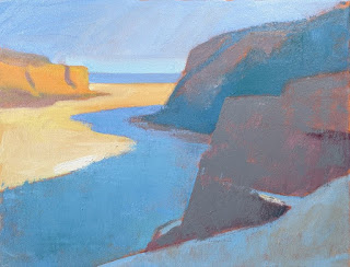
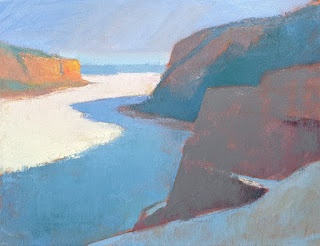
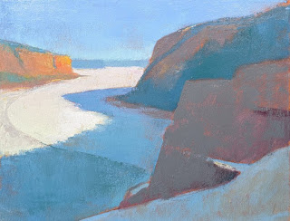
Lake Ice 2
14x18 oil/canvas - Available


In the last post, I showed you how I created my 12x36 version of  “Lake Ice.”  In the post prior to that, I showed several different design possibilities, any one of which would have made a successful painting.  But one I didn't show was a more square version, cropped to emphasize the lake itself.  So without further ado, here is that version:  “Lake Ice 2,” a 14x18.

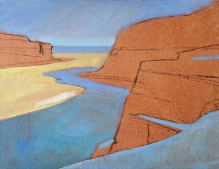
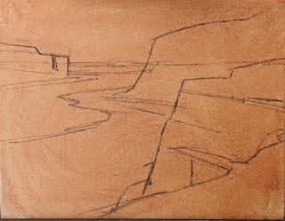
Starting with14x18 stretched cotton, pre-primed with acrylic.  I apply a thin wash of Gamblin's Transparent Earth Red. Although I don't always tone my panels--sometimes I like little bits of white to pop through, adding a scintillant effect to a sunny one scene--I always tone my canvas.  It fills in a texture that is hard to fill later.  I then use soft vine charcoal to outline my main shapes.

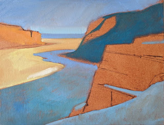
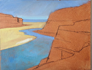
Starting with a brush, I begin to block in my lightest values.  I add a streak of pure titantium-zinc white to the sunlit lake ice to help me understand just how light my lightest value is.  Everything else will be darker. I'm using cerulean blue hue (all paints are Gamblin) for sky and shadowed ice; yellow ochre for the sunlit ice.

I begin to add the patch of snow in the foreground.  It needs to be lighter than the shadowed ice in the distance, so I'm careful to note that on the canvas.  I'm greying down the strong cerulean blue hue (which contains intense phthalo blue) with burnt sienna.

I block in my distant shadowed tree masses on the cliff, making sure to get the value relationships right with the other shadowed areas.

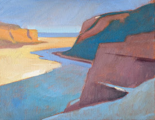
Now I block in my rock colors--both shadowed and light--and again keeping careful track of the value relationships.  This painting is all about the light, so these relationships are crucial.  For my shadowed rocks, I'm using burnt sienna, cerulean blue hue, permanent alizarin crimson and white.  For the sunny ones in the distance, yellow ochre brightened up with cadmium yellow light. Hints of greyed-down cerulean blue hue create the shadows on that distant promontory.

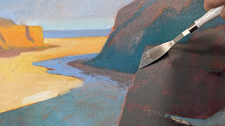
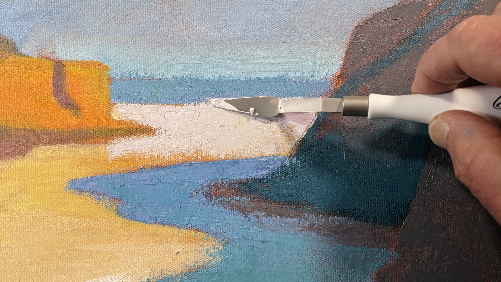
At this point, with the entire scene blocked in, I put down my brush and move to the knife.  This shape of knife gives me a nice sharp edge on the closest cliff.  I continue to evaluate value relationships between my large masses, and I begin to adjust the color saturation of the foreground cliff, greying it down a bit.

Here's the first pass with the knives. You'll notice I've begun to "muddy up" the foreground snow on the cliff.  It's a bit too clean for snow that's been sitting awhile.  (I think the storm that laid down the snow was at least a month ago!)

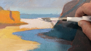
More knife work, trying to get the icy feeling to the lake ice.  This is a smaller knife that is good for tight areas.  It's my favorite size and shape, even for large paintings. (Large being 12x16 or 12x24.)

More adustments, especially in the lake ice.

I always like to have some sort of surface feature that runs from light to shadow.  This helps show form.  In a rock, it might be a crack.  Here in the lake ice, I've added a "swoop," a nice curve that goes from light to shadow.  This feature was actually there, but not quite so prominent.  Sometimes the ice gets covered with a bit of snow, and the wind can blow it around, creating a pattern like this.  This curve shows that the lake ice is not just flat but solid.

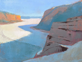
Now I move to the foreground rock, adding the major cracks with a very dark mixture.  This is ultramarine blue and burnt sienna.  I vary proportions, depending on whether on want the mixture warmer or cooler. 

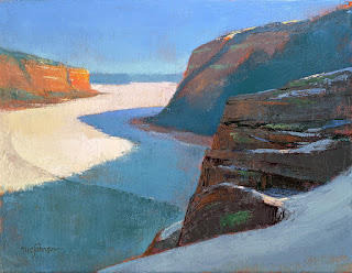
Final state (also shown at the top of this post.)  I continued to work on the foreground cliff, adjusting its overall value to a darker note, and varying the color within the mass.  Little touches of snow on the cliff  complete the painting.