Authentically Human! Not Written by AI!
All Content Copyright © Michael Chesley Johnson AIS PSA MPAC

Wednesday, September 29, 2010

Acadia National Park Workshop

Showers Over Seawall, 8x10, oil

Trina and I left New Hampshire on Sunday for Bernard, Maine, and the Acadia Workshop Center. This marks my sixth time teaching for AWC. I alternate between workshops in June and September (or October.) In June, we get to paint the pretty spring greens, and in fall, the breath-taking reds of maples and oaks.

Even though it's not quite October, we're seeing patches of vivid color. I plan to take the class to some of my favorite foliage spots, but for now, we're letting the colors "ripen" a bit more and are exploring the shore instead. So far, we've painted near Lopaus Point and at Seawall. A bit of spotty rain added some drama to the day - a sudden shower sent us scurrying during my morning demo, but the rest of the day gave us good weather.

One of the errors I see students make when painting a cove is not flattening the "ellipse" enough. Imagine looking at a perfectly round cove from an airplane. The cove would appear as a semicircle. Now let's have the plane land. As it drops lower and lower, the cove starts to flatten into an ellipse. By the time you exit the plane, the far side of the ellipse - the most distant shore - will appear nearly flat. In fact, it should be painted flat. Any curvature at all in that distant shore will make it look poorly drawn

Above is one of two demos I did yesterday at Seawall. Below is a picture of one of my students, Bill, hard at work.

Sunday, September 26, 2010

New Hampshire Workshop

Cloud Study, 8x10, oil

Yesterday, I wrapped up a four-day workshop in Goffstown, New Hampshire, for the New Hampshire Plein Air group. Although it was a warm week - one day topped out at 84 degrees - we had gorgeous, sunny weather. We even had some foliage change, which added some welcome "spice color" to this very green landscape. There's a farm nearby that I like to take the group to, and the foliage with the red barns made for some great paintings. (Above is a cloud demonstration I did, and you can see a bit of autumn in it.)

The students came from all backgrounds, from fashion designers to retired nurses to professional painters. I love this kind of mix, for we always have fascinating lunch times. I think everyone had a great time and learned a lot.

Now I'm off to Mount Desert Island to teach for the Acadia Workshop Center. I'm looking forward to this five-day workshop in Acadia National Park. Maybe we'll have some good color there, too!

Sunday, September 19, 2010

Not Painting Exactly What We See

"Atlantic Maritimer" 9x12, oil

Learning to paint outdoors is first all about learning to see - and then learning not to see so much!

When you first start working from life, you become enchanted with all the little things you never noticed before. Not to dredge up the 60s, but it's almost as if you've taken a drug that expands your sense of sight. Details, especially, seem to take on a larger importance. The exact pattern of cracks in a rocky cliff becomes paramount, and your eyes ache, trying to trace a fingernail-thin fracture from a few hundred feet away.

This level of detail is only important if you want to create a photograph of the scene in paint. But I would bet that even photorealists do a certain amount of filtering and don't paint everything.

For the plein air painter, the next step in learning to paint is to not see everything. See a little less. See only what's important in capturing the magic of the moment.

In the painting above, I left out a lot. For example, I omitted a mass of rusted steel pipes sticking out from a pile of old tires and the registration numbers on the side of the boat. I was more interested in the sense of light. (By the way, I've nicknamed this boat "Stubby" - it really does look that short! It has an enormous hold for carrying vast quantities of fish.)

Today is the second and last day of the Two Countries, One Bay Open Studio Tour. Come on by! We're open 10-5 AT. www.TwoCountriesArt.com.

Friday, September 17, 2010

Full-Length Oil Video Now Available

"Camelhead Backlit" 9x12, oil
featured in
Backpacker Painting: Outdoors with Oil

I'm pleased to announce that my full-length oil video, Backpacker Painting: Outdoors with Oil, is now available from ArtistsNetwork.tv. You can preview and order here. The painting above is the painting created in the video.

The video is the second of two; the first is Backpacker Painting: Outdoors with Pastel, and it's also available through the same link. Both videos are companions to the book, Backpacker Painting: Outdoors with Oil & Pastel, which is available through Lulu.com via this link.

By the way, here's a final reminder about the Two Countries, One Bay Open Studio Art Tour. For details, visit www.TwoCountriesArt.com. I'll be here at Friar's Bay Studio Gallery from 10-5 AT demonstrating. Come on by!

Wednesday, September 15, 2010

Breaking Down the Problem

"Sunny Day at Liberty Point" 9x12, oil

When you say to yourself, "I just can't make that rock look like a rock," you must stop to analyze your frustration. Often, I find a big, amorphous problem can be broken down into some combination of three smaller and well-delimited problems. Either you're:

- Not skilled enough in your chosen medium;
- Not understanding some painting principle; or
- Not observing the subject well enough.

For example, maybe it's your first time with pastel, and you just can't get the pastel to layer the way you want it to. Or maybe you don't know how to treat the rock as a large, simple shape with smaller, simple shapes inside it. Perhaps you just aren't seeing how much darker the shadowed side is in comparison to the lit side.

Breaking down the problem this way can help a lot. It'll help you recognize your weak spots so you can work on them. If you're new to pastel, you can learn that it's easier to layer soft pastel over hard. If you're new to painting, you can learn to break up the scene into simple shapes. If you're new to plein air, you can learn to judge shape relationships more accurately.

There's nothing more frustrating than not knowing where to start. Breaking down the frustration into its component parts will help.

By the way, I put together a short promo video for my PaintSedona (www.paintsedona.com) workshops. You can see it below. If you can't see the image, go to http://www.youtube.com/watch?v=yQHlPfboqL8.

Monday, September 13, 2010

Two Approaches

"Quoddy Cliffs I" 9x12, oil

The other day, we went out to West Quoddy Head State Park in Lubec, the easternmost point in the States. There's a lighthouse, but I avoid painting it. ("Why?" deserves its own blog post.) Usually, I'm drawn to the 150-foot cliffs and the challenge they present. Although the jumble of cracks and planes seem to defy a painter's need to simplify, you can see the underlying pattern if you try. I spent a couple of overcast hours painstakingly observing one prominent cliff, working especially on the subtle colors of the rocks. I felt it was important to accurately observe. The overcast light gave me steady shadows, so I didn't have to rush.

Then the sun broke out. The cloud shadows speeding over the cliffs killed any chance of a leisurely approach, and I had to move on to a different painting. Now, observing anything accurately is tiring work, and I wasn't up to doing that again. So I took a more intuitive approach, focussing less on exact form and more on capturing light effects and a sense of atmosphere. (This is how I most often work.) Also, rather than mix color carefully on my palette, I chose to mix directly on the surface. That's a gut-wrenching way to paint, especially if you're a very methodical painter. But you paint yourself into a corner, and then you find you can paint yourself out of it. It was like a carnival ride, putting down a too rich, too dark blue for the sky, and then stirring a dollop of white into it to make it work.

I'm curious: Which of the two paintings seem to work best? (By the way, the second is not the exact same scene, but a different view of a different rock.)

"Quoddy Cliffs II" 9x12, oil

Saturday, September 11, 2010

September 2010 Newsletter

"Fog at Glensevern" 9x12, pastel

September 2010
Campobello Island in the Canadian Maritimes

Hard to believe, but another summer has come and gone. Although we still have a couple of workshops to teach in the Northeast (Maine and New Hampshire), we are winding down. By mid-October, we'll be on our way west for the winter.

This has been one of the hotter summers in our six years here. Normally, it's cool enough that we keep the windows closed at night, but even in early September, we were keeping them open. It's been dry, too. As a result, we've had some great painting weather.

As you may know, I do many small paintings for demonstrations and small sketches. Most of these will never go into a gallery. So, I've created an online "studio store" where you can buy them. I'll be adding paintings to this store over time, so check back often! The link for the store is http://johnsonstudiostore.blogspot.com/. I think you'll find some good deals there.

Our annual "Two Countries, One Bay" open studio tour is the weekend of September 18-19. This is our fourth year, and as one of the founders, I'm proud to say we have more artists than ever - over 50! If you're in the area, I invite you to visit us. For full details, schedules and maps, visit http://www.TwoCountriesArt.com. For the tour, I'll be doing demonstrations in oil and pastel right outside my gallery, Friar's Bay Studio Gallery (www.friarsbaygallery.com).

The Acadia Invitational II exhibition continues at Argosy Gallery in Bar Harbor, Maine. I was one of 30 painters invited to participate in this show. The show runs through September 2011 (yes, that's for a full year!) I hope you'll have a chance to see it. You can see most of the works online at the Argosy Gallery site, www.argosygallery.com.

I'm continuing to work on a series of short videos for my series, Plein Air Essentials. The latest in these is "Creating a Sense of Distance," which includes a brief pastel demonstration. You can get this video and others at my Lulu store, http://stores.lulu.com/miragenm. Videos are priced between 99¢ and $1.99. I'll be adding more videos over time.

Speaking of videos, the first of my full-length demonstration videos is now available through F&W Media, publishers of The Artist's Magazine and The Pastel Journal. You can get Backpacker Painting: Outdoors in Pastel for $16.99 from Artistsnetwork.tv. Follow this link to see a preview or to order. The oil video will be released in September, and I'll post a note to my blog when it's out.

In case you missed the news earlier, I've been juried into the 2010/2011 Plein Air Southwest event. Sponsored by the Outdoor Painters Society, this event spans several months and has events at the Grand Canyon, Ouray (CO), Prescott (AZ), the Texas coast and Dallas. Some of the participating artists include my friends Bob Rohm, Ann Templeton, Jill Carver and Bill Cramer. The show opens April 8 at Southwest Gallery in Dallas. Here's a link to the show page: http://www.pleinairsouthwest.com/Index.html

There's still time to get in on my popular Paint Sedona workshops this winter. I offer three levels of workshops:
  • Traditional plein air workshops (all levels of student welcome)
  • Advanced topic plein air workshops (intermediate-advanced students only; this winter's topic, "Large Format Painting")
  • Mentoring plein air workshops (intermediate-advanced students or professionals only)
For more much information, please visit my website, www.PaintSedona.com. And don't forget that I have a long list of workshops for both the end of 2010 and all of 2011!

That's all the news for now. The next time you get my newsletter, I'll be in Sedona!

Michael

Friday, September 10, 2010

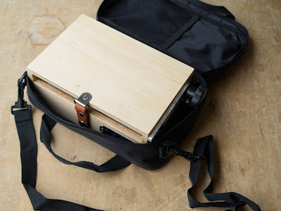
5x7 PocketBox from Judson's

"Bridge to the Dunes" 5x7, oil

As many of you know, I paint a lot of 5x7 sketches. Typically, I drag out my 9x12 Guerrilla Painter Box and a few Art Cocoons configured for 5x7 panels. But recently, I acquired one of the new 5x7 PocketBoxes from Judson's Art Outfitters. I took it out today for a test drive.

A good, soaking rain started last night, and it just didn't want to quit. If I need to paint on a rainy day, I do small sketches. It's no good starting an 18x24 masterpiece only to get chilled by the rain and to have to call it a day. So, I headed for a big picnic shelter down by the beach with a handful of panels and my PocketBox.

I did three 5x7s - two with the box in my lap or on a picnic table, and one while actually holding the box in my hand. It's a very light box - it only weighs a pound - so I found it much easier to hold up than the heavier 6x8 ThumBox. (Yeah, I know, I should lift weights more often.) I usually spend about 30 minutes on a 5x7. I held up that box for a full half-hour, and I didn't get tired.

Although my box came with an optional, hinged palette extension, I stripped down my usual colors to the three primaries plus white and black. I had plenty of room on the main palette for these. Also, to keep the box light, I didn't store my paint tubes in the box. Because I chose to use water-miscible oils, I packed in a Mighty Mite Jr. brush washer topped off with water. It fits right inside the box. Finally, I used just two flats, a #4 and a #2. When you put it all together, it's a very portable box. I easily stuffed all of this in a small daypack with room to spare.

I started the day by painting with the box on the picnic table, but I found that without a bit of weight, the box was tippy. I added a 150ml tube of white, and that did the trick. Before going into "thumb mode," I took out the tube to lighten things. The palette extension, by the way, is drilled with holes that you can stick your brushes in. I just laid mine down on the table or held them in my free fingers. But if you don't have a table and don't want to hold the brushes, the holes are a good solution.

One thing I do with my 9x12 box that I can't with the 5x7 is hang a roll of paper towels off of it. But for the portability and freedom of the PocketBox, I can live with such a compromise!

(Below are some photos of the PocketBox. Above is one of the paintings I did today.)


Tuesday, September 7, 2010

Two Countries, One Bay Open Studio Tour

"Friar's Head, Morning" oil, 9x12

For those of you living in the area or perhaps visiting soon, I want to remind you of our "Two Countries, One Bay" Open Studio Tour. I'm one of the founders of the tour, and I'm proud to say we are about to launch our fourth annual tour!

In one weekend (September 18-19) you'll have the opportunity to visit over 50 artists and their studios around the Passamaquoddy Bay region in the U.S. and Canada. The ferry between Deer Island and Campobello Island will be running, so you'll be able to do the tour as a loop.
Here's a map of the area:

Artists will be demonstrating in their chosen media. I will be demonstrating outside Friar's Bay Studio Gallery (www.friarsbaygallery.com) both days, and in oil or pastel. In addition, many of us will have art for sale. So, I hope you'll join us for this end-of-season tour!

The tour is Saturday and Sunday, September 18-19, from 10-5 (ET and AT). You can find out which artists are participating, download maps and brochures, learn about the ferry schedules and our sponsors, all at the website: www.TwoCountriesArt.com.

I'll see you there!


Saturday, September 4, 2010

New Mini-Video - Creating an Illusion of Distance

Hurricane Earl raced by this morning, dropping nearly 3" of rain on Campobello Island here in New Brunswick. I took advantage of the rainy day and put together another mini-video in my "Plein Air Essentials" series. This one shows you how to create the illusion of distance in your paintings. It's based on a demonstration I created for my workshops. I thought the demonstration worked so well that I decided to include it!

This one runs 6 1/2 minutes and sells for $1.49. You can get it at my Lulu store: http://stores.lulu.com/miragenm

The sun has broken out. It's time to take the dog for a walk and pick up downed limbs.

Thursday, September 2, 2010

The Curse of Two Eyes

"Golden Field" oil, 8x10

We painters are cursed with binocular vision. Having two eyes allows us to easily see the spatial relationships of objects. When I paint a line of trees marching off to the horizon, I can easily tell which trees are close and which ones are farther off. (It has to do with parallax, which is the apparent displacement of an object as seen from two different points - your eyes.) But if I try to paint with one eye closed, it's not so easy to judge distance. Don't believe me? Try driving a car with one eye closed.

So here's the problem. Unless you're into painting stereopticon images, a painting represents a single-eye viewpoint. If you paint the scene exactly as you see it with two eyes, you won't be painting a strong enough illusion for the one-eyed viewer.

There are five ways to create the illusion. By overlapping objects, diminishing size, lessening contrast, softening edges, and cooling and muting color, we can make a line of trees recede convincingly. By pushing these effects - making the distant trees even cooler and softer than we see them - the scene will look convincing. You can't simply paint the distance as you see it.

The scene depicted above didn't have anywhere near as much "atmosphere" as the painting shows, but I pushed the illusion to make it work.

Wednesday, September 1, 2010

Mood and Dominance

"Fog Study 1" 3x9, pastel

"Fog Study 2" 4x9, pastel

Like many people, I enjoy movies. For me, it's not just the storyline but the moods. If the movie's any good, it will be dominated by a particular mood. Some of my very favorite moody films include Dark City , City of Lost Children and, well, there are many others, some not so dark.

If you study movies, you'll note that mood is created through several devices including music, value and color. Music doesn't have much application to landscape painting (unless you paint wearing your iPod), but value and color certainly do. For the mood to really work for the viewer, some value and some color must dominate. For City of Lost Children, for example, the movie is dominated by dark values and cool greens and browns. The movie wouldn't work as well if there were as many high-key scenes as low-key ones, or if there were lots of sunny scenes sprinkled in.

The same goes for any particular scene. A dark, mysterious scene might not work if some set designer painted half the furniture a cheery, bright yellow. It's the same with painting. A successful piece will have a dominant value and a dominant color - always.

The two pastel sketches were done on a cool, foggy day. I purposely made dominant the light values and cool colors. (Both pieces are available for sale in my studio store, http://johnsonstudiostore.blogspot.com/).