 |
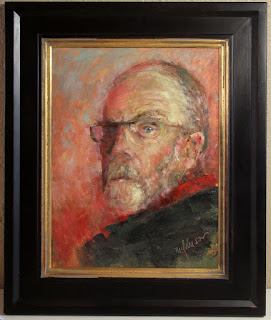
| Mr Hyde 12x9 Oil |
This past week, I decided to paint a self-portrait. It was one of those days when you feel rudderless, even though you have plenty to do. I had hoped to paint outdoors, but the weather had suddenly turned Arctic. Painting from a photo didn't appeal to me, either. But what did get me excited was the idea of a self-portrait. I haven't painted one in awhile, and I could use more practice in that, so—why not?
Sometimes the best way to do a self-portrait is to do it quickly. Get the paint down, and then adjust minimally. I envisioned a rough, painterly look, thinking of Lucien Freud and Van Gogh. I gave myself an hour for the project. (Plus a couple of days looking at the results and adding five-second tweaks now and then.)
 |
| The setup |
 |
| Messy but effective palette |
I set up a big mirror on another easel by my main one and pulled out a 12x16 stretched linen canvas. I toned it with burnt sienna, using Gamblin's FastMatte so it would set quickly. Then I laid out my palette. I wanted to make this simple, so I went with a limited one: Hansa yellow light, naphthol red, ultramarine blue plus raw umber to help in muting the colors. I used titantium-zinc white, and also a little of Gamblin's Solvent-Free Gel to help the paint dry a little faster. While painting, I used mostly a small, worn-out flat brush—not much more than a chopstick with a chewed end—but did use a knife where it suited me. I had "red" in my head as I worked, since that was the color of the toned canvas, and you can see the result at the top of this post. I know I look a little severe in the painting, but remember it is just the look of intense concentration.
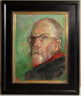
After I posted the image on Facebook, asking for title suggestions, an artist friend said that the red background was a little overwhelming and if I took it out, that "the wedge of red shirt would sing." This, I felt, was an interesting thought. So I ran the image of the painting through my Photoshop mill, changing the red background to a cool green. I posted that and took a poll of what people liked best. The original, red background (as of this writing) has a slight edge over a green background.
Some offered explanations for their choices. Among those favoring red:
- The red seems more cohesive. The green a little disconcerting.
- Red matches his demeanor.
- Color harmony on red works better. The highlights are cool and the darker areas are warm on the head, so it makes visual sense to me the deeper values of the background continue that.
- Red must support the intensity of the vision. Green is too placid. This is a living portrait and yes a lusty lad.
- The red looks better than the green, but I think it blends too much with the face, and makes the face look more angry. But I’m not really a fan of the green...Not sure I can explain why, though. Maybe too much contrast?? But I like the self portrait!!
- Red. I feel the green is too pretty (chroma too high).
- Red. The green background mimics the portraits done by van Gogh.
- The green sets off the portrait of the man in a much sharper focus.
- Green… aesthetically pleasing and highlights your blue eyes… red is disconcerting and appears to be angry 😡 color card [color of collar?] is too close between red and flesh tones. Whereas green is more of a contrast to the flesh face tones and the red scarf or collar.
- Green. Red makes me think “anger” kind of Van Gogh-ish.
- Honestly, I see you in the one on the right [green]. It creates a more thoughtful affect without losing its edge.
I love designing by committee.
So, I ran the portrait through the Photoshop mill a second time, changing the background to more of a blue-grey. I thought I'd offer all three here for another vote. THE POLL IS BELOW. Here are the three:
 |
| RED background |
 |
| GREEN background |
 |
| BLUE(ish) background |
Remember to vote! (If the popup below doesn't work for you, go to this link to vote - https://www.surveymonkey.com/r/Y8P38ZL )
Create your own user feedback survey
