Authentically Human! Not Written by AI!
All Content Copyright © Michael Chesley Johnson AIS PSA MPAC

Sunday, July 26, 2020

More News from the Canyon

Canyon Abstract III
16x20 Oil
Available


The good news is, the much-anticipated monsoon season has arrived in New Mexico.  After virtually no precipitation since mid-April, we are blessed with afternoon rains now in late July.  The one cottonwood tree by the house, which has been losing more than just a few leaves, is grateful.  So also are the sunflowers, which are now starting to burst into bloom. 

The bad news is, the rains, which can be quite heavy at times, make mud.  My trail down into the canyon has gotten a little slippery.  Also, I like to sketch my rocks and trees with good, strong sunlight beaming down on them.  The light and shadow patterns make the form of these subjects easier to define.  The clouds are softening the light too much.  So, I am taking a little break from canyon sketching.

In the meantime, though, I have turned to the studio for painting.  My inspiration are the sketches I made in my Pandemic Sketchbooks, Vol. 1, which are all about rocks and canyon walls.  I have chosen another part of the canyon for this third Canyon Abstract.  Below, I'll show you the three reference studies I used, plus the steps in painting the 16x20 version.

One secret ingredient for painting canyon walls:  Gamblin's Warm White.  I used this exclusively in the painting.  Yellow ochre, which is the base color for the walls, cools off just too much if I use my regular titanium-zinc white.  Also, to punch up the color a bit, I included a little Permanent Orange and Napthol Scarlet.  To add life to the warm, dark shadows—mostly painted with Raw Umber—I used Prussian Blue to indicate where the blue skylight spills down into the shadows, creating temperature contrast.

Finally, I've put together the progress shots into a short Youtube video.  If you can't see it in this post, here is the link:  https://youtu.be/n1KPZXDeMOc

Video:


5x8 gouache studies I used as references:


Progress shots of the 16x20 studio painting:


And the finished painting again:

Canyon Abstract III - 16x20 Oil
Available

Sunday, July 19, 2020

The Medium is the Message

These are the mediums I use most often.


I'm often asked by my oil painting students what mediums to use, when to use them and how to use them.  Frequently, I find students are confused about mediums in general.  “What's this about 'fat over lean'?”  “Maroger medium—isn't that some long-lost secret of the Old Masters?”  “Why can't I just use paint thinner as a medium?”  And so on.

Well, it's not that difficult.  Here's everything you need to know about mediums.

Here's the first thing to know.  It's best to use no medium at all.  A good manufacturer of artist grade paint fine-tunes its product so it works perfectly, right out of the tube.  I always prefer to use paint without adding anything that might negatively alter its working properties or archival quality.

Here's the second thing.  Mediums possess no magic.  Despite the mystique that once surrounded Maroger medium—the inventor, Jacques Maroger, claimed to have rediscovered a secret formula used by the Old Masters—mediums are simply chemical compounds designed to change the properties of paint in certain ways.

So, when should a medium be used?  Here's my list:

  • If the paint is too thick to work, I can add a medium to make it more workable.
  • If the paint dries too slowly, I can add a medium to make it dry faster.
  • If the paint dries too quickly, I can add a medium to make it dry more slowly.
  • If the paint needs a gloss (or matte) finish, I can add a medium to make it more glossy (or more matte.)
  • If an area of a painting needs to have transparent color glazed over it, I can use a glazing medium.

Although there are other situations when one might use a medium, these are the common ones.

Any medium should be used sparingly.  Manufacturers often list the recommended percentage for a mixture.  Gamblin, for example, recommends that their Solvent-Free Gel make up no more than 25% of the mixture.  (That is 1:3, 1 part SFG and 3 parts paint.)

By the way, a medium is not simply paint thinner, like Gamsol.  If you add too much thinner to the paint, you risk weakening the paint film.  The paint will flake off over time.  The only time I use Gamsol is to thin paint initially for my block-in.  After that, I don't use it.  Instead, I use pure paint or paint with a proper medium, which will maintain the integrity of the paint film.

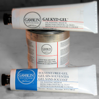
Although there are many brands and varieties of mediums on the market, I basically use three, all from Gamblin:

  • Solvent-Free Gel
  • Galkyd Gel
  • Cold Wax Medium

The first two (Solvent-Free Gel and Galkyd Gel) come in tubes.  I like the tubes because, as a plein air painter, I can just squeeze out a dollop on my palette and not have to worry about it running all over the place.  And I don't have to use those messy medium cups.  (I long ago gave up cups with screw lids, as the lids seemed to get welded on after a couple of uses.)

The Solvent-Free Gel is jellied safflower oil with a little alkyd resin added to it to make it dry faster.  The Galkyd Gel is similar but contains solvent and dries much more quickly.  Both of these give a glossy finish to the paint film.

The Cold Wax Medium is something I use only in the studio.  It contains beeswax with a little Gamsol and alkyd resin added to it to speed up drying time.  It gives a matte finish to the paint, and it can be used thickly to create translucent depth in a painting.  Also used as a final varnish, it can be buffed to the desired level of sheen, like shoe polish.

(For more information on these products from Gamblin:  solvent-free painting mediums,
contemporary oil painting mediums.)

Finally, let me explain the concept of “fat over lean.”  Fatty layers of paint—that is, paint with more oil or medium in it—dry so that they are flexible.  Lean layers of paint—that is, paint that has been thinned with a solvent like Gamsol—dry more brittle.  You want the more flexible layers on top of the more brittle layers to avoid any cracking of the final paint layer.  If you reverse this, and put brittle (lean) on top of flexible (fat), the upper, brittle layer is prone to cracking as the lower layer flexes.  (Cracking, as you might have guessed, is not desirable, unless you are trying to forge an Old Master.) So:

  • Lean = paint with solvent
  • Fat = pure paint
  • Fattier = paint with medium

Medium is always considered “fat.”

Now, here's a secret.  The “fat over lean” rule applies only to “indirect” painting, where one paints in layers over time.  It doesn't matter at all with “direct” or “alla prima” or “au premier coup” painting, where the painting is created in one session.

And that's all you need to know about mediums for basic painting.  There's much more to learn, of course, and I urge you to read more about mediums and then experiment.  The Gamblin site has lots of information on this topic, as well as videos.

Sunday, July 12, 2020

Canyon Abstract No. 2, 16x20 Oil

Canyon Abstract No.2
16x20 Oil - Available Here

This past week, I went through my “Pandemic Sketchbook,” looking for another canyon sketch to turn into a larger painting.  One of my favorites is this 5x8 gouache sketch:


I like it because of the unsettling, vertiginous feeling I get when I look at the boulder on the left.  It seems almost suspended in mid-slide,  as if it would take only a small touch to get it going again.  I thought that, if I made an even larger image, I could intensify that feeling.

I first toned the 16x20 canvas with a thin wash of acrylic yellow ochre.  Then, as with the last canyon painting, I used Van Dyke brown to lay in the dark notes, followed by burnt sienna in some of the shadows to indicate where warm light would be bouncing into them.  I had a lot of fun playing with greens, blues and reds in the shadows.

It was all smooth sailing—until I reached the right half of the canvas.  I wanted this to be a large, mostly empty area to make the boulder seem even more precarious.  In the gouache sketch, I had a couple of thin trees in that area, anchored by a shadowed ledge, but I decided they weren't necessary as they detracted from my idea.  But what to put there?  The area needed something, some dark shape, to balance the visual weight of the boulder.

I repainted this area twice, each time missing the mark.  My first attempt, a large dark shape, felt too heavy; my second, a smaller shape, still seemed too much.  Finally, I hit upon the solution.  A thin crack pulled the eye just enough to balance the boulder.

Here are the steps in the process, followed by some details shots.


That dark shape on the right was going to give me trouble!


I replaced the big dark shape on the right with
another, smaller one down toward the bottom.


I finally got rid of that annoying dark square
and replaced it with a simple, thin crack.
Finished:  Canyon Abstract No. 2 16x20 Oil

Some detail shots:


Wednesday, July 8, 2020

To Sit or Not to Sit—That is the Question

"Artist in his Studio" by Rembrandt van Rijn
(Museum of Fine Arts, Boston)
Here, a painter steps back to view his work.


Hamlet never had to wrestle with the one question that plagues every painter:  “To sit or not to sit?”

Most of us were instructed early on in our art education to stand when painting.  We were given two reasons.  First, standing makes it easier to step back frequently so we can see how the painting is (or is not) coming together.  It you're sitting, it's a lot of trouble to heave yourself off your seat, push back the chair or stool, and then re-seat yourself after looking.  You probably won't do it much.

Second, standing allows for full arm movement, which is critical for making long, gestural strokes.  If you're hunched over your canvas, it's impossible to swing out your arm to make elegant, curvy lines.  That graceful tree you hoped to paint will end up a cramped, arthritic thing more fitting for a Halloween greeting card.

But there are valid reasons for sitting.  One is personal comfort.  I'm a tall person and prone to back pain, so if I am painting all day, I often will stand in the morning but choose to sit in the afternoon.  Even so, I will make sure to get up and step back now and then.  Another is scale.  If I'm painting in a very small format, as I do with gouache, I will sit, understanding that I can simply hold the work out at arm's length to get the distance I need for judging unity of effect.  (Illustrators will often sit, partly because of the precision their work may demand.)

One last reason is laziness.  Don't we all feel lazy now and then, but still want to do a little Sunday painting?  There's nothing wrong with just sitting and noodling once in awhile.

Here are a few painters, studio and plein air, sitting and standing.  Take your pick!

Camille Pisarro.  Will he stand or sit?

Dean Cornwell

Frank Benson
This might be a staged photo.  Benson
would have to squat to paint this low.

Frank Vincent Dumond

Granville Redmond

Henri Paul Royer

Howard Pyle

J.H. Wijsmuller

John Singer Sargent

Willard Metcalf

James McNeil Whistler

Sunday, July 5, 2020

Canyon Abstract 20x24 Oil

Canyon Abstract
20x24 Oil
Available - Contact Me

As you may recall, I spent several weeks this late spring hiking into the canyon behind my studio, studying the canyon walls with my gouache kit.  Some of the sketches struck me as worthy of expanding into larger paintings.  One in particular caught my fancy, a closeup of the canyon wall, and I thought it had an enchanting abstract quality.

So, I took this 5x8 gouache sketch and based an 18x24 oil painting on it.  The larger version is very similar to the small sketch with respect to shapes, but I added or amplified some of the color, and also the texture.   I also removed the juniper bush in the bottom right, as I felt that made this "abstraction" more representational that I wanted.

Also, one thing I like to do when I base studio paintings on my sketches is to change the medium; this makes for a more interesting process and forces different color choices.   Also, for these studio pieces, I don't use any photo references--just the gouache sketch.  The sketch really contains plenty of information for a larger painting.

Here's the original 5x8 sketch:


Here are some of the steps in creating the larger piece:


Here is the final painting again. Please let me know if you are interested in purchasing it.  

Canyon Abstract 18x24 Oil
Also, some detail shots of the painting: