Authentically Human! Not Written by AI!
All Content Copyright © Michael Chesley Johnson AIS PSNM
Showing posts with label abstraction. Show all posts

Wednesday, March 29, 2023

Abstracting the Landscape: Workshop with Scott Gellatly

View in browser

"Rio Grande" 4x8 Watermedia on Cold-Press Watercolor Paper
(One of the abstractions I came up during the workshop.)


As a long-time, committed plein air painter, I tend to paint what I see.  Sure, I may "abstract" the landscape, as most outdoor painters do, by squinting or making a thumbnail sketch.  Really, though, this isn't abstracting so much as simplifying—rendering the landscape in a few simple shapes and values.  My purpose is to take a three-dimensional view and flatten it so I can transpose it easily to canvas.  The result can, indeed, look pretty abstract.  But then my very next step is to re-install the third dimension and add bits of detail.  In short, to make it look like what I see.

I don't care for abstract painting, per se.  Most of it is just lazy painting.  It looks like decorator art—something you'd see in HGTV's "Property Brothers", whipped up out of masking tape and spray paint.  (Granted, that's often the best the team can do with an exhausted project budget.)  But what if we take the landscape and use it as a jumping-off point for abstraction?  What if we move it beyond reality to a place where the paint and the surface are more important than the scene itself?

Now, this kind of abstract painting I do like.  It takes the real and pushes it—richer color, stronger rhythms—all in an effort to enhance whatever quality of the scene attracted us in the first place.  In the process, the landscape takes a back seat, letting design elements and principles drive the painting, with tools and materials riding shotgun.  The result can excite and engage far more than the actual scene.

It's something I've always wanted to experiment with.  I've tried it on my own, but it was a struggle.  So, I was delighted to see that my long-time artist friend Scott Gellatly was offering an online workshop on this very topic through the Winslow Art Center on Bainbridge Island, WA. Over three weeks, he explained the process and gave us homework.  Playing with a variety of watermedia—watercolor, casein and gouache—plus a variety of tools and surfaces, I based my experiments on plein air sketches.  

I've included in this post some of my favorite results from my week.  Some are more abstract than others; in most cases, you might have a fair idea of what they represent.  All of them are 8x10 or smaller.

Am I satisfied with them?  Well, I had enormous amounts of fun, but I still struggled.  For me, having painted realism all these years, pushing the real into abstraction is hard work.  It's so easy to fall back on old ways, adding atmospheric perspective and details.  Fortunately, there is no recognized, absolute degree of abstraction in this game; the road between photorealism and the non-objective allows for many stops along the way.

One thought:  Can I take this approach into the field with me?  Can I push the abstraction while standing in front of my subject?  Often, just painting the subject in a representational manner is hard enough.  Adding the complexity of interpreting it in this new way might break me—or will it make me a stronger painter?  It will certainly give me new eyes.

I expect Scott will teach this workshop again.  I highly recommend it, and you can keep in touch with the Winslow Art Center's offerings here.


Sunday, November 13, 2022

Autumn Abstract -- And What About Abstraction?

View in browser

Autumn Abstract
14x11 oil


Over the course of my painting career, I've often wished to move from realistic representation to the more abstract.  It doesn't suit my impatient nature to depict scenes that are better (and more easily and more accurately) captured with a lens.  Of course, there's a market out there for realism, and it's hard not to paint to the market.  And certainly, because painting is a craft, there's something satisfying about getting skilled enough to depict every grass blade and twig.  But in my soul, this isn't what I want to do.  I want to paint an abstracted impression.

So I came up with "Autumn Abstract," a 14x11 experiment in oil.  You'll note in the image above that I still haven't managed to unglue myself from realism—the painting is obviously of a tree in autumn.   Still, it's a departure for me.  When I paint a tree in full foliage, I usually "mass" the leaves so they hang together in leafy boughs and look very much like a tree seen through squinted (or myopic) eyes.  Here, I've tried to avoid that, preferring to suggest the masses of leaves with just swatches of color.  For the tree, I've left out the twigs—I don't paint those, anyway—and have removed most of the branches.  Maybe my next tree will have even less of the tree and more of the abstracted "treeness."

Abtraction is prone to laziness.  I've seen many abstract (or non-objective) paintings that have hardly anything to them.  A splash of color, a brush stroke—nothing more.  It's as if the painter was proud of his laziness.  But I want to create a painting that looks like I labored over it, to make it look like it's worth something.  Worth the effort of a viewer to study, worth the leisure of the viewer to enjoy, and perhaps, worth enough to even buy.

Yes, I've heard that good art should look effortless, like it was born wholly-formed.  But I can tell when I look at a seemingly-effortless good painting that much study, practice and thought went into it.  It smells of sweat, not of laziness.  It doesn't matter whether it's a landscape, portrait, still life or something conjured up out of the artist's imagination.  

Here are some notes about "Abstract Autumn":
  • I painted this almost entirely with a 1" foam brush, the kind you might use to paint the mullions of a window.  The very last bit of paint went on with a painting knife.
  • I purposely took my time with this painting.  I painted it over several days, trying to carefully consider what path best to achieve my vision.  (My vision:  I wanted to represent the intense colors and warmth of a tree in autumn.)
  • The first phase consisted of thin washes:  Indian yellow, transparent earth orange, quinacridone magenta.  (All colors are from Gamblin.)
  • Once I'd finished this first phase, I took a hike.  I went out to the canyon behind the studio where the color of the oaks was peak.  When I reached the end of the canyon where the color was best, I stood perched on the canyon's lip and spent several minutes just observing color.  The canyon's end is called the "bathtub," and it's a deep pocket that's been carved by summer rains and melting winter snows.  A huge ponderosa pine is fixed like an axle in a wheel  in the center of this tub, and at its base the oaks have gathered.  It was a spiritual moment, with clouds sweeping alternate waves of shadow and light into the canyon.  My attention to the colors was broken for a moment by the sudden appearance of a lone bald eagle, being chased through the canyon by a pair of ravens.  My plein air experiences are often filled with this kind of memorable event.
  • Back in the studio, I started the next phase:  glazes of phthalo green, sweeps of dioxazine purple, and then all that warmth punctuated with  a few notes of cool radiant blue.
  • The final phase:  more transparent earth orange, cadmium red deep, cadmium red light, olive green, permanent orange and cadmium yellow light.
  • After a few days of letting the painting rest, I made a few adjustments with the knife.
I put together a short video of shots of the different phases. You can view it here:  https://youtu.be/0BNRJRr00gc


Sunday, July 12, 2020

Canyon Abstract No. 2, 16x20 Oil

Canyon Abstract No.2
16x20 Oil - Available Here

This past week, I went through my “Pandemic Sketchbook,” looking for another canyon sketch to turn into a larger painting.  One of my favorites is this 5x8 gouache sketch:


I like it because of the unsettling, vertiginous feeling I get when I look at the boulder on the left.  It seems almost suspended in mid-slide,  as if it would take only a small touch to get it going again.  I thought that, if I made an even larger image, I could intensify that feeling.

I first toned the 16x20 canvas with a thin wash of acrylic yellow ochre.  Then, as with the last canyon painting, I used Van Dyke brown to lay in the dark notes, followed by burnt sienna in some of the shadows to indicate where warm light would be bouncing into them.  I had a lot of fun playing with greens, blues and reds in the shadows.

It was all smooth sailing—until I reached the right half of the canvas.  I wanted this to be a large, mostly empty area to make the boulder seem even more precarious.  In the gouache sketch, I had a couple of thin trees in that area, anchored by a shadowed ledge, but I decided they weren't necessary as they detracted from my idea.  But what to put there?  The area needed something, some dark shape, to balance the visual weight of the boulder.

I repainted this area twice, each time missing the mark.  My first attempt, a large dark shape, felt too heavy; my second, a smaller shape, still seemed too much.  Finally, I hit upon the solution.  A thin crack pulled the eye just enough to balance the boulder.

Here are the steps in the process, followed by some details shots.


That dark shape on the right was going to give me trouble!


I replaced the big dark shape on the right with
another, smaller one down toward the bottom.


I finally got rid of that annoying dark square
and replaced it with a simple, thin crack.
Finished:  Canyon Abstract No. 2 16x20 Oil

Some detail shots:


Sunday, July 5, 2020

Canyon Abstract 20x24 Oil

Canyon Abstract
20x24 Oil
Available - Contact Me

As you may recall, I spent several weeks this late spring hiking into the canyon behind my studio, studying the canyon walls with my gouache kit.  Some of the sketches struck me as worthy of expanding into larger paintings.  One in particular caught my fancy, a closeup of the canyon wall, and I thought it had an enchanting abstract quality.

So, I took this 5x8 gouache sketch and based an 18x24 oil painting on it.  The larger version is very similar to the small sketch with respect to shapes, but I added or amplified some of the color, and also the texture.   I also removed the juniper bush in the bottom right, as I felt that made this "abstraction" more representational that I wanted.

Also, one thing I like to do when I base studio paintings on my sketches is to change the medium; this makes for a more interesting process and forces different color choices.   Also, for these studio pieces, I don't use any photo references--just the gouache sketch.  The sketch really contains plenty of information for a larger painting.

Here's the original 5x8 sketch:


Here are some of the steps in creating the larger piece:


Here is the final painting again. Please let me know if you are interested in purchasing it.  

Canyon Abstract 18x24 Oil
Also, some detail shots of the painting:


Friday, January 18, 2013

From the Mailbag: Making the Complex Simple

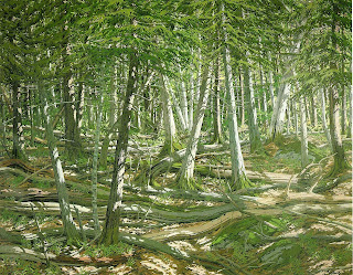
"Old Windfall" by Neil Welliver

A reader writes:  "When I look out at the world it seems complex.  How do I simplify it in a painting without losing touch with its complexity?"

I often find my eye pulled toward the natural world's wonderful complexity.  There's something infinitely pleasing about, for example, the baroque intricacy of a woodlot.  Tangled brambles, interlocked branches, and the play of little spots of light and shadow form a visual playground.

But as attractive as such a scene is, is it a suitable subject for a painting?  Well, that depends on your goal.  If your goal is to convey the complexity, then yes.  But with what method and materials will you accomplish your task?  In my mind, you will be working with many, many small shapes.  If you flatten the scene to analyze it - that is, if you close one eye to eliminate the third dimension and then squint to simply and consider the scene as a collection of shapes - you'll see an infinitude of tiny polygons.  The precise relationship of each polygon to its neighbor is crucial to creating the sense of overlapping vines and limbs.

This kind of precision means drawing.  So, I would consider a drawing medium such as pencil, charcoal or pastel to be an obvious choice.  But what about paint?  You can use that, too, but it's still going to require careful drawing.

Of course, you will still have to initially simplify the scene.  You'll need to take infinity and break it down to a handful of large, simple shapes.  Again, if you squint, you can simplify the scene and see these big shapes.  With a particularly dense woodlot, you may have mostly dark big shapes and a few tiny light shapes.  (Light has a hard time penetrating a thick stand of trees.)  Start with that, and then open your eyes slowly and begin to break the big shapes down into smaller ones.

All that said, this task is almost impossible to accomplish in a plein air painting.  In a dense woodlot, the passage of the sun seems to have a greater impact than it does in, say, an open field.  Those little spots of light seem to move along the branches much faster that you'd expect.   You are better off doing a quick color sketch to get the color notes, a value sketch to get a handle on values, and then take photos for all the details.  Then, head for the studio where you can work on recreating the complexity at your leisure.

Personally, I find this kind of complexity enchanting, but I don't have the stamina for it.  But some painters excelled at this kind of thing - the Maine painter Neil Welliver comes to mind.  At the top of this post, you can see and example of his work.  It would be a good exercise to look at "Old Windfall" and see, if you were to recreate this scene on your own, how you would start to simplify it.

Friday, November 13, 2009

Mossy Birch - Abstraction

"Mossy Birch"
5x7, oil

We've have two hard frosts in the past two nights, but the afternoons have been pleasant and sunny. I took the opportunity to head into the thicket that borders our property. The thicket is home to a number of fantastically-shaped birches and maples and, right now, piles of golden leaves. I decided to focus in on one birch with a mossy patch. The sun was hitting it just right.

I'm still using my limited palette of alkyds (one yellow, two reds, one blue, one green plus black). Today I worked on a sheet of Ampersand Hardbord on which I'd slathered two coats of Golden Acrylic Gel Medium. This ground is transparent, so I was working against the dark, warm tones of the hardboard. I had to do my initial sketch in a light color and then work out from there, going darker and lighter. It was a fun little piece!

Thursday, November 12, 2009

Gnarled Apple - Abstraction

"Gnarled Apples"
5x7, oil

These gorgeous fall days are almost getting to be too much to bear! How much longer can they last? At low tide, we hiked from the Lower Duck Pond around Gooseberry Point to Mink Point and back - an absolutely wonderful one-hour walk across unspoiled broad, sandy beaches and shingle ledges. Once done, though, I decided to paint something a bit more domestic. The bare apple trees in our field were calling to me. There are still apples left on the trees, clinging in all their beautiful color of fall. I thought they'd make a nice "abstraction."

My first thought was how to make the apples stand out. The values of apple, limb and background were very close, so I decided to focus more on temperature contrast. I analyzed the red of the apples as a cool red, and so I first laid in a dark, yellow-green background for contrast before putting in the apples. As I worked, I began to detect more warmth in the apples (the sun, which had been behind a thin scrim of clouds, began to come out), so I added a warmer red and then scumbled in a cooler, blue-green into the background. I think this interplay of warm/cool helps to make the scene mimic some of the natural complexity of color temperatures we see. Not everything is so cut-and-dry as to have the foreground all warm and the background, all cool. Bits of both ends of the scale appear everywhere.

So...does it work, or doesn't it? I relish your input!

Wednesday, November 11, 2009

November Noon - Abstraction

"November Noon"
5x7, oil - SOLD

Gosh, we're just having one beautiful day after another! Today we drove down to Liberty Point and hiked the mile out to Ragged Point, home of the Sunsweep Sculpture. On the way back, I looked down off the cliff to see this wonderful composition and thought it'd make a nice "abstraction." Fortunately, I'd brought my paints with me. This was only a few hundred feet on the trail from the parking lot, an easy walk.

For those of you who've never painted rockweed, it's a tough color to master. It can look green one moment, and then a few seconds later, orange - or even blue. I used a mixture of Transparent Red Oxide, Quinacridone Red, Phthalo Green and Hansa Yellow Medium - and okay, even a little black - to get something that was close. The trick is to not mix the paint thoroughly and to vary the mixture in every brushstroke.

While I worked, a lobster boat and a skiff were parked out in the cove, and divers were gathering sea urchins. The roe is intended for Japan. How much do the Japanese pay, so that it is worth it for five fishermen to harvest urchins laboriously by hand with scuba gear?

Monday, November 9, 2009

Last Maples - Abstraction

This "Indian Summer" continues. It's nearly mid-November, and we can hike with just a fleece jacket. Who wouldn't go out and paint today?

I'm continuing my series of little abstractions - and this one is really abstract! If I didn't title it "Last Maples," you might have trouble telling what it is. But does it matter? I think there's enough going on for the eye to linger for awhile. Light and dark, warm and cool, red and green - it's a study in contrasts. What do you think?

"Last Maples"
5x7, oil/panel, SOLD

Saturday, November 7, 2009

Burst of Autumn

As we tie up loose ends in preparation for our trip west, I have vowed to get out almost every day to paint a bit. Just a tiny piece, something with a low stress quotient, to stay limber. After winterizing the lawn mower and weed trimmer, I went out to paint this little maple that caught my eye. I fell in love with the light bouncing into the shadowed side of the shed and the near-incandescent illumination of the leaves.

"Burst of Autumn"
5x7, oil/panel

I'm still using the water-miscible oils. A reader asked if it was because I've developed a sensitivity to mineral spirits. Thankfully, no. Some of my students have started to use them, and I want to expand my knowledge base. So far, I find them a little stiffer than what I'm used to. They seem to call for a bit of medium, which I refuse to use because I want to keep things simple. I add just a tad of water if needed.