Authentically Human! Not Written by AI!
All Content Copyright © Michael Chesley Johnson AIS PSA MPAC

Saturday, March 29, 2008

Springfield Pastel Workshop - Friday

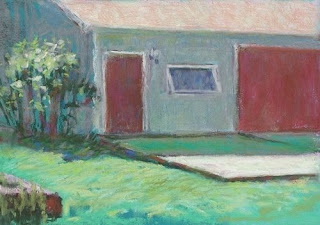
Friday arrived sunny but cool. With lots of loose ends to tie up -- how to correct a painting, how to know when you're done -- we had plenty to keep us busy. We also completed paintings that we'd begun earlier in the week. I finished up this 5x7 sketch. I'd been admiring this building all week through our studio window. When the sun was out, the play of light on it was enchanting. In this small format, it was impossible to capture all the detail, so I opted to merely suggest the architectural features and to focus more on light and color.


I also went over my "extreme limited pastel palette" concept, which gave everyone something to work on when the post-workshop blues hit. (They always do, and the instructor is not immune.) As I've written elsewhere, the palette consists of 14 sticks -- a warm and cool version of each of the six color families, plus black and white. To get a better value range, select the darkest violets, blues and greens, and then the lightest yellows, orange and reds. Black and white are used only as a last resort for lightening or darkening a color. This exercise helps artists who paint only in pastel to learn the art of color mixing.

I had a great time with this group. We're already talking about bringing me back next year, at a time when the weather is warmer and sunnier and when the flowers will be blooming. The building in the sketch above has a magnificent magnolia tree in front of it. The tree has only begun to bud. It'd be fun to paint it in all its glory.

Friday, March 28, 2008

Springfield Pastel Workshop - Thursday

The rain finally did arrive on Thursday, and it was torrential. All of us were happy to be in the studio and out of the raw weather. I'm sure the crocuses, which are just coming up in the Springfield Art Association's courtyard, enjoyed the weather.


I spent part of the morning discussing perspective. In Springfield, which has many wonderful structures in districts like "Old Aristocracy Hill" and in the four-block Lincoln Home National Historic Site, it's hard to escape the rigors of perspective. I've written elsewhere about this science, so I'll just say here that you don't need the books. It's helpful to know the rules, but it all comes down to close and careful observation of angle and proportion. Use a pencil to measure these.


At lunchtime, the group got an exclusive tour of the Edwards Place, which is attached to the Association's facilities. Built in 1833 and the only house in Springfield on its original foundation, it includes period furnishings and the famous "Lincoln Courting Couch," on which Lincoln courted Mary Todd. (My favorite feature of the house is the oval skylight over the central staircase. You can look through it and up into the tower. In the summers, the skylight's glass was removed, allowing the tower to serve as a sort of chimney, drawing up the sweltering Illinois air and cooling the house.) The house was donated in 1913 to the then-fledgling art association and became its quarters. Today, the association is nearing the completion of historic renovations.

Finally, by popular request, I demonstrated how to paint a tree. After choosing a photograph featuring an old adobe structure and some cottonwoods in autumn, I toned my paper with a red-violet pastel to create a complementary backdrop for the greens. I next sketched in the dark trunks and a few of the major branches of the cottonwoods with a dark magenta pastel. For the foliage, I picked out three greens: a cool, dark green; a warmer, mid-value green; and a very warm, light green. I laid in the shadowed areas first and then moved my way into the lights. This covered up some of the trunks, so I reworked those and added a few, sharp darks for more branches.

On Friday, I'll cover how to fix problems and finish paintings.

Thursday, March 27, 2008

Springfield Pastel Workshop - Wednesday

Although rain had been predicted for Wednesday, the day turned glorious and full of spring sunshine. It was still a little cool, but with a jacket, some of us found it warm enough to paint outdoors. Others stayed inside, working either from photos or from life, observing buildings and trees through the grand new windows that had been installed just the week before.

As an outdoor demonstration, I showed how I paint my 30-minute, 5x7 pastel sketches. As I've mentioned elsewhere, these sketches are "risk-free." They require few materials and little time, but the payback can be big in terms of honing your skills of observation. Here's my sketch of a historic brick building across the street in the early morning sun.

Value was one of our discussion topics. While visiting students at their easels, I walked around the property with a value finder to verify (and even disprove) some theories I'd read about how value works in the landscape. I'll present my full findings in my next book, but for now let me offer one curious observation about value finders: you can't trust them.

For example, here's a paved driveway as seen through a value finder. The red circle indicates the value of the pavement.


Now, here's exactly the same scene. You'll note that the value of the pavement seems to have changed significantly.

Why? Well, neither the light on the pavement nor the pavement's intrinsic value has changed. What has changed, however, is the incidence of light on the value finder itself. The first photo shows the value finder in full sunlight; the second shows it tilted into near-shadow. I found I could get the pavement to read as any value I wanted just by tilting the tool a little more or a little less. In fact, it was almost impossible to avoid tilting the tool and getting erroneous readings.

Tilting the tool changes the angle of light hitting the cardboard, allowing more or less light to illuminate it.

Two properties are at work. As the amount of light hitting the cardboard increases, the value scale becomes brighter, thus making the pavement seem darker. Also, your pupil constricts as it adjusts to the stronger light. (The camera adjusts, too.) This allows less light from the pavement to enter your eye, and again, the pavement seems darker.

The best value finder is your naked eye. You just have to get better at comparing values.

Wednesday, March 26, 2008

Springfield Pastel Workshop - Tuesday

I've been taking early morning walks to clear my mind before teaching. It also gives me a chance to eye the weather for the day. Tuesday morning I was glad I had a good, windproof spring coat -- the wind blew as briskly as it can on Campobello Island! There was no plein air painting on Tuesday.

It didn't matter, though, as we had plenty of work to do indoors. I went over John Carlson's observations on value in the landscape, and I reiterated the importance of minimizing value shifts within masses. To illustrate, I painted a demonstration based on a photo of El Morro National Monument in New Mexico.

Here's the value sketch I made. You'll note that I used only three values: dark, light and a mid-value. Carlson writes about breaking up the landscape into four values. But because the hard pastels I use for underpainting don't have an extensive value range, it's sometimes difficult to find four pastels with enough separation in value to indicate clearly that masses are of different values. Three values work fine, just so long as you later expand the range with softer pastels, which typically have lighter lights and darker darks.


Here's the complete "working palette" of pastels that I used for the painting. Rather than put the pastels back into their proper spots in the box after using them, I placed them in a small plastic lid so I could find them again quickly if needed.

Here is the almost-finished painting with the reference photo beside it. The students remarked on how dull the photo is. To compensate, I used rich, vivid color right off the bat for my underpainting. In the later stages of painting, I adjusted the color to make it more realistic.


Finally, here's the finished piece. As you can see, I gradually worked in a few more values to expand the range. Still, the design remained strong, thanks to the practice of minimizing shifts in value within the masses.

Later in the day, I talked a bit about color thumbnails and did a mini-demonstration to show their usefulness.

On Wednesday, we'll dive head-first into expressive color. In the evening, I have a book signing at the Springfield Art Association, where I'll be reading from Through a Painter's Brush and the upcoming book, Backpacker Painting.

Tuesday, March 25, 2008

Springfield Pastel Workshop - Monday

When Springfield Area Pastelists (SAP) invited me to teach a weeklong workshop in late March, we had hoped that the weather might cooperate for a little plein air painting. But early spring weather is fickle, and when I arrived on Saturday, flurries were spinning down in the capital city of Illinois. By Sunday, the flurries had changed to snow squalls. Big, sloppy flakes decorated my coat as I took an evening walk.

On Monday morning, the sun burst out of the clouds. Still a bit cool, the weather kept us indoors. This isn't a bad thing on the first day of a workshop; there's much to cover before we put down even the first pastel stroke. Later in the week, though, I hope to do one demonstration outdoors. The facilities of the Springfield Art Association (SAA), which is where the workshop is being held, include a beautifully treed sculpture garden and several historic buildings, all great material for painting. For students wanting to brave an Illinois spring, they can paint right outside our studio while the others work indoors. The studio will be waiting for them should the snow squalls return.

Here are a couple of photos from Monday. The SAA studio has a new set of north-facing windows, which shed a generous and even light on the space.


Although my students are all experienced pastelists, I like to cover the basics in the first day: my essential palette, my underpainting technique and, of course, the Importance of Values. (I won't rehash these here, since I've discussed them in earlier blog entries. Besides, I'll elaborate upon them in my new book, Backpacker Painting. I don't want to give away all my secrets!) After a short demonstration in the morning, I let students work in the afternoon.

This is the first pastel workshop I've flown out for. Usually I drive so I can carry the whole kit'n'kaboodle. This time, I had to pack carefully and lightly. I was very pleased to have the new Heilman Backpack Pastel Box. It carries my entire set of NuPastels, plus a set of sepia Pastels Carré and three dozen half-stick Senneliers. I even had room left over for a fistful of pastel pencils.

I took this box as carry-on luggage. I'd heard tales of how airport security sees pastels under x-ray as suspicious objects. Perhaps so, but in the two security checks I had to pass through to get to Springfield, not one person asked to open the box.

Here's the box in action today:

Forecasters predict a good day for Tuesday, so maybe I'll get to do an outdoor demonstration in the sculpture garden. If not, we've got plenty of photos to paint from - and great view out the window for painting de la fenêtre.

Wednesday, March 19, 2008

Plein Air & Adobe Photoshop

Among the many tools available to the outdoor painter, photo-editing software is just not one of them. Although you can lug to the field a laptop loaded with Adobe Photoshop, using it is impractical, thanks to the time constraint imposed by the sun's movement. However, it can be very useful when you're in the studio analyzing your field sketches.

This week, I'm in Georgia visiting family. While helping out my elderly parents, I'm finding time to paint. Yesterday, I did this 5x7 pastel sketch of my father's workshop. I was attracted primarily to the strong sunlight on the pavement and the contrast with the shadowed building.

(5x7, pastel/sanded paper)

But that old bugaboo, perspective, gave me trouble. From where I sat, the effect was very slight, and I found it difficult to render it properly, given the tight tolerances required by the small format. (A larger format would have given me more leeway with my strokes. Changing my position to enhance the effect would also have helped.) Later that day, I pulled the image into Photoshop and drew some perspective lines. Strangely, the perspective wasn't that far off, as you can see.

(Red line represents eye level. Vanishing point is to the right.)

In Photoshop, I made some small adjustments, but still wasn't satisfied. I noticed that the tops of the window and the small door made a strong line, creating an odd, near-tangent with the large door. I felt that moving the window down to break the line would help. Photoshop made it easy to test this out.


I often play with my paintings in Photoshop, solving perspective problems and playing with different color harmonies. It can be a great teacher. (Tip: GIMP is very similar to Photoshop, and it doesn't cost anything.)

Tuesday, March 11, 2008

Heading Out

I'm heading out in the morning for an extended trip, part of which is for a pastel workshop I'm teaching in Illinois. Since access to the Internet will be variable, I thought I'd leave you with the following painting -- just in the event you hear nothing else from me until Spring. (Since I'll have the laptop and camera with me, I will try to post. It's hard to believe the workshop season has already arrived!)

I did this one just before the last storm hit. The air was full of moisture, making for an excellent example of "atmospheric perspective." Things in the distance become cooler in color temperature and have less contrast and sharpness. In particular, I liked the reds in the nearest hill as they turned to violets in the more distant one.

See you in a few weeks!

"Snow at Herring Cove"
5x7, oil/panel, en plein air

Sunday, March 9, 2008

More Thoughts on Painting Size

My small paintings often display greater energy than my large ones. Mostly, this is because I use large brushes even for small pieces and, because of the nature of outdoor painting, I have a limited amount of time. These factors force me to work in big shapes with an economy of movement. This doesn't mean the brushwork is sloppy, but it does mean that the paint tends to be thick and the strokes a little less refined. Thus, the small paintings have a more painterly feeling.
"Birches in a Red Field"
5x7, oil/panel, en plein air - SOLD

There's no reason, of course, that this can't all be brought to a bigger canvas. And why wouldn't I want to? Bigger canvases can be sold for more, and there's definitely a market for them.

The main obstacle to painting large is the risk factor.

Painting large is full of risk. It uses a lot more resources than small paintings -- more paint, more canvas, more time, more coffee and snacks. It's very possible that, after using all those resources, the painting may still end up a "scraper."

Small paintings are virtually risk-free. Paint is measured in quarter-teaspoons rather than cups; canvas, in square inches rather than square yards; time, in minutes rather than hours; and coffee and snacks, in sips and bites rather than quarts and pounds. Plus, they're a great way to develop skill and to fine-tune one's response to the landscape.

"Birches in a Red Field" - Detail

To tackle a large outdoor painting, I need to get quickly past the risk factor. This means that my skill must already be in top form and my response to the landscape, tuned to perfection. This way, I won't worry about the mounds of paint I squeeze out or the expense of a square yard of canvas. What helps is doing a series of small pieces in the days immediately prior.

Finally, to avoid overworking both detail and paint, two common flaws that suck out the energy of any painting, large or small, I would go with the very biggest brush I have and set a time limit. I'd use a #12 flat and give myself two hours, max.

So where's the large painting demonstration? I haven't done one I like yet. But, the season has barely started. Stay tuned!

Thursday, March 6, 2008

Drying Rate of Oils

I recently had a question from a reader who is making the switch from acrylics to oils. What's bothering him is the longer drying time of oils.

I used to paint in acrylics. At the time, I was living in the Southwest, and as one can imagine, acrylics dry pretty quickly out there. I found myself doing everything I could to keep the paint wet and workable. Eventually, a light bulb clicked on, and I realized that I was trying to make them act like oils. Why not go with the genuine article? I thought, and so I switched. I haven't looked back since.

Even so, as my reader notes, the slower drying time can be a problem.

"Yellow Barn, Evening"
6x8 oil, en plein air - SOLD

It's a plus if you're painting portraits or large studio landscapes in which the paint must stay workable so you can make adjustments day to day. But it's lousy for a plein air painter who needs to ship a piece not long after signing his name to it.

Oils can have a variety of drying times, depending on many factors. Key is heat. Since they dry by a chemical reaction (oxidation), the warmer they are, the faster they dry. Low humidity is also said to help, but in my experience in the oft-humid Canadian Maritimes, I haven't seen high humidity slow the drying time.

Another factor is pigment. For example, Zinc White takes much longer to dry than Titanium White. It can take days or weeks. Earlier in the year, when I was painting apple trees in full bloom, I found an old tube of Zinc White in a drawer -- it's not something I use typically -- and decided to give it a try. The apple blossoms took nearly two months to dry.

Alizarin Crimson also takes a long time. Other paints, such as earth colors like Burnt Sienna, dry very quickly.

Here's what to do if you want your paintings to dry in 24 hours or less.

First, you can use an alkyd paint rather than traditional oil paint. Alkyd is a resin, and it dries within hours. Since a great deal of white is used in outdoor painting, one might use alkyd white and make sure to mix a bit of it into everything. Winsor & Newton makes the Griffin Alkyd line of paints, and their Titanium White would be a good one to try.

Another option is to use a fast-drying medium, such as Gamblin's Galkyd Painting Medium or Galkyd Lite. Thin layers of color put down with these will dry within 24 hours. Thicker paint, of course, takes a little longer. If you tend to use thick paint, try using alkyd white with them.

One last option, which is not often recommended, is to add a siccative or drier such as lead napthenate, cobalt drier or CoZiCa. Driers can affect the stability of the paint film over time.

Finally, if you're painting alla prima (all at once), you may find it difficult to lay down wet paint on top of wet paint. To do this takes practice. For those last layers, use a "loaded" brush and, holding it horizontally to the surface, drag it very lightly across. Just kiss the surface. This way, the paint will come off without disturbing the lower layers of paint. This is how I add finishing touches such as highlights and dark accents.

(Yes, I have tried drying wet paintings in a warm oven. It does work, but the fumes are nearly overpowering. And 9 out of 10 artists, including this one, recommend against it. Again, stability is the issue.)

Monday, March 3, 2008

Winter Interior

I wanted to try out some panels a new manufacturer had sent me. The panels, made by R-tis-tx in Texas (www.rtistx.com), are suitable for any medium that doesn't involve acetone or alcohol. The surface feels like gesso with a light peppering of pumice. I did the following pastel on it, and I enjoyed the way the pastels responded to the surface. (I used a light application of Polychromos pastels followed by Mount Vision pastels. I'll try an oil painting on these panels next.)

"Winter Interior"


9x12, pastel, de la fenêtre

I don't normally "do" interiors, but Trina asked. As it was a very cold day with several inches of new snow, I was more than happy to sit in the breakfast nook with a cup of hot tea and paint.

The colors and the contrasts are what really excited me about this scene. I loved the violets in the distant, shadowed woods and the way some of that color bounced down onto the red placemats. I also loved the interior walls, which looked full of green shadow. Although the table is green, the walls aren't. The violet, complement to green, made them appear so thanks to simultaneous contrast.