
I had a frame.
Sometimes, that's how a painting starts—with a frame. A couple of years ago, a patron made me a deal. He offered to purchase some paintings and to pay part of the bill by trading a frame. It was a very nice frame—solid wood, gold leaf, enough scrollwork so it looked classy but not gaudy—and even though it was for a large size (24x30) of painting I rarely work in, I took it. It was a frame I couldn't have afforded to buy, not without a specific painting and a committed collector, but with the trade I thought it was a good deal.
The frame then sat in my studio, getting moved from corner to corner as I puttered around and tried to avoid it because I had no idea what kind of painting I'd make for it.
One day, while on a misty hike along our island's rarely-visited shoreline, I spied a beautiful arrangement of rocks sitting at the edge of the water. The mist had made the rocks silvery with moisture, and the seaweed, at mid-tide, trailed gracefully about them. The water was glassy-calm, as it often is on foggy days. After snapping a few photos, I wondered if I should run off to get my gear and come back to paint my usual 9x12 plein air piece. But I realized a 9x12 simply would not do it justice. I felt it called for something bigger.
I then remembered my frame and immediately knew I had found my subject. I took my photos home and got to work on some design ideas. I pulled out a couple of plein air sketches I'd made under similar weather conditions to use as color references. I gessoed some etching paper and got to work on figuring out a color scheme. I ordered a panel large enough to fit the frame. (Its arrival was delayed for a few weeks, which was too bad, as I had wanted to put this new painting in a show as a centerpiece but the panel came too late. But that tale is for a future post.)
Once I'd settled on design and color, I got to work. I used a mid-value grey pastel to place the major shapes on the panel. I like to use pastel for this step, as I can draw with it more easily than with a brush, and the pastel, being pure pigment, gets more or less eaten up by the following layer of paint. Next, I used a large brush and blocked in the main dark shapes in raw umber, following this with greys, primarily cool reds, greens and blues. For this, I made heavy use of Gamblin's Portland Greys, tinting them as needed with color. I then moved on to sky and water, using the same color palette. Once completed, I put down the brush and took up a large knife, blocking in first the rock cracks, using nothing but Ivory Black. (I don't know why we artists are told that black is taboo, but there's nothing like it for the kind of dark you see in the crevices between maritime rocks.) From here, I continued with the rock shadows, the lit parts of the rocks and seaweed and, finally, sky and water.
While working, I kept my color study, with was about a quarter the size of the final painting, right beside my easel so I could refer to it constantly. I'd worked hard to come up with a palette that worked, and I didn't want to depart too much from that. Occasionally, I found myself getting excited by adding some odd bit of color that lay outside my pre-chosen palette, but when I stepped back, I always saw it hurt the overall mood, and so I would scrape it off and go back to my color study, which had the mood just right.
Toward the end of the painting, I found that it was helpful to have a second pair of eyes. Despite all the tricks of turning a painting upside down or viewing a photo of it to uncover hidden problems, there are some issues that only fresh eyes can see. Trina pointed out a few that, once corrected, helped the painting immeasurably. The lesson here: Don't be afraid to show a work-in-progress to another artist. You don't have to take the advice, but at least it gives you another perspective and, in the end, might improve the piece.
And don't turn down a frame just because you don't have a painting for it. Someday, maybe, you will.
Here a few photos of my process. Not pictured is my palette: Portland Grey (Light, Medium, Deep), Phthalo Green, Olive Green, Permanent Green Light, Green Gold, Raw Umber, Ivory Black, Permanent Alizarin Crimson, Ultramarine Blue, Titanium-Zinc White. (All Gamblin.)
 |
| Block-in with raw umber |
 |
| Restating the drawing with pastel |
 |
| Block-in over the Raw Umber with tinted Portland Greys |
 |
| Restating the drawing with paint, correcting the drawing |
 |
| Working here and there |
 |
| Done with the brush |
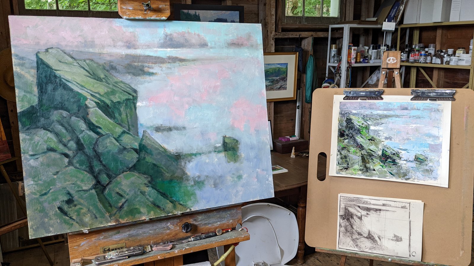 |
| My set-up. Color study and value sketch on right. |
 |
| Now the knife and some richer color |
 |
| More knife work |
 |
| Finished painting. Adjusted shape of two rocks in the foreground. Can you find them? "Littoral" 24x30 Oil Available, frame included - details here |