Authentically Human! Not Written by AI!
All Content Copyright © Michael Chesley Johnson AIS PSA MPAC

Saturday, July 29, 2023

My Art History: John William Waterhouse

View in browser

**Authentically Human! Not Written by AI**
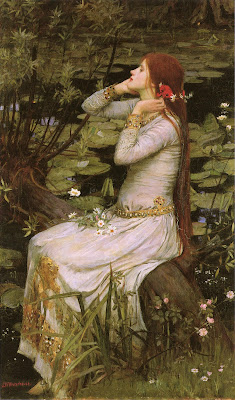

Ophelia by John William Waterhouse
1894, oil on canvas, 124.4 x 73.6 cm (49.0 x 29.0 in).
Private collection 

I wrote about one of the founding members of the Pre-Raphaelite Brotherhood, John Everett Millais, in a previous post.  (You might recall that his most famous painting, “Ophelia,” required the model, Elizabeth Siddall, to sit in a tub of water for so long she caught pneumonia.)  Another artist, John William Waterhouse (1849-1917), who came much later to the Brotherhood, also painted an “Ophelia”—actually, several of them.

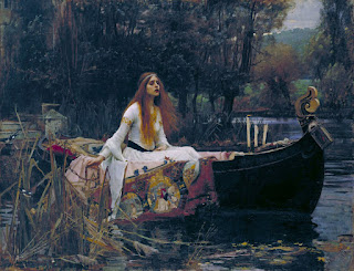
As with Millais’ 1851 painting, Waterhouse’s 1894 “Ophelia” was another favorite while I was in college.  I guess there’s something about a beautiful but tragic figure perched by dark water in a half-lit landscape that appeals to the romantic in a teenager.  (Also, I was deep-reading “Hamlet” for my Shakespeare seminar at the time, and so my infatuation with Ophelia seemed relevant.)  Another Waterhouse favorite with that doleful theme is “The Lady of Shallot,” featuring the same model.

The Lady of Shallot
1888, oil on canvas, 153 x 200 cm (60.2 x 78.7 in).
Tate Britain, London 

The model, Muriel Foster, looks somewhat like Siddall, but they were not related or even contemporaries.  Siddall died in 1862 from an overdose of laudanum, long before Foster posed for Waterhouse.  Many of the women depicted by the PRB look similar.  Partly this is because the artists often shared models, but also because they tended to paint an idealized representation of a certain type of female beauty.

Another common aspect of Pre-Raphaelite paintings is a dreamlike landscape bursting with color and texture.  Millais stepped beyond reality when he painted his “Ophelia” from life in a garden over seasons in order to capture the full range of blooming plants.  But so many of the PRB landscapes seem less than real and more like the backdrop of a stage set.

Here’s an interesting take on this by critic A. Lys Baldry from an article he wrote on Waterhouse in 1895, in which he discusses the difference between painting in the studio and outdoors:

...as outside colour is beyond the reach of the painter in the studio, outside effects of atmosphere are also to be forbidden. On this point, Mr. Waterhouse, most of whose pictures, by the way, are now treated with landscape backgrounds, has equally rational convictions. To paint the conventionalised figures in accordance with the studio theory and to juxtapose with them a realistic landscape would be obviously jarring, and the result would be disjointed and uncomfortable. Therefore, if the setting of the subject chosen for the picture must necessarily be trees and sky, or a blue sea, these details must be in their turn conventionalised and treated as colour masses alone. The land must, in fact, be of the nature of a tapestry backing, real enough in form, accurate as it can be made in drawing and perspective, and possessed of all possible charm and harmony of colour, but without any suggestion of atmospheric variation or change of effect. Of this use of out-of-door material for pictures that have to be painted under a roof, Mr. Waterhouse has given excellent examples in his “Naiad” and “Ophelia,” both of which owe not a little of their refinement and charm of colour to the sensitive treatment of the backgrounds and accessories of leaves and branches.

— from The Studio, An Illustrated Magazine of Fine and Applied Art, Baldry, A. Lys (January 1895), J. W. Waterhouse and his Work, vol. 4, pp. 103–115

Saturday, July 22, 2023

My Art History: Claude Monet

View in browser

**Authentically Human! Not Written by AI**

Monet's Water Lily Paintings at Musée de l'Orangerie

Where do I even start?  It was Claude Monet who inspired many people to become artists—including me.  Sure, when I was very young I'd dabbled in paint and salivated over the prints in One Hundred and One Masterpieces, but none of that set my path.  Instead, the catalyst was an exhibit of Monet's water lily series, which my mother took me to see as a teenager.  I remember entering a vast, round hall, vibrant with color—and all I saw was color.  I knew at that moment that I wanted to paint, and to paint just like that.

Monet (1846-1926) didn't paint "just like that" at the start.  He first took a more academic route, starting at age 11 at Le Havre Secondary School of the Arts and continuing at 18 with studies at Académie Suisse, focusing on the figure.  Around that same time, he befriended the older artist Eugène Boudin (1824-1898), who introduced him to plein air painting.  Following this, he fell in with a group of ne'er-do-wells that included Pierre-Auguste Renoir (1841-1919), Edgar Degas (1834-1917) and Camille Pissarro (1830-1903).  Plein air painting and his comrades-in-art changed the way he painted.  After that, he was rarely accepted by the academic Salon for its exhibitions: "His work was considered radical, 'discouraged at all official levels.'"

Left: Monet at age 21 in a portrait by his teacher, Carolus Duran
Right: Monet at 53

In 1874, Monet exhibited the now-famous "Impression, Soleil Levant" at the first exhibit of the Société Anonyme des Artistes Peintres, Sculpteurs et Graveurs, a group he co-founded with his fellow revolutionaries.  Of course, the practice that is today called Impressionism had been born a few years before, but it was this exhibit that gave the movement its name.  A dyspeptic critic titled the exhibit "Exposition des Impressionnistes."  He wrote of Monet's entry:  "A preliminary drawing for a wallpaper pattern is more finished than this seascape."

The rest is history, of course.  Monet painted his water lily series late in life, just before his vision began to deteriorate from cataracts. (Color rather than form became his focus.)  Unhappy with his eyesight, he had surgery presented to him as an option.  But his close friend, Mary Cassatt, had recently had the surgery, and it had not gone well.  So, he fought against it:  "I prefer to make the most of my poor sight, and even give up painting if necessary, but at least be able to see a little of these things that I love."

As his vision worsened, he was finally persuaded in 1923 to have the surgery performed on his right eye.  This two part-procedure, which involved removal of part of the iris and the entire lens, required him to lie flat on his back with sandbags butted up against him to keep him from moving.  After a third procedure, he wrote:  "It is to my great chagrin that I regret having had this fatal operation. Pardon me for speaking so frankly and let me tell you that it is criminal to have put me in this situation."

So frustrated with the experience, he never had the left eye done.  But interestingly, a discussion of Monet's cataract problems by Anna Gruener in the British Journal of General Practice notes:

Monet’s postoperative works are devoid of garish colours or coarse application and resemble his paintings from before 1914. The delicate colour schemes emphasising gentle blues and greens are consistent with the earlier pond and garden views. It is therefore unlikely that he had intentionally adopted the broader and more abstract style of his late paintings, reinforcing the argument that Monet’s late works were the result of cataracts and not conscious experimentation with a more expressionistic style. Nonetheless, it is his late works, created under the influence of his cataracts, that link impressionism with modern abstract art.  

(For the full, fascinating tale of Monet and cataracts, visit this link.)

Many of us develop cataracts as we age.  I've been told I have the beginnings. Will I, like Monet, fight against having surgery? Things have come a long way since Monet.  But the friends who've had it tell me blues will look more vivid.  Do I really want that?


Wednesday, July 19, 2023

Bog Meditations, Part 4

View in browser

**Authentically Human! Not Written by AI**

"Sunny Bog: Bog Meditation 2"
12x24 oil/panel
Available

After completing my foggy bog painting, I needed to make one more of the bog, but this time with strong sunshine.  The bog looks completely different under a bright sun.  Also, the tree needed more attention.  It possesses a beautiful, graceful quality that stamps it as a unique individual.  How could one not feel obligated to show that characteristic?

For the tree's trunk and branches, I referred to a pencil drawing from the field.  After transferring this drawing to my panel with pastel pencil--toned first with transparent color to mark warm and cool areas--I then traced over the pastel lines with a small brush and paint.  My goal was to maintain a fairly accurate representation of the rhythm of the branches.

For the rest of the painting, I worked with mostly out-of-the-tube colors.  (Gamblin's Nickel Titanate Yellow, a bright, cheery color, was perfect for the grasses in the middle ground.)  For distant colors, I greyed them down with a little Portland Grey Light; for the darkest darks, Dioxazine Purple mixed with Viridian.

Here are some detail photos:


Saturday, July 15, 2023

Bog Meditations, Part 3

View in browser

**Authentically Human! Not Written by AI**

Bog Meditation 1
8x24 oil/canvas (gallery-wrap)
$2000 - Available here

This past week, I completed the first of my final bog paintings.  "Bog Meditation 1" was a pleasure to create.  I first propped up all the reference material on an easel—pencil sketches, gouache studies, a photo or two, plus notan studies—and decided to go with a 1:3 format and a foggy day scene.

Next, I pulled out an 8x24 stretched canvas (gallery-wrap) that I'd toned previously with Gamblin's Transparent Earth Red.  The tone would serve not only to help unify the painting but also to add a subtle "pop" of warm color to all the cool colors I planned to use.  I sorted through my collection of Gamblin paints looking specifically for cools such as cadmium green, viridian and cerulean blue.  I also chose quinacridone magenta; although it's a red, it's a cool red.  But I also wanted a few warmer notes for contrast, so I added Portland Grey Deep, a neutral grey that looks warm against all the cool colors, and Napthol Red.

You'll note that I put the tree right in the middle.  Yes, I know I broke a rule, but I wanted this kind of strong emphasis.  The viewer needed to see the tree first and only then the supporting landscape.  The danger, of course, is that the painting could become too evenly balanced.  To avoid this, I made some of the branches swoop and curve. I also played with the patterning of the trees in the distant fog, keeping intervals uneven and shapes different.

Next, I plan to do a 1:2 sunny scene of the same.  In the meantime, here are some detail shots.


Saturday, July 8, 2023

Bog Meditations, Part 2

View in browser

**Authentically Human! Not Written by AI**


1:3 Notan, Value Study for my Bog Painting

I'm continuing to work on my bog painting project.  (You can read my previous post about it here) After last week's foray into the field for photos, color sketches and some pencil drawings, my next step was to create a series of design explorations or notan studies.

For this, I used watercolor, sticking to just one color (red) so I could focus on value shapes.  Not sure of what size I'd finally end up using, but knowing I wanted to stick with a landscape format, I pencilled in 4"x8" (1:2) and 3"x9" (1:3) rectangles on 300-lb cold-press paper.  I laid down tape around each of these so I could have a nice, crisp border, enabling me to see the design better.  I used a Chinese calligraphy brush so I could get expressive strokes.  (Maybe not the best choice, as I found it held more water than I needed, and I was constantly squeezing out water before dipping it into color.)  Here's what I came up with, besides the one at the top of this post:


Next, even though I'd made some field studies, I felt I didn't have a good grip on the forms of some of the trees I wanted to include.  So, back to the bog I went.  I took more photos plus made a pencil study:


Finally, I had enough material for the next step, which was to explore color.  Using the same format and size as the notan studies, I used gouache to explore some color options.  (For this, I decided the 300-lb paper was too pricey for just quick sketches, so I opted to use cheaper 150-lb paper instead.)  For the final painting, I am thinking about a foggy day, but I wanted to include a sunny option as well, just in case I change my mind.  Here's what I did:


So now I have lots of material to refer to when I start the actual painting.  Will I go back to the bog for more reference material?  Undoubtedly!  The bog is a beautiful place.  But it's also generally empty of other humans.  Few people visiting the park go there, preferring the beaches or rocky cliff trails with ocean overlooks.  The bog has become my quiet place.  Yet it's not just a visual treasure—it's a full sensory experience, complete with boggy smells, bird song and a moist breeze.  Even if I don't take pictures (it's hard not to, though) I'll certainly saunter and enjoy the moment.

Saturday, July 1, 2023

Will Art Vandalism Save the Planet?

View in browser

**Authentically Human! Not Written by AI**

Monet avec Pomme Purée
(New York Times; Letzte Generation, via Getty Images)

We've all seen the photos in the news several times now:  a couple of protestors in a museum, hands Super-Glued to the protective glass, with yet another famous painting doused with soup or oil or paint.  

Anger rises in my gullet every time I see this.  Most of the paintings we see in museums have great cultural and educational value and, quite often, great beauty. Here are some of the paintings that have been attacked:

  • Johannes Vermeer, "Girl with a Pearl Earring" (Netherlands)
  • John Constable, "The Hay Wain" (UK) 
  • Pablo Picasso, "Massacre en Corée" (Spain)
  • Claude Monet, "The Artist’s Garden at Giverny" (Sweden)
  • Botticelli, "Primavera" (Italy)
  • Vincent Van Gogh, "Sunflowers" (US)
  • Francisco de Goya,  "La Maja Vestida" and "La Maja Desnuda" (Spain)

and so on.

But like beauty, cultural and educational value often lies in the eye of the beholder.  For the protestors, clearly the value of the paintings lies only in their utility in helping them raise awareness and spread a message.

What message?  It really doesn't matter--it could be anything.  What does matter, however, is that these works are being attacked and exploited.  Granted, I agree that the protestors' message is important.  Climate change is real, and one of the secondary causes is the oil industry.  (What's the primary cause? you may ask.  Overpopulation—but that's a blog post for a different venue.)  And although apparently none of the paintings have been harmed, other than damage to protective glass and frames, the risk is there.

To my mind, the protestors are undercutting their message.  Rather than raising awareness of the peril of Big Oil's contribution to climate change, the message becomes one about the peril of activists choosing the wrong way to go about it.  Their message is much weakened by this behavior.

At one of the protests, a participant said:  "When there’s no food, what use is art? When there’s no water, what use is art?”

One might ask instead, "When there's no art, what use is food and water?"  Art is what makes us human; food and water merely make us animals.

Here are a couple of good articles on these protests:

https://www.theatlantic.com/science/archive/2022/10/vermeer-glue-soup-climate-protest-outrage/671904/ 

https://www.washingtonpost.com/arts-entertainment/2022/10/27/climate-activists-glue-art-trend/