 |
| "Sunny Morning in Auchterarder" 11x14 Oil - Available This is the first painting discussed below, with cadmium orange, phthalo green and dioxazine purple. |
 |
| "Highland Path" 9x12 Oil - Available This is the second painting, with naphthol red, chromium oxide green and dioxazine purple. |
By now, most of us painters have run into Albert H. Munsell and his color system. Munsell swept away earlier, unsatisfactory attempts at ordering color and replaced them with a more logical model. He gave each color equal space and assigned to it a number that represents its hue, value and chroma. Somewhere, I read that he felt the Newtonian color wheel, which has red, yellow and blue as its primaries, was too heavily weighted toward the warm colors (red and yellow). So in his model, he decided there would be not three but five primaries: red, yellow, green, blue and purple, thus distributing temperature more evenly.
Although Munsell's model is three-dimensional, with the axes being hue, value and chroma, one can flatten out this model into a color wheel. In it, the complements to the primaries are different from the ones you find in the Newtonian wheel. As you will recall, the complement pairs in a Newtonian wheel are:
- Red/green
- Yellow/purple
- Blue/orange
But in the Munsell model, they are:
- Red/blue-green
- Yellow/purple-blue
- Green/red-purple
- Blue/yellow-red (orange)
- Purple/green-yellow
Here's the Munsell wheel with its hue numbers, courtesy of Gamblin Colors:
This makes for color harmonies that are slightly different from ones made with the Newtonian wheel. I decided to play with this, and made two paintings based on Munsell triads composed of green and two split-complements, purple and red. (If I'd used the Newtonian wheel, the split-complements would have been purple and orange.)
Of course, the pigments used for such an experiment are important. Gamblin offers the following list that describes its paints in terms of Munsell numbers:
https://gamblincolors.com/color-temperature-list/
This is a very useful chart if you want to play with Munsell color choices. (At the moment, the Munsell numbers don't appear on the tube labels, but I think it would be very helpful and have requested that Gamblin put them there.)
I used this list to make my color choices. For the first painting (“Sunny Morning in Auchterader”), I used phthalo green (5BG), cadmium orange (5YR) and dioxazine purple (2.5P). I intentionally made my choices a little off so you could contrast it with the second painting. Here's how these colors are plotted:
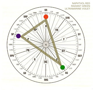
If I'd wanted to get a true split-complement triad, I would have chosen instead radiant green (5G), naphthol red (5R) and ultramarine violet (5P). See how these are plotted, and notice the nice isoceles triangle with green at the apex:
Unfortunately, I don't have radiant green or ultramarine violet on hand. So, for my second painting (“Highland Path”), I did my best. My choices were chromium oxide green (2.5G), naphthol red (5R) and dioxazine purple (2.5P). Here's the chart:
These are closer to being a true split-complement triad.
Of course, for both paintings, I included a few other colors. For the first painting, I added minimal amounts of permanent green light, chromium green and napthol red, and I greyed down most colors with Gamblin's Portland Greys. For the second, I used touches of permanent green light and yellow ochre, and again greyed down color with the greys.
There are, of course, many variations on triads. If you're looking at the charts, I think building a triad around an isoceles triangle is a good solution. (This triangle has two sides of equal length; the main color choice would be at the point where these two sides join. Although note that according to this idea, in my paintings, where green would have been the main color choice, it is not the dominant color—violet is. But the green does have more impact because of its rich chroma and lighter value.)
Does your brain hurt yet? If you'd like more information for your own experiments, here are some good resources:
Gamblin's discussion of the Munsell system as relates to its products:
https://gamblincolors.com/munsell-color-system/
“Navigating Color Space,” a video discussion of Gamblin's use of the system:
https://gamblincolors.com/navigating-color-space/
An article about the importance of color theory in painting:
https://munsell.com/color-blog/the-importance-of-color-theory-in-painting/
An article about color harmony with respect to the Munsell system:
https://munsell.com/color-blog/visual-analytics-color-wheel-triad-harmony/
An article about Munsell as an artist:
https://munsell.com/color-blog/albert-h-munsell-artist/
And a very good book on the history of all of this:
Color: A Visual History from Newton to Modern Color Matching Guides by Alexandra Loske.
https://www.amazon.com/dp/1588346579/ref=cm_sw_em_r_mt_dp_U_trGFEbG9FJRCS


