Authentically Human! Not Written by AI!
All Content Copyright © Michael Chesley Johnson AIS PSA MPAC

Friday, February 22, 2019

Self-Portrait, Part II

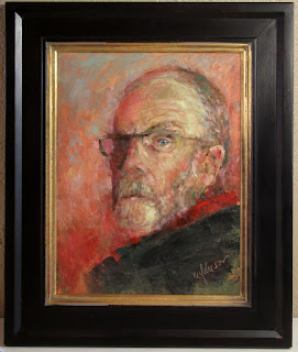
Mr Hyde
16x12 Oil - NFS

In a previous post, I wrote about a self-portrait I've been working on.  At the time, the "first draft" of the self-portrait was complete; I'd spent about an hour in the studio, channeling Lucien Freud and, perhaps, Van Gogh.  I was looking to achieve an intuitive but accurate representation in a short time.  Liking the result, I posted it on Facebook and Instagram.

Well, turning a self-portrait into a group effort is always risky, as you never know what the responses will be—especially if you like what you've done and think the work is complete.  Predictably, most responses (from close friends, family and fans) were favorable, but a few included suggestions.  The most important suggestion, I thought, had to do with background color.  The original background was a fiery red, and the red collar of my shirt got lost in it.  What if, it was suggested, I remove the red background?  The red collar would then "sing."

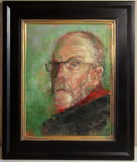
I wasn't sure if I wanted the red collar to "sing," but the suggestion planted the idea of playing with background color.  So, I digitally changed the color to first green and then a bluish green and took a poll.  First, here are the three images:


and here is the result of the poll:


Blue led with 47%, followed by red with 36%, and trailed by green, at 17%.

I was a little surprised that green didn't get a larger slice of the pie.  Green tends to enhance the warmth of the face as well as that red collar.  ("Now it really 'sings'!")  And as much as some viewers didn't like the red—saying it made my expression feel even angrier—nearly as many people voted for red as for blue.

I also asked respondents to comment on their choices.  These comments were interesting, too.  Here are a few of them:

The Argument for Blue
  • The contrast of cool and warm is more pleasing with the blue background.
  • Blue...or red if you are after a very disturbing image.  But I prefer the more peaceful bluish background. 
  • Although I do like the red one, the bluish background allows the red highlights to stand out in a very nice way. The red one makes me feel like you are standing near the Gates of Hades.
  • They all create different moods, and they are all effective in their own way. So it depends on what kind of mood  YOU want to create. I chose blue because the other two are too intense for my taste.
  • Brings balance to the whole.
  • The blue is cool enough to drop more into the background than the green and it picks up the colour in your eye. I was really okay with the red, too, but when you started to talk about the nice pop of red at your collar, I realized the sense in that. 
  • The intensity of the expression is exaggerated by the overall heat of the red background.  I like the blue-green better.
  • The red and green are to harsh (severe). They both compete with the portrait. The blue is more neutral, more sedate and doesn't compete with the portrait. 
  • The blue reads as neutral and calms the angry, intense red. 

The Argument for Green
  • The red is harsh and the scarf looks better with the green or blue background.
  • More on the complementary side than red.

The Argument for Red
  • Green makes you look sickly; red makes you look wise! 
  • Red is more unique and suits the warmth in your personality. 
  • The original red has a fabulous intensity. I always believe in creative 'gut reactions.' The original was painted that for a reason. The subconscious sees it as a more cohesive whole and focuses on the subject rather than the background. 
  • Red best suits the "aggressive" look of the face.
  • The red is much more graphic and exciting.  Yes, more grumpy, but more powerful. 
  • Red is an "energy" color..and a "passionate" color. 
  • The red seems to better suit the nature of the picture, and I like how it emphasizes the red collar/scarf. 

The Argument for Something Else 

(Yes, there's always someone who wants a choice outside the ones offered.)
  • If you are questioning either red or green, why not mix them to create a neutral that picks up both in the portrait? Better harmony, and a bit more highlight/shadow would have your likeness leap off the canvas.


I actually began to modify the background in the portrait before I got so many votes and began to read the comments.  As much as a fiery red background seemed appropriate at the time—I'd started with a burnt sienna background to give the canvas some initial life and warmth—it felt a little too much as I sat looking at it with a cup of tea during a relaxed moment.  Green, I decided would make it too jazzy and, as someone else pointed out, invoked Van Gogh in a heavy-handed way.  I decided to try blue.  Blue calms, and I felt that's what the thing needed.

So, that one-hour self-portrait ended up having another few hours added to it in the way of background changes and tweaks.  I initially started with a light blue scumble, but it gave the sense of floating through the sky.  I darkened it, greyed it, and finally ended up with something that seemed to give the overall painting more weight.  I also adjusted the contours of the head, getting it closer to the actual thing.  (Yes, I had to pull out my antique 50-pound wall mirror a few more times.)  I tweaked the facial hair, losing the lower lip and then regaining the lower lip.  That "mystery eye," as someone called it—my right eye—needed more definition despite being in the shadows, so I played with that some until it read right.  (Oh, and I ended up darkening that red collar.  Too much "sing.")

The result of all this is the painting at the top of the post.

Am I as satisfied with the portrait as I was after that initial single hour of inspired bravura?  I do like it, but it's going to sit on the easel for awhile longer.  It is said:

A work of art is never finished, only abandoned.

and I think this is more true of a self-portrait than of any other type of painting.

Mr Hyde (framed)
16x12 Oil - NFS

Monday, February 18, 2019

Looking for a Creative Summer Retreat?


Are you looking for a creative summer retreat? One that gets you out of the heat and into the cool mountains? Then read on!

Our home in the mountains of New Mexico is available for a 5-month rental from May to October this year. Living at this 7,000-foot elevation, with access to trails on public land and a lake, we've found it a perfect place to be creative. Whether you're a painter or writer or are involved in some other creative endeavor, you'll enjoy not just the beauty of the area but also the house, which sits at the edge of the quiet, friendly community of Ramah.

The house, which is our home and studio, is completely furnished, and the price includes all utilities (electricity, LP gas heat and hot water, water softener, town water and sewer, and Internet) as well as washer/dryer and creative spaces to work in. The 1200-sq-ft house is suitable for one or a couple. Sorry, but no smoking anywhere on the property and no pets.

The price is $800/month and requires a five-month commitment from early May to early October. In addition, we would ask for some minor yard work—weed-whacking the weeds.

Ramah lies in the heart of what is called the Ancient Way. The Zuni reservation is just to the west; the Ramah Navajo reservation just to the east; and the Cibola National Forest surrounds it all. The El Morro and El Malpais National Monuments are just a few miles away. Gallup, the main service town, is about 45 minutes away, but Zuni (20 minutes) has an excellent grocery store and Ramah itself has a restaurant, the El Morro Market (natural foods and local produce) plus a convenience store as well as the Farmer's Market in the summertime.

And here's an idea. If you are thinking of retiring to a scenic area like this, perhaps you might use your time to explore. We have a nearly 8-acre lot nearby in Timberlake for sale, and it would be a perfect building lot in a very desirable area with views of rocky cliffs, the Zuni Mountains and ponderosa and juniper.

If you are interested, please send an e-mail to mchesleyjohnson@gmail.com and I can provide photos and other details.  I've included a few photos of the area here, plus some paintings I've done.


Sunday, February 17, 2019

A Scottish Burn

"A Scottish Burn" 12x16 Pastel - Available

We've been having a good deal of snow here in northern New Mexico.  It seems like we get one warm, sunny day, and then we get another snowstorm blowing through.  I'll gladly paint snow, but not when it's snowing!  So, I've been spending some time in the studio working on painting projects.  It's fun to poke through old plein air sketches to see what strikes one's fancy.  This week, I'm thinking of Scotland.  As you may recall, I've made two trips to Scotland, so I have quite a bit of material to review.

I decided I wanted to paint a scene of a burn.  We don't call it a "burn" here in America, but rather a "stream" or "creek."  I also wanted to play some more with my set of Blue Earth pastels.  With that in mind, I set up some reference photos on my tablet, pulled out some color studies, and got to work.  "A Scottish Burn" is the result.  Although I started with harder Cretacolor pastels for the block in, I quickly moved to the softer Blue Earth pastels.  As I mentioned in a previous blog, I like Blue Earth pastels because of the logical color and value arrangement, which is very similar to how I arrange my palette.  (You can read all about that here.)   I painted it on a sheet of burgundy Art Spectrum Colourfix, a brand I prefer because of its coarser texture, which gives a more "painterly" look to the finished piece.

One guiding thought I had as I worked was to use as many greens as I could, but to incorporate touches of red and orange here and there to keep the green from being overwhelming.  I found that, even in Scotland, where you see so much green, there is still an undertone of red and orange in the landscape.  Also, I chose the burgundy paper for the same reason.

I've included some details photos as well as two shots of the studio (thank you, Trina!) to show you how I have it set up.   By the way, the painting is available for sale.  Click here for details.


Blue Earth pastels used for the painting.  I like taking a photo
of this box at the end because of the little "jumble" I create
as I work.


Thursday, February 14, 2019

Outdoor Study-to-Studio Painting Workshop: Dakota Pastels, Mount Vernon, WA, May 1-4, 2019


I'm excited about an upcoming trip to the Pacific Northwest to teach for Dakota Pastels this May.  Only a few minutes from Mount Vernon and the historic village of La Conner, Dakota is located in the scenic Skagit Valley, where we'll have plenty of subjects to choose from.  I'm told we might even still be in tulip season!

In this outdoor study-to-studio workshop, we'll first venture into the landscape, where I'll show you the best way to gather reference material in the way of color sketches and photos.  Then, we'll head for the studio, where we'll explore value designs and color schemes based on this material.  Finally, we'll put it all together to create stunning, finished paintings.

Dakota has spacious classrooms and art materials on-site at the retail store. The largest selection of pastels in the world is in the adjacent warehouse and is open to workshop attendees.  Students will receive a generous 10% discount on materials (during the workshop only and while you're there) so I suggest you purchase your materials through Dakota at www.DakotaPastels.com.

By the way, although the workshop is being hosted by Dakota Pastels, the workshop is also open to oil painters.  I will be working in both media, so no one will be left out!

Details:

Dates:  May 1-4, 2019
Price:  $400
Register on-line at https://www.dakotapastels.com/product/Johnson-2019?cat=272 .  You may also email info@dakotapastels.com or call 888-345-0067 ext 5

I hope to see you in the Skagit Valley in May!

Tuesday, February 12, 2019

Self-Portrait

Mr Hyde 12x9 Oil

This past week, I decided to paint a self-portrait.  It was one of those days when you feel rudderless, even though you have plenty to do.  I had hoped to paint outdoors, but the weather had suddenly turned Arctic.  Painting from a photo didn't appeal to me, either.   But what did get me excited was the idea of a self-portrait.  I haven't painted one in awhile, and I could use more practice in that, so—why not?

Sometimes the best way to do a self-portrait is to do it quickly.  Get the paint down, and then adjust minimally.  I envisioned a rough, painterly look, thinking of Lucien Freud and Van Gogh.  I gave myself an hour for the project.  (Plus a couple of days looking at the results and adding five-second tweaks now and then.)

The setup
Messy but effective palette

I set up a big mirror on another easel by my main one and pulled out a 12x16 stretched linen canvas.  I toned it with burnt sienna, using Gamblin's FastMatte so it would set quickly.  Then I laid out my palette.  I wanted to make this simple, so I went with a limited one:  Hansa yellow light, naphthol red, ultramarine blue plus raw umber to help in muting the colors.  I used titantium-zinc white, and also a little of Gamblin's Solvent-Free Gel to help the paint dry a little faster.   While painting, I used mostly a small, worn-out flat brush—not much more than a chopstick with a chewed end—but did use a knife where it suited me.  I had "red" in my head as I worked, since that was the color of the toned canvas, and you can see the result at the top of this post.  I know I look a little severe in the painting, but remember it is just the look of intense concentration.

After I posted the image on Facebook, asking for title suggestions, an artist friend said that the red background was a little overwhelming and if I took it out, that "the wedge of red shirt would sing."  This, I felt, was an interesting thought.  So I ran the image of the painting through my Photoshop mill, changing the red background to a cool green.  I posted that and took a poll of what people liked best.  The original, red background (as of this writing) has a slight edge over a green background.

Some offered explanations for their choices.  Among those favoring red:
  • The red seems more cohesive. The green a little disconcerting.
  • Red matches his demeanor.
  • Color harmony on red works better. The highlights are cool and the darker areas are warm on the head, so it makes visual sense to me the deeper values of the background continue that.
  • Red must support the intensity of the vision. Green is too placid. This is a living portrait and yes a lusty lad.
  • The red looks better than the green, but I think it blends too much with the face, and makes the face look more angry. But I’m not really a fan of the green...Not sure I can explain why, though. Maybe too much contrast?? But I like the self portrait!!
  • Red. I feel the green is too pretty (chroma too high).
  • Red. The green background mimics the portraits done by van Gogh.
And green:
  • The green sets off the portrait of the man in a much sharper focus.
  • Green… aesthetically pleasing and highlights your blue eyes… red is disconcerting and appears to be angry 😡 color card [color of collar?] is too close between red and flesh tones. Whereas green is more of a contrast to the flesh face tones and the red scarf or collar.
  • Green. Red makes me think “anger” kind of Van Gogh-ish.
  • Honestly, I see you in the one on the right [green]. It creates a more thoughtful affect without losing its edge.
Then someone—there's always someone, right?—suggested a blue background, to bring out the color of the eye.

I love designing by committee.

So, I ran the portrait through the Photoshop mill a second time, changing the background to more of a blue-grey.  I thought I'd offer all three here for another vote.  THE POLL IS BELOW.  Here are the three:

RED background

GREEN background

BLUE(ish) background
Oh, and about my expression.  Another artist friend writes, "Ok, Michael, I have to say this. The portrait is acceptable as a painting. It bears a visual likeness to you—but it fails miserably at conveying your truly kind spirit and gentle nature. A portrait must exhibit the outward and inward person who is the subject if it is to be successful. I’ve spent enough time with you to know that this one does not describe the true you. Give it another try. Put some softness into it! Set this one aside as a practice piece that won’t be retained."

Remember to vote! (If the popup below doesn't work for you, go to this link to vote - https://www.surveymonkey.com/r/Y8P38ZL )

Create your own user feedback survey

Monday, February 4, 2019

Play to Your Strengths—and Forget Your Weaknesses?

I had a chemistry set similar to this when growing up.

Way back when, I entered college as a biochemistry major.  Why?  Science was one of my strengths in high school.  I could grasp concepts faster than anyone, and I helped many a sad student who needed a complex idea explained better than the teacher could.  That, and the fact that both my parents were in the sciences, told me the field was right for me.

College Honors Chemistry, though, was an eye-opener.  Try as I might in lab, the last few decimal places were always disastrously off.  I was unprepared for the rigor of quantitative analysis because my high school program placed no emphasis on it.  And it didn't help that the TAs or teaching assistants were generally unkind grad students with their noses up in the air.  They offered no encouragement.

So I gave up and became an English major—literature was my other love—with the hope of becoming a writer.  Apparently, my performance in that was mixed, too.  I'll never forget a professor who, in a review of my semester's work, remarked cruelly, "You'll never be a writer."

I couldn't run an electronic analytic balance, and I couldn't write an essay.  But though I gave up on one (science), I persisted in the other (writing.)  Eventually, I got pretty good at writing.  I've been writing for a long time now and making a living at it.

What if I'd persisted at chemistry and finally mastered measuring with precision?  Today I might be retiring from a long and perhaps lucrative career in biochemistry.  But it didn't play out that way, since I took my weakness as a writer instead and worked on it, diligently and with discipline.

When we are young, we have no clue what our strengths are.  We rely on parents, teachers and mentors to help point them out to us.  As we enter the world, some of us take that guidance and run with it; others, however, continue to search.  Some of us, told that we have a mind for math, go to college as accounting majors and see a future in the financial world.  Others, however, bounce here and there, exploring their weaknesses.  (One of my favorite parts of college was that I could take electives; I relished all sorts of oddball courses.)  These explorers also may end up with solid careers in the financial world, but probably not.  Most all of us, however, as we move into the latter years of adulthood, will learn with some pain what our strengths and weaknesses really are—and also how well our strategy has worked.

Me, I'm glad I worked on my weaknesses rather than building on my strengths.  I'm a more-rounded person because of the exploring process, and as a result, I find satisfaction and fulfillment in many things.  Along the way, I remembered that I've always had an aptitude for art, something that I'd not paid much attention to until well into adulthood.  An aptitude doesn't become a strength until you work on it.  Recognizing that art was something else I loved, I decide to embark on learning how to paint.  I worked very hard at getting better.  The proverbial "miles of canvas" passed beneath my brush as if on an assembly line. 

Playing to your strength may get you far—but just on that one strength.  For example, you may have learned that you can paint mountains better than anyone.  So when your painting instructor advises you to play to your strength, you study Edgar Payne and Maynard Dixon, two of the best mountain painters who ever lived, learning all you can, and paint nothing but mountains.  The galleries and collectors come to love you, and you win big prizes, finally enabling you to build that 3000-square-foot dream studio.  But what if the market for well-painted mountain scenes should suddenly collapse?  Where would you be then?

As a former Boy Scout, I had to learn many things to survive in the wild.  It wasn't just about learning one thing, like how make a fire.  I could become the best fire-maker there was, but if I didn't also know how to tie a knot to make a trap to catch a rabbit, I wouldn't last very long.   And it's the same with art.  Being strong in one area is a case of "all your eggs in one basket."  You can secure continued success by not just playing to your strength but also by working on your weaknesses, which will give you something to fall back on.   Besides painting mountains, you might practice painting portraits, the figure or the still life.  You might even expand farther by refining your teaching skills or learning to write articles about art, all for supplemental income.   

But living is more than about just making a living.  It's about Living, with a capital "L."  The more things you know how to do, and to do well, the richer your life will become.

Friday, February 1, 2019

My Article on Painting Snow -- and Painting IN the Snow!

The article in PleinAir Magazine. 
Featured here are two paintings by Marc Dalessio. 
(Digital screenshot, since I get only the digital version of the magazine.)

My latest article, "What to Know About Painting Snow," appears in the current (Feb/Mar 2019) issue of PleinAir Magazine.  Apparently, with this week's monstrous winter storm hitting the north, the article is timely.  I've already had one reader write to me to say:  "The article was very inspiring; I've ordered a yard full."

In the article, I offer my own tips on painting snow, based on my wintertime experiences in the Canadian Maritimes as well as in the high desert of New Mexico.  But I also interviewed several other artists of note:  T.M. Nicholas, Barbara Jaenicke, Marc Dalessio, Chuck Marshall, T.J. Cunningham, D.F. Gray, Lynn Boggess and Carol Strock Wasson.  Thank you to all the artists who gave me such valuable information.

One thing to note about the magazine is that, in addition to the print version, it offers an "expanded digital" version.  The digital version has many more images that you won't find in the print version.

Here are the images of mine that are included in the article.

Snow on Shiprock 6x12 Oil by Michael Chesley Johnson
Collection the Artist

Lake Snow 10x12 Oil by Michael Chesley Johnson
Collection the Artist

Study for "By the Bridge" 12x9 Oil by Michael Chesley Johnson
Private Collection

By the Bridge 30x24 Oil by Michael Chesley Johnson
Private Collection