 |
| Yellows from Gamblin Artists Colors |
As a plein air painter, I use yellow often—but very little of it "right out of the tube." Unless I'm painting brilliant, sunlit autumn foliage, intense yellows like Cadmium Yellow Deep need to be dulled down, usually with a complement or near-complement. (By the way, Gamblin's series of Portland Grays are wonderful for this.) But already-dulled yellows, such as Yellow Ochre and Naples Yellow, do work well "right out of the tube," as they make up a great deal of the dull color in the Southwest landscape I inhabit.
HISTORY
Before the Industrial Age, the only yellows available were mined from the earth. The ancient Egyptians used Yellow Ochre to paint the skin tones on their murals. Naples Yellow was used by the Babylonians in ceramics. (The genuine version is a toxic lead compound; these days, many artists use the "hue" which is usually a mixture of Yellow Ochre, white and a red.) One yellow you don't hear of much is the also-poisonous Orpiment (arsenic sulfide), which the Chinese used for illuminating manuscripts. Gamboge, which was not mined but harvested from solidified tree sap, was used in glazing. Indian Yellow replaced Gamboge in the mid-19th century. True Indian Yellow, which is no longer available, is said to have been made in India from the bladder stones of cows fed on mango leaves. (Recent research indicates this isn't true.)
The 19th century saw the advent of mineral colors, such as Chrome Yellow, which was used by Van Gogh and Seurat. This toxic pigment (lead chromate) was quickly replaced with another, Cadmium Yellow (cadmium sulfide), around 1840. You might wonder why cadmium, which is also poisonous, replaced Chrome Yellow. While Chrome Yellow discolors quickly and has a low-tinting strength, Cadmium Yellow remains bright and enjoys greater tinting strength. Monet used it in his paintings.
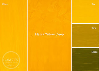
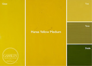
Finally, in modern times, organic (carbon-based) pigments were developed. Hansa Yellow, which was first made in pre-World War I Germany, is very similar to Cadmium Yellow, except that it's transparent, brighter and non-toxic. Also, a little goes a long way, thanks to its greater tinting strength. It's also cheaper than Cadmium Yellow and weighs less per ounce, which is important to the plein air painter.
USAGE
In my workshops, when discussing palettes, I usually get the question: What's better, a hue or the genuine article? "Hue" doesn't necessarily equate to "student quality." There are a couple of reasons why you might use a hue rather than the genuine pigment. Sometimes the genuine pigment is toxic, as in the case of Naples Yellow. Or it's expensive, as in the case of Cerulean Blue. (Yes, I know my post is on yellows.) Or, sometimes it's no longer available, as in the case of Manganese Blue, which is no longer mined because of environmental concerns. In all three of these examples, the hue versions are perfectly fine and often superior.
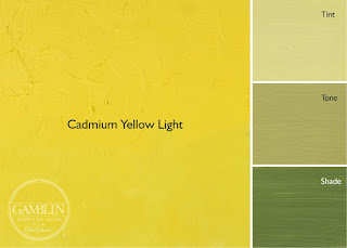
Thanks to modern chemistry, we now have an abundance of yellow pigments to work with. When I'm painting outdoors, I usually use Cadmium Yellow Light, Cadmium Yellow Deep, Yellow Ochre and, sometimes, Naples Yellow Hue. The two cadmium yellows are great for flowers in the field and autumn foliage, but as I mentioned earlier, I usually knock these down in intensity with a little complement or near-complement. For this I typically use Ultramarine Blue with a dab of Permanent Alizarin Crimson or just Gamblin's Portland Gray Light. Yellow Ochre and Naples Yellow I might use straight out of the tube for exposed rock. If I have to lighten either of these more, I also add a touch of Cadmium Yellow Light to raise the intensity; white tends to cool and dull color. I also sometimes add a touch of Naples Yellow Hue to my Titanium-Zinc White to increase the overall warmth of my lights.
And what about pastel? As I mentioned in my post about my palette, I have both warm and cool yellows, in a variety of tints and shades. The tints tend to lose intensity unless the manufacturer knows what he's doing; the shades always tend to brown. It's almost impossible to get a dark, rich yellow that isn't brown. Yellow really just wants to be light. (I won't be talking about pastel much or at all in this series. With pastel, what you see is what you get. The only concern is whether the pigments used are lightfast or not.)
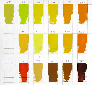
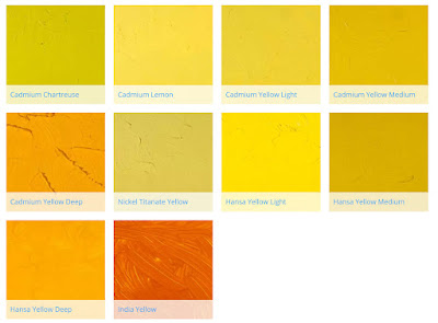
I'm including below an image of swatches I've made of colors from Gamblin. You can learn more about their line of colors here. They also have a series of informative articles about the color experience here.
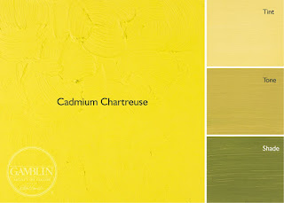
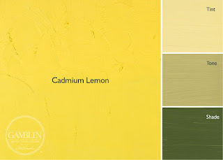
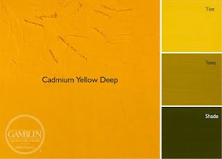
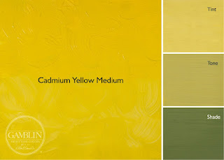
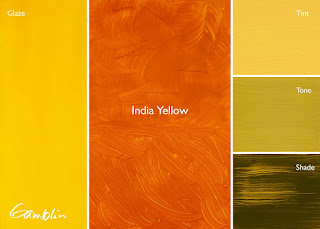
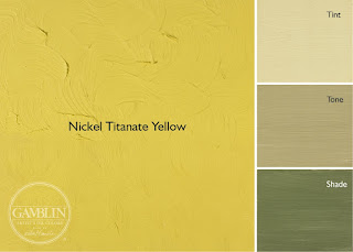
Here are color swatches from Gamblin's website, showing some of the colors as tints, tones and shades. Also, if the color is transparent, there is a glaze. Tint is made with Titanium Zinc White + the color, tone is made from Portland Grey Medium + the color, and shade is made from Chromatic Black + color. The glaze swatch is made with Galkyd medium.

