
 |
| Oranges from Gamblin Artists Colors |
Orange is a color I don't use much unless I need a pure orange note, such as I can get with Cadmium Orange. Most often, I just mix orange out of Cadmium Light and Napthol Scarlet or some other yellow/red combination. For pastel, I do use orange, but most often the duller versions that tend toward brown; I have some lovely dull tints that are just right for highlights on sunlit rock planes or dry grasses. Bright orange isn't a color I see often in a landscape, unless it's flowers or some man-made element.
HISTORY
One doesn't think of orange as a color derived from earth pigments, but some of the ochres possess a decidedly orange cast. The ancients made use of realgar, a mineral that can be red but also orange. Realgar is an incredibly poisonous arsenic compound—and it's usually found in ores right beside the equally-toxic orpiment, which I discussed in my post on yellow. (The ancient Chinese, interestingly, called realgar "masculine yellow" and orpiment, "feminine yellow.") Realgar was once used to kill weeds and rodents. So yes, it is that toxic and why we don't paint with it today.
In 1809, chemists invented Chrome Orange. Cheaper and less toxic than Realgar, this lead compound is rather fugitive. Fortunately, a more lightfast (but still somewhat toxic) pigment, Cadmium Orange, became available after 1840. The Impressionists used both of these oranges. Finally, late in the 19th century, chemists discovered organic (carbon-based) pigments that are richer and more permanent and possess a greater tinting strength than any earth or mineral pigment. Today, we have orange pigments such as monoacetolone that maintain their richness in thin glazes and also mix in beautiful ways with other colors.
USAGE
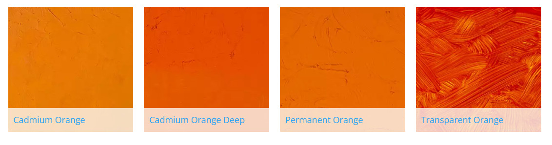
As I mentioned in an earlier post, on my palette I have two yellows and two reds. If I mix a cool yellow with a cool red, I get a much cooler orange than if I mix a warm yellow and a warm red—two very different oranges that can be used in different ways. If I want a brighter orange, I would use one of three oranges from Gamblin: either the mineral-based Cadmium Orange or the carbon-based Permanent Orange or Transparent Earth Orange. If I'm painting a cityscape, I might want to use Cadmium Orange or Permanent Orange (mixed with a little white to increase opacity) in warning signs or traffic cones. I might use Transparent Earth Orange for toning a white canvas. This makes a great alternative to Burnt Sienna or some other warm but opaque earth pigment; a tone of Transparent Earth Orange almost glows like stained glass.
I'm including below an image of swatches I've made of colors from Gamblin. You can learn more about their line of colors here. They also have a series of informative articles about the color experience here.
 |
| Oranges: Tints, Drawdowns and Shades Top row, tint. Bottom row, shade. Between, drawdown. L-to-R: Transparent Orange, Transparent Earth Orange, Permanent Orange, Cadmium Orange, Cadmium Orange Deep. |
Here are color swatches from Gamblin's website, showing some of the colors as tints, tones and shades. Also, if the color is transparent, there is a glaze. Tint is made with Titanium Zinc White + the color, tone is made from Portland Grey Medium + the color, and shade is made from Chromatic Black + color. The glaze swatch is made with Galkyd medium.


