View in browser
 |
Madeover: The Cliffs of Zion
12x16 oil / Available, PM/DM if interested
Read about my process below |
(Continuing my series of Extreme Makeovers for Plein Air Paintings.)
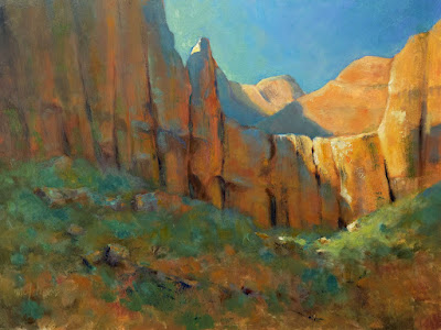
I've painted at Zion National Park many times, usually in the early morning and just as the sun was coming up. Well, there is a certain difficulty with this. If you haven't been to Zion before, you need to know that if you follow the river into the canyon, which I think has some of the best scenery, the passage becomes narrower and narrower and the walls, closer and closer. When sunlight penetrates into the canyon striking one wall, the light seems to bounce around forever in the shadows, causing all the shadowed walls to glow with a warm light. Sometimes this bounced light seems to be very bright—and therein lies the problem. Our eyes see warm colors as being lighter in value than they are.
 |
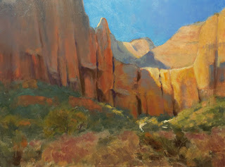
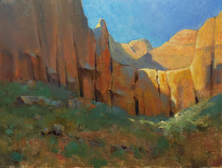
| 1. Here's a 12x16 oil plein air painting I made several years ago at Zion. You'll note that the values of the shadowed walls are very light—too light. So, I begin to make adjustments. And, of course, one thing always leads to another.... |
 |
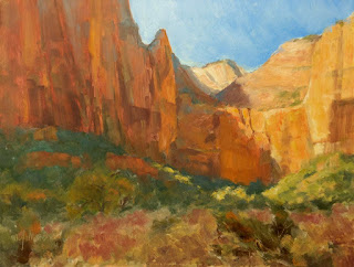
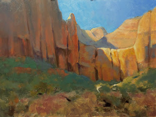
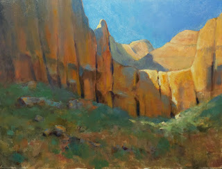
2. The painting needs some highlights for focus. I add a tiny light shape—it could be a rock—beneath the sunny cliff area. I also add a tentative highlight on the peak in the upper middle. I am thinking of strengthening a pattern for the eye to follow through the painting. |
 |
| 3. To make the peak with the new highlight stand out a bit more, I darken the sky. |
 |
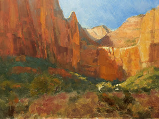
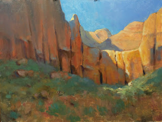
| 4. Now to the meat of the matter. I darken the shadows on the cliffs. I remember there being a distinct blue tone to the shadows, not that overall warmth that I'd painted originally. I'll worry about adding warmth back in later. |
 |
| 5. The shadowed middle ground and foreground grasses and shrubs are too warm, so I work in some of that same shadowy blue I used on the cliffs. I also begin to play more with the patterning, especially in the foreground, where I add some strong darks. Oh, and I change the shape of the highlight on the peak, giving it more interest. |
 |
| 6. I decide the dark accents in the foreground change the balance in the painting too much, so I remove them; instead, I suggest rocks on the left. This better balances the "weight" of the light area on the right, where the shadow cuts diagonally across the cliffs. I also change the pattern of the fallen lit rocks just below this, as they seem too distracting at this point. |
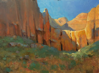 |
| 7. I like the rocks I added to the left, so I work on them a bit more, giving them more interest. |
 |
| 8. Still thinking of a pathway for the eye, I add dark accents again to the foreground, but this time I keep them subtle. |
 |
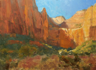
| 9. Satisfied with the pathway, I now go back to my shadowed cliffs and overlay strokes of warmer color to indicate bounced light. I don't want to overdo it, so I manage my values carefully—something that's hard to do in the field, in the heat of the moment, with all the light bouncing into one's eyes. I also restate the geology of the cliffs, as I lost some of the characteristic strata while overpainting earlier. |
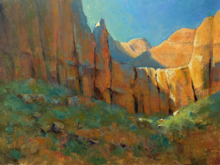 |
| 10. Finally, I add more texture with a knife to rocks and grasses/shrubs. I also repaint the sky, creating a gradation from warmer blue on the left to cooler blue on the right. I add hints of these colors into the grass/shrub area. I think it's done. Do you? |


