
 |
| Blacks and Greys by Gamblin Artists Colors |
So many of us plein air painters, working in the Impressionist tradition that dominates our craft, have been warned to steer clear of black. We're told that the landscape is all about color—color in the shadows, color in the darks—and if black should touch our painting it will be tainted forever.
Well, here's a secret: I know more than a few master artists who have confessed that they have black on their palettes. When no other dark pigment is dark enough, black is their go-to for dark accents. They even use it in mixtures to dull down colors. Sometimes, the resulting slight bit of muddiness is exactly the note needed.
HISTORY
Black is a very old pigment. When humans first discovered fire, they also discovered charcoal. Wood, bone and ivory probably gave us our first blacks. Manganese oxide, found in minerals like magnesite and in various earths, provided an even darker and possibly earlier black. The first black ink was made by the Chinese, who in the 23rd century B.C. compounded it from soot, walnuts and grease. The Romans burned grapevines and grape promace—the stems, skins and seeds left over from winemaking—to make Vine Black. In Renaissance Italy, almond shells and apricot pits were burned to make a similar black. For most of humanity's existence, black was either dug from the earth or manufactured in a fire pit.
Fast forward to the Industrial Age and the discovery of coal gas and other coal byproducts. Chemists in 1863, playing around with coal tar, created Aniline Black, the first synthetic, organic (carbon-based) black. Other blacks followed in the early 20th century, including the non-organic Mars Black, which is made of synthetic iron oxide. And finally, a blacker-than-black pigment, Vantablack, was invented in 2014. It absorbs up to 99.5% of visible light. In my view, it has no practical application for the painter of traditional landscapes but possibly for the Modernist.
USAGE
I, too, use black. But I prefer to keep it in the studio rather than to take it to the field. With all the light bouncing around outdoors, I often have a hard time telling just how dark my darks are getting; if I use black, my accents most likely will be too dark. Yet once I'm in the studio under controlled lighting, I can see better if a painting needs a value adjustment, and sometimes, I'll use black to get a darker note.
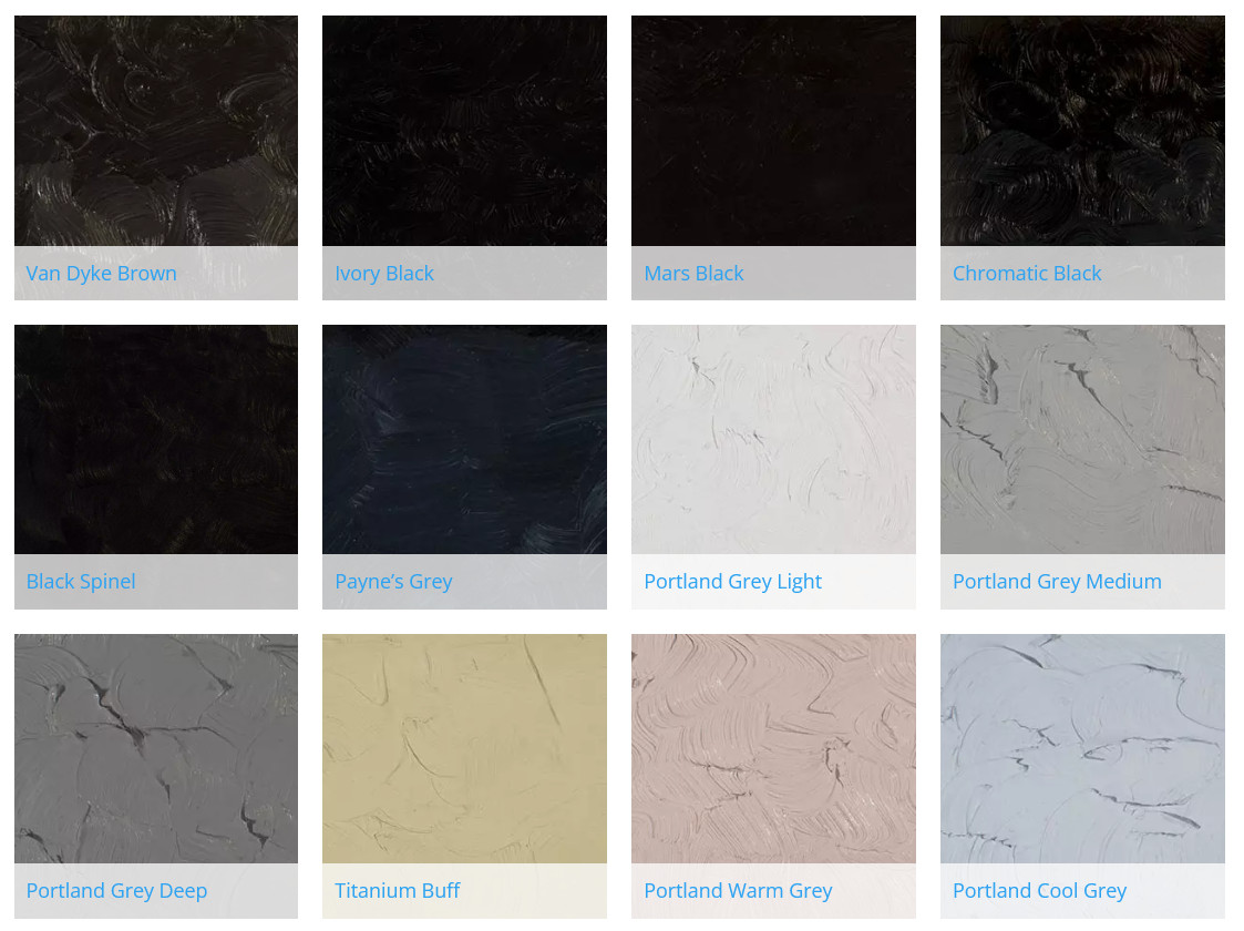
But what kind of black? Ivory Black dries slowly like all carbon-based blacks, but it is my black of choice. It's cheap, and I always have a tube of it somewhere. It's also semi-opaque, which is good for accents. Gamblin sells a Chromatic Black, made from cool red and cool green pigments, but it's transparent and never seems quite dark enough as an accent. Chromatic Black is more properly used in dulling other colors—unlike Ivory Black, which has a bluish tint, Chromatic Black is neutral and won't affect the hue as much. (All that said, I sometimes think Chromatic Black has a slight greenish cast; Gamblin's website, however, says it is neutral.) You can make your own with Phthalo Green and Permanent Alizarin Crimson.
Speaking of Ivory Black, it was sometimes used as a blue by the Swedish painter Anders Zorn. (Contrary to popular myth, he also sometimes used an actual blue.) I use it in my earth palette, which includes Yellow Ochre and Burnt Sienna. This black makes a lovely, dull blue when mixed with white and, when mixed with Yellow Ochre, a nice, greyed green.
And let's not forget greys. Many of the blacks available make interesting greys in tints. Some useful "tubed" greys I like are the three Portland Greys (Light, Medium and Deep) from Gamblin, which are good for dulling down the split-primary palette when painting the natural landscape. Portland Grey Light, by the way, isn't quite light enough, and I often mix a fourth value by adding white to it.
Here's some good info on Gamblin's blacks and greys:
https://gamblincolors.com/choosingblackoilpaint/
https://gamblincolors.com/neutral-greys-portland-grey/
https://gamblincolors.com/choosingblackoilpaint/
https://gamblincolors.com/neutral-greys-portland-grey/
I'm including below an image of swatches I've made of colors from Gamblin. You can learn more about their line of colors here. They also have a series of informative articles about the color experience here.
 |
| Left column, tint. Middle, masstone. Right, mixed with Cadmium Yellow Light. Top to Bottom: Ivory Black, Mars Black, Black Spinel, Chromatic Black, Asphaltum (hue), Van Dyke Brown, Payne's Grey |
Here are color swatches from Gamblin's website, showing some of the colors as tints, tones and shades. Also, if the color is transparent, there is a glaze. Tint is made with Titanium Zinc White + the color, tone is made from Portland Grey Medium + the color, and shade is made from Chromatic Black + color. The glaze swatch is made with Galkyd medium.


