 |
| Blues from Gamblin Artists Colors |
Blue is a color that has more effect on the landscape than one might think. Question: How many light sources are there in the landscape on a sunny day? The man-on-the-street would say just one, the sun. But plein air painters know there is a second light source, the sky. The light provided by the noontime sun (on average) tips the scale at 111,000 lux—lux being a measure of illumination—but the sky alone measures a whopping 20,000 lux. This is nearly 20% of the sun's illumination. (A full moon, which can seem quite bright, shines at only 0.25 lux.)
And what does the light from this second source do? A clear sky at noon has a light temperature of around 7000°K, which is a blue light. The sun, on the other hand, has one of around 5000°K, which sits a little more toward yellow on the spectrum. (An incandescent light bulb glows at a very yellowy 3600°K.) So, on a clear day, the sky throws a considerable amount of blue light onto everything, not just the shadows but even the open, unobstructed landscape. Most often, though, you won't see this as a definite blue cast but will sense it more as a general cooling-down of colors.
HISTORY
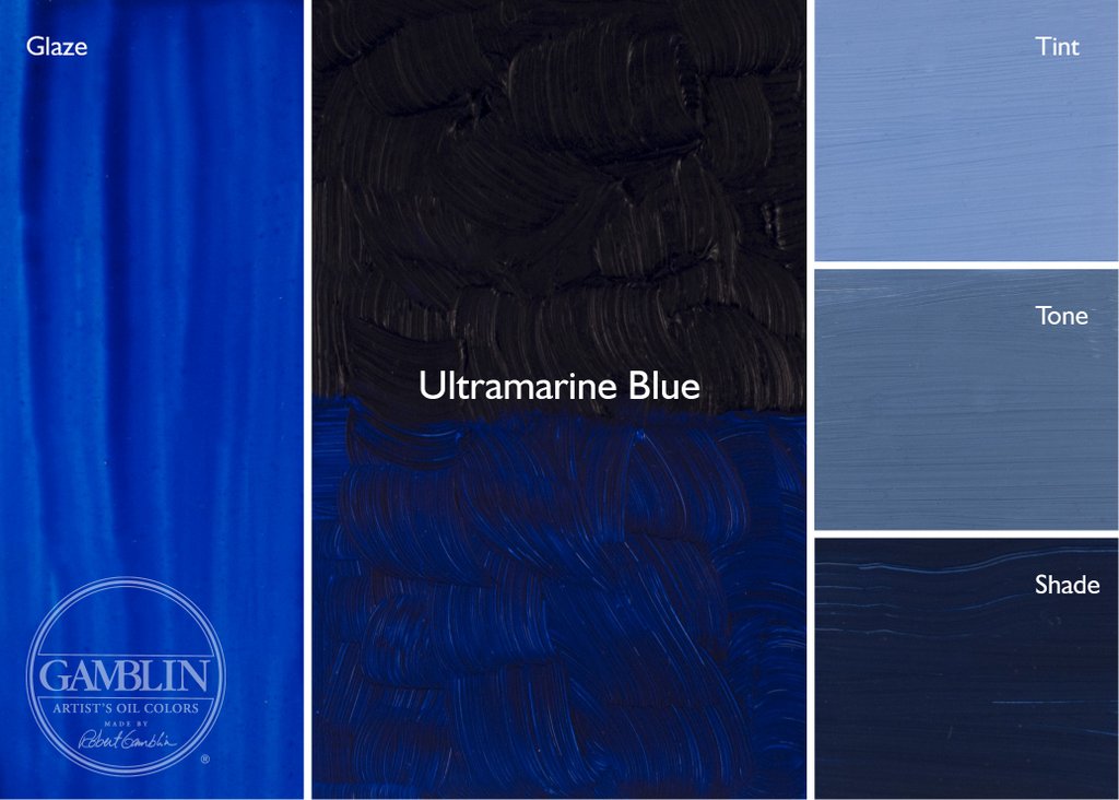
Blue has long been an essential hue. Before the invention of synthetic pigments, it was the only color that could provide a cool contrast to warm earth colors. The ancients had Egyptian Blue, a glass made from copper and sand. Replacing this in the 16th century was Smalt, a finely-ground glass made with cobalt. In Renaissance times, a method to refine a very pure blue from the precious mineral lapis lazuli was discovered. Lapis, or Ultramarine Blue, was so highly prized that it cost more than gold—understandably, since it was hauled over the dangerous Silk Routes from a remote part of Khorasan (now Afghanistan) and passed through many hands before arriving in Europe.
The creation of modern blues was haphazard at first. Prussian Blue was discovered serendipitously in 1724; Cobalt Blue, also by accident, in 1807. Then, in the 1820s, the French government, wanting to find a cheaper alternative to the not-to-be-matched beauty of Lapis, offered a 6,000-franc prize to anyone who could make it for less than 300 francs per kilo. Finally, in 1826, a process was invented to make French Ultramarine, giving impoverished painters who weren't under the employ of a nobleman or the Church a cheap and plentiful supply of blue. Since then, a variety of organic (carbon-based) pigments have been created, including Phthalo Blue in 1928.
USAGE
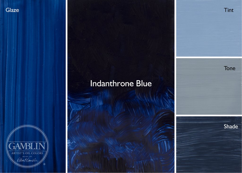
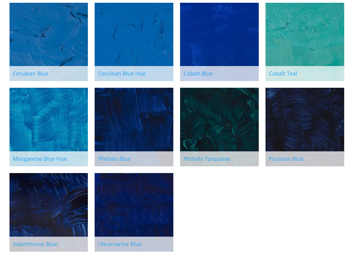
Although Ultramarine Blue is the most common blue used by painters, each painter seems to have a favorite "other" blue: Cobalt Blue, Cerulean Blue, Sevres Blue, Indanthrone Blue—the list goes on. Cobalt seems to be #2 on most palettes, right after Ultramarine, filling out the split-primary palette. Ultramarine is a warm blue with a slightly purple cast; Cobalt, which has no purple, a cooler blue.
But to my somewhat deuteranomalic eyes, Cobalt Blue isn't visually different enough from Ultramarine, especially when in a tint. So instead, I prefer a more greenish blue, Cerulean Blue Hue. (I prefer this over the genuine pigment, which is more expensive and weakens too much when mixed with white.) This gives me a wider temperature difference between the two.
I use Ultramarine Blue for a sky approaching the zenith, as the blue there seems darker and redder. Lower down toward the horizon, where the blue is lighter and greener, I use Cerulean Blue Hue. (I sometimes add a cool yellow to this to make the color even greener.) This color also makes lovely greys when mixed with tints of red or orange.
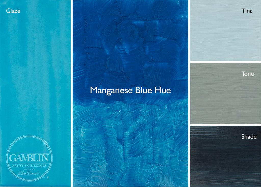
What about Manganese Blue, once used for swimming pools and achingly reminiscent of Caribbean waters? Mining the mineral for this color was an environmentally toxic process and has stopped. According to Robert Gamblin of Gamblin Artists Colors, the last industrial batch of this pigment was made in 1989, and he worked hard to create a "hue" that closely matched the original. (Robert once gave me a rare tube of genuine Manganese Blue to play with and, honestly, I prefer the "hue" he makes. Genuine Manganese weakens too easily.)
And, finally, what about Phthalo Blue? This intense pigment is great in pastels, providing a beautiful range of intense darks and tints. But it's a lot like nitroglycerin (or maybe Brylcreem), where "a little dab'll do ya." Powerful stuff, it's best avoided in oil and acrylic paints. I used to have both it and Phthalo Green on my palette, and to this day I regret the messes it made. Prussian Blue is a better choice than Phthalo Green. Intense and staining, yes, but not like Phthalo Blue. Plus, Prussian Blue, Yellow Ochre and Burnt Sienna make a wonderful three-color palette for landscape painting.
I'm including below an image of swatches I've made of colors from Gamblin. You can learn more about their line of colors here. They also have a series of informative articles about the color experience here.
Masstone, Drawdowns, Undertone, Tints and Shades
 |
| Top: Masstone/Drawdown/Undertone Bottom: Shade/Tints L-R: Prussian Blue, Phthalo Blue, Indanthrone Blue, Cobalt Blue, Ultramarine Blue |
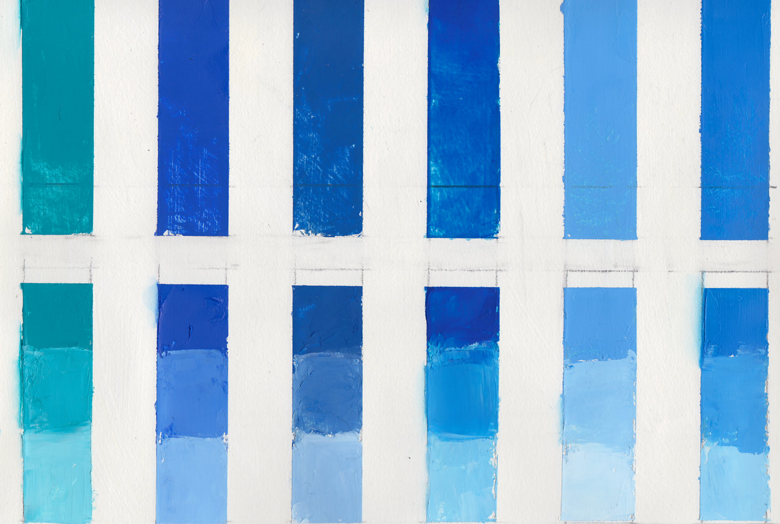 |
| Top: Masstone/Drawdown/Undertone Bottom: Shade/Tints L-R: Cobalt Teal, Cerulean Blue Hue, Cerulean Blue, Manganese Blue Hue, King's Blue (Williamsburg), Sevres Blue (Williamsburg) |