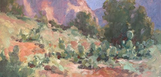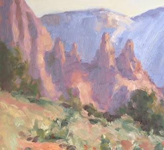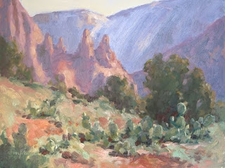
 Maybe you've already guessed from the color harmonies and other clues that they are from the same painting. When I painted the original, a 9x12, I was over-ambitious. Here it is:
 I really loved that clump of prickly pears, and I really loved those rocks in the distance. The result of loving all parts of the scene a little too much can be the classic "Two Paintings In One" mistake. When my students do this and we get to the critique session, I don't say a word but pull out a couple of pieces of mat board and do some impromptu cropping. Their faces light up at once. Even I'm amazed at the great compositions the students made - once I put the cropping tools to their work.
Of course, for this blog post I used Photoshop, my "magic bandsaw," to do some virtual cropping. And you would need a bandsaw on this hardboard panel! It's a lot better to plan the composition in advance so you don't have to run out to Home Depot. (Or, maybe I could charge my buyer twice as much, since he'd be getting two paintings in one.)
The painting is much-improved with the cropping. In the first image, the distant rocks are the focus; in the second, the clump of prickly pears. In each case, I've approximated the "rule of thirds" to position my center of interest. I could analyze each of these more for you, but I think you get the point: Measure twice, cut once.
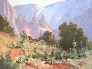
Footnote. Another solution is to pull some of the attention from the background by reducing contrast and cooling color in the background and then increasing contrast and warming the color in the foreground. It's easier to do in the field right from the start than to do it in Photoshop! But here is the Photoshopped correction, which puts the emphasis on the foreground:

