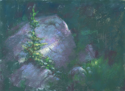
"Fir & Shadow" 9x12, pastel
I recently finished reading Lois Griffel's excellent new book, Painting Impressionist Color, and it got me to thinking about Impressionism and its ugly stepmother, Tonalism.
Ugly stepmother? Well, yes, in a way.
"Tonalism implies a painting limited to pigments that are somewhat gray and dull, lacking vibrancy. Impressionism on the other hand, uses rich and stunning color." Lois writes a great deal about these two approaches to painting, and there are more complete definitions, but this paragraph sums it up. Basically, both approaches to painting have the goal of creating an illusion of reality. Tonalism does it with value; Impressionism starts with value, but enhances the effect with clever color use.
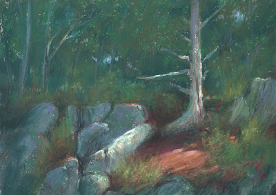
Inexplicably, I've lately found myself creating drama with broad areas of dark punctuated by small spots of light. (It's like theatrical lighting.) I paint the illusion of light by using value differences and not necessarily focusing on juxtaposing complementary colors. Some might call this devolution, but I think of it as exploring the roots of Impressionism. Most of the French Impressionists were academically trained as Tonalists. (I've posted a couple of my new pastels here; the one at the bottom I posted the other day, but it was appropriate to re-post it.)
Of course, knowing today all about impressionistic color, it's hard for us to turn back the clock completely. I still put complements into my shadows or a stroke of dark violet beside a stroke of yellow to make the yellow more intense. I just don't carry it to the "micro" level, where every single brush stroke is accompanied by its complement. Look at some of Monet's skies, and you'll see little pink and violet dots intermingled with the blue and yellow ones. I, on the other hand, will sometimes paint a sky with nothing but blues.
I think this is what most of the American Impressionists were about. Unlike the French, who allowed shapes to dissolve through keeping everything high-key and close in value, the Americans maintained strong value contrasts but used Impressionist color theory to enhance the illusion of light. I'd say that most landscape painters today who are not strict Tonalists take this approach. The result is often strong design with exciting color.
I recommend Lois' book. It's not for beginners, but it does build on the foundation laid by her earlier book, Painting the Impressionist Landscape. It has nine demonstrations in oil, acrylic, pastel and watercolor along with many illustrations to accompany the text.

"Spruce & Shadow" 9x12, pastel
