View in browser
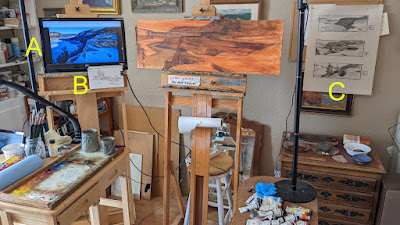 |
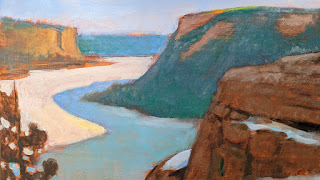
| Here's my studio setup. (Normally, my studio is quite orderly, unless I'm working on a painting.) You can see the variety of reference material I use. A. Photograph displayed on a large monitor. I hook up my Chromebook via HDMI to the monitor for display. B. A sketchbook with pencil field studies of different parts of the scene. C. My original design explorations, but I'm focusing just on the one that I've chosen. Also, I'll be pulling out a number of oil or gouache snow studies I made in and around the canyon to serve as color references. |
In my last post, I showed you how I chose a design "by committee" for a painting. In this post, I thought I'd show you each step in the progress of creating Lake Ice, a 12x36 oil painting. (I'm long overdue for sharing a demonstration here in my blog.)
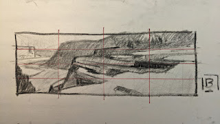 |
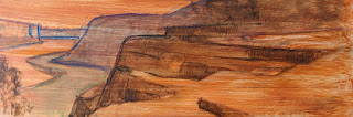
| My design sketch. Half-size (6x12) of the final painting. Vine charcoal on newsprint. After choosing this one, I penciled a simple grid over it to help in transferring the design. After spending all that time on design, it's important to transfer the design accurately! |
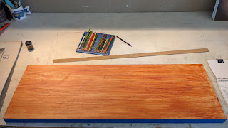 |
| The 12x36 panel. This is a sheet of birch plywood that has been cradled and then sealed with BIN primer. Once the primer dried, I toned it with Gamblin's Transparent Earth Red. Using a pastel pencil, which is basically pure pigment, I lightly sketched in my transfer grid and the design. |
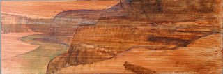 |
| My first pass at establishing an underpainting. I'm using thin paint (as opposed to "thinned" paint, which can be quite drippy) to block in some general value relationships. I'm limiting color at this point to just warm and cool--burnt sienna in the nearby shapes, cobalt blue in the distant shapes. |
 |
| Here I'm refining some shapes. My initial underpainting always tends to be loose and to hide some of the shape outlines. |
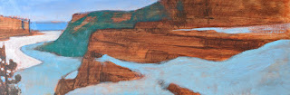 |
| My first pass of color beyond the underpainting. I'm now concerned with getting the value of the lighter passages correct first. The sunlit snow will be the lightest thing in the painting. If I were to start instead with the darkest passages, I run the risk of running to the light end of the value scale too early. In a painting where the light is most important, it's best to start with the lights, and to then work toward the darks. |
 |
| With the lightest value relationships established correctly, I now start to work on refining and deepening the darks. |
 |
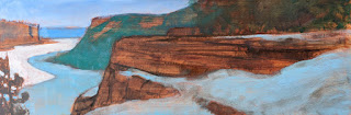
| The foreground rocks needed texture and more grey, so I begin to slather on a variety of greys, some warm, some cool. My palette: Cadmium Lemon Yellow, Cadmium Yellow Light, Cadmium Yellow Deep, Cadmium Orange, Cadmium Red Light, Cadmium Red Deep, Permanent Alizarin Crimson, Ultramarine Blue, Cobalt Blue, Burnt Sienna, Yellow Ochre, Raw Umber, Titanium-Zinc White (all from Gamblin.) |
 |
| Detail at this stage. |
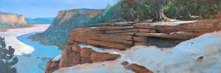 |
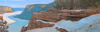
| Now I spend most of my time on creating tree shapes above the near cliff and working out the correct relationships of the darks. I also add the magic of a couple of sunlit spots on the nearby snow. These will help move the eye around the painting; I like to compare them to stepping stones for the eye. Also, I've added a little detail to the lake ice--a few dark patches where the snow has blown off, revealing the bare, darker ice beneath. It's important that the patches cross over the terminator between light and dark on the lake. This helps let us know that the cast shadow of the hills is indeed a shadow and not just a a different color of ice (or open water, which it is not.) |
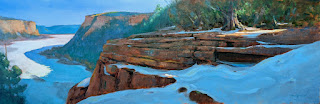 |
Here's the final painting. For the last stage, rather than my usual hog bristle flats, I used a few rounds that allowed me to get the nice, smooth flow of snow in the shadows.
Lake Ice, 12x36, oil. |
