Authentically Human! Not Written by AI!
All Content Copyright © Michael Chesley Johnson AIS PSA MPAC

Friday, December 31, 2010

Starting Shadows with Cool - or Hot?

Sedona's red rocks can really glow when the light hits them just right. But better yet, it's even more dramatic when the light bounces off the rocks into a shadowed plane, warming up an area that usually would appear quite cool.  The effect is most stunning when the rocks are lit from behind and you can't see the illuminated planes, just the shadowed ones.  Those shadows can look downright hot!

I've painted Munds Mountain many times over the years, and from the parking lot where I paint it, its mass is nearly always backlit.  Toward the afternoon hours, a little bit of rim lighting sneaks in.  I'm always fascinated by the light bouncing off one plane and creating that wonderful warm glow in the shadows.  The trick to painting this glow, as you probably know, is to keep the glow dark enough so it doesn't look like sunlight.  I've seen some beginners paint the glow so light you'd think someone was shining a Klieg light into it.

Recently, I did two small studies of an outcrop on Munds Mountain that shows this effect nearly every day.   It's what I call a "fin," and it  juts out from the surrounding rock.  Although it's in shadow all day, it gets a great deal of bounced light on its flat, shadowed side.  For these two studies, I decided to take two different approaches to painting the glow.  In the first one, I started with all cool shadows - mostly ultramarine blue, alizarin crimson and a little of Gamblin's Chromatic Black to dull the color.  Then I snuck up on the warmth by adding a little cadmium red light to the mixture, adjusting the warmth until I felt I had it right.


Fin 1 - 5x7, oil

In the second, I did a crazy thing.  I painted the glow backwards.  That is, I started right off the bat by painting the shadow with pure cadmium red light.  Then I added blue and alizarin crimson to cool things down a bit.  I never paint shadows this way, but I wanted to try it and see if I could get away with it.  I had a lot of fun doing it.


Fin 2, 7x5, oil

So what do you think?  Please note that drawing wasn't my prime concern, so the shape of the fin looks a little different in each piece.  (By the way, they're $60 each or $100 for the pair, plus $10 shipping. Contact me.)

Thursday, December 30, 2010

Small Study for the Big One


Schnebly Hill Study, 8x10, oil

We're at the tail end of a snowstorm that socked Flagstaff in overnight.  We didn't get much down here along Oak Creek and in Sedona, but today we're getting wind and snow squalls.  I've painted in snow squalls before, and it's a challenge, sifting through the sleet on your palette to mix paint!

I thought I show you the little study I did up on Schnebly Hill a couple of weeks ago.  As you recall, I went out repeatedly to the site with the 24x30 canvas, but one day I went out to do an 8x10 in which I focused on the line between light and shadow.  I was trying to determine exactly how bright the sunlit trees were in relation to the shadowed hills.

Although the color temperature is somewhat different from the finished piece, you can see how useful it was to go back out into the field to collect additional information.  It's a good trick - I mean, why drag out that big piece back up the hill yet again?

Tuesday, December 28, 2010

My Most Popular Blog Posts

"Quiet Watcher" 9x12 oil - $200, free shipping - contact Michael

Blogger has given bloggers a new gadget to put on their blogs - a list of the most popular posts. I took a look at mine, and it's interesting to see what's on the list. Below are the top ten:
Nicolai Fechin is a well-known painter, so lots of people are probably doing searches on him. But how do you explain, for example, the popularity of "Grab-n-Go Paintings"?

By the way, my total number of posts is 553. That's a lot to weed through. Fortunately, Blogger also gives us some gadgets that allow us to sort posts by topic or label, and also a chronological archive and a search feature. I just added the full topic list, and I've always had the archive. If you're new to the blog, you might enjoy spending part of your holiday surfing through previous posts. These gadgets follow below.

Wednesday, December 22, 2010

New Video - Composing in the Field


I've finished and uploaded the latest video in my Plein Air Essentials series. This one is Composing in the Field, a 7-minute video of how I go about isolating my subject, creating a design around it, making thumbnail sketches and more. Price - only $1.49!

(And if you haven't seen the others, I've got a nice little collection of these mini-videos available. The whole series would make a nice Christmas present for an aspiring plein air painter!)

Go to my Lulu store for them: http://www.lulu.com/miragenm

Sunday, December 19, 2010

Getting the Big Picture: Large-Format


"December Morning in the Desert" 24x30, oil/canvas - Finished Version

Followers of my blog will remember that, about two weeks ago, I dragged a 24x30 canvas, along with my Beauport easel, a bag of paints and my Classic EasyL box, up to the Schnebly Hill parking lot. In the field, I worked on the piece over two separate three-hour sessions, and then I posted a photo of "our story so far."

Since then, I have gone back up to Schnebly Hill, but to do an 8x10 study of the scene. I wanted to zoom in on the terminator between light and shadow at the foot of the distant mountain. I needed to refresh my memory of how dark the shadow was in relationship to the light and of the quality of temperature contrast between the two.

I also invited a friend over to take a look and give me some feedback. M.L. Coleman (www.mlcolemanart.com) suggested I break up the large, green area of vegetation between the chasm and the mountains a bit more. He said, "The painting is more about rock than about greenery." I completely agreed with him.

So, over a couple of afternoons this week, I made my adjustments. Using my study as a reference, I increased the contrast between light and dark along the distant terminator; pushed the mountains farther away with lighter blues and purples; and dug up some shrubs in the middle ground and exposed more rock. I also added highlights here and there to "punch up" the center of interest and pathway for the eye.

Now, as you know, I'm a committed plein air painter. Most of what I do is outside, and to be outside is always my preference. I'd say this piece, even though about one-third of my time was spent in the studio, still qualifies as plein air. What do you think?

Saturday, December 18, 2010

Composition - Books

I'm starting to work on a mini-video on Composition. For the video, I've pulled out some of my favorite books that deal with composition. These are:
  • Edgar Payne - Composition of Outdoor Painting
  • Arthur Wesley Dow - Composition: Understanding Line, Notan and Color
  • Andrew Loomis - Creative Illustration
Below are the covers plus a page from each. (I don't have a copy of Dow's book with me, so his page is from another but similar text on composition he wrote.)

Payne is pretty much a traditionalist, going with the old ideas of "templates" for designing your field compositions. "Templates" is my word for it, for lack of a better. You've probably heard of the "balance beam" design, or of designs based on letters of the alphabet such as S or U.


Dow, although he died in 1922, a good 25 years before Payne, was a true modern. He looked at Japanese design influences and latched upon the idea of notan, or a play of light and dark shapes. He stated that composition can't be taught; it must be learned by looking at good paintings. (It's hard for this painting instructor to tell that to his students!)


Loomis is a different cat altogether. A master illustrator, he used some of the ideas Payne wrote about, but he also dove deep into what he called "informal subdivision," in which he concocted a system for dividing a plane into a framework upon which design elements might be hung. He probably comes closest to using the Golden Mean than any of these. (By the way, you can get the Loomis book as a free download here.)


When you're out in the field, it's good to think a bit about design. Sometimes we get so wrapped up in trying to capture the magic that we forget about something so fundamental.

Thursday, December 16, 2010

A Visit with Leslie B. DeMille


Leslie B. DeMille and a quick pastel demonstration he gave me.
(It's not a portrait, but an illustration of a particular technique he uses.)

DeMille's taboret.

I recently had the opportunity to visit and interview master portraitist Leslie B. DeMille. It's rare that I actually get to visit an artist of that caliber. I do most of my interviews for The Pastel Journal and The Artist's Magazine by telephone and e-mail. Since I tend to live in remote places, interviewing in this way works well for me. But I always prefer a face-to-face interview, when I can get one. There's real magic in making the personal connection.

Of course, Sedona isn't as remote as Tierra del Fuego. We're only two hours from Phoenix. But, it's a detour off the Interstate, and it has a population of only 12,000. Although there are plenty of good artists here, several of which have national reputations, I thought I knew the names of all of them. So imagine my surprise when an artist friend visiting from Georgia mentioned she had just come from a visit with DeMille down the road. He lives about 8 miles away as the crow flies. (It's more like 20 miles when you have to drive around Oak Creek to get there.)

At 83 years young, he is an inspiration to me. When I called him to set up an interview, he was on the golf course. When I went out to visit, he was preparing for a trip first to California and then to Ontario, Canada - all to be followed by a trip to England to gather reference material for a commission. No grass grows under his feet!

DeMille been doing portraits for 60 years, and he has done thousands. Known at the "Artist of Champions," he's painted commissions of sports greats such as Arnold Palmer and Jack Nicklaus and also heads of state such as Ronald Reagan. I'm glad to have met him. You can meet him, too, in my interview with him in The Pastel Journal next spring. (Scheduled for the May issue.)

Wednesday, December 15, 2010

My Paintings Aren't Drying


I've been painting two weeks with students in oil, and we've been having a great time working out the issues with Sedona's red rocks. If you've not been to Sedona before, the red rocks can be overwhelming - the red jumps out at you, especially against the green junipers, and that's all you see. I do my best in getting the students to understand that the color isn't really as intense as it seems at first glance.

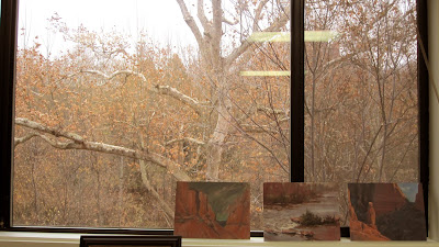
Strangely, my paintings are taking a long time to dry this week. Except for today, when we're having some overcast and showers, we've had above-average temperatures. It's been downright toasty out in the field. I've been stripping off my fleece jacket and just painting in my shirt (and, oh yes, in pants, too.) So, it's a mystery. I'm using Titanium White, and that usually dries fast enough for my needs. But now the paintings are building up on the "wet painting" shelf. I've even had to move some over to the window sill.

Here are a few pictures of the paintings in situ. Hopefully, they'll dry in time for the next workshop so I can make room for more! As they dry, I'll scan them in and talk about them individually.


Sunday, December 12, 2010

Marketing Your Work

Wilson Mountain Sketch, 9x12, pastel - $100 - SOLD

Imagine a beet farmer with lots of beets to sell but no truck to get them to the grocery store. It's like a painter without marketing skills. Marketing is the engine that sells the beets - or paintings - and puts money in the bank. It allows you to keep on doing what you love best.

It's tough being a self-employed painter in a free-market economy. There's enough to being a painter without having to market the work, too. Just think of all the details that occupy your day in the studio - ordering paints and canvas, wrestling with composition, color and brush-handling, framing the work. I sometimes yearn for the days of Soviet-style, state-supported arts in which an artist could just make paintings and not have to worry about marketing it. (Of course, then I'd have other problems to worry about, such as whether I'd have to give up painting for a few years to go work on a collective farm, harvesting beets.)

In the old days, you got a gallery to do your marketing, and it wasn't much. They had a mailing list and perhaps placed an ad in some glossy collectors' magazine. You might also have hung out a shingle advertising your studio. But today, marketing - and the economy - has changed. We haven't totally abandoned mailing lists, magazine ads and shingles, but now we also have Facebook, Twitter, eBay and Google Adwords. Figuring out how to market turnips is a lot harder now, especially with so many ways to do so and with many of them, such as Facebook and Twitter, still unproven.

So what do you do? As you've always done - establish a marketing budget that fits your business projections. In that budget, be mostly conservative in your marketing venues, but leave yourself a little room for new marketing opportunities. Something may come along with a lot of buzz attached to it, and you may want to try it.

And, please, let me know if you find one that really works!

Thursday, December 9, 2010

Painting Competitions

Snoopy Rock sketch, 5x7 pastel - $60 - contact Michael

It seems that everyone is hosting some sort of national painting competition these days. Application is typically by slide or digital image. But do you really want to try for an award based on a 3-second glimpse of your lovingly-crafted work?

When you don't win or even make the "finalist" cut, don't be sad. The initial cut was made by viewing the images in 3 to 5 seconds. (You'd need to have been weaned on MTV to have the neural circuitry to make that kind of rapid-fire judgement.) The next cut, of course, takes longer, but if your work doesn't hook the jury in that first 3 seconds - or if they blinked or reached for a cup of coffee - you are out of the game.

To hook the jury, the piece can't be subtle. In my own experience as juror and judge, I know that work with impact will cause me to look longer. Strong value contrast, stunning color and dynamic design will likely send your work to the "possibles" pile. Anything less than that will be rejected. This includes moodier pieces that work their magic with subtle shifts in value or muted colors. Weighing judgement on them takes more time and consideration, a luxury the jury doesn't have when viewing a thousand slides.

If you're a painter who paints such pieces, carefully consider your chances. If getting into shows and winning awards, neither of which translates necessarily into sales and satisfaction, are important to you, you may want to enter smaller shows, local or regional. These typically have fewer entries, which might mean more stage time. Or, you might want to enter shows more appropriate to your style. Loose, impressionistic plein air work will not do well in a competition that historically favors tight, realistic work.

Monday, December 6, 2010

Tubac Workshop


Tubac sketch, 9x12, pastel

I thought I'd mention a three-day workshop I'm teaching in the southern part of Arizona this winter. I'll be teaching in historic Tubac January 19-21 (Wednesday-Friday). We still have openings left, so if you're interested, contact Kathy Reyes at gallery@losreyes.com. Price of the workshop is only $180. This plein air workshop is suitable for all levels and all media. I'll be working in oil and pastel.

Tubac, which is only about 20 miles from Nogales, Mexico, was founded in 1752. Today, it's a thriving art colony with the Tubac Presidio Historic State Park at its center. It's also home to the Tumacacori Mission. Old Town has lots of shops and galleries and outdoor merchants. There's a lot of great painting here, so I hope you'll join me.

For much more on Tubac, please visit http://www.tubacaz.com/abouttubac.asp.

Friday, December 3, 2010

More Large-Format Oil

We had beautiful weather again yesterday - it hit nearly 70 by mid-afternoon - so I went out again at the same time to work on my big Munds Mountain painting. I didn't show you my setup, so here it is.

I'm using a Beauport easel, translated from the Chinese per Dan Corey's instructions so it works properly. On the crossbars is an Artwork Essentials EasyL "Classic." The 12x16 "Classic" not only serves as a big palette for the easel, but it's also a good pochade box when used with a tripod. What I like about it in this case is that the lid also serves as a sunshade. A bungee cord keeps it securely in place. By the way, I found that the peg holes in the Beauport legs are excellent brush holders - just watch out for them when you bend over! (In the second photo you can see a #12 flat jutting out.)


I spent another two hours on the piece. I continued to make adjustments in value and temperature relationships and tried to improve the foreground patterning so it makes a better lead-in for the eye. I finished by adding a few foreground details in the way of a couple of dead snags and some bunch grasses. I held back doing more because I wasn't sure where to go next. Today, it's in the studio, and now that we have some clouds moving in, I'll spend some time indoors pondering it before making my next move. That's what I love about these multi-session plein air pieces - you don't have to rush.


Munds Mountain - 24x20, Work-in-Progress, Stage 2

In case you missed my announcement, I've been invited to lead a New Zealand workshop March 7-14, 2012. (That's 16 months from now.) Cost is about $2500, not including air fare. The price includes accomodations, most meals and transportation to painting spots. We'll also have land and sea sightseeing trips plus some great dining! I need 16-20 people. If you're interested, e-mail me at mcj.painter@gmail.com.

Thursday, December 2, 2010

Large-Format Oil - and a New Zealand Workshop!

Before I show you my latest large-format painting, I want to share some exciting news with you. I've been invited to teach a workshop on New Zealand's Kowhai Coast March 7-14, 2012. (That is not next year, but 16 months from now.) Although this will be a painting retreat-style workshop, I'll be giving plenty of demonstrations and critiques. There'll also be land and sea excurisons and some fine dining to look forward to. The workshop is being coordinated by artists Adele Earnshaw, a native New Zealander who grew up in the area and who will be our guide, and Joe Garcia.

The price of the workshop will be around $2500, not including air fare. If I can get 16-20 people interested, we can make this trip happen. Non-painters are welcome to join us. If you'd like more information, please send me an e-mail (mcj.painter@gmail.com), and I will forward details to you.

I am very excited about this workshop and I hope you'll join me. Please let me know by Sunday if you have interest.

Yesterday I went out to one of my favorite painting spots to start a 24x30 oil. This is a scene I have painted countless times and have gotten to be pretty familiar with. I feel that familiarity with a scene can help when it comes to large pieces that will require a significant investment of time, energy and materials. Although I've done this scene in small formats, I've always wanted to get deeper into it and show some of the finer details in it.

I initially toned the canvas with a mixture of acrylic yellow ochre and magenta, biased toward the red. A good deal of the red still shows through, especially in the shadowed mountains and the still-unpainted red rim at the bottom of the painting.

Munds Mountain View, 24x30, oil - Work-in-Progress


Tuesday, November 30, 2010

Large Format, Yet Again

Well, the vote here at home was to retain the foreground hill, but to minimize its influence in the painting. So, I increased the amount of real estate the shadow occupies on the hill's left side so that it is almost entirely in shadow now. I left a little light to give an idea of its form. I also minimized the detail in the shadows; elsewhere in the painting, that's the way the shadows are working. Small details and rich color will appear either in shadow or light - but not in both. In this painting, all the detail and color really is in the sunlit portions, so this helps with the consistency of lighting.

Also, I wanted to post the other large painting, the one that really had two paintings in it. Here are the two halves. I've put the bottom on top, so your mind won't inadvertently rejoin the two halves.


I've really enjoyed reading the variety of suggestions and opinions. I'd like to hear what you think of these revisions.

Monday, November 29, 2010

Not Done with the Large Format - Yet!

Several days ago, I posted the "finished" version of a couple of large pastel paintings I did on-location. One obviously needed more work, and it provoked a number of useful comments. (To be sure, I have actually taken scissors to the painting and cut it in half. I'll post the "new" finished version of this one once I take some good photos of it.) But the one that I thought really was finished also got a lot of comments, especially over in the Wetcanvas.com plein air forum. As a reminder, here's the painting (9x24):

Some folks had a problem with the foreground hill, claiming it read more like a staircase or pathway into the distance rather than like a little hill. One commentor suggested that changing the shape so it wasn't triangular would solve the problem. Well, I can't do that because it's a well-known landform, and the local residents would get upset if I just took a backhoe to it. Others suggested hardening lines, darkening shadows, etc., to correct the illusion. Or move it to the left a bit so it didn't point so directly into the distance.

One suggestion I made was to remove the hill entirely. The reason I suggested this is that there is probably some point near where I painted where I could have had a very similar view, but without the hill. I'm not sure the hill is entirely necessary. So this morning I ran the image through the Photoshop mill, and below is the result. I find Photoshop a really useful tool in these cases. Hasty erasures or cuts with scissors are impossible to "undo" otherwise.

I'm interested in hearing your opinion on this piece. Remove the hill, fix it in some way, or just leave the thing alone - your vote counts!

Normally, I wouldn't spend this much time on a plein air painting, But my intention was to get this piece (and the other) as close to completion outdoors as possible. With any plein air piece, large or small, you will run into problems like this that would perhaps be more easily foreseen in the calm and quiet of the studio. And since I have invested considerable time on them, both outdoors and now inside, I'll keep at it. It's a great learning experience!

Sunday, November 28, 2010

Picking a Subject - New Video

I've finished a new mini-video in my Plein Air Essentials series. This one is called "Picking a Subject." I've had lots of students in my plein air painting workshops over the years who pick subjects that just don't work. This 6 1/2 minute video is designed to show you what guidelines I follow when looking for a suitable plein air subject.

The video, which features some of Sedona's fabulous Red Rock country, is only $1.49 and is available through Lulu.com at my store, http://stores.lulu.com/miragenm.

I'd love to hear your thoughts about the Plein Air Essentials series and about this one in particular.

Saturday, November 27, 2010

Free Pastel Painting Demonstration

I'm doing a free pastel painting demonstration today from 3-4 pm at our studio gallery, Pumphouse Studio Gallery. We've got a big Arizona sycamore tree down by the old pumphouse, and I've been aching to paint it. If you're not familiar with these trees, they are huge! Here's the one I'll be painting. I took a photo of it for you yesterday:

I hope to see you at the demonstration! In case you don't know where we are, we are in the lowest level of Creekside Plaza, just across the road from the Tlaquepaque Arts & Crafts Village. They've finished construction on this road, and we even have a nice crosswalk from Tlaquepaque.

Thursday, November 25, 2010

Large-Format Pastels - Revisited

I've had a chance now to revisit the two large pastels I did in the field the other week. I'm very satisfied with the 9x24 panorama of Lee Mountain and the Rabbit's Ears. Here is the finished version:

On my second trip, which immediately followed the first day, I spent three hours refining my first day's work. As you may recall, that first day I was able to capture the light and shadow patterns and basic color temperature relationships. In the second outdoor session, I refined shapes. Refining shapes also meant breaking up bigger shapes into smaller ones and thus creating an illusion of more detail. Like most outdoor painters, I then spent some time in the studio - two hours - adding finishing touches. One major change I made in the studio was to the foreground hill. It was simply too warm and jumped out of the picture plane. To integrate it more fully into the painting, I severely cooled down the colors, both in the shadow and lighted areas. I think this painting works just fine.

The second painting, the one of the canyon beneath the view of Munds Mountain, I'm not so satisfied with. I followed pretty much the same process as with the Lee Mountain painting - light/shadow and temperature relationships the first day, and refining shapes the second day. Once in the studio, though, I realized I had an obvious composition problem, which a large mirror helped reveal to me. I wiped out the area and repainted it. I also felt the temperature difference between near and far could be pushed a bit, so I adjusted it. I played up the reflected light in the shadows, lessened the contrast in the mountains and cooled them down a bit.

Yet, I intuitively feel something is still "off" in the painting. I've tried to reason it out using the five basic questions:
  • Is it a composition problem?
  • If not, is it a value problem?
  • If not that, is it a problem with color?
  • Well, then, is it a problem with aerial perspective?
  • What about the mark-making, then?
I'm still thinking on this one. To me, it seems like there's too much going on and the painting still seems a bit flat, with not enough depth in it.

I'd love to hear your opinions! Here it is, 24x18:

Wednesday, November 24, 2010

Cottonwood Colors

"Cottonwood Colors" 9x12, pastel - available

On our trip this fall, Trina and I were fortunate in being able to follow the wave of autumnal color change. When we left Campobello Island in mid-October, foliage in that part of the world was at its peak. (There are few things prettier than New England's sugar maples in autumn! ) As we drove, passing from New England into the Midwest and then into Texas and beyond, we rode a crest of color - reds, oranges and yellow-green.

I've always lamented the fact that, in five years with the Sedona Plein Air Festival, I never saw any good fall color, except far up Oak Creek Canyon near the West Fork trailhead. The reason, of course, is that the Festival happens a bit too early for the change. But now, nearly a month later, we're hitting our peak here along Oak Creek. We drove out yesterday to some of the spots I thought would be good, and I wasn't disappointed. I did a small pastel of Red Rock Crossing, looking out over the colorful cottownwoods toward Cathedral Rock.

For those of you in the area, we've opened up Pumphouse Studio Gallery officially. Hours are Tuesday-Saturday, 1-5, or by appointment or chance. This Saturday, November 27th, I'll be giving a free painting demonstration at the gallery from 3-4. For more on the studio gallery, please visit www.PumphouseGallery.com.

Tuesday, November 16, 2010

2011 Calendar Available - Seascapes and Arizona

Now that the holiday season is fast approaching - or already here, if you heed the retailers - you're probably trying to figure out what to give Uncle Harry. Uncle Harry may be the sort of person who likes to scribble down appointments on a calendar rather than key them in on his iPad or iPhone. If so, you might consider giving him my calendar. Not only does it have 12 new paintings from this year (plus an extra one on the cover), it has plenty of room to write in doctor's appointments and other important memos. I think he'll also enjoy the selected paintings of the Canadian Maritimes, coastal Maine and the Southwest. I picked my personal favorites.

The calendar is only $17 this year, plus shipping. You can order it on-line at my Lulu store:


By the way, Lulu is discounting 40% off the calendar. At checkout, use the code:

CALENDARVIP305

Thursday, November 11, 2010

More on Large-Format Painting

Lee Mountain and the Rabbit Ears Formation (WIP), 9x24, pastel

As I mentioned in my last post, this week I'm teaching an advanced workshop, the topic of which is large-format painting. A student asked: But why paint large outdoors? Indeed, large paintings are a lot of trouble, especially outdoors.

Usually, you'll see outdoor painters painting small pieces. Small pieces go faster, and they're easier to transport. They also force you to work mostly with big shapes, which is a real plus if your goal is to capture the sweeping generalities of mood and magic. Large pieces take longer, and if the light changes quickly, they must be completed over several sessions. They're also harder to lug to the field - watch out for prickly pears and cat-claw acacia! - and if you tote them in your compact sedan, it'll be hard to keep paint off the back seat. But worse yet, it's easy to get trapped in detail too soon, causing unfinished areas of the painting to suffer.

Well, then, for that matter, why paint large in the studio? Besides the convenience of a coffee maker and a bug-free zone, it gives you a chance to work with larger rhythms, rhythms that are impossible within the confines of a 9x12 format. You can put your whole arm into sketching the sweep of a mountain range. You also have the opportunity to play with more complex compositions that may not succeed in a smaller size and to develop more fully small areas that, when scaled up, may seem flat otherwise. And ultimately, it gives you a chance to really breathe while you work.

All these also hold true for painting large outdoors.

Above is a piece I started today, a 9x24 pastel. I'll go back on location tomorrow to work more on it. Below is the scene.

Wednesday, November 10, 2010

Large-Format Pastel and the New Studio Gallery


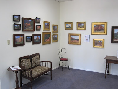
Trina and I have spent the last week getting Pumphouse Studio Gallery ready for the first in a series of Sedona plein air workshops. Although we bought the space mostly because I needed a place to hold workshops, we decided it'd also be a great place to hang and sell my work. So, over the last week, the space has metamorphosed into a full-fledged gallery. The only thing left to do is to put up the prices.

You'll note from the pictures that the space is, well, spartan. We purposely left it uncluttered and open for my students. Although my Paint Sedona painting workshops are small - never more than four students - and, of course, outdoors, we do need a place to meet in the mornings, for critiques, and for the occasional day of iffy weather.

Although we won't officially open the gallery until November 23, we'll be there off and on, and if the sign says "Open," come on in! You can also call us for an appointment (928-274-8043.) Pumphouse Studio Gallery is located in the lowest level of Creekside Plaza (across the road from the Tlaquepaque Arts & Crafts Village) and below Ken's Creekside restaurant. Regular hours will be Tuesday-Saturday, 1-5, and by appointment or chance. You can find out more about the gallery at www.PumphouseGallery.com.

This week's workshop is an advanced level one focusing on large-format paintings. Large format for me is anything 16x20 and bigger. I started a pastel yesterday that is 18x24. We worked as long as we could before the light changed so much that we had to stop. We'll go back again this morning to finish up. For my first session, I always like to get the big shapes blocked in and to get the value and temperature relationships right. In my second, I work on breaking up the big shapes into smaller ones and working my way toward detail. Here's the painting in the field and then back in the studio. Keep in mind that this painting is a work in progress. I'll post the finished piece next time.


Wednesday, November 3, 2010

Two Upcoming Shows

"Oak Creek Flow" 9x12, pastel - in the Arizona Pastel Artists Association Fall Juried Show

"Prickly Path" 12x9, pastel - in the Sedona Visual Artists Coalition show

Two local shows open this weekend that I'm part of: the juried fall Arizona Pastel Artists Association (APAA) and the Sedona Visual Artists Coalition show (SVAC).

Here are details on the APAA show:

November 6-20, 2010
Manheim Gallery
747 North Main Street Cottonwood, AZ 86326-3644

From the Manheim Gallery site: "The Manheim is proud to host the first fall competition of The Arizona Pastel Artist Association, juried by award winning artist Don Rantz. The show will open Saturday, November 6th with an opening reception with the artists 2:30 – 4:30 pm. Winners will be announced at the reception. The show will hang in the gallery through November 20th."

The Manheim gallery hours are Wednesday - Saturday, 1:00 - 5:00 pm, and other times by appointment.

Here are details on the SVAC show, "Pathways - A Visual Journey":

SVAC's annual fall show begins Nov. 5th & is open 10:00 a.m.- 5:00 p.m. daily through Nov. 19th, 2010 in the Sala de Milagro Ballroom (above RENÉ) at Tlaquepaque Arts & Crafts Village, 336 Hwy 179 at the Bridge, Sedona, AZ.

Please join the SVAC artists for the Opening Reception of Pathways on Saturday, Nov. 6th from 5:00-8:00 p.m. on the Sala de Milagro Ballroom Terrace. Hors d'oeuvres, beverages, music & a silent auction are all part of the fun under the stars.

For those of you in the area, I hope to see you at the receptions. How convenient, that they are on the same day and timed so you can attend both!